The Brand Monograph
LUNGE brand identity by Porto Rocha
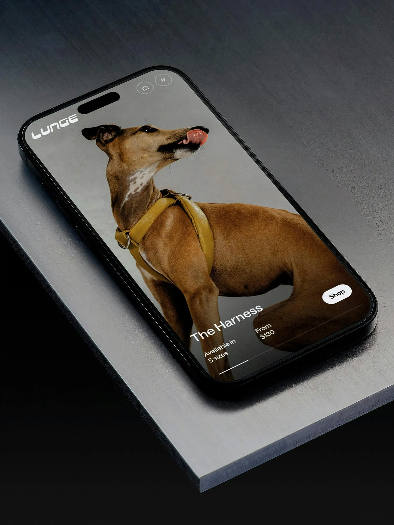
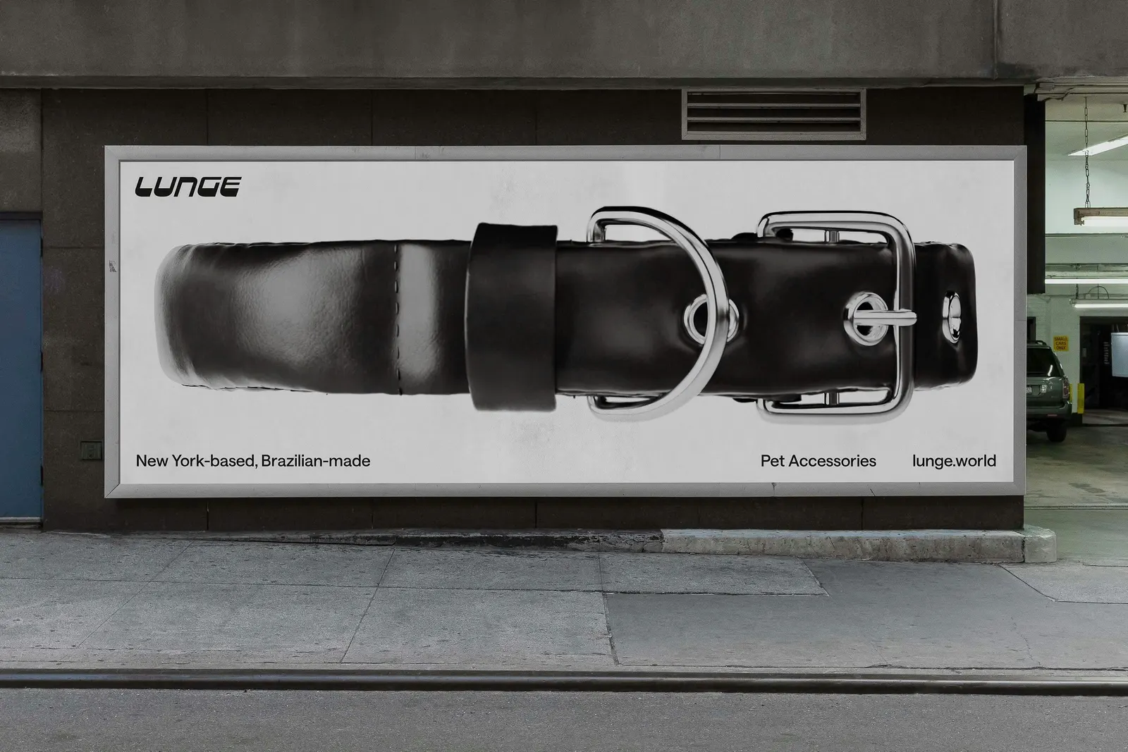
↗Porto Rocha treats the dog leash the way a fashion house treats a handbag: as an object that deserves art direction. The studio joined LUNGE before its first collection of Napa leather collars, harnesses, and leashes launched, and worked with the founder on a single identity that runs through the logo, packaging, photography, and online store.
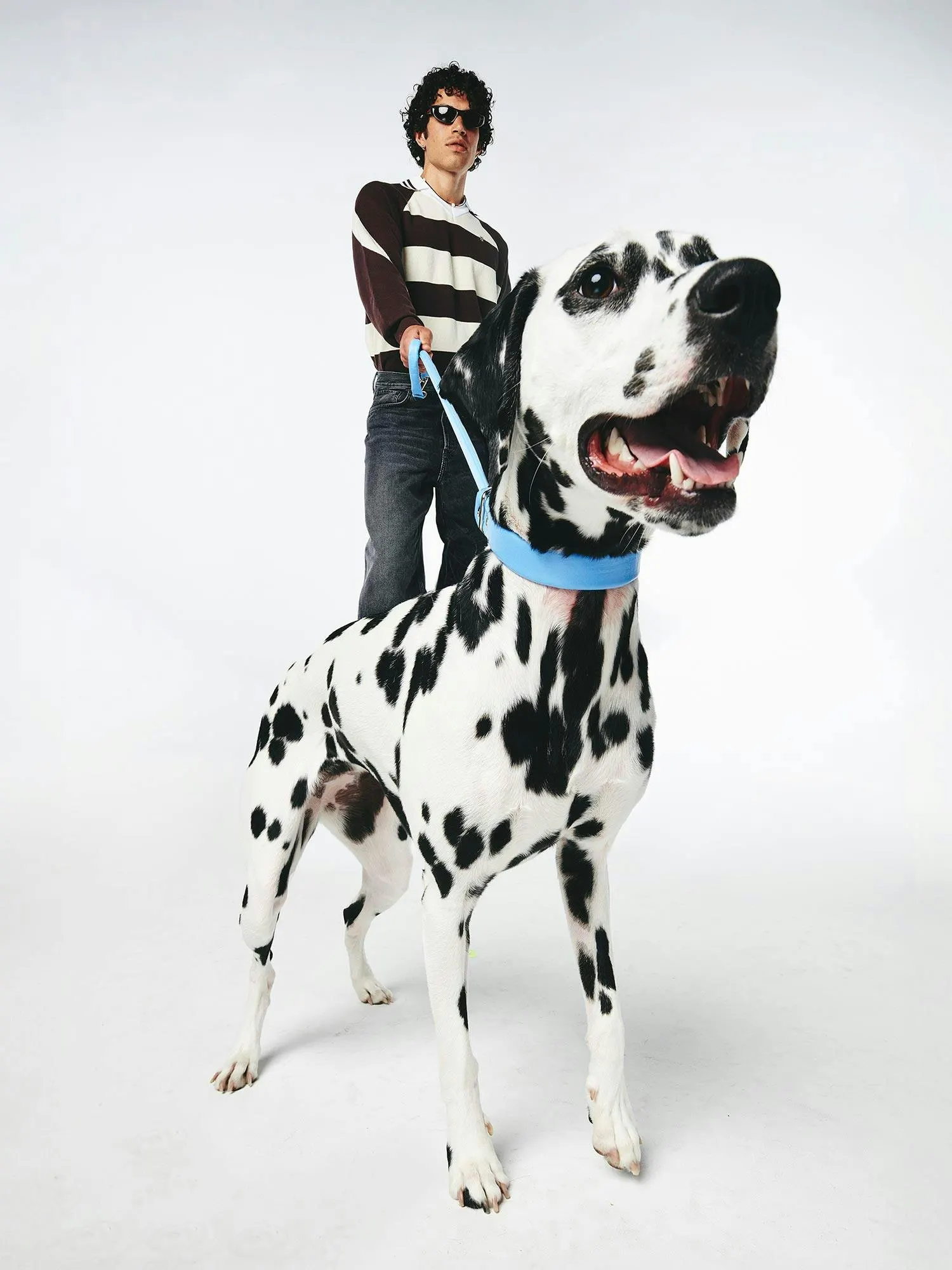
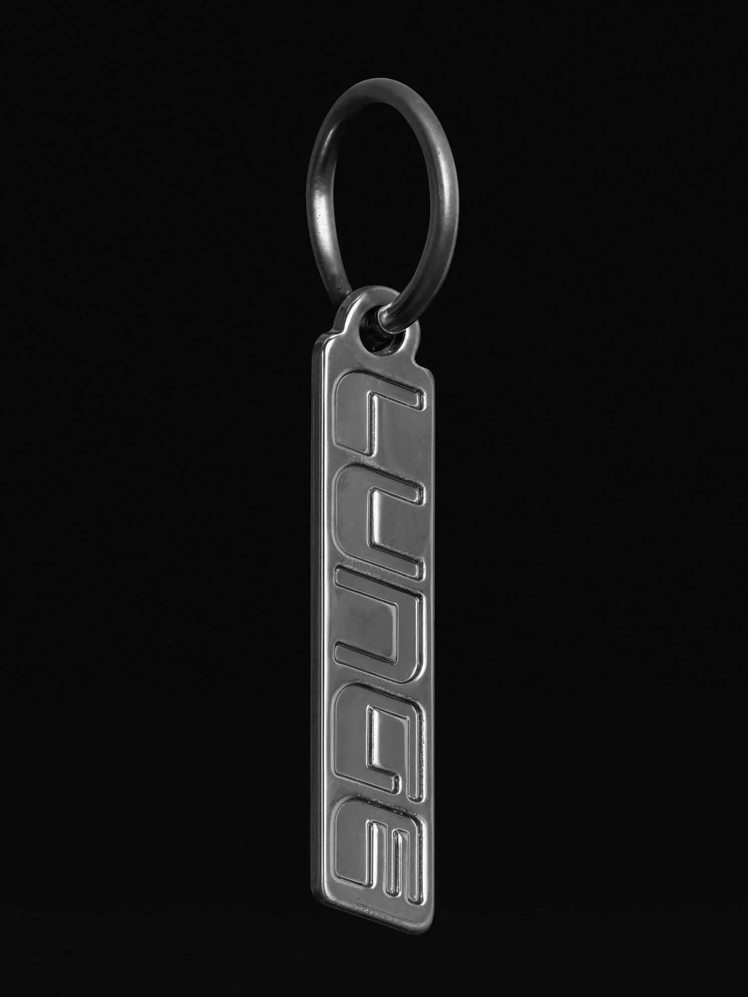
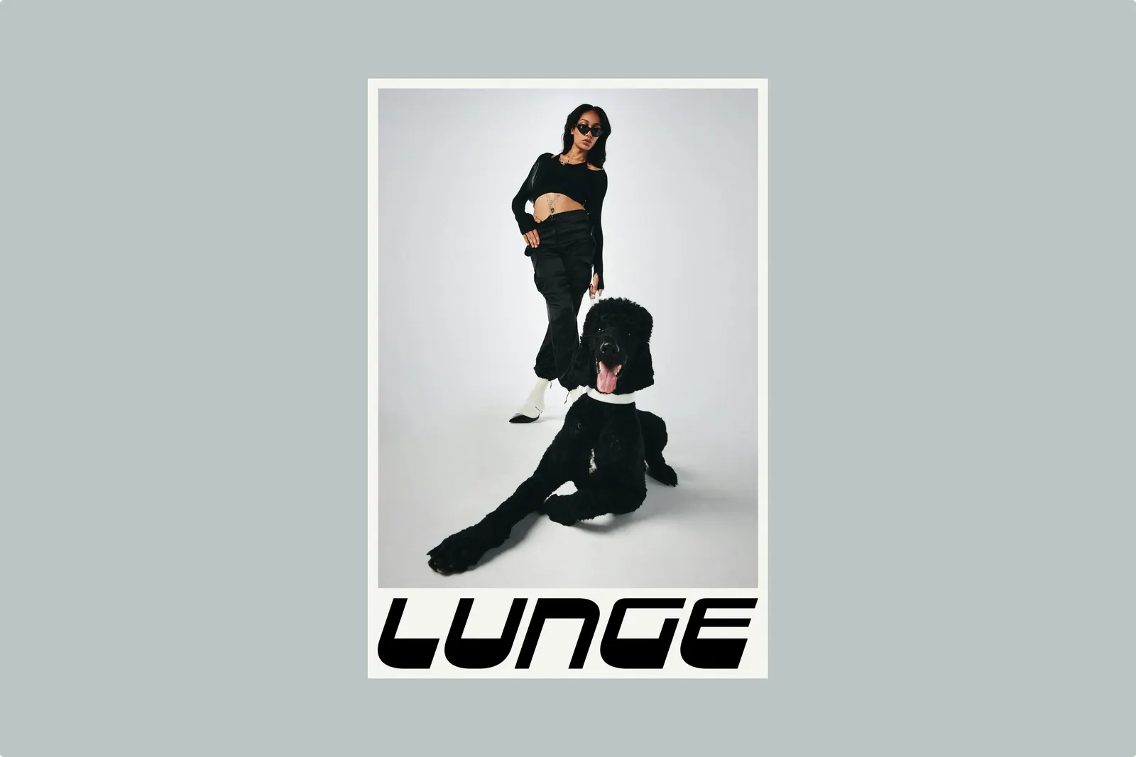
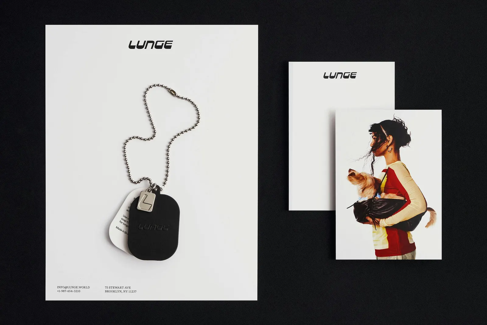
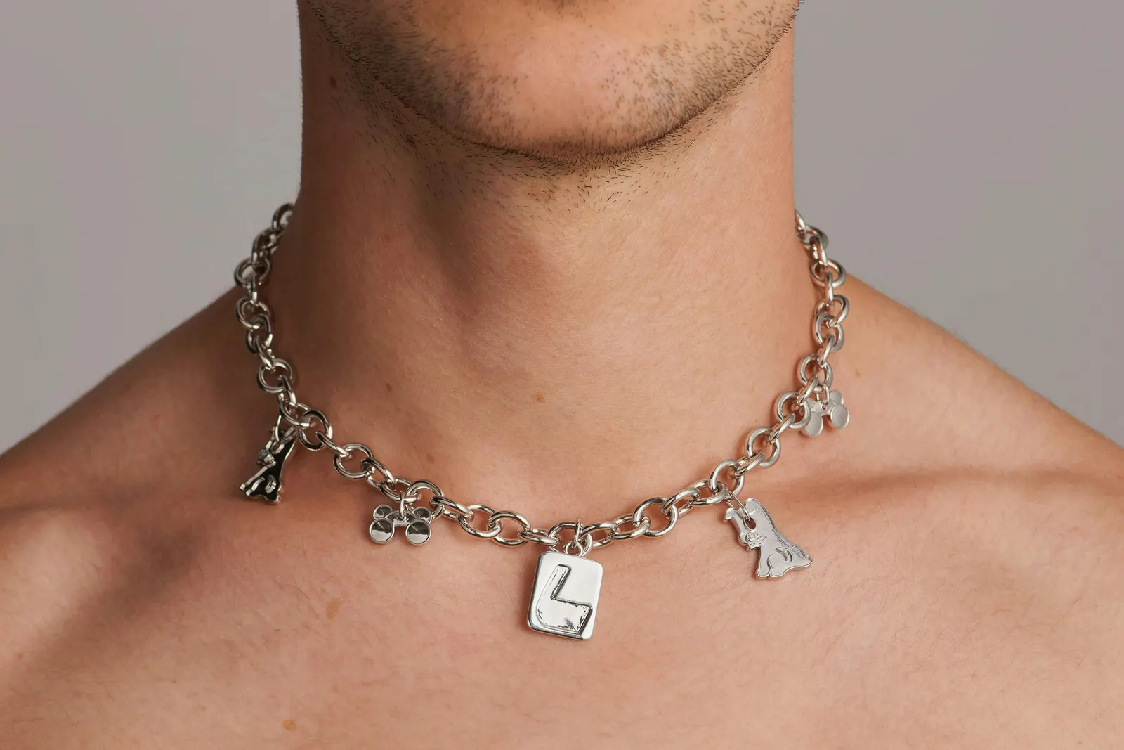
The core is a custom wordmark in heavy, squared-off letters, plus an angled L that suggests forward motion and is compact enough to sit on hardware. Displaay and Klim Type Foundry contributed typography, and Open Statement handled development. Black and off-white form the base, with cornflower blue and moss as accents, used on the products as well as in communications. Motion, sound, 3D, and six photographers extend the system into campaign work.
Why it works
Pet brands tend to default to soft curves, paw prints, and cheerfulness. Here, the hard-edged wordmark reads as confident and adult, and it sits comfortably beside the softness of the leather. The angled L works as a small stamp, so the brand shows up on the hardware that owners handle every day. The restrained palette keeps the products at home in a wardrobe, while the blue and moss add personality without turning cute. It speaks to owners who see their dog as part of their personal style.
Applications


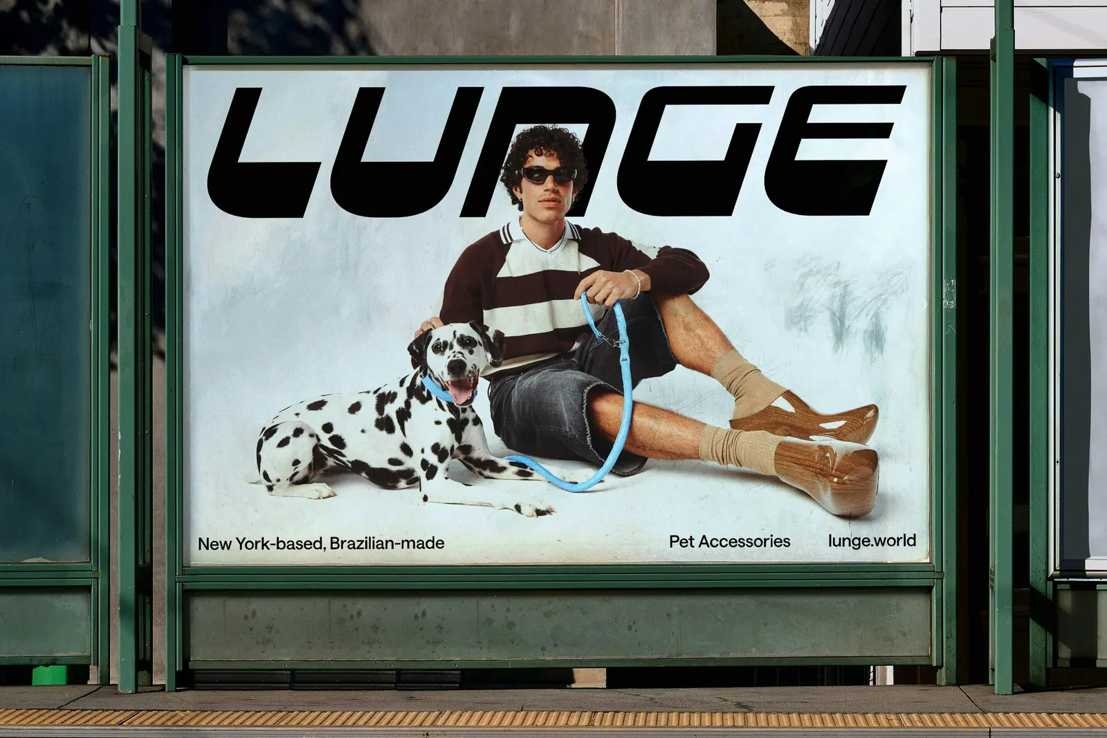
Images and video from portorocha.com, by Porto Rocha.