 The Brand Monograph
BPM brand identity by Porto Rocha
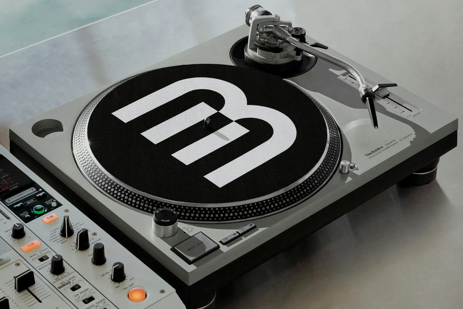
↗Porto Rocha gives BPM Music an identity that behaves like the product it represents: modular, rhythmic, and made for people who spend their nights with headphones on. The studio took a service known mainly for its catalog and made it look at home in the DJ booth.
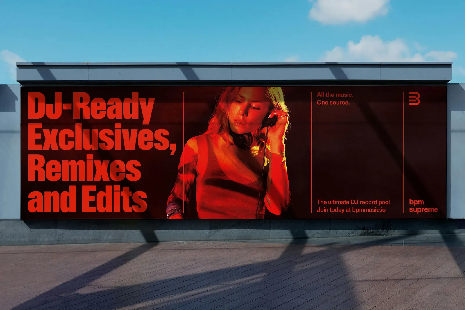
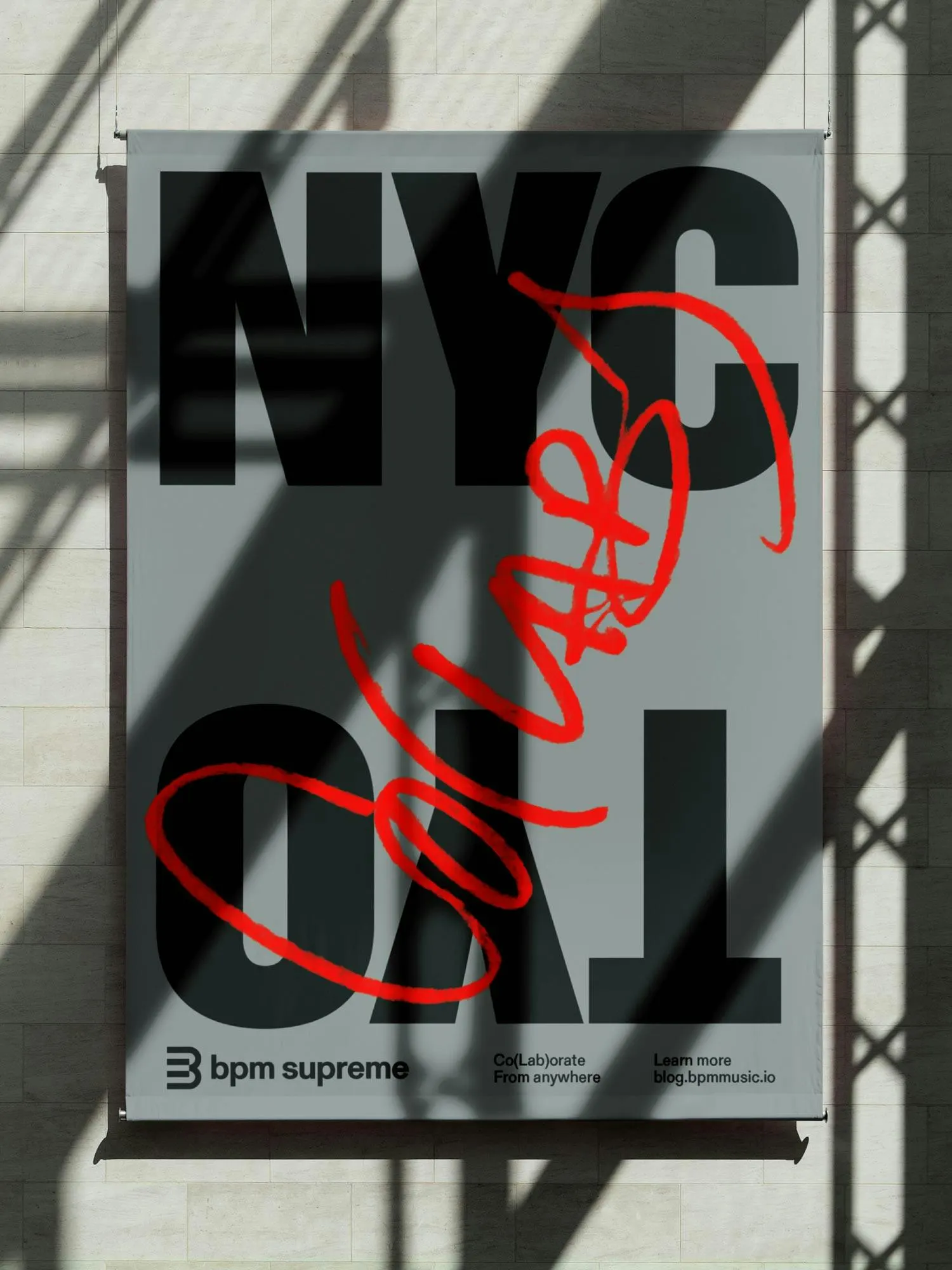
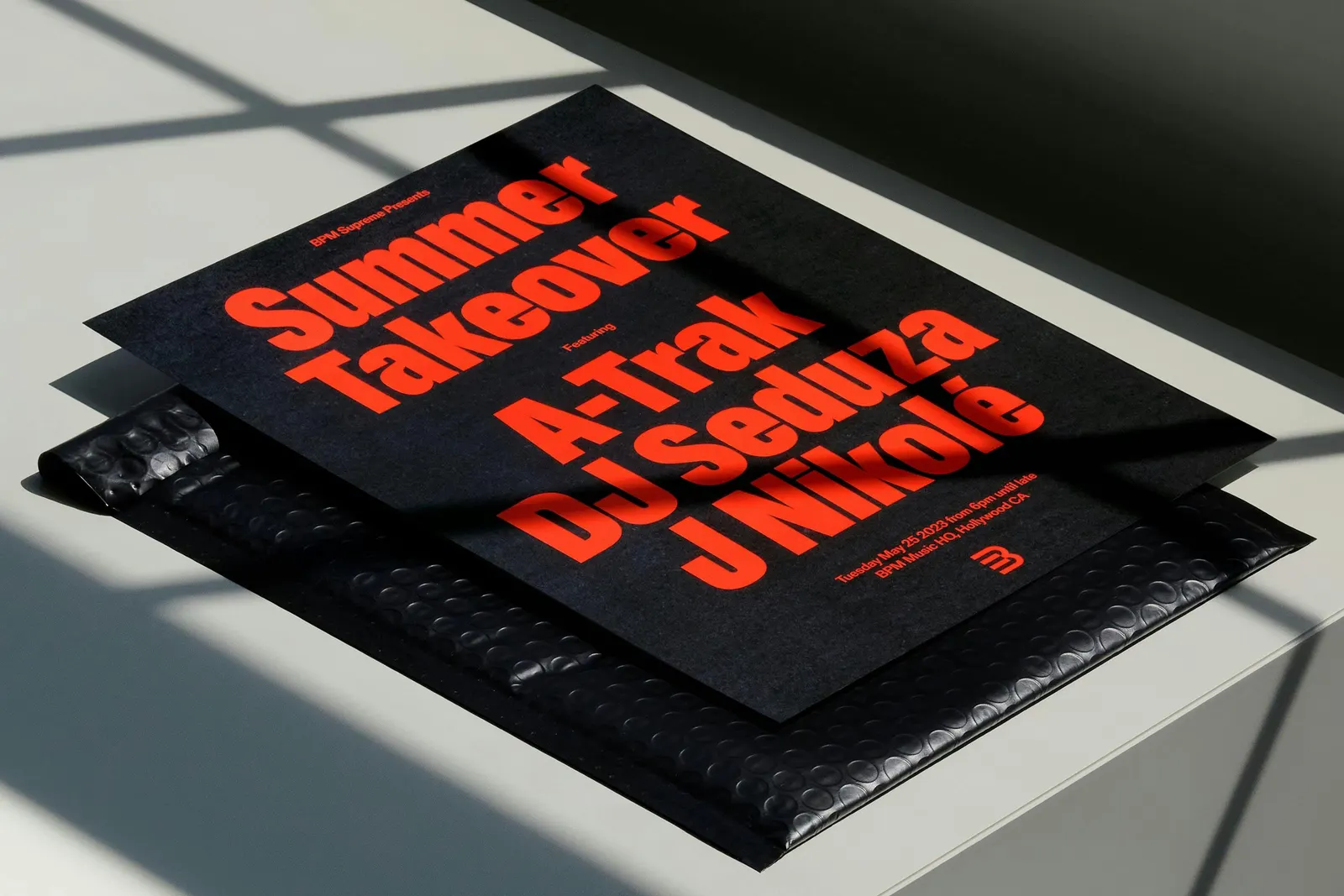
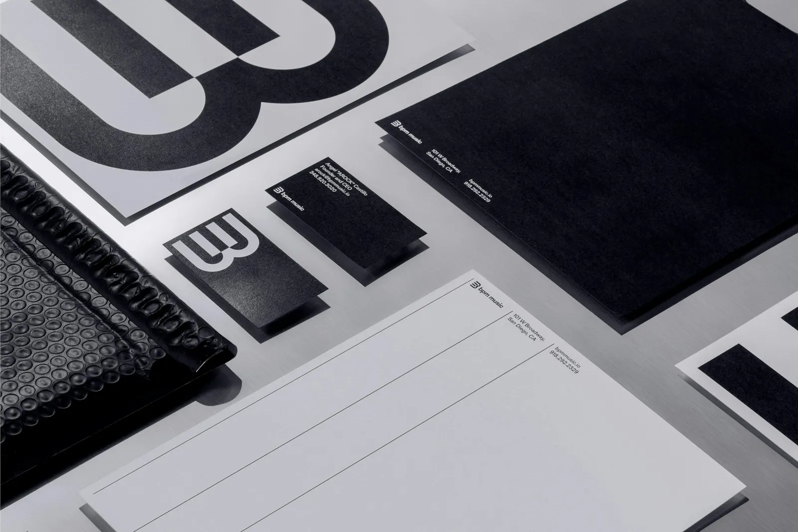
BPM is a record pool serving DJs, producers, and other industry pros with tracks from more than 100 labels, but its brand hadn't kept pace with its library. Porto Rocha's system starts with thin vertical rules that set the pace of layouts, and a symbol that reads as keys, pads, or a laptop grid. A tall, condensed headline face, with typography credited to ABC Dinamo and Forgotten Shapes, puts artist names up front. A broader palette gives each product and sub-brand its own color, and the dark-mode website, built with BYND, adds editorial modules and motion.
Why it works
The symbol is the smartest move here. A grid of keys or pads could belong to a synth, a controller, or a laptop, so it covers both the musical and technical sides without falling back on waveforms or speakers, the clichés of this category. The condensed type borrows the language of a lineup poster, which BPM's audience already reads when deciding where to go. Color-coding the products makes a multipart brand easy to navigate without extra explanation.
Applications
Logo
Typography
Images and video from portorocha.com, by Porto Rocha.


