 The Brand Monograph
Zigzag brand identity by Porto Rocha
↗Porto Rocha gave Zigzag, Korea's largest shopping app, a logo with the poise of a fashion magazine masthead. With more than 35 million downloads and over 7,000 stores, from emerging Korean labels to Nike, the app needed a sharper identity for Gen Z and for markets beyond Korea. The studio built it around a condensed wordmark drawn from periodical typography, with a "Z" that works alone as an icon. Carolina Carballo and Kiwoong Byeon rendered it in 3D, in materials that keep changing.
Around the mark sit a cooler, brighter pink and a broader palette. Korean and Latin typefaces, developed with Displaay, Google Fonts, and Hurufatfont, are matched in weight and character. Editorial photography mixes with cut-out user content, and custom 3D stickers are made for Instagram Stories. Motion is by Thales Muniz.
Why it works
A marketplace with thousands of sellers has no single product to put on its logo, so the mark has to carry the personality. The masthead-style wordmark borrows the authority of fashion publishing, while the 3D treatments let it change surface without changing shape, which suits an audience that treats identity as fluid. The adjusted pink stays recognizable but feels less like generic retail color. Matching the Korean and Latin type is a quiet decision that matters, because the brand will be read in both scripts and should look like one voice.
Logo

Applications


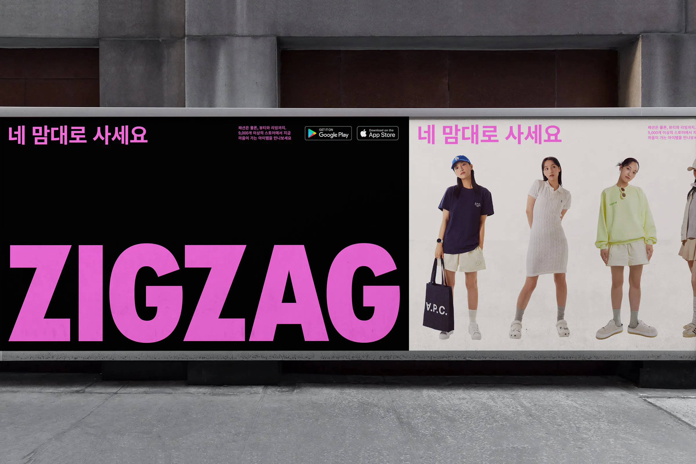


Images and video from portorocha.com, by Porto Rocha.


