 The Brand Monograph
Scandy Skincare Brand Project brand identity by Classmate Studio
↗Skincare aimed at young people often defaults to clinical restraint or pastel sameness. Classmate Studio's work for Scandy Beauty goes another way, taking its cues from sweets and letting them shape everything from the identity to the webshop.
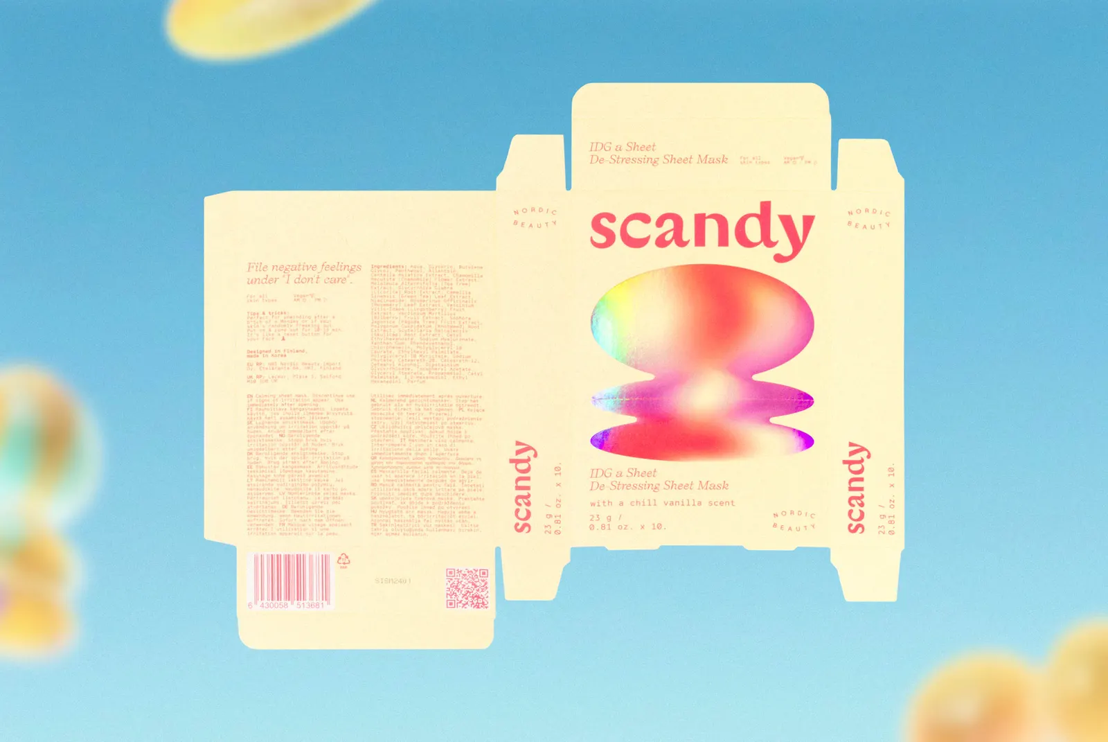
Scandy is a Scandinavian brand with international reach, and its stance is that beauty shouldn't come with a single template. The studio turned that into soft, rounded forms, a wide-ranging palette where no one color speaks for everyone, and typography spare enough to let the shapes carry the personality. The webshop extends the same system into a place to browse and buy, while photography by Silja Minkkinen adds the human side.
Why it works
Candy is a smart reference for this category because it's about choice: a pile of different colors, none ranked above the others. That turns the palette into an argument for inclusivity rather than decoration. The restrained type matters just as much. It keeps the brand from tipping into childish, which a young audience would notice quickly. And by carrying the look into the webshop, the personality shows up where people actually decide what to buy, not just in campaign imagery. Next to the muted, clinical look common in skincare, Scandy reads as friendly without losing credibility.
Applications



Images and video from classmatestudio.com, by Classmate Studio.


