 The Brand Monograph
Funatics brand identity by Mucho
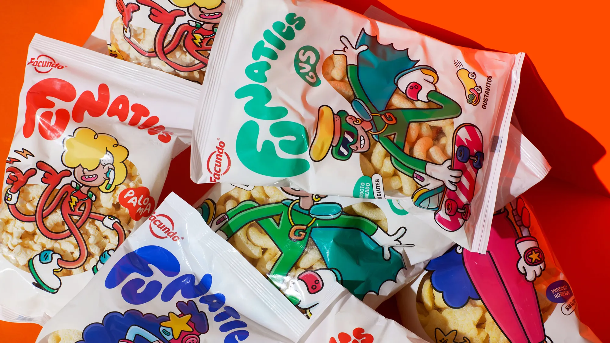
↗Few snack brands with decades behind them can speak to teenagers without sounding like a parent in a borrowed hoodie. Mucho's Funatics for Facundo, a Spanish company with more than 75 years in snacks, avoids that trap by treating a new extruded range as a cast of characters rather than a product line.
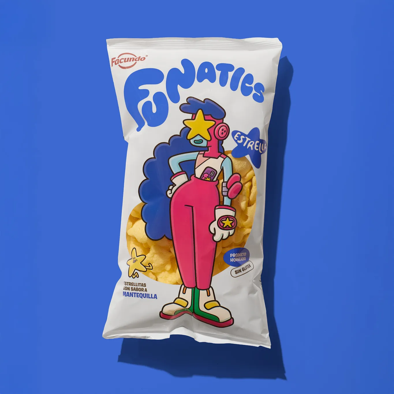
The brief was to make puffed stars, popcorn, and corn sticks matter to a digital-native Gen Z audience. Mucho built the brand from emotion instead of flavor, giving it a gender-neutral name, a soft, inflated wordmark, and three characters: Estrella, Paloma, and Gus. Brosmind handled design and illustration, drawing them into packaging that reads like a panel from a comic. Name, flavor, and snack type slot together in a modular system, so new products can join without reworking the story. Hoodies, stickers, socks, and an interactive landing page carry the crew beyond the shelf.
Why it works
The wordmark looks like the product. Puffy, rounded letters suggest air, volume, and crunch, so the logo does some of the flavor talking before anyone reads a label. Tying each character to a snack type gives every product a personality and a reason to collect the set, which is a sharper hook than the usual flavor callouts on a shelf. Stickers and apparel are things this audience already trades and wears, so the brand gets shared for free. Facundo's heritage stays in the background, which keeps the tone credible.
Logo
Graphic elements
Applications


Images and video from wearemucho.com, by Mucho.

