The Brand Monograph
Ceremony Matcha brand identity by Alphabet
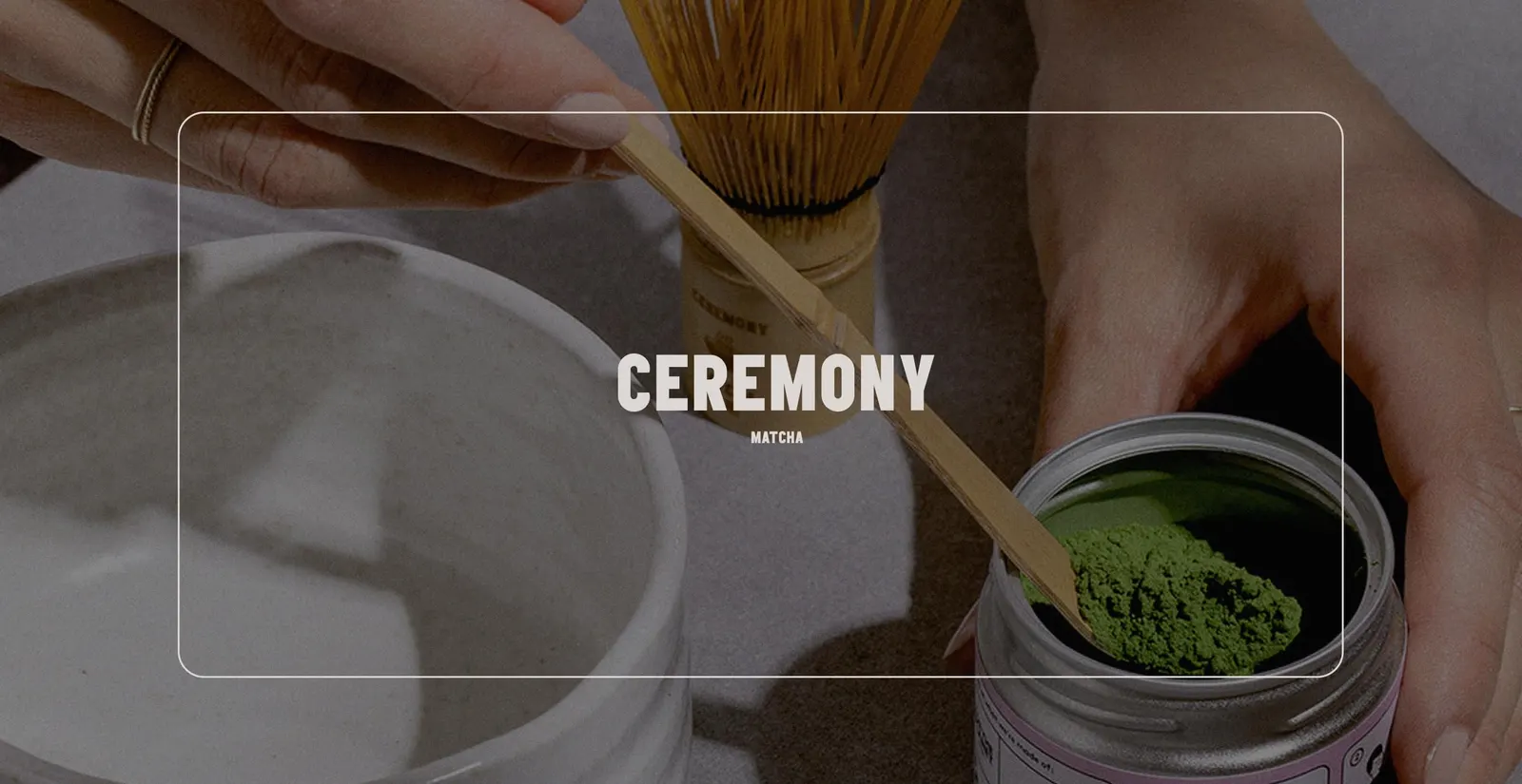
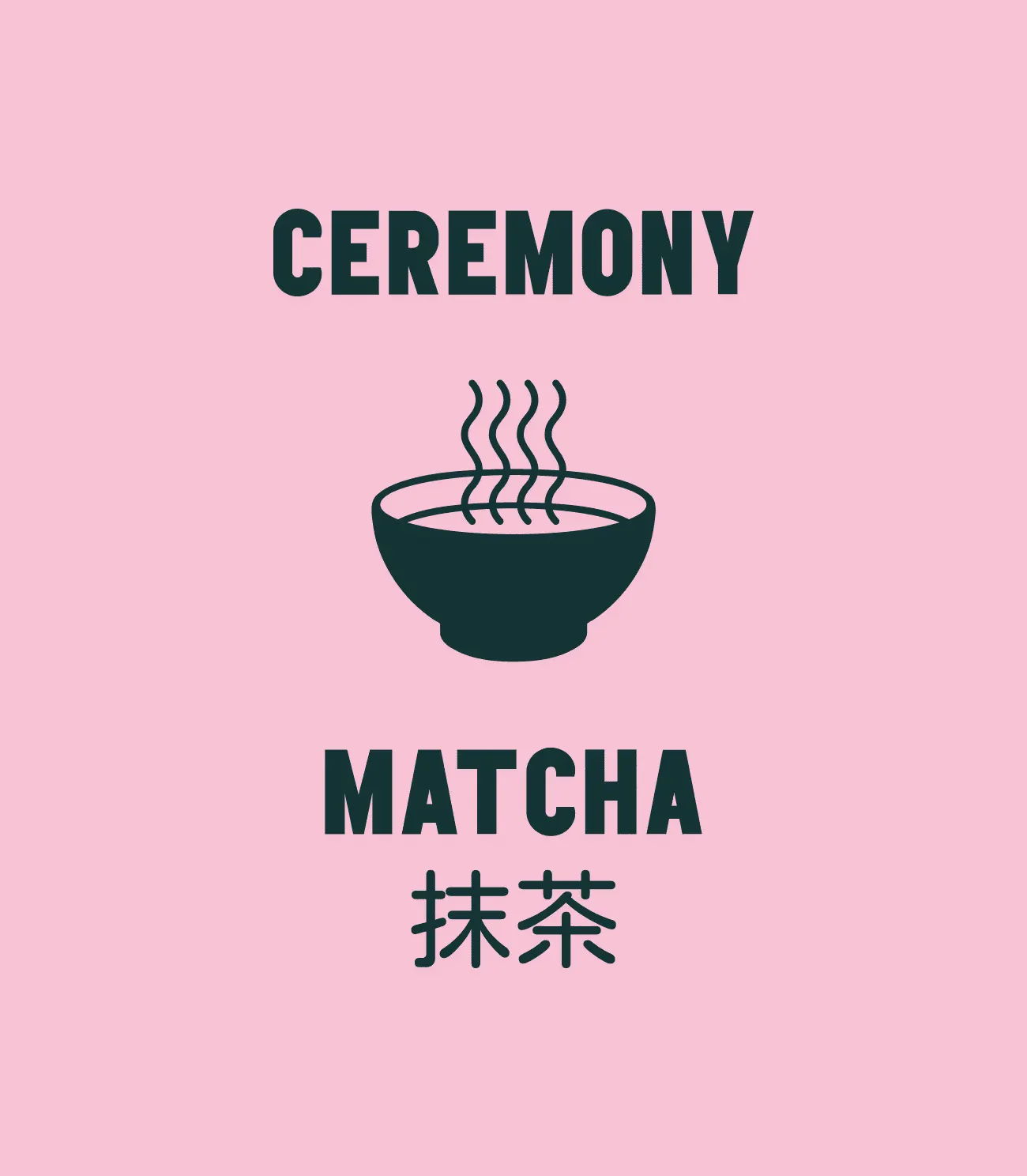
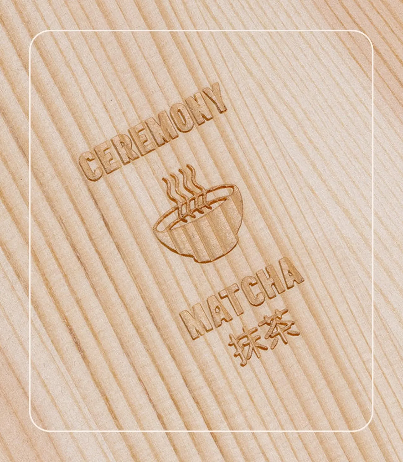
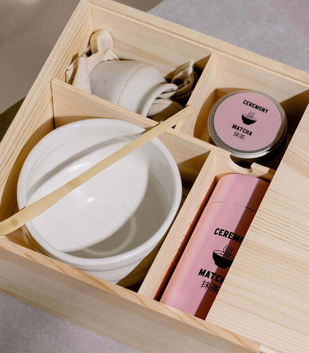
↗Ceremony Matcha shows how a tea brand can stay rooted in its origin without sliding into pastiche. Alphabet designed the identity for an organic, ceremonial matcha sourced directly from Uji, Japan. The studio's answer to a global audience is confident rather than precious: a heavy wordmark with its Japanese translation beside it, set in a saturated pink.
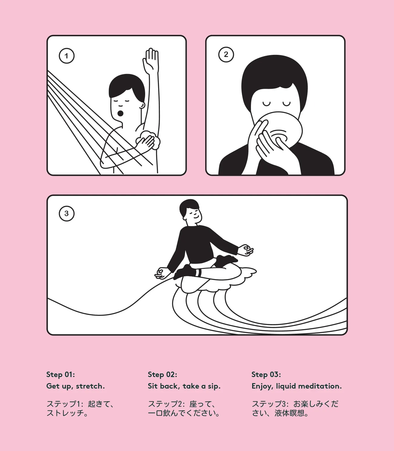
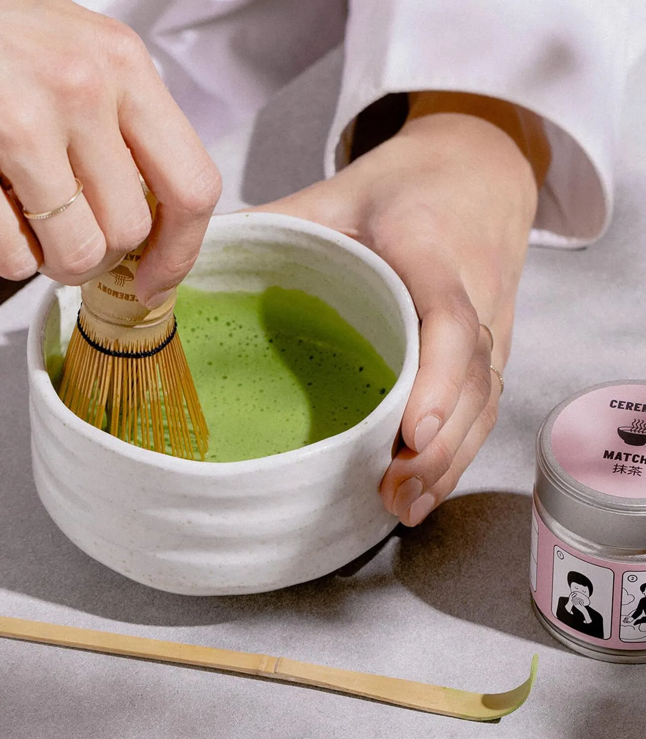
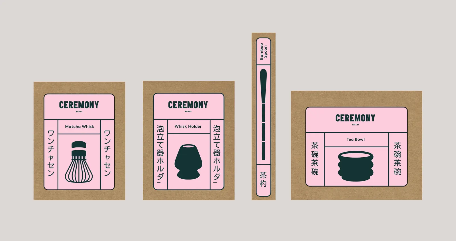
Around that mark, the studio built a flexible system. Simple icons for the whisk, whisk holder, tea bowl, and bamboo spoon sit inside a label grid drawn from tatami layouts, with product names in Japanese running vertically. The grid adapts from a wide bowl to a slim spoon. Manga-style illustrations on the tins follow a day from waking up to the first cup, and the same logic extends to event icons, website, social templates, and merchandise.
Why it works
Matcha branding often leans on leaf green and quiet wellness cues. Alphabet's pink and poster-weight type break from that, which makes the product feel like an everyday habit rather than a special-occasion purchase. The bilingual lockup carries authenticity without asking the audience to know any Japanese. The grid gives a stretchy range of formats one recognizable structure, and the illustrated routine makes ritual feel approachable, which suits a brand built on accessibility.
Applications
Logo
Typography
Images and video from madebyalphabet.com, by Alphabet.