 The Brand Monograph
Speed & Scale brand identity by Order
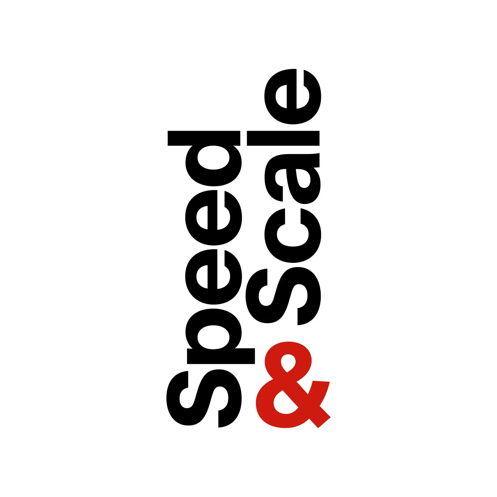
↗Order gave a climate book the look of a working document rather than a plea. Speed & Scale lays out how to reach net-zero emissions by 2050, and its identity had to travel from the printed page to a website, an app, and exhibitions. The studio's starting point is a wordmark turned on its side, with the ampersand in red every time it appears.
Set in Optimo Type Foundry's Plain Medium, the system repeats that vertical orientation in headers and pull quotes. Each of the book's goals, from electrified transportation to carbon removal, gets its own photographic icon, used alone, beside type, or in collage. The 433-page hardback prints in Pantone 2035 U and black, with 38 infographics, red-toned photography for negative impacts, and grey panels for specialist interviews. Akshita Chandra, Emily Klaebe, Jesse Reed, and Hyperakt worked with Order on the design.
Why it works
Climate publishing often leans on leaves, globes, and gradients, and this identity avoids all of them. Photographs of real industries and a tight two-color palette read as evidence, which suits readers who want to act, not be soothed. Red does double duty as brand accent and warning signal, so it's learned once and then carries meaning. The sideways type is the memorable move: it's odd enough to recognize at a glance, yet it needs no ornament to hold a page together.
Logo


Typography

Graphic elements


Applications



Images and video from order.design, by Order.


