The Brand Monograph
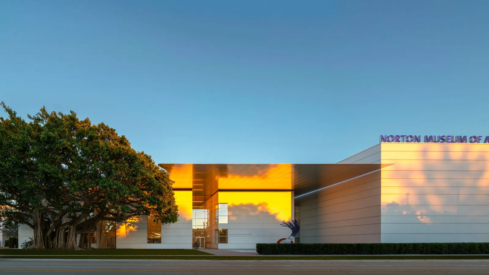
The Norton Museum of Art
by Koto
Koto's identity for the Norton Museum of Art stands out because so much of it was already there. Rather than inventing a new look, the studio dug into the museum's archive and found the raw material for a brand that feels both historic and ready for a bigger stage.
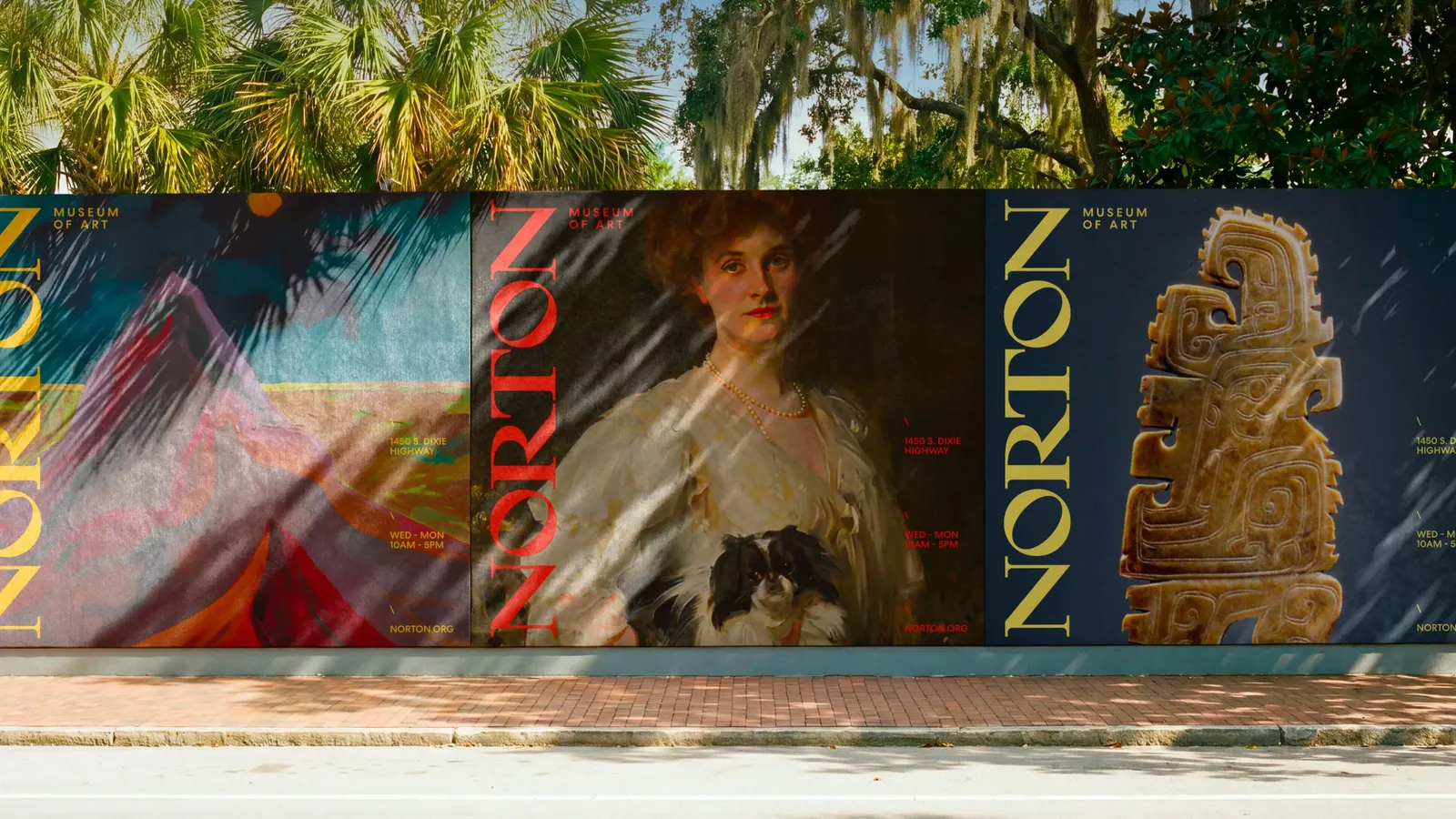
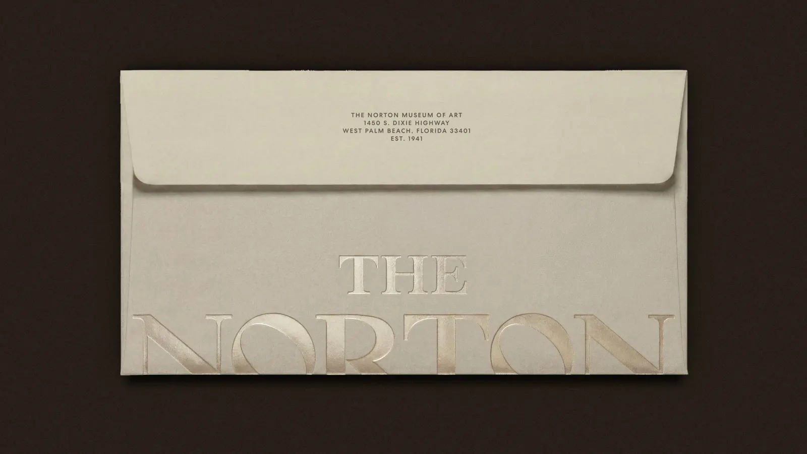
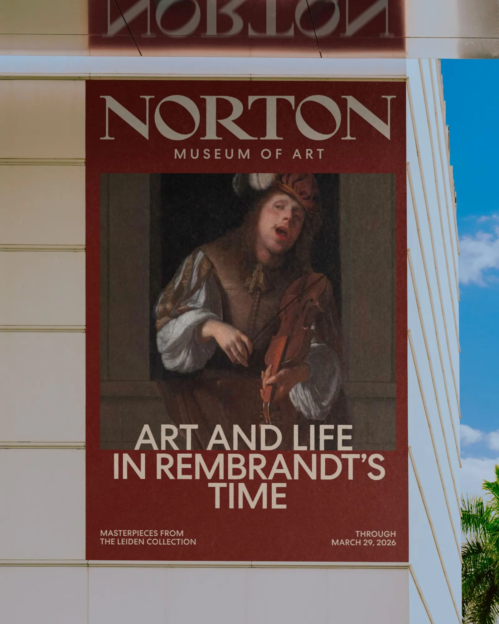
The Norton has spent more than 80 years blending galleries, gardens, dining, and community programming, but it lacked a brand that could carry that mix to a national audience. Koto's answer was "Where Art Meets Life," an idea that describes the place as it already works. The studio revived an archival wordmark, refining it for contemporary use and turning the 40° angle of its "N" into a recurring motif. It also brought back the Diana seal, adapted from the museum's 50th anniversary mark and rooted in Paul Manship's sculpture, which Ralph Norton commissioned at the museum's founding in 1941.
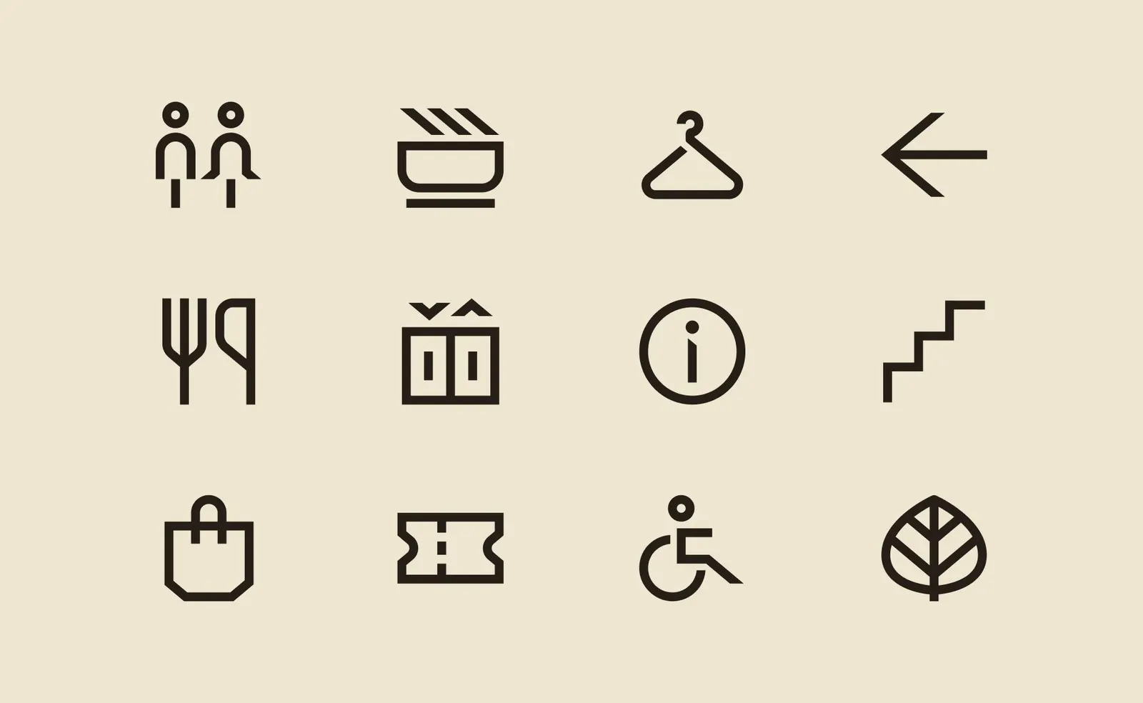
The graphic system is built around a slash that marks where art crosses into life, and around layers of color, type, and image that stack the way work does in a gallery. Florida's saturated light shapes the main palette, while an extended range is drawn directly from pieces on view. The website follows the same logic, with generous space, an unhurried pace, and an interface that takes its colors from featured artwork. The result flexes from playful to refined as the museum needs.

Images and video from koto.com, by Koto.