The Brand Monograph
Ytri Island Retreat
by Bielke&Yang
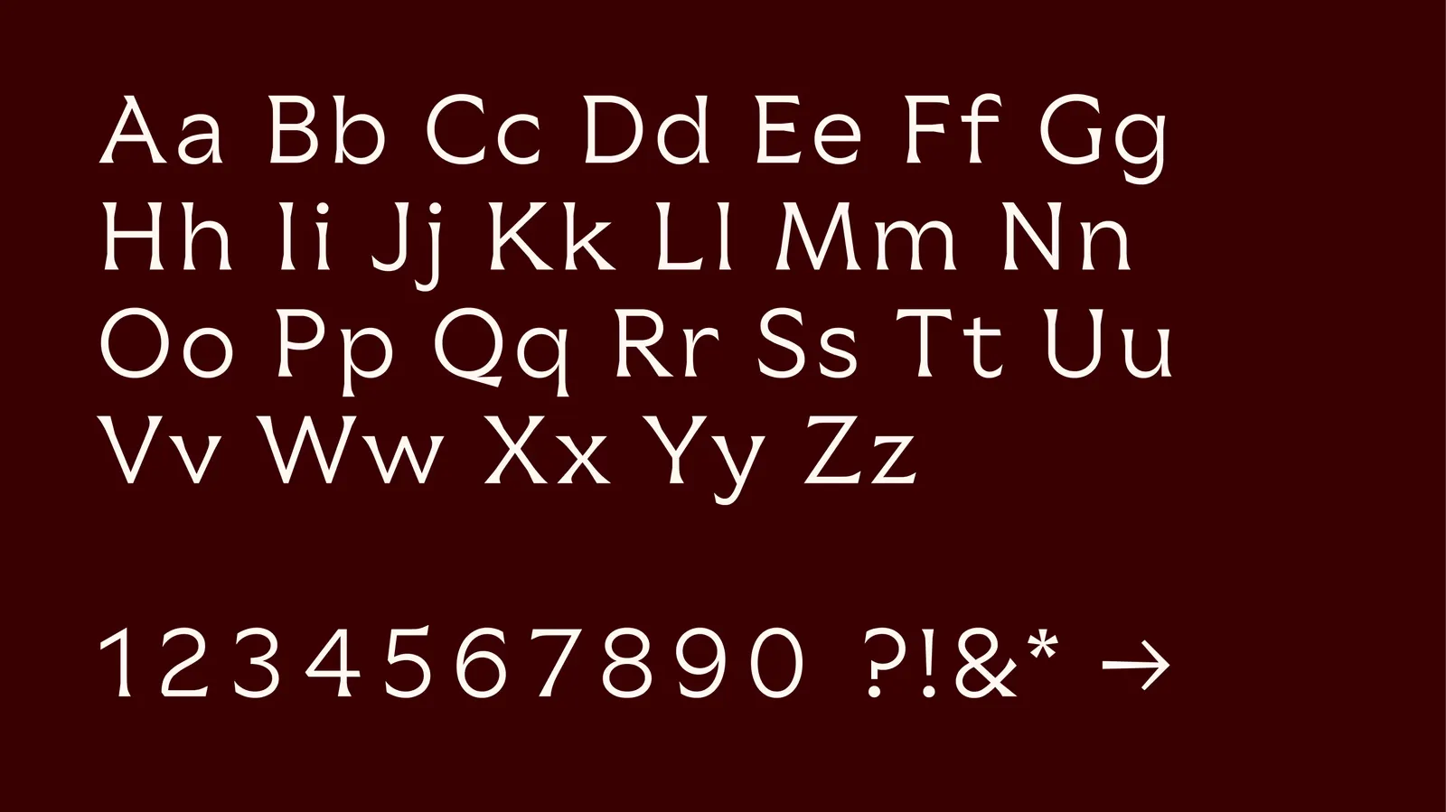
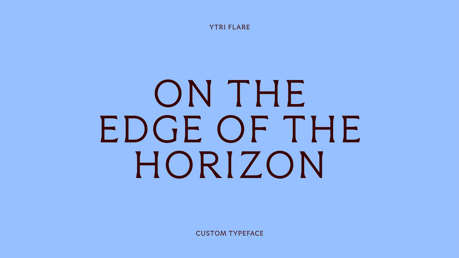
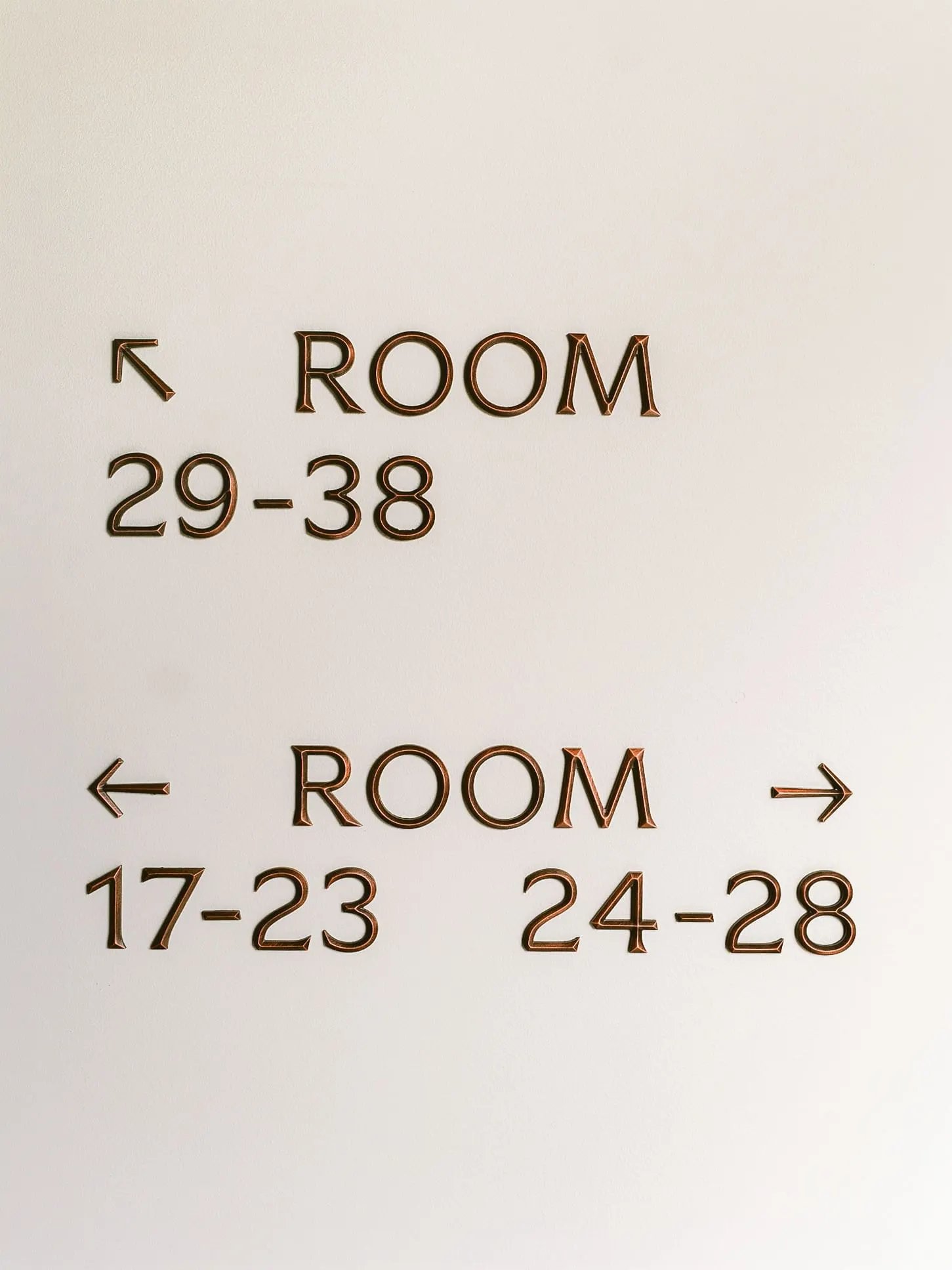
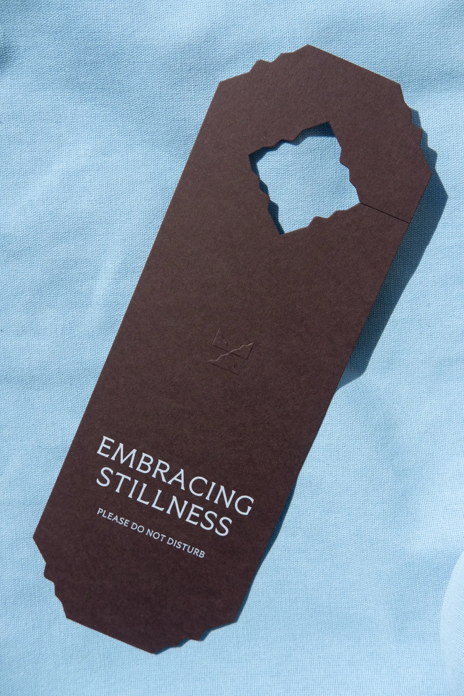
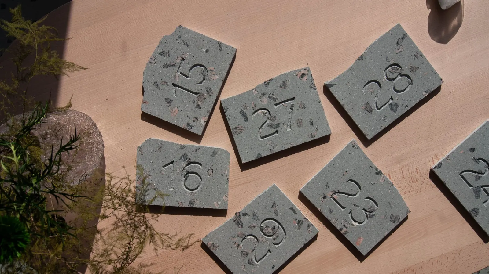
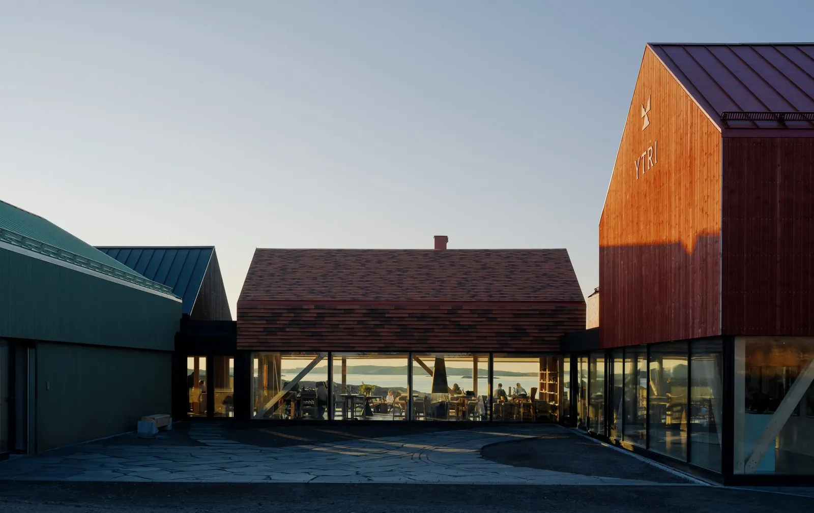
Every room at Ytri has its own number plate, cut from offcuts of the hotel's terrazzo flooring and engraved in a custom typeface. It is a small detail, but it shows how closely the brand and the building were designed together. Bielke&Yang created the identity for Norway's outermost hotel, on Træna, where the next stop is Greenland.
The brief was to make a brand that feels rooted in its place and still appeals to an international audience. Bielke&Yang found the answer in "havfolket," the sea people who have lived on the island for 9,000 years. The studio treats the idea as a way of understanding the place rather than a nostalgic gesture, and it shapes the hotel, the restaurants, the activities, and the meetings between guests and locals. The name comes from Old Norse and means "outermost point." Together, they give barefoot luxury a Norwegian form, one where closeness to place is the luxury itself.
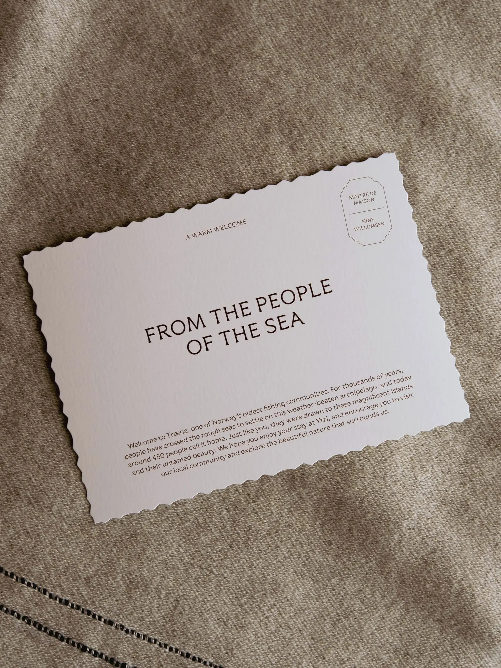
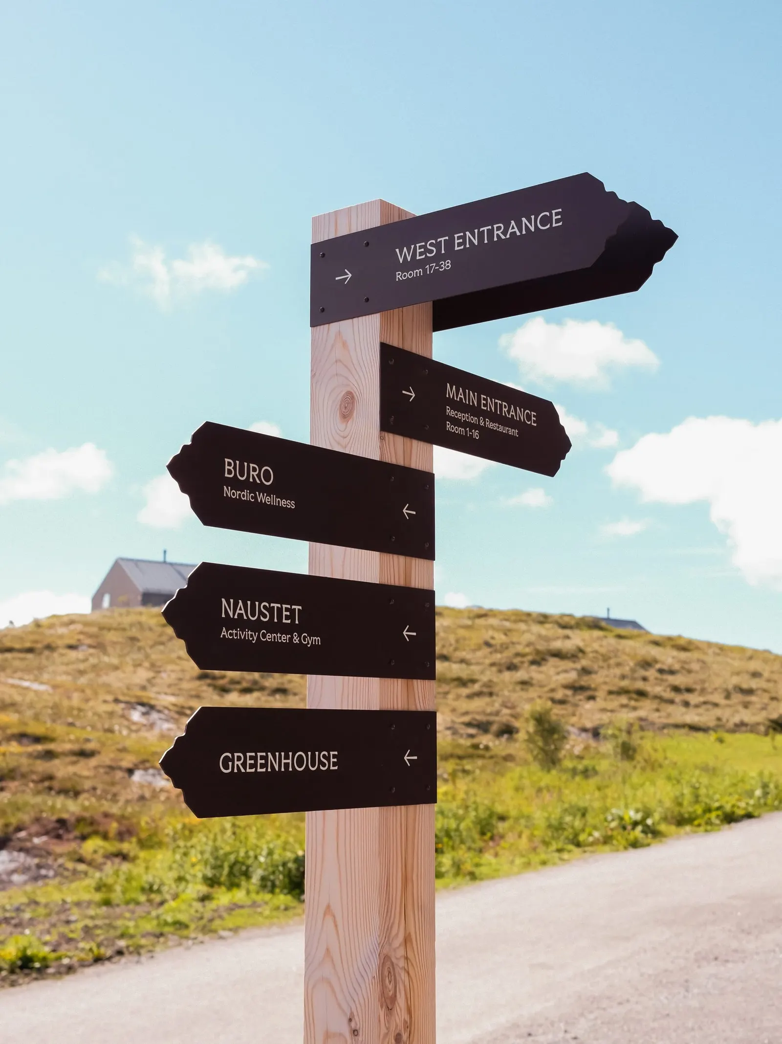
The identity is a flexible design system that moves from signage and the website to interiors, menus, and products, balancing the rugged and the warm. Bobby Tannam worked on the typography, BOW wrote the copy, and Bonaparte and Vardehaugen Arkitekter contributed to the design. The website serves as both a practical destination guide and a brand experience. Ytri opened in spring 2026 and has since been featured in the New York Times, Vogue, and Forbes.


Images and video from bielkeyang.com, by Bielke&Yang.