The Brand Monograph
McMaster Museum of Art
Underline Studio gave the McMaster Museum of Art an identity that behaves like a parenthetical aside: a small interruption that changes how the surrounding story reads. The idea is simple, and it is applied with real discipline.
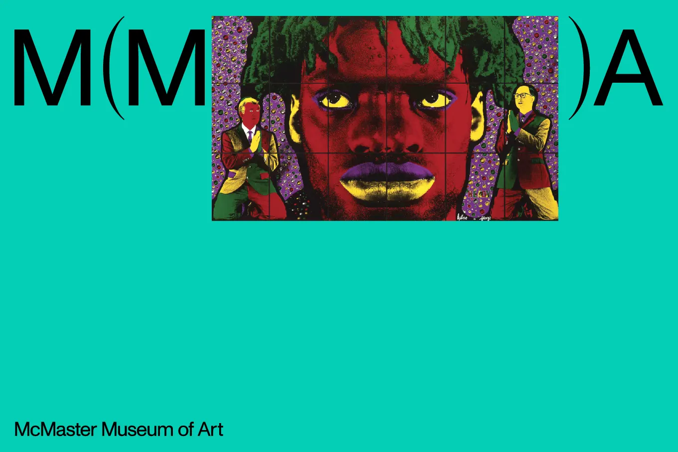
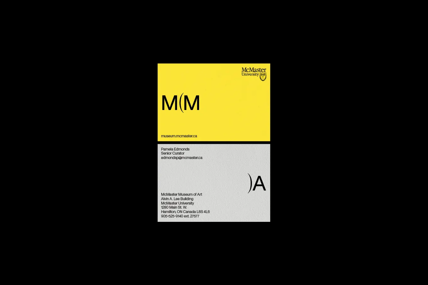
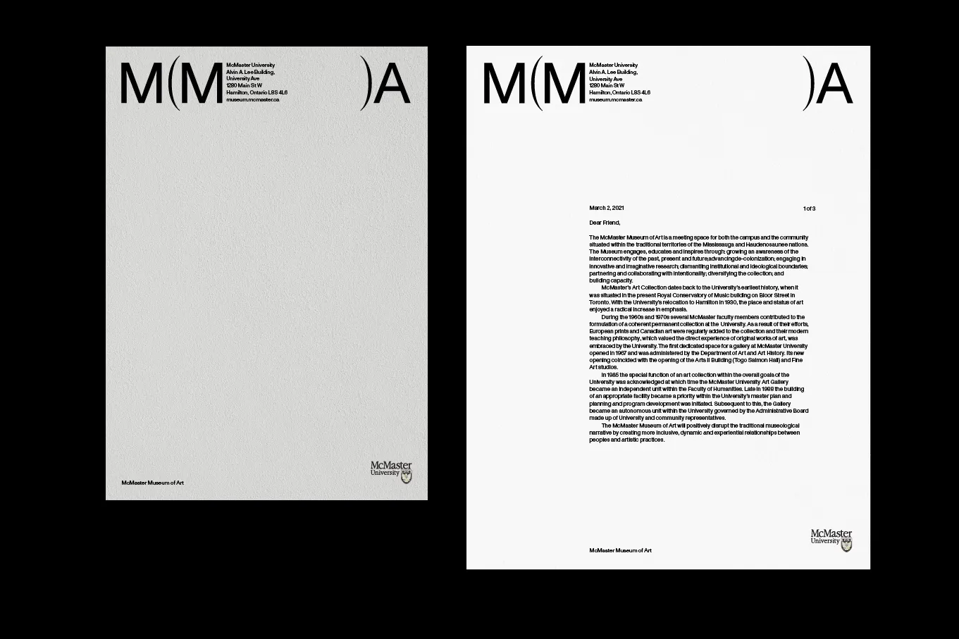
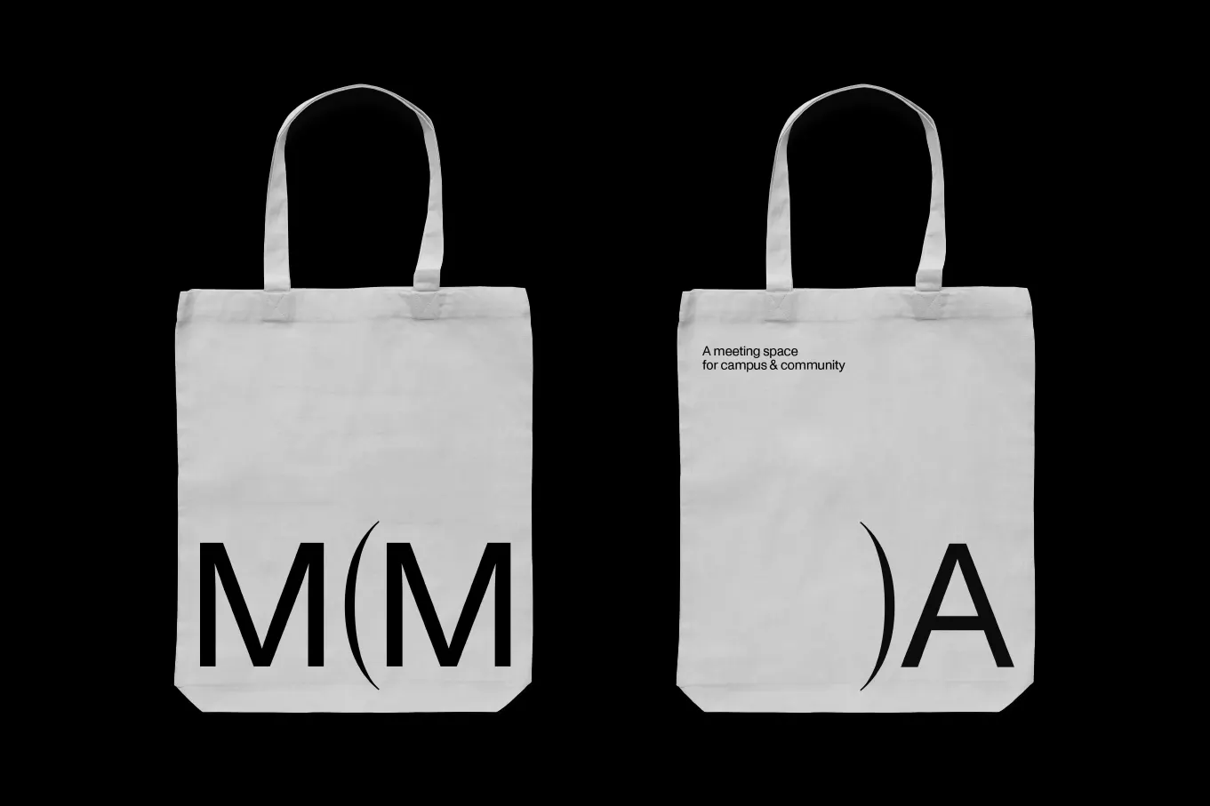
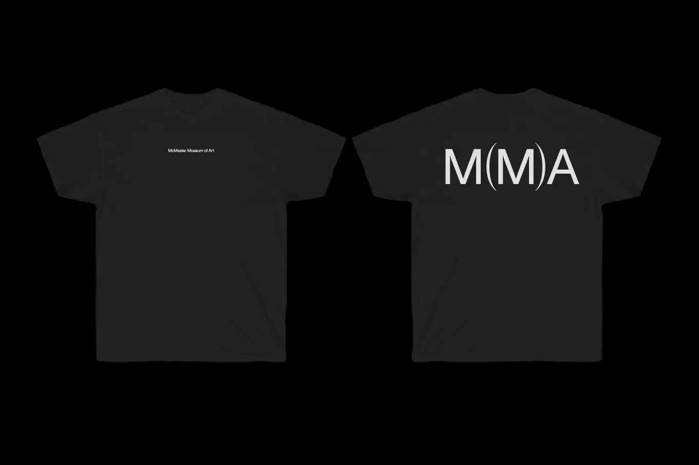
The museum is a public gallery in the middle of the McMaster University campus in Hamilton, Canada, and it wanted a brand that reflected its aim of disrupting the traditional museological narrative. Underline Studio answered by setting the "M" for "Museum" inside parentheses, the punctuation we use for a remark that departs from the main discourse. Here, the main discourse is the idea of the museum itself, and the mark quietly steps outside it.
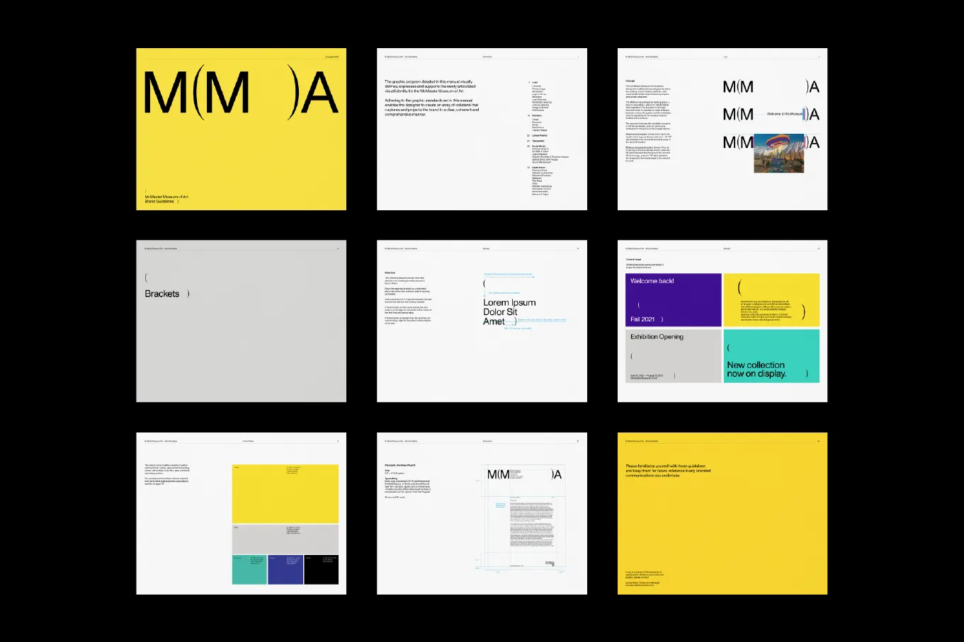
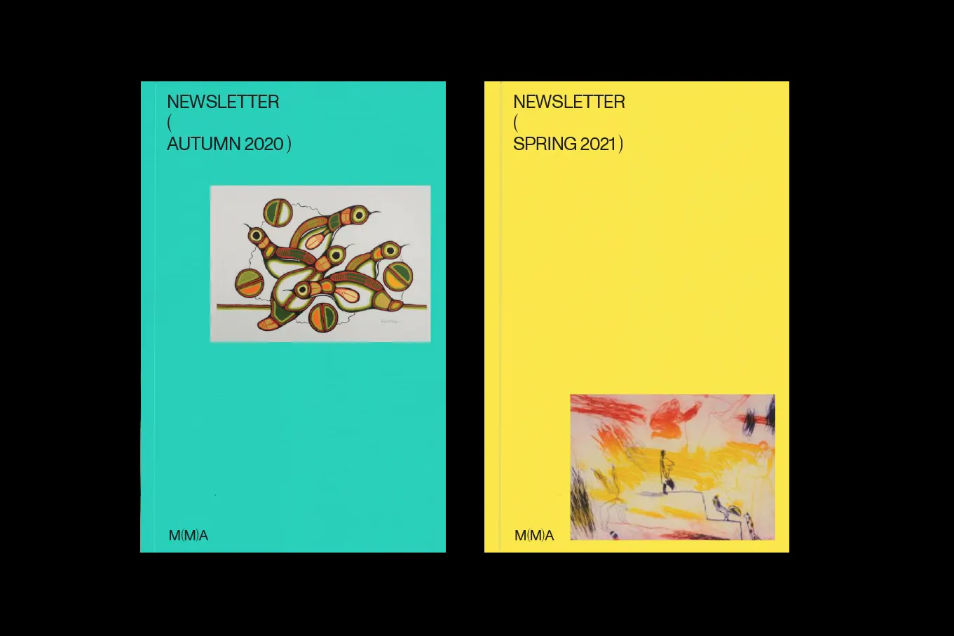
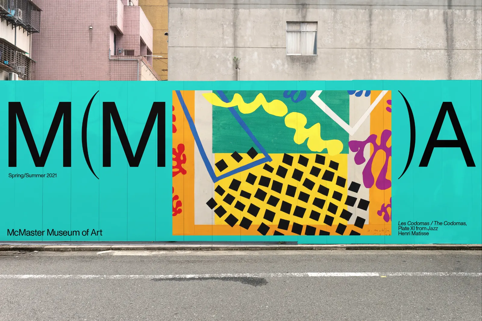
What makes the system more than a logo is that the parentheses can grow. In applications they open up to hold text or works of art, so the museum's commitment to inclusivity and diversification is built into the layouts rather than described beside them. Typography, developed with Dinamo Typefaces and Pangram Pangram Foundry, supports the mark across brochures, posters, signage, social media, and the website. The result is a flexible framework that feels consistent from a printed flyer to a screen, and one that lets the art take the space inside the brackets.

Images and video from underlinestudio.com, by Underline Studio.