The Brand Monograph
Alchemy Cannabis
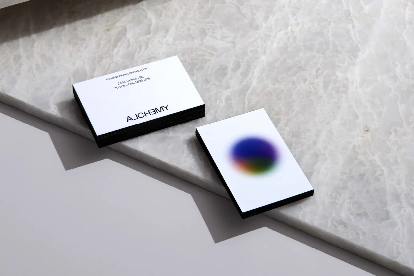
Alchemy Cannabis has a wordmark that refuses to hold still. Underline Studio built the identity around that instability, so the logo behaves less like a fixed stamp and more like a substance mid-transformation.
The brief came from a newcomer in Canada's crowded cannabis retail market. Alchemy Canna Corp chose to compete on atmosphere, with a store designed by Studio Paolo Ferrari to immerse visitors from the moment they walk in. Underline's idea draws on the name itself. Alchemy suggests a near-magical change from one state to another, and that is close to the shift in mood cannabis can bring. A mark that is always changing carries both meanings without needing to explain either.
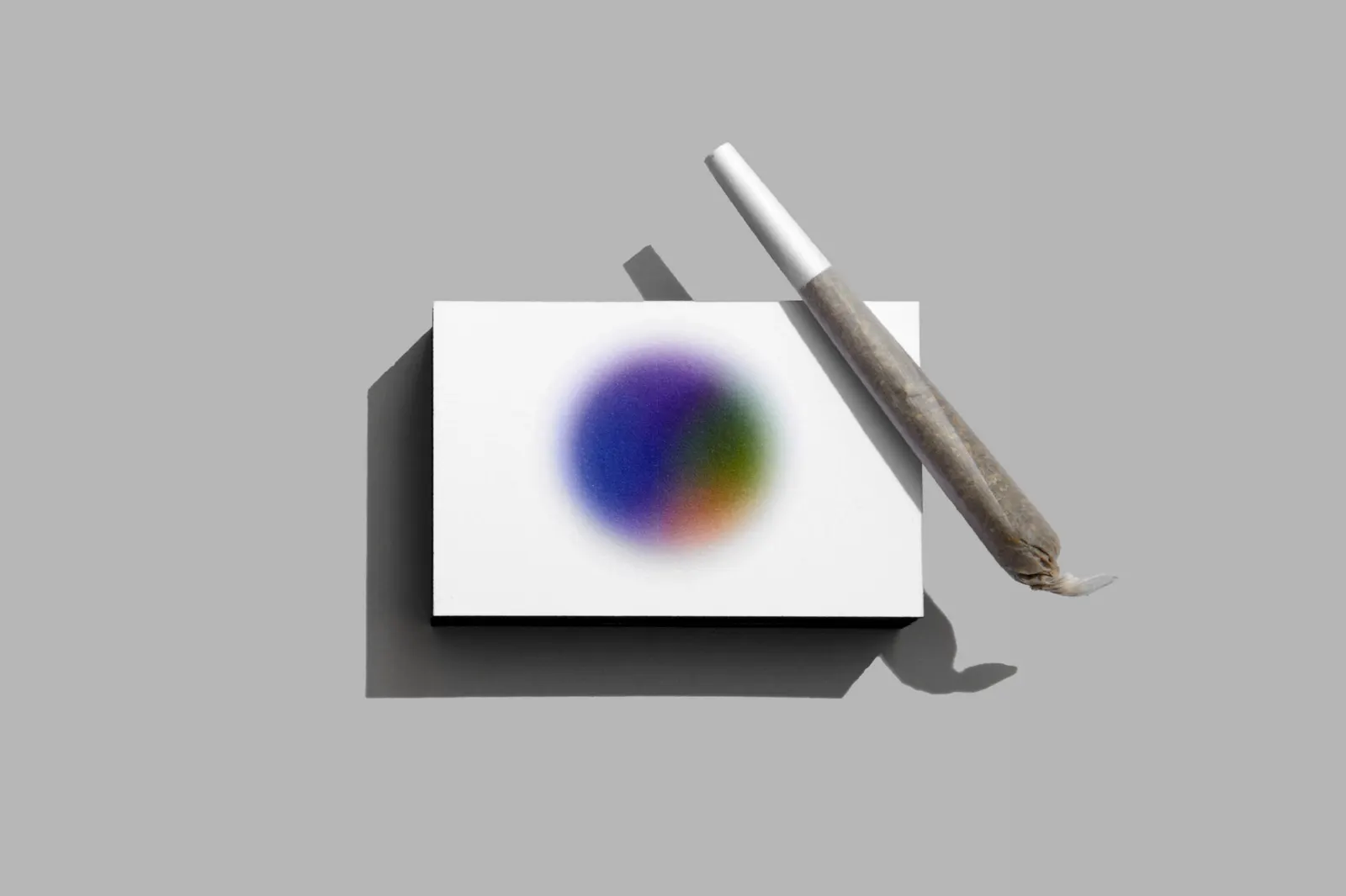
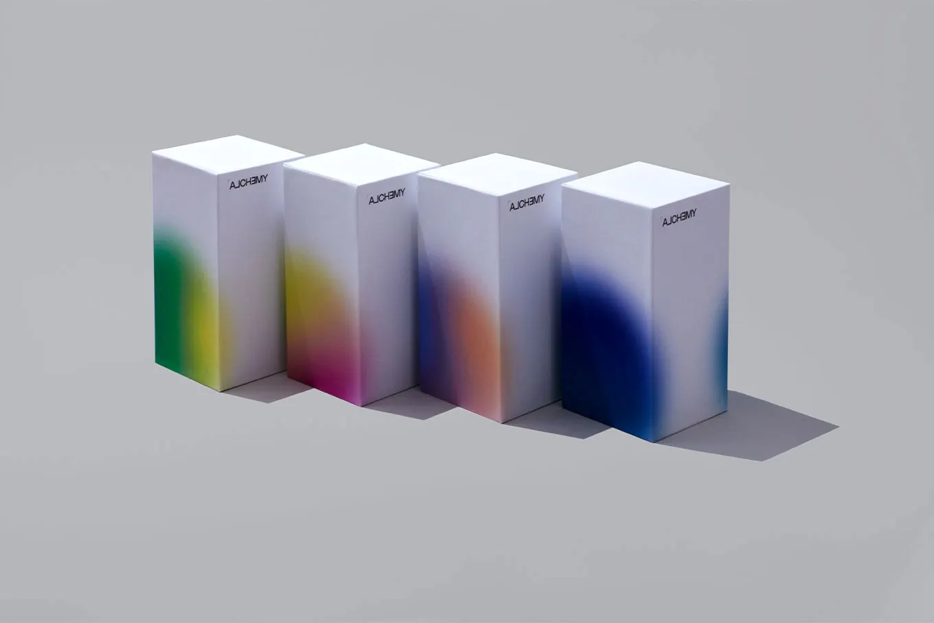
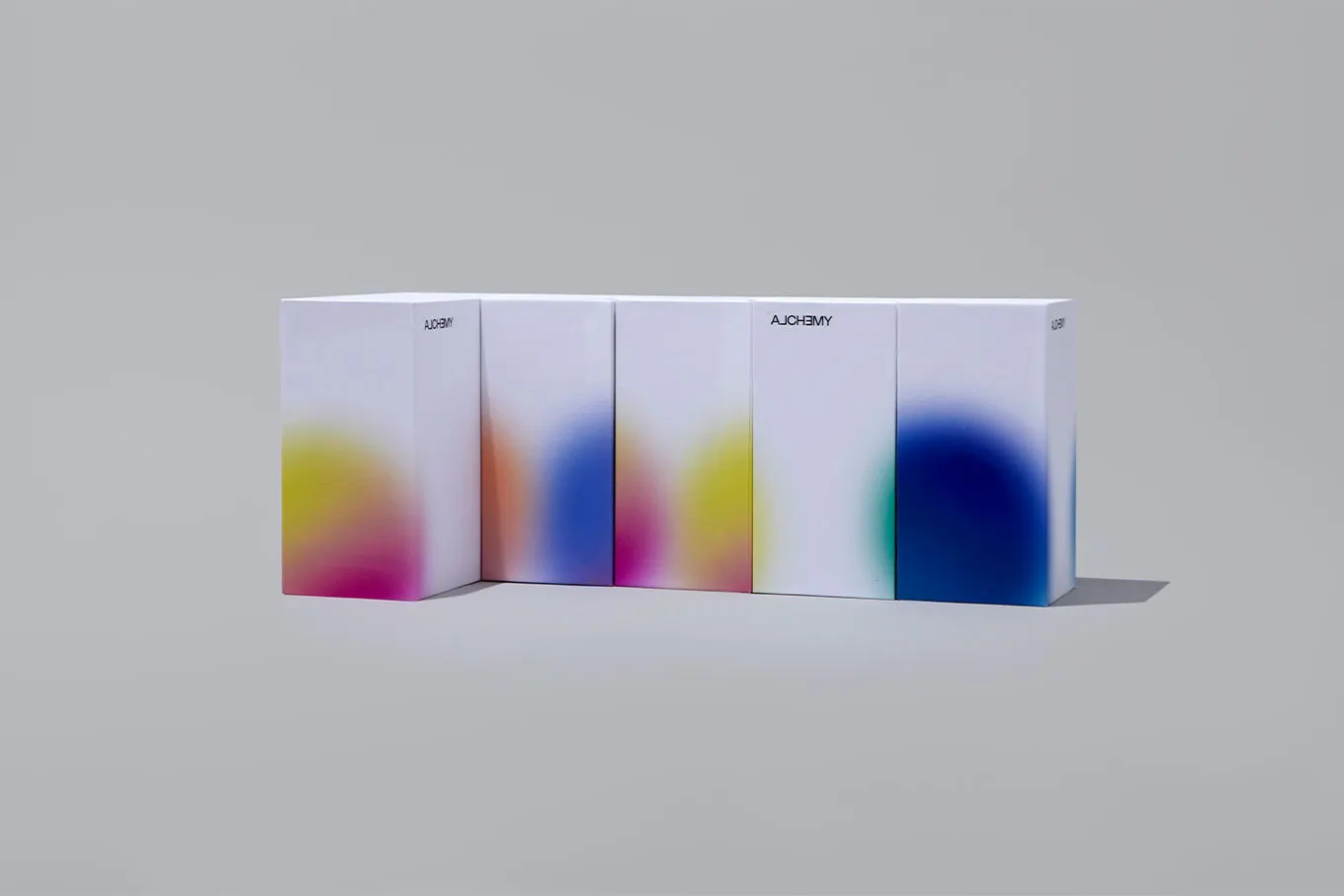
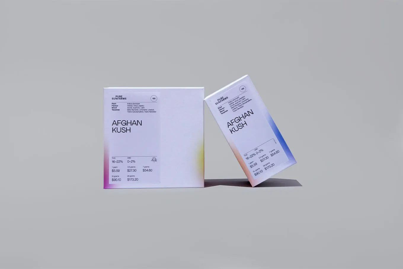
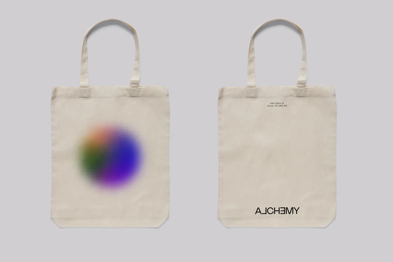
What makes the work effective is how far the idea travels. The studio extended the identity across packaging, signage, and both print and digital collateral, so the shifting wordmark is part of a working system, not just a clever logo. Studio Paolo Ferrari also photographed the project, and the images show the brand and the space reinforcing each other.


Images and video from underlinestudio.com, by Underline Studio.