The Brand Monograph
Little Caesars
Ten years as "Best Value in America" should have been an easy win for Little Caesars, but it came with a catch: shoppers were reading low prices as low quality. Turner Duckworth's answer is a rebrand that earns its confidence, built around a mascot who finally gets the attention he deserves.
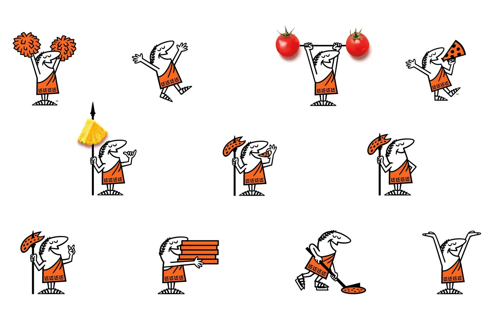
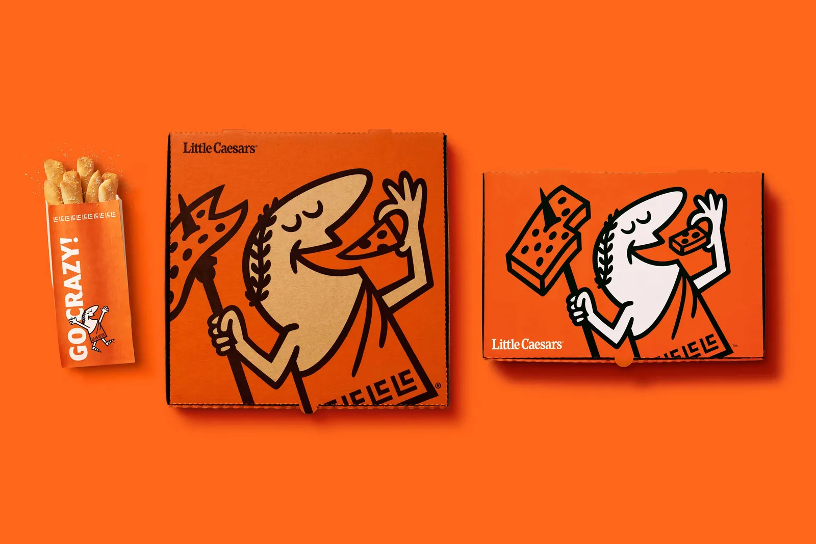
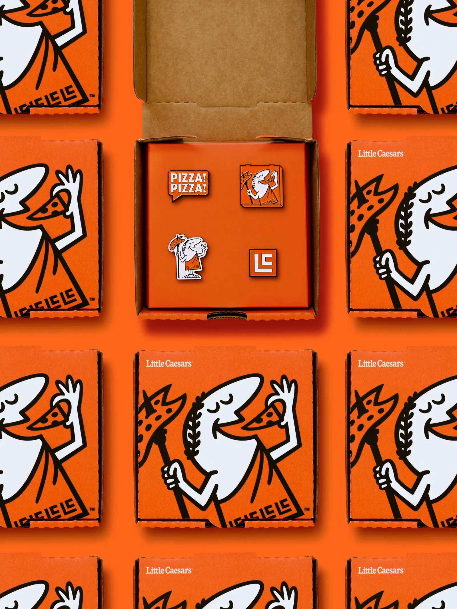
The studio's idea was to let the product's own qualities lead. Fresh, simple ingredients and smart distribution are what keep prices down, so the design is bold, simple, and handcrafted. Turner Duckworth restored Little Caesar with a respectful nod to his 1950s cartoon origins, giving the brand one consistent face. The wordmark was optimized, with versions for different global markets, and paired with a custom typeface and typographic style developed with Arley Torsone and MCKL. Orange takes center stage across everything from products to promotions, and the food photography is richer and more appetizing.
Motion is where Caesar really goes to work. With Jonathan Dahl and Jonathan Warner animating, and Dan Wool handling sound, he now appears in social posts, ads, TV end cards, the ordering app, and Little Caesars Arena. His spear, laurel crown, and toga monogram have become recognizable brand symbols, and the small details are easy to miss at first. Some customers may even wonder if they were always there.


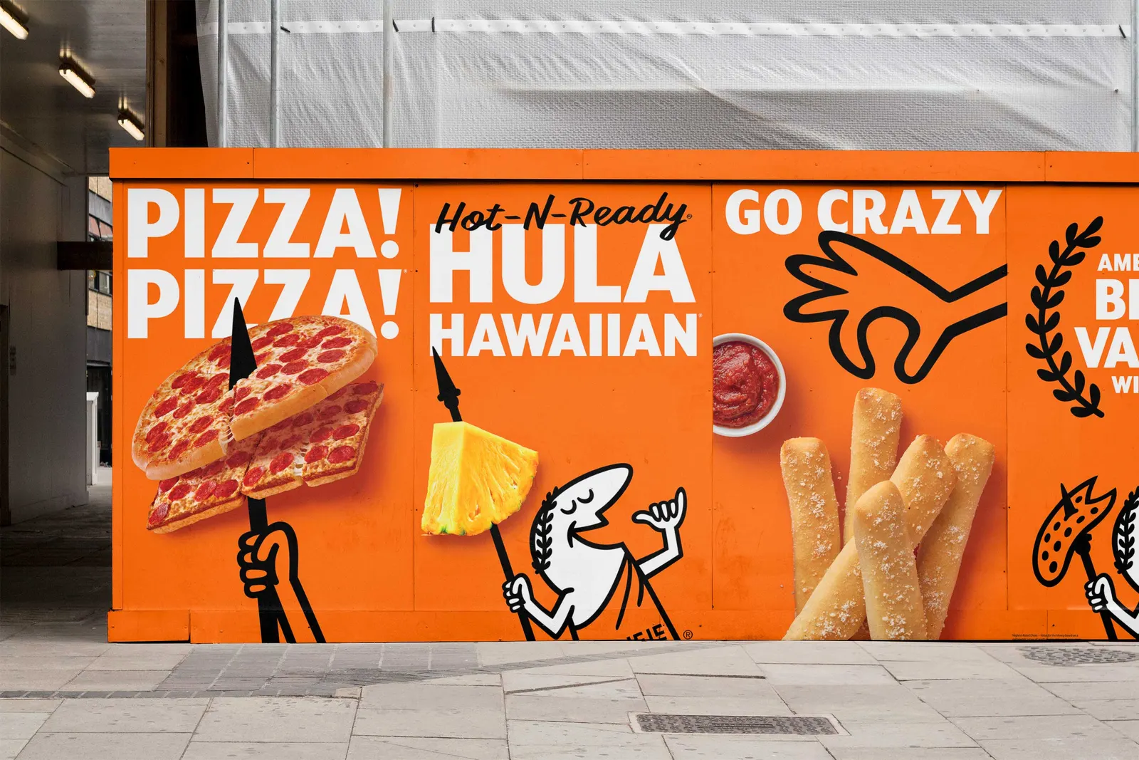
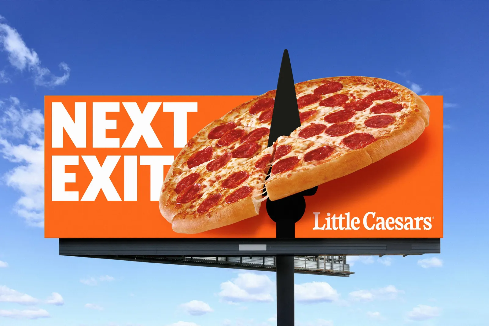
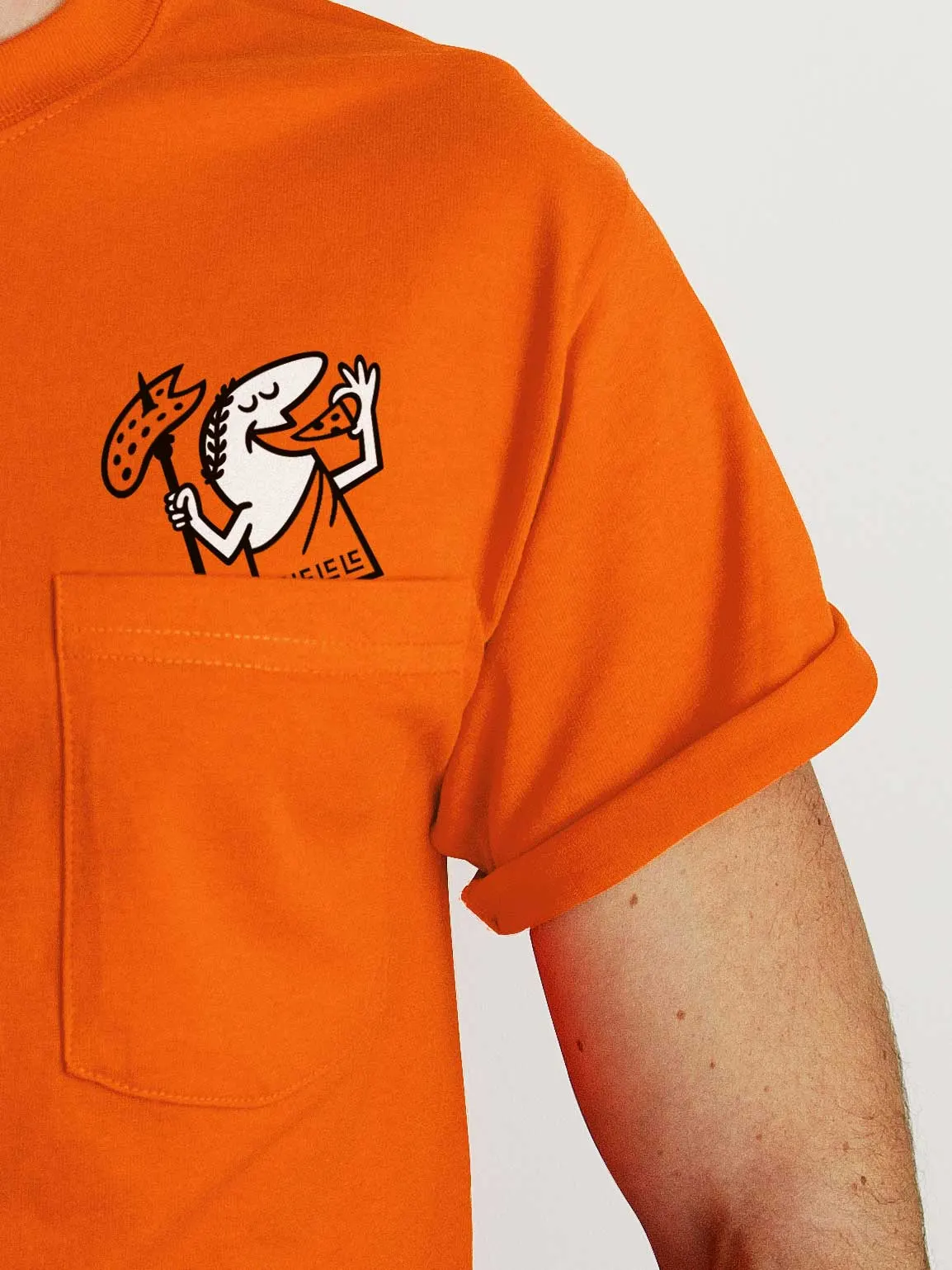
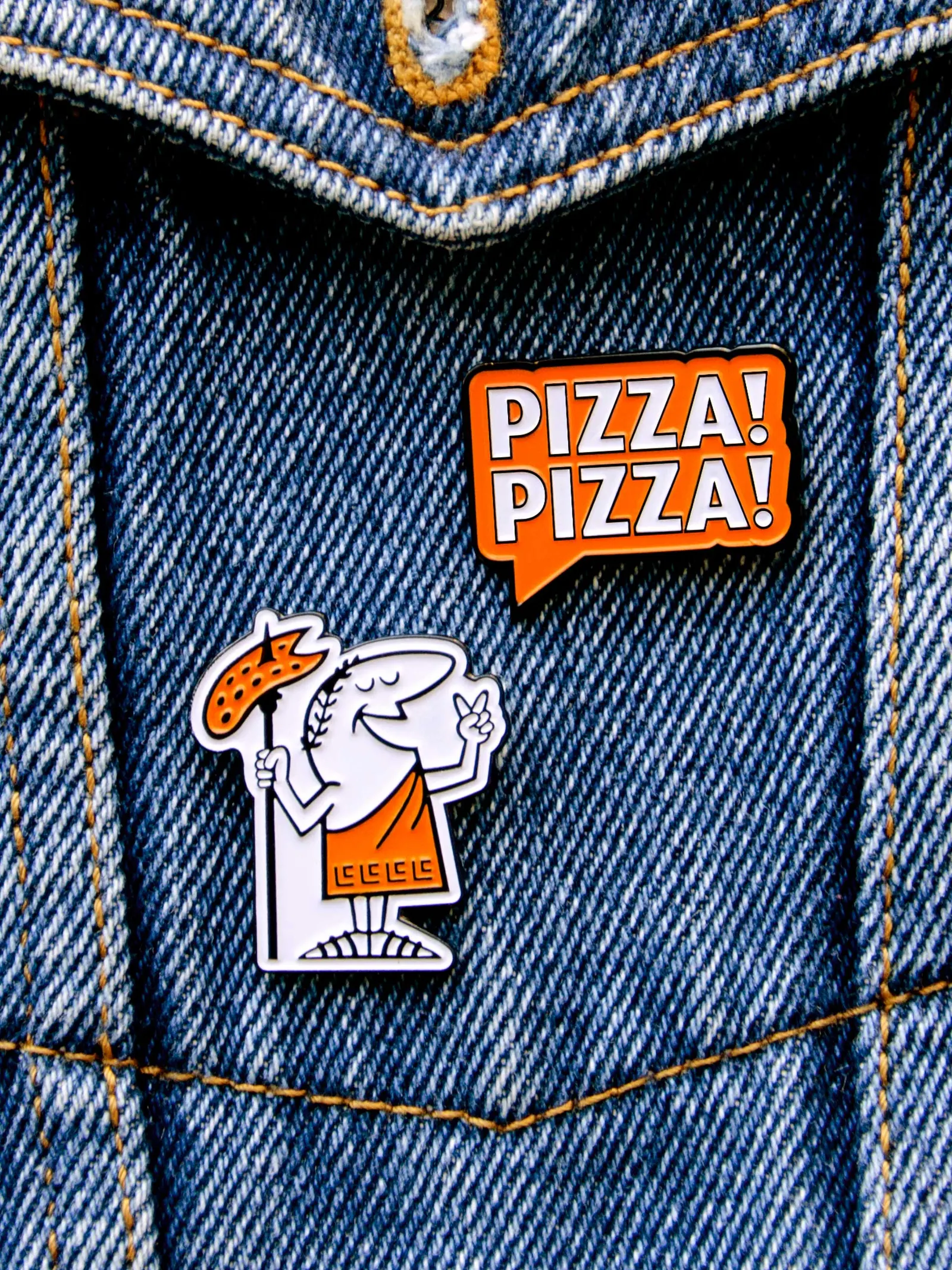
Images and video from turnerduckworth.com, by Turner Duckworth.