The Brand Monograph
Crumbl
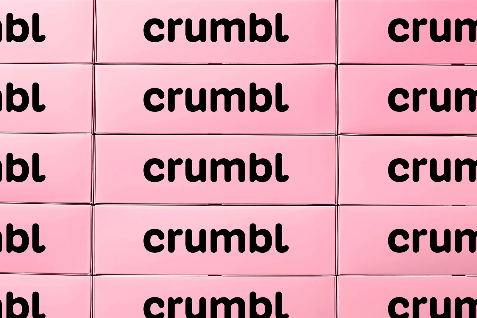
Turner Duckworth built Crumbl's new identity around the thing customers already recognize: the box. Rather than redraw the brand from scratch, the studio made the familiar pink container a structural part of the system, so the icon feels even more distinctive than before.
The brief was to take a cookie phenomenon that began with two cousins and one store and give it a look that could scale internationally without losing its playful, homegrown spirit. Turner Duckworth kept the core of the old wordmark and added small, tasty details to sharpen it. The idea underneath is simple: Crumbl exists to bring friends and family together over a box of great cookies, and the identity is built to reflect that.
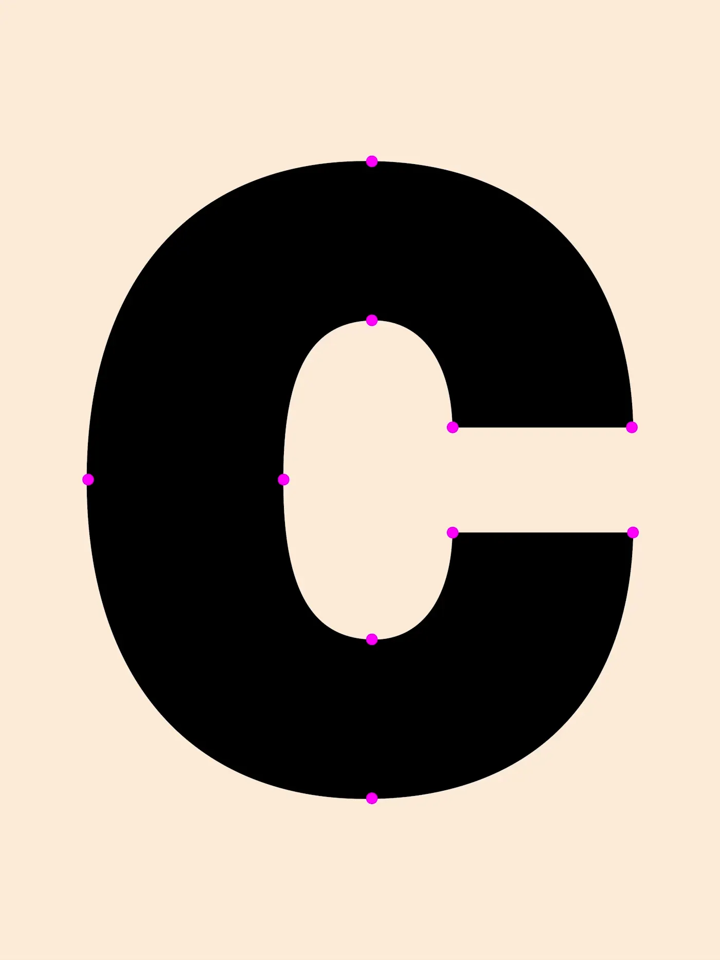
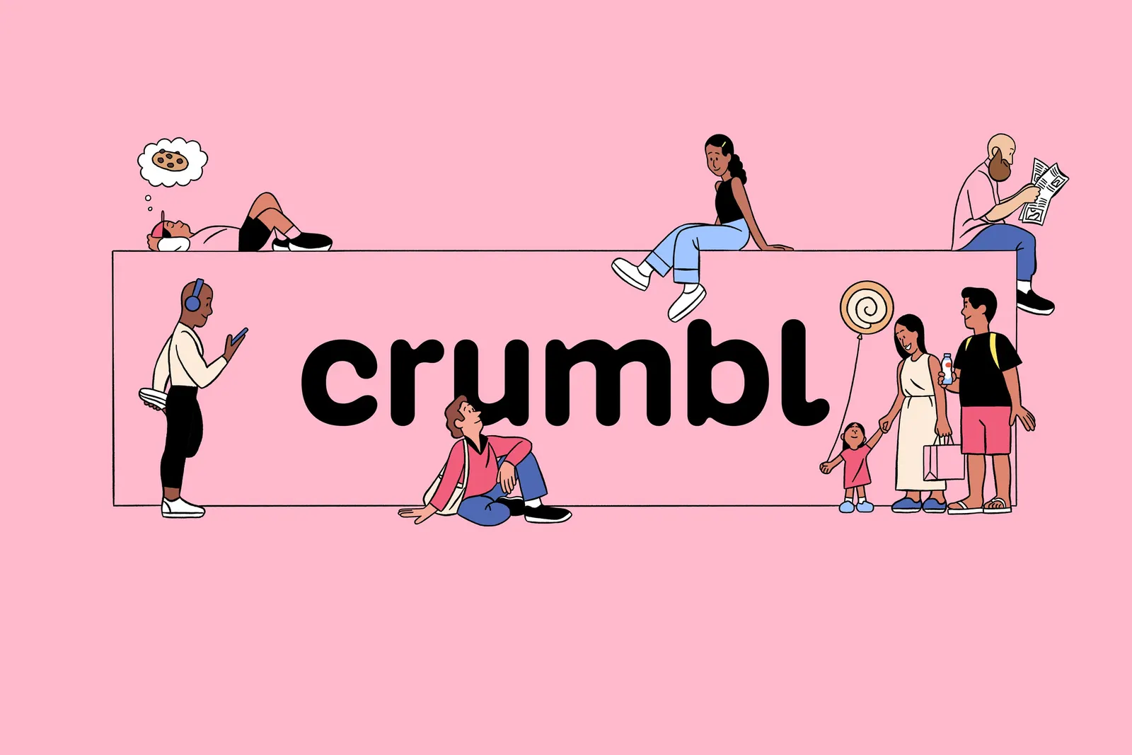
The craft shows in the details. BUCK illustrated the Crumblverse, a whimsical world that gives the brand's stories, community, and bakers a place to live. Crumbl Sans, a custom variable typeface developed with Kilotype and Alec Tear, moves from pixel-perfect utility to bold, expressive display. Ted Cavanaugh's photography treats oversized cookies with a baker's precision, and the whole system stretches comfortably into merch that fans actually want to own.


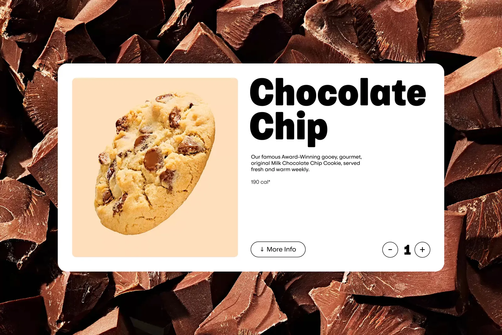

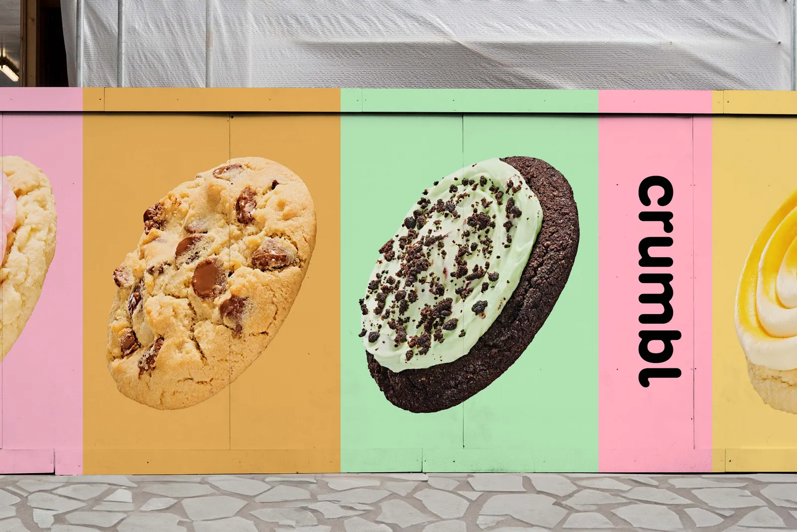
Images and video from turnerduckworth.com, by Turner Duckworth.