The Brand Monograph
Bolt
by Koto
Bolt's checkout completes in 50 milliseconds, and Koto's identity for the company is built to move at the same pace. It's a rare case of a brand that doesn't just describe its product's speed but makes you feel it.
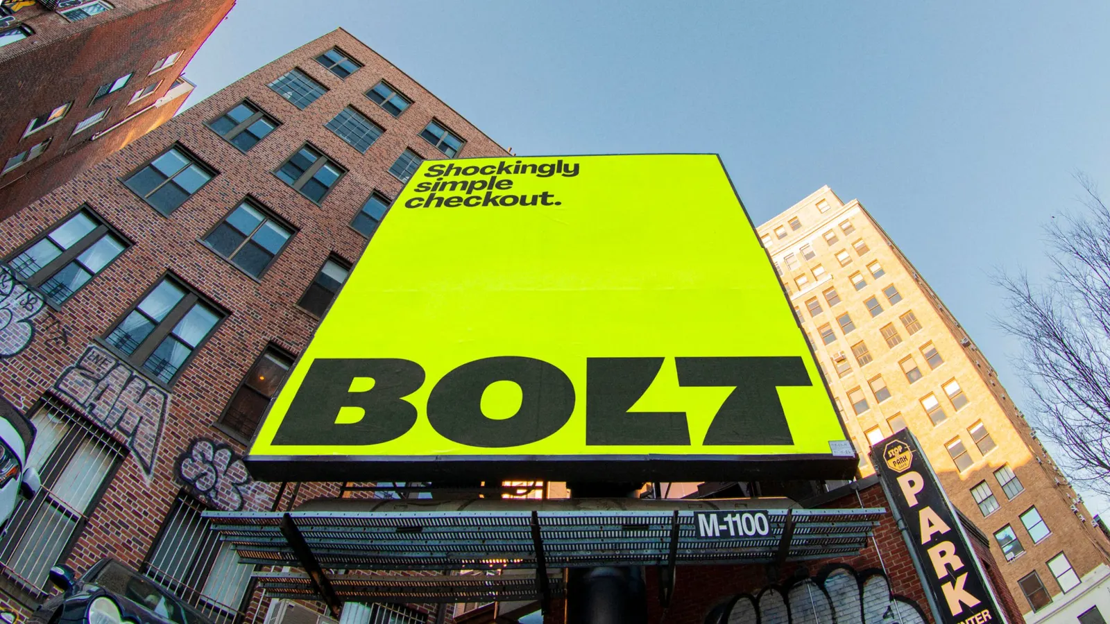
The brief was to take a payments product that most people want to forget about and give it a presence as instant as the experience itself. Koto's answer was "Shockingly Simple," an idea rooted in freedom rather than speed for its own sake. Shoppers get less friction and more ease, merchants get stronger loyalty, and checkout stops being a barrier and becomes the easiest part of buying.
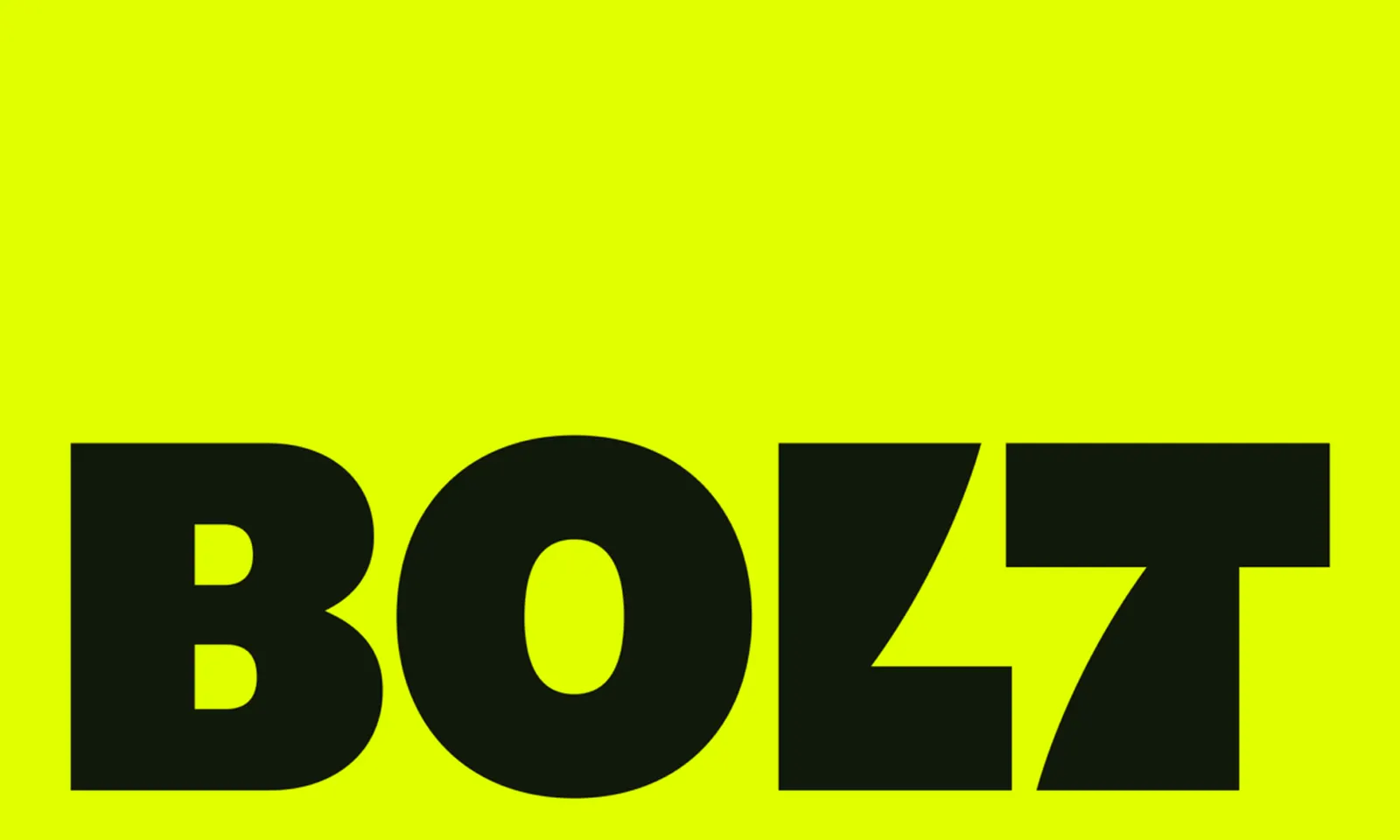
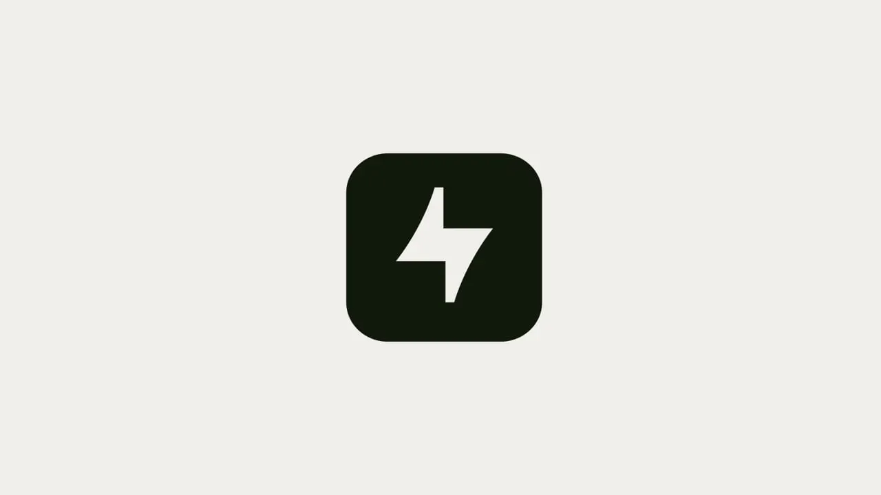
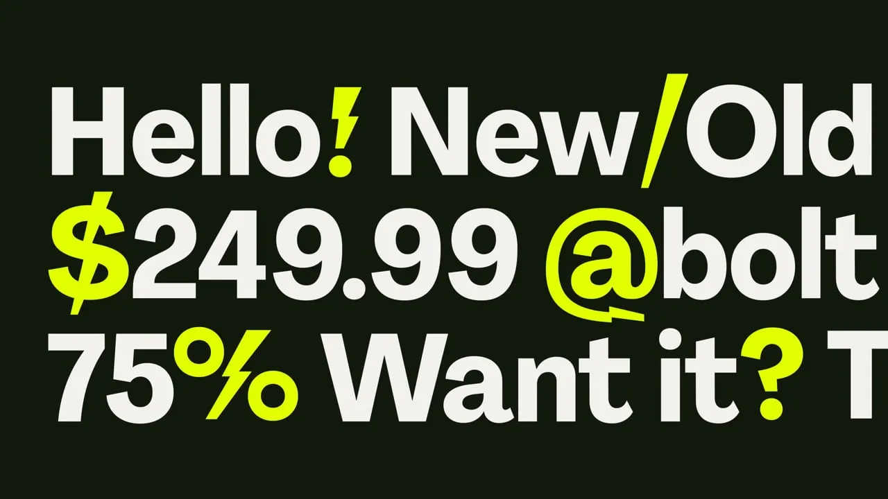
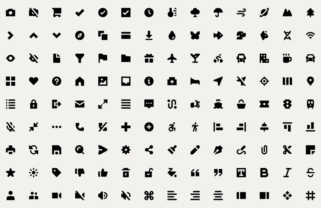
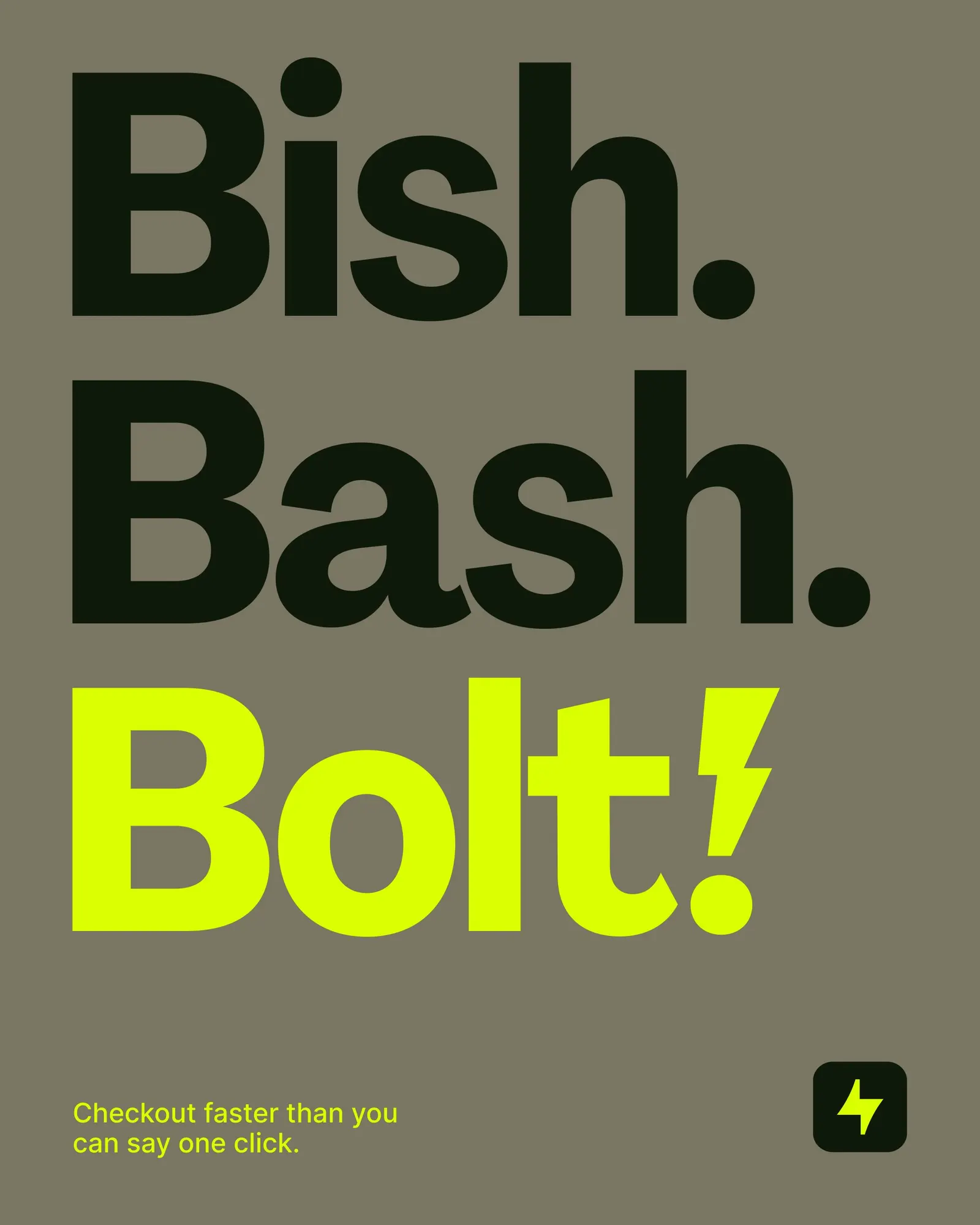
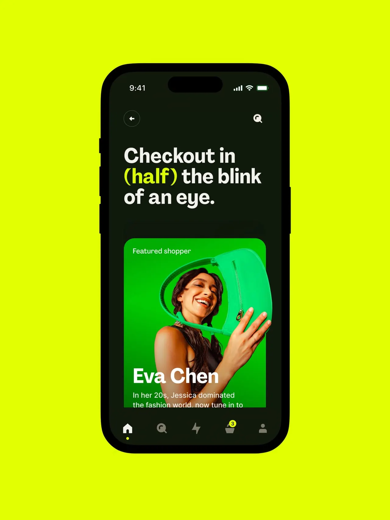
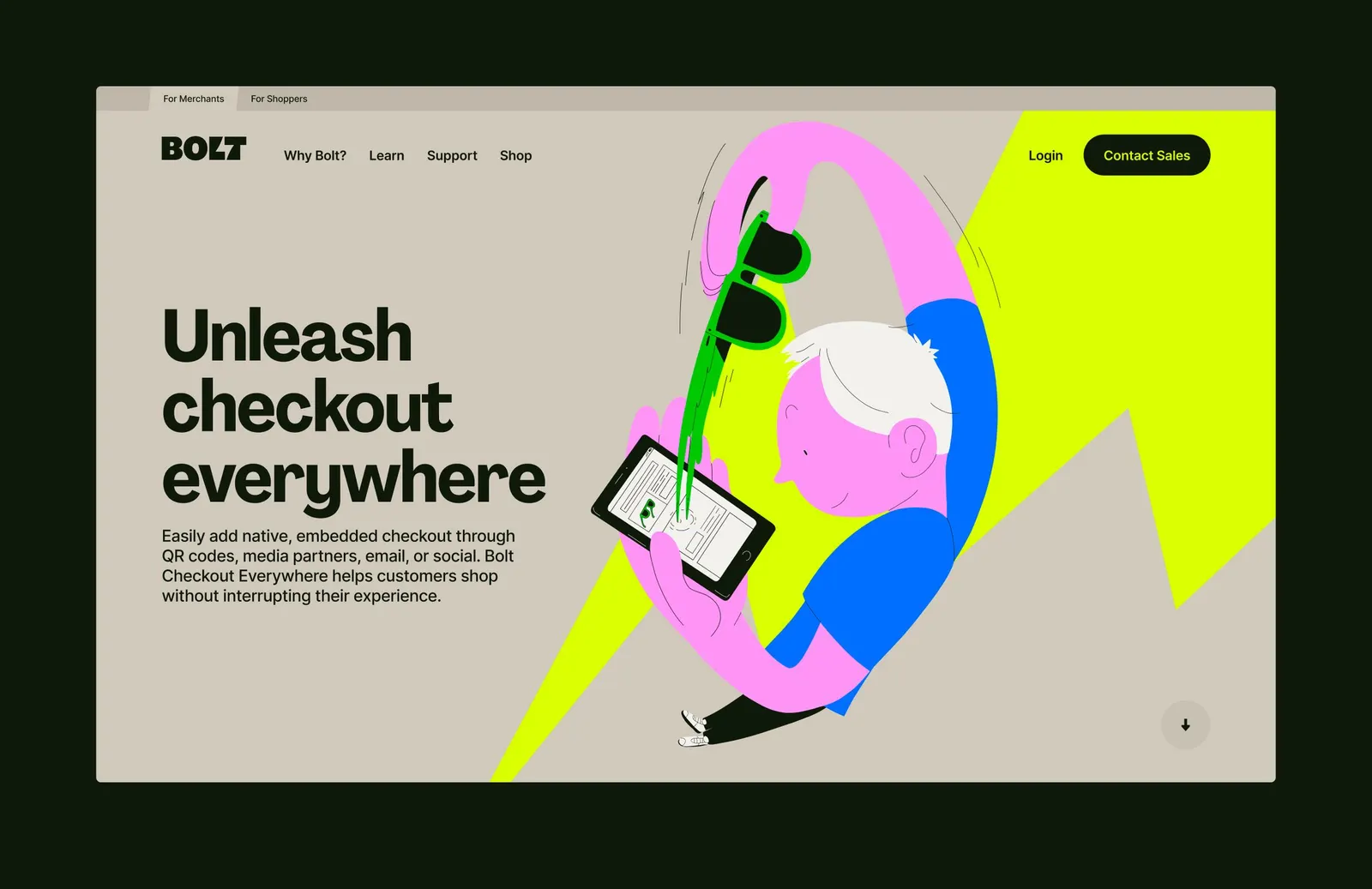
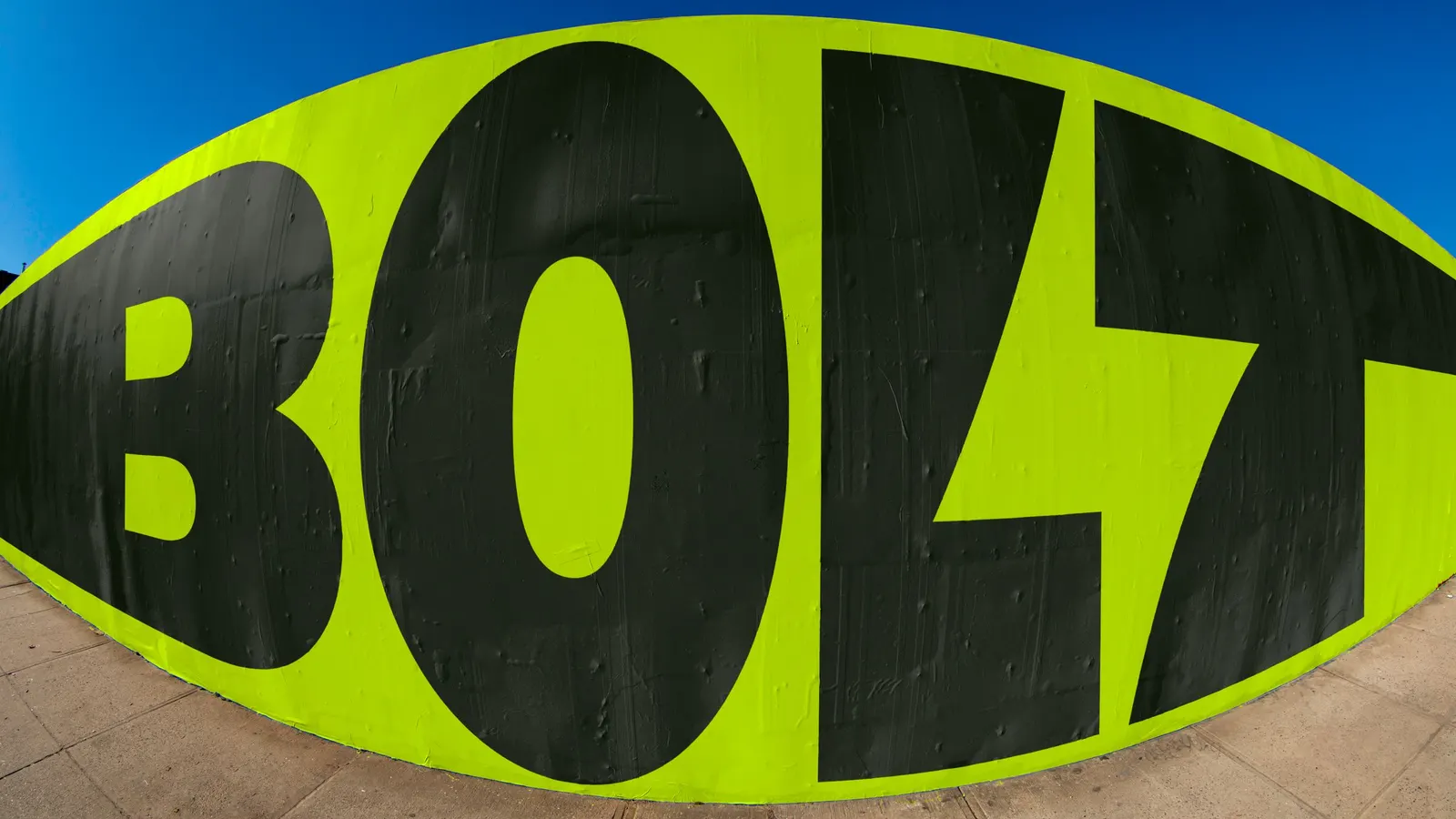
The identity takes the name literally. Koto drew a sharp new logo and paired it with custom type developed with Pangram Pangram Foundry, then added a high-voltage palette that delivers impact right away. Motion and sonic branding carry the snap of a click into every interaction, while photography and illustration keep the simplicity feeling human. The system extends across the UI, campaigns, motion, sound, and code, so each touchpoint stays immediate and uncluttered. The result moves Bolt out of the utility category and into the position of leader in fast checkout.
Images and video from koto.com, by Koto.