The Brand Monograph
Cresta AI | Rebrand | Motto® Brand Strategy & Design
by Motto®
Cresta's rebrand by Motto® stands out for how well it matches a visual identity to the product behind it. The AI contact center platform had the traction, the technology, and a fresh round of Series D funding, but its brand spoke more quietly than its ambitions. Motto® set out to close that gap as Cresta launched AI Agents and expanded into new markets.
The studio began with workshops alongside Cresta's leadership, building on the name's origin in the crest of a wave. Themes of transformation, adaptability, and flow led to "Better together," an idea rooted in the belief that AI is most powerful when it elevates human expertise rather than replacing it.
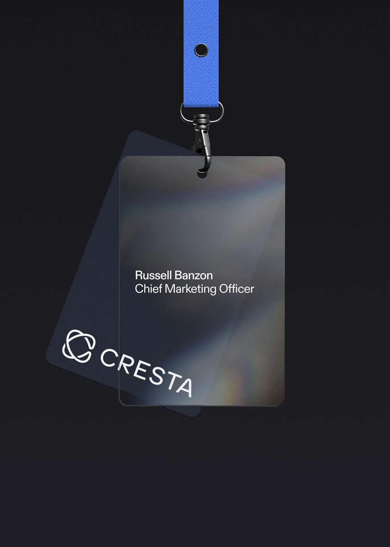
That thinking shows up in the details. Lissajous curves, which map the interplay of signals, inform the stylized "C" and the rising peak of the "A" in the wordmark, and Cresta now has a standalone symbol too. An expanded accent palette is built for UI and data visualization, and Diatype by Dinamo anchors the typography. Motto® extended the system into a website developed with Antinomy, plus a pitch deck, motion pack, brand guidelines, and press release, giving Cresta's team the tools to carry the brand across marketing, product, and communications.
Images and video from wearemotto.com, by Motto®.