The Brand Monograph
Freetrade
by Koto
Few rebrands hold up as well as Freetrade's. Koto built the investing platform's original identity in 2017, then returned seven years later to refresh it, and the result still feels like it's looking ahead rather than back.
The timing mattered. Freetrade was about to launch a range of product and service upgrades, and the brand needed to keep pace with a more sophisticated offer and a bigger business. Koto's strategy centered on the product innovation behind Freetrade's success, distilled into a single idea: "A New Dawn of Investment." It gave the brand a clear, scalable story that is both immersive and easy to build on.
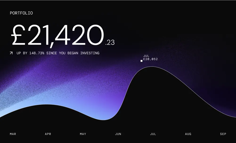
The craft shows in how that idea plays out. Gradients drawn from sunrise and sunset anchor a digital-first palette, brought to life through cinematic animation that recalls auroras and planetary movement. Confident, elegant typefaces, developed with Dinamo Typefaces and Newglyph, keep the look grounded. Koto then built a design system that stretches across the website and the app, linking the two with celestial 3D illustrations and interface moments that carry the energy of space. A year after the rollout, Freetrade was acquired by the IG Group, and the brand's strength was cited in the press and investor rationale.
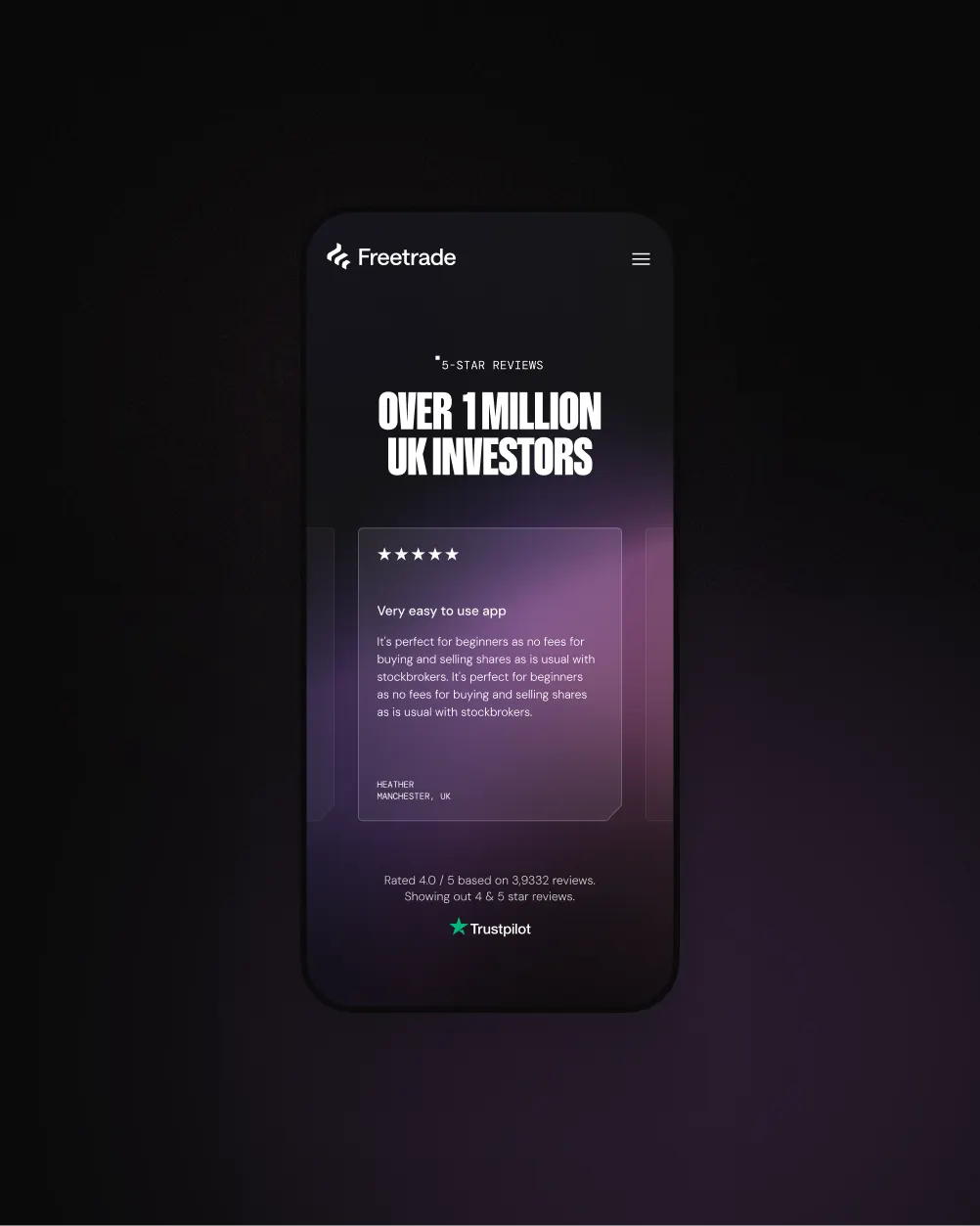
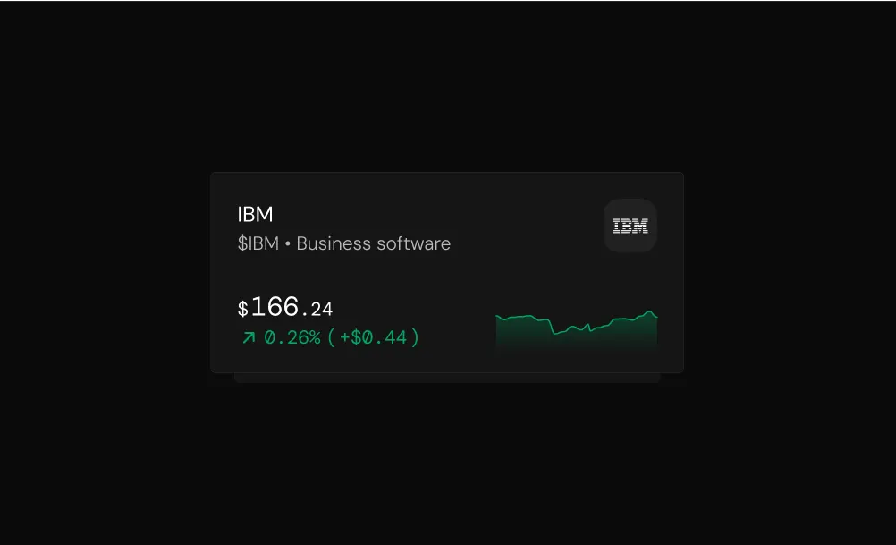
Images and video from koto.com, by Koto.