The Brand Monograph
Huntington Bank
by Koto
Koto's work for Huntington Bank takes a 150-year-old institution and gives it the nerve of a challenger without losing its character. The result feels confident and contemporary, yet it never drifts from the empathy and fairness the bank is known for.
The brief came at a pivotal moment. Huntington was growing from a Midwest mainstay into a national player, caught between fintechs selling speed and legacy banks leaning on safety. Koto's research found a common feeling across income levels: people feel outclassed by money. Rather than simply making banking simpler, the studio reframed it around a new idea, money as a craft, where money is something you can shape and get better at.
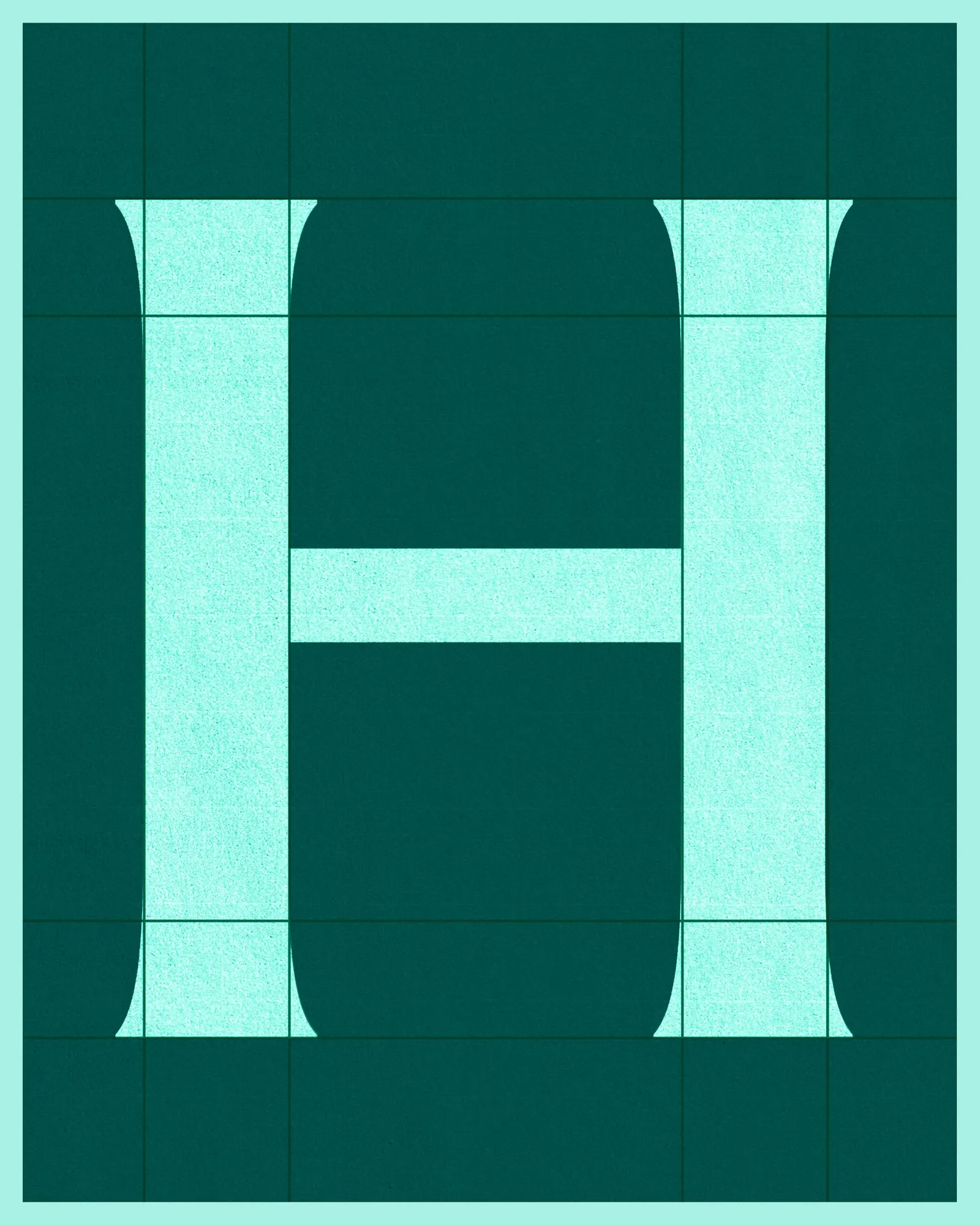
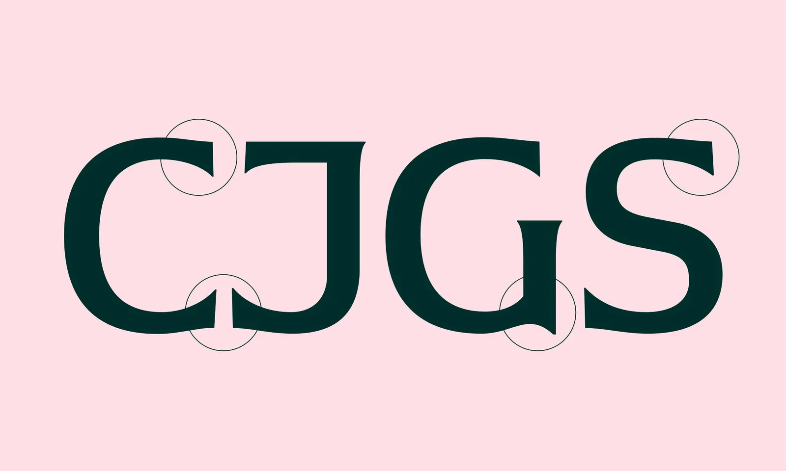
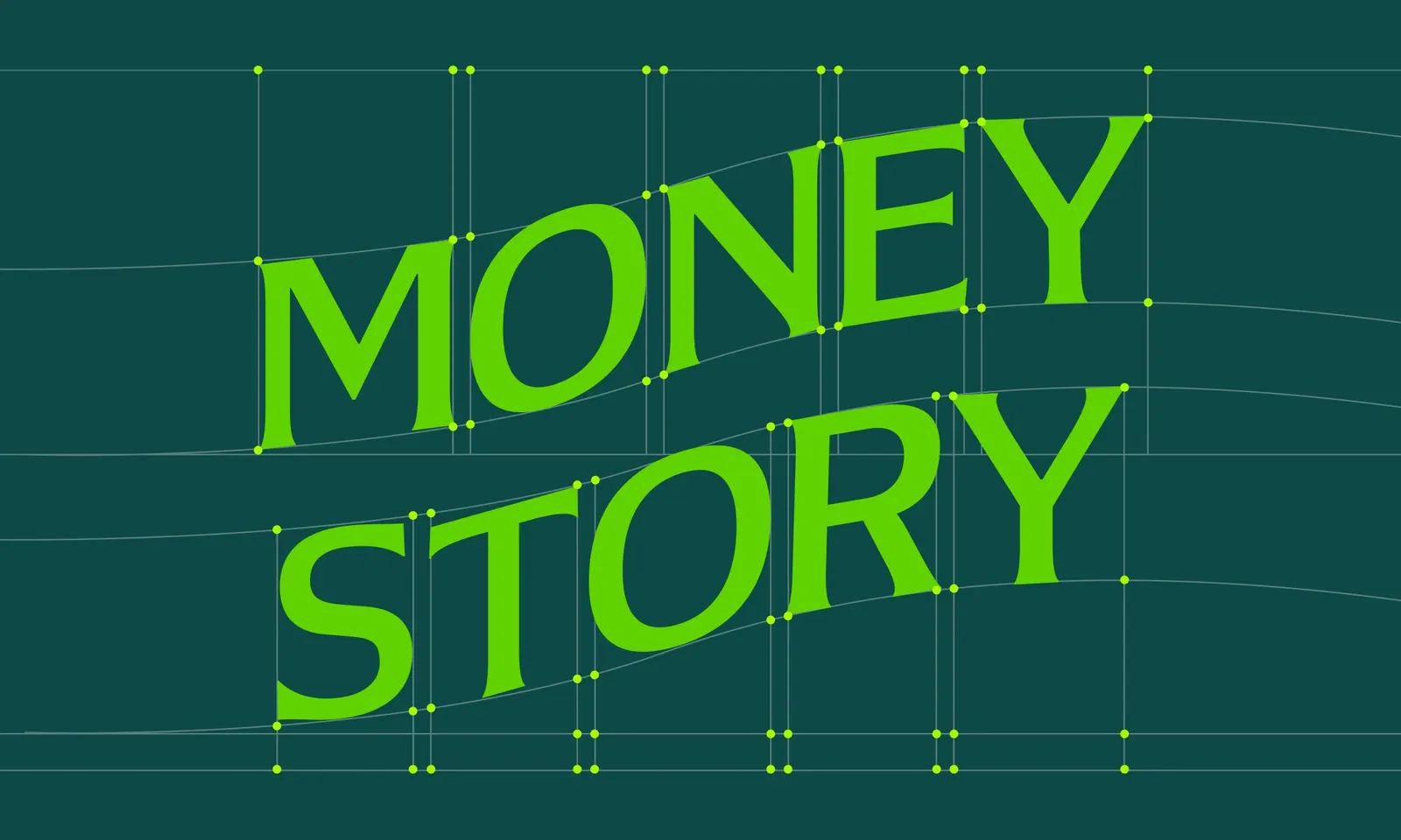
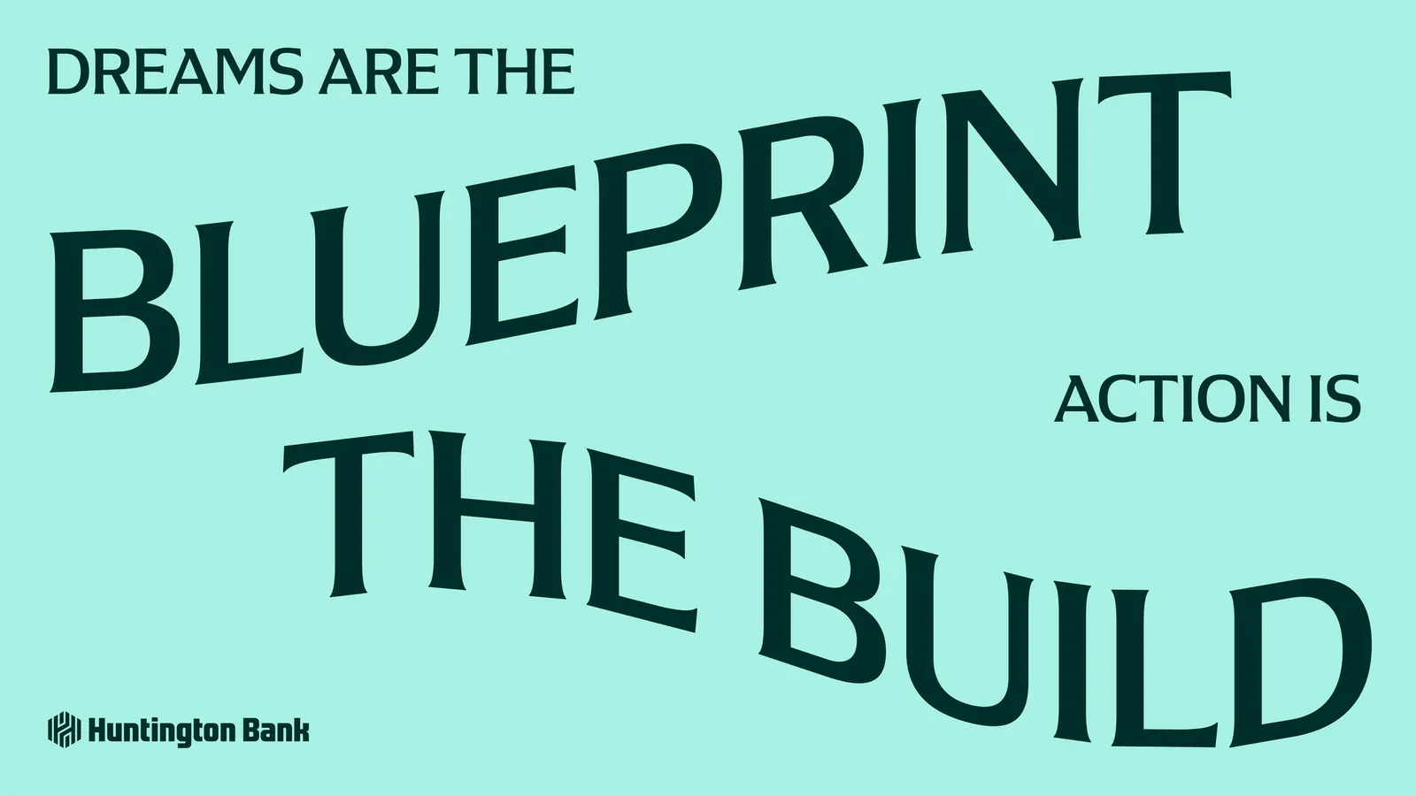
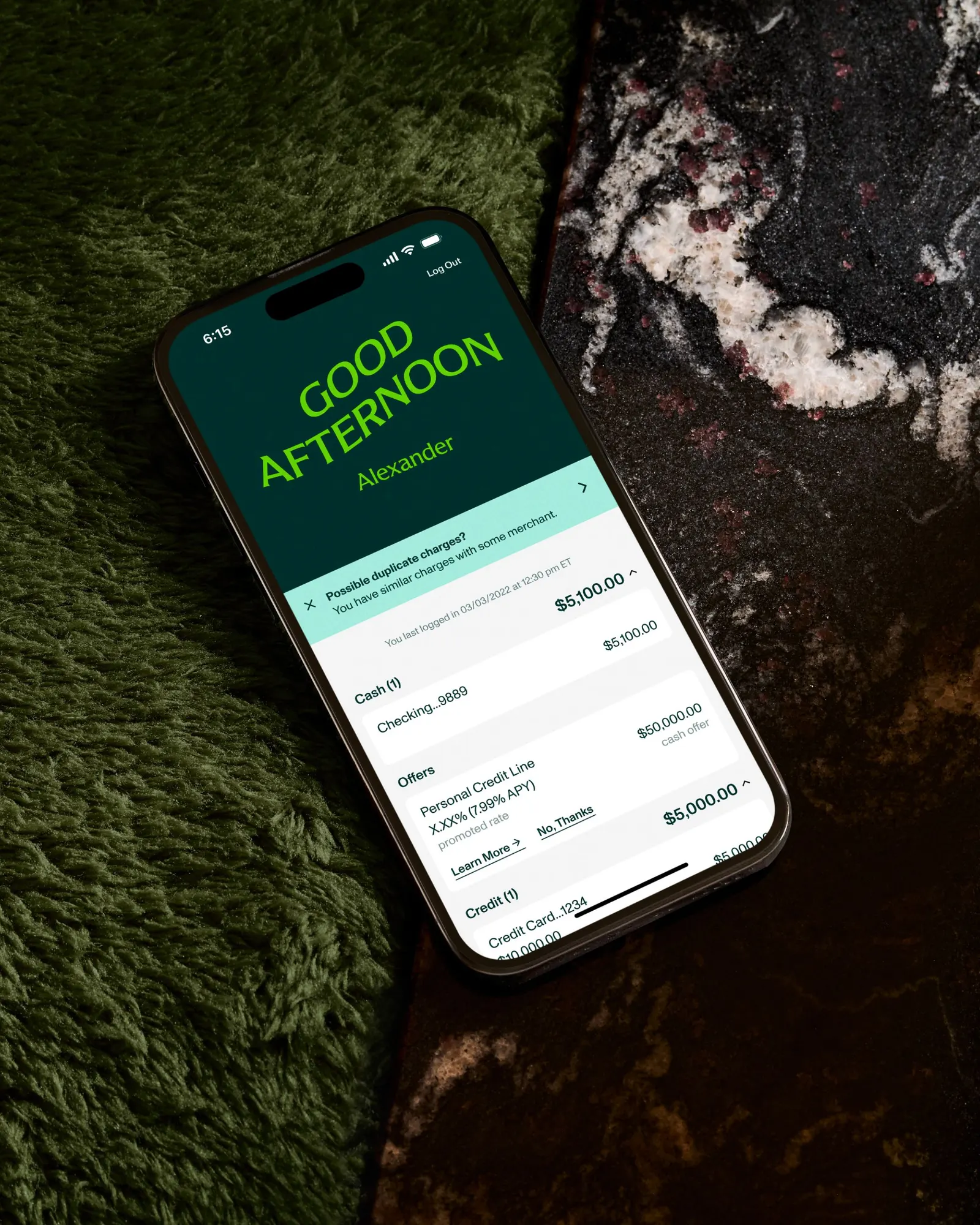
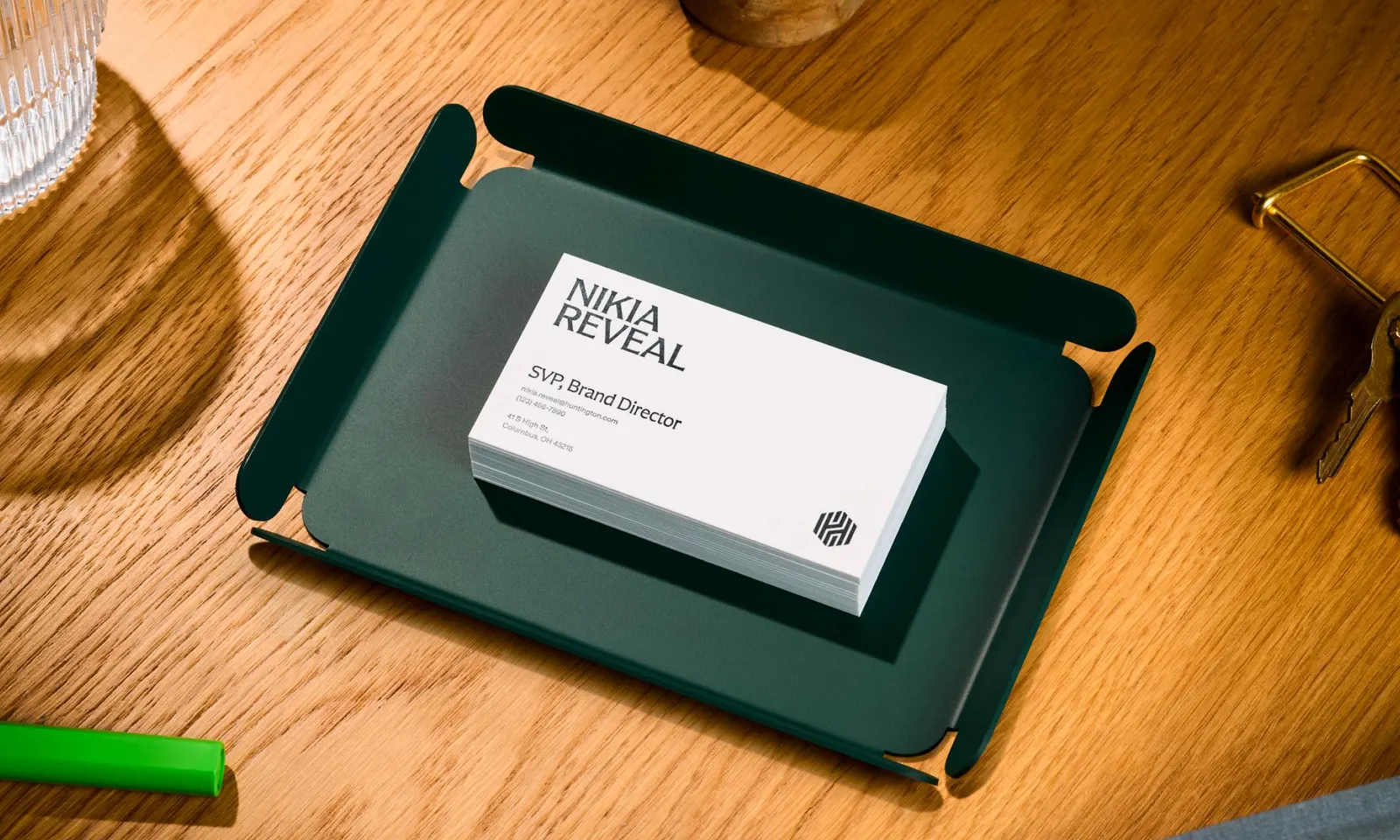
That idea shows up in the details. Working with Lewis McGuffie, Koto developed Huntington Serif, a custom typeface with flared edges and a refined rhythm that anchors the identity. Around it sits a system of 3D badges that mark milestones, and motion that adds warmth to everyday interactions. The system also stretches with ease, feeling elevated and focused for Commercial Banking and more personal for Wealth Management.




Images and video from koto.com, by Koto.