The Brand Monograph
San Francisco Symphony
by COLLINS
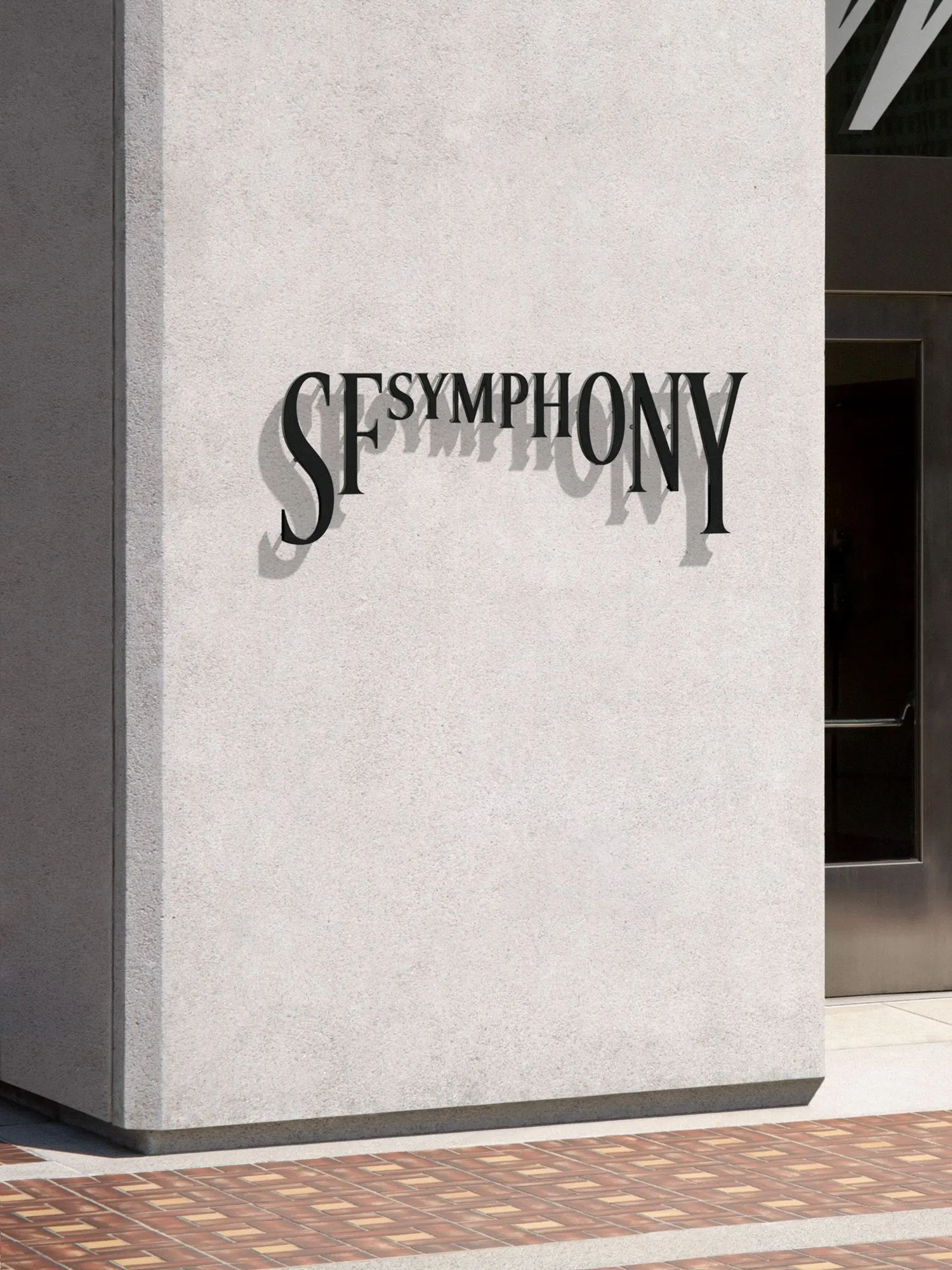
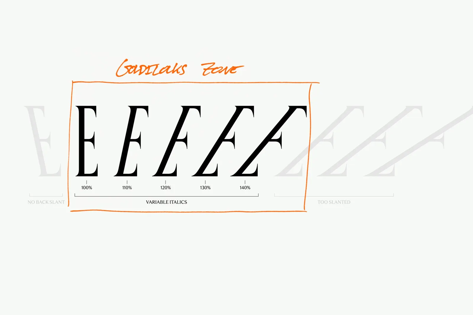
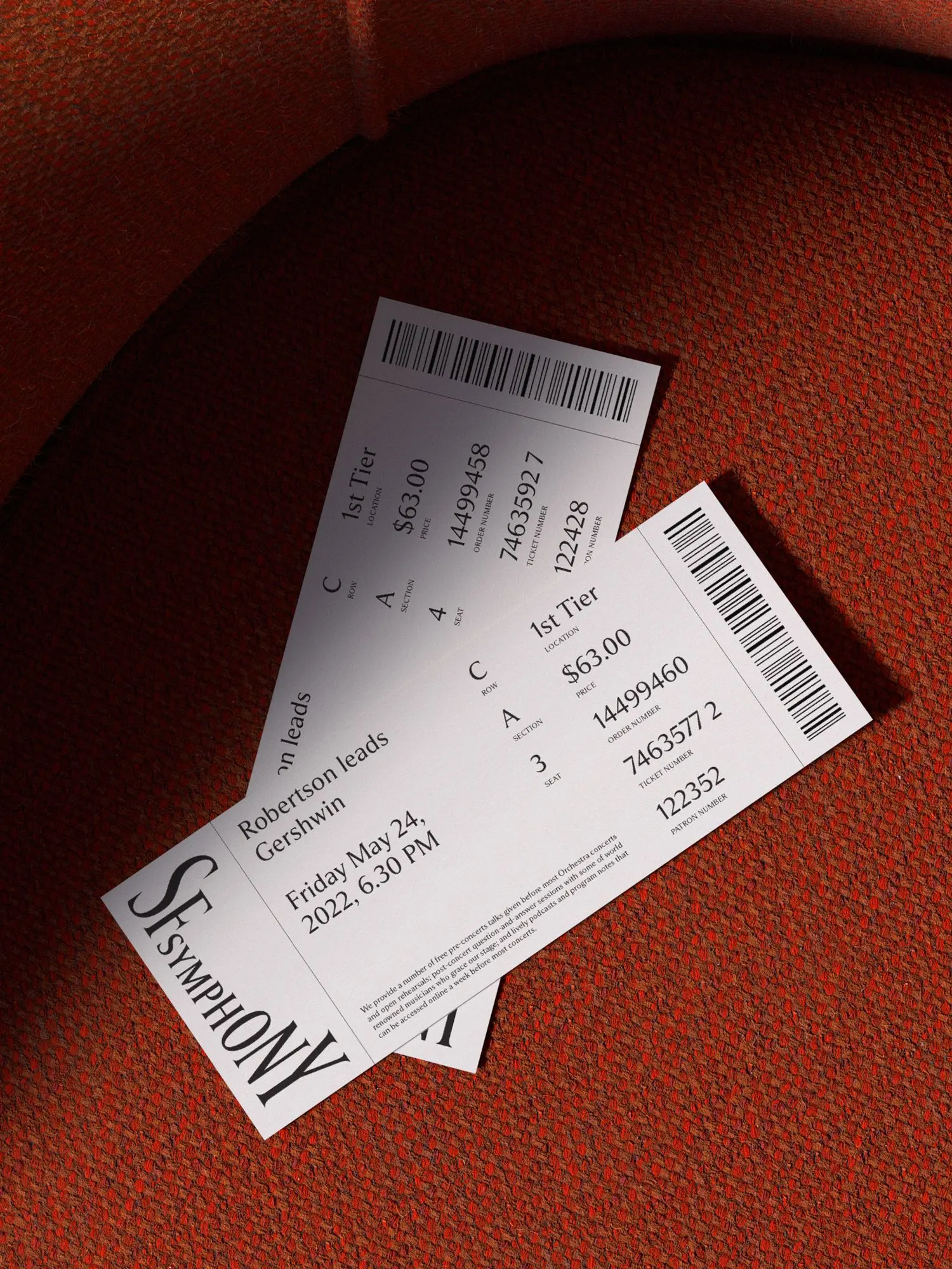
The San Francisco Symphony's identity, created by COLLINS, lets the letters themselves perform. Each character is built to change shape in response to sound, so the type behaves less like fixed signage and more like part of the music.
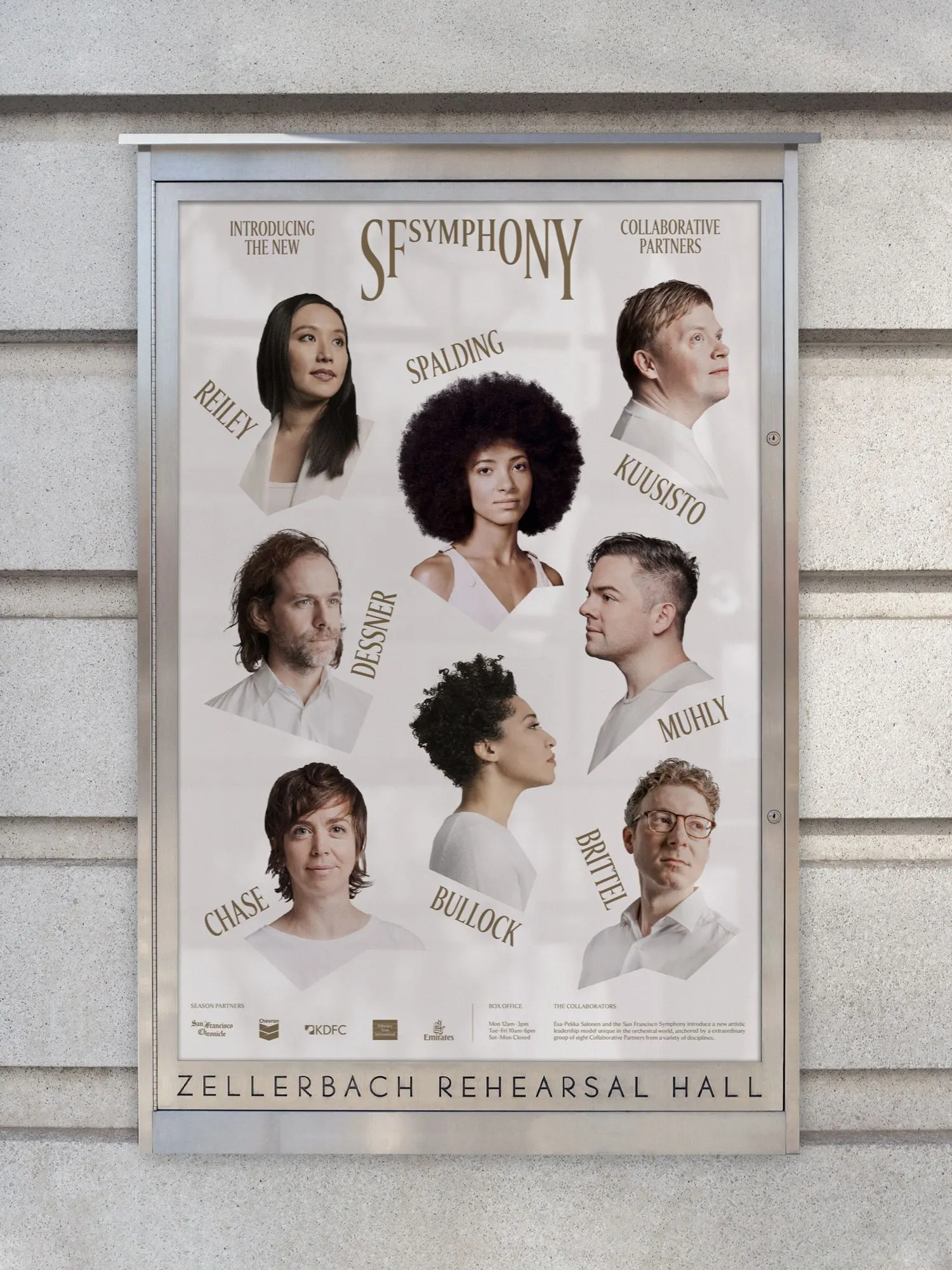
The brief arrived at a turning point. After 25 years under Michael Tilson Thomas, the 108-year-old orchestra was welcoming Esa-Pekka Salonen, reorganizing its artistic leadership around eight collaborative partners from different disciplines, and working to shake the perception of classical music as dusty and exclusive. COLLINS began by talking with musicians, audiences, staff, executives, and board members to agree on a shared vision, then used it to guide the design experiments.
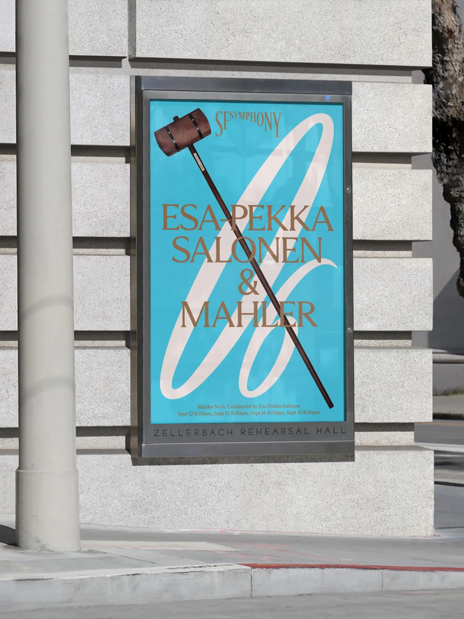
The craft is in the balance. The studio started with traditional letterforms that respect the art form's heritage, then worked with Dinamo to make them responsive through variable font technology. Formal black and white anchors the system, while a palette drawn from Bay Area colors and landscape gives it a contemporary voice. Results include a 19% year-over-year increase in donor participation and seasonal attendance rising to 74% of capacity.


Images and video from wearecollins.com, by COLLINS.