 The Brand Monograph
GoFundMe
by Koto
Koto's work for GoFundMe starts with a smart move: taking the goal bar, the brand's most familiar visual, and turning it into the engine of a whole identity. The result feels like progress made visible, and it gives a fundraising platform a clear sense of momentum.
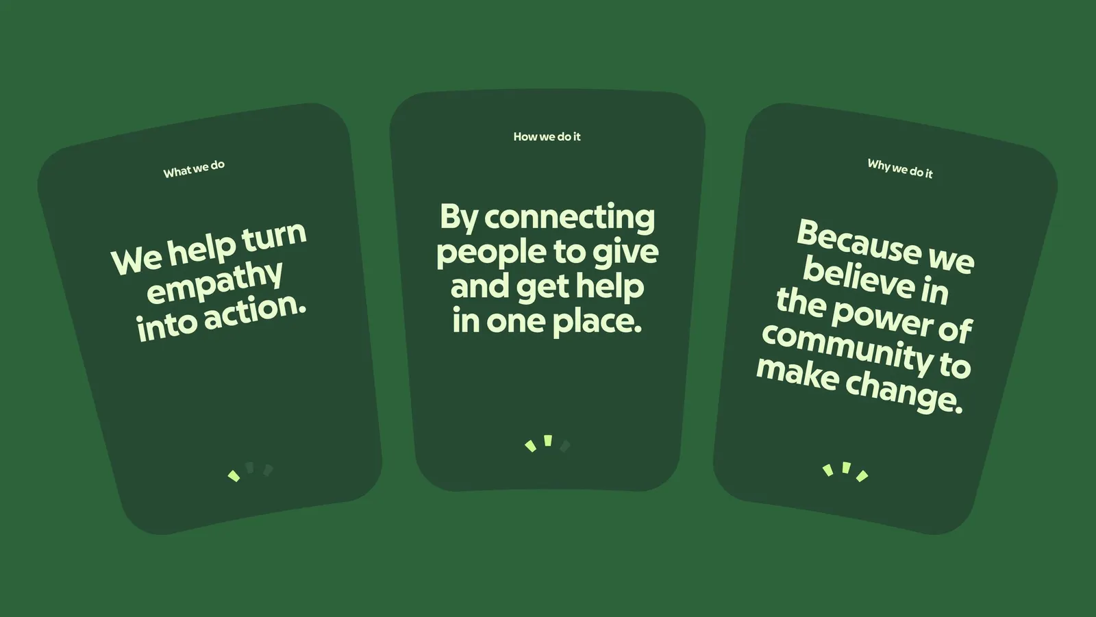
The brief came after GoFundMe acquired Classy. The product now served nonprofits as well as individual fundraisers, but the brand still looked like its peer-to-peer beginnings. Koto built the new identity on "Help Adds Up," an idea that frames giving as shared, cumulative progress. It also moves the brand's tone from sympathetic to guiding, which suits a company that wants to help people act.
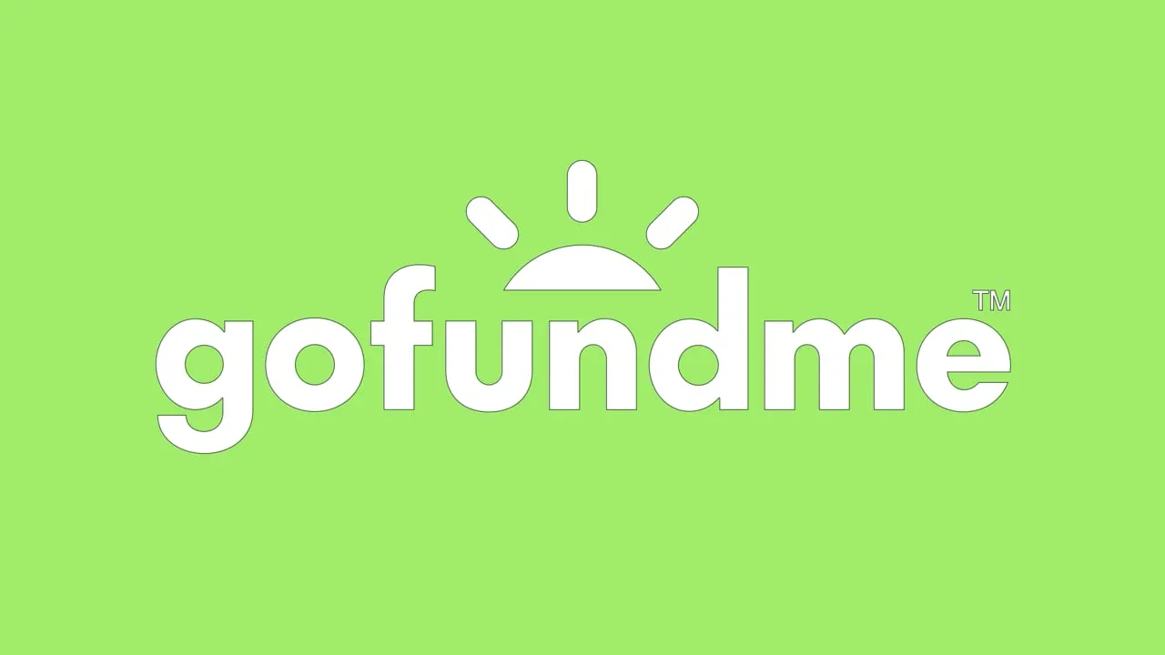
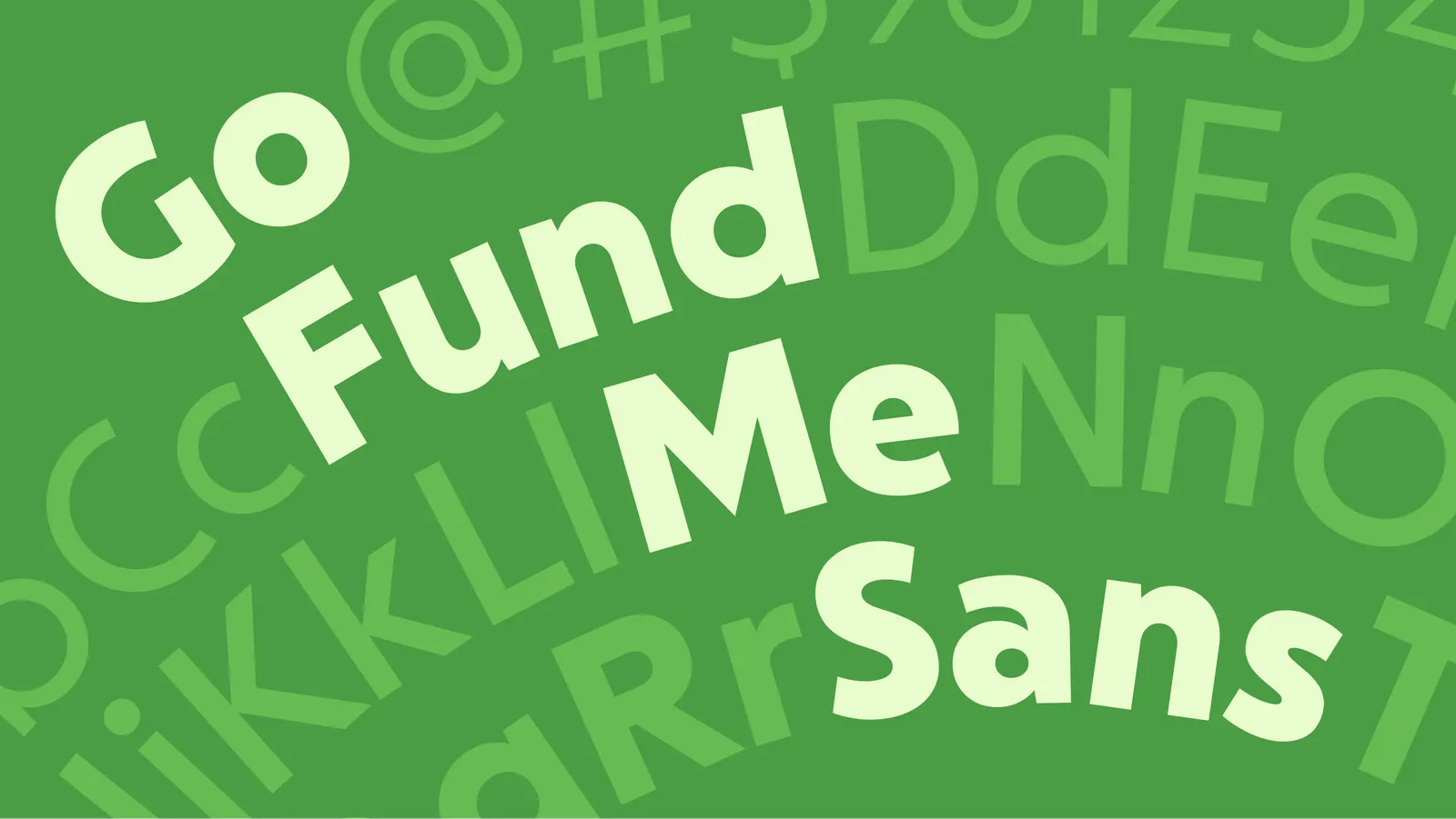
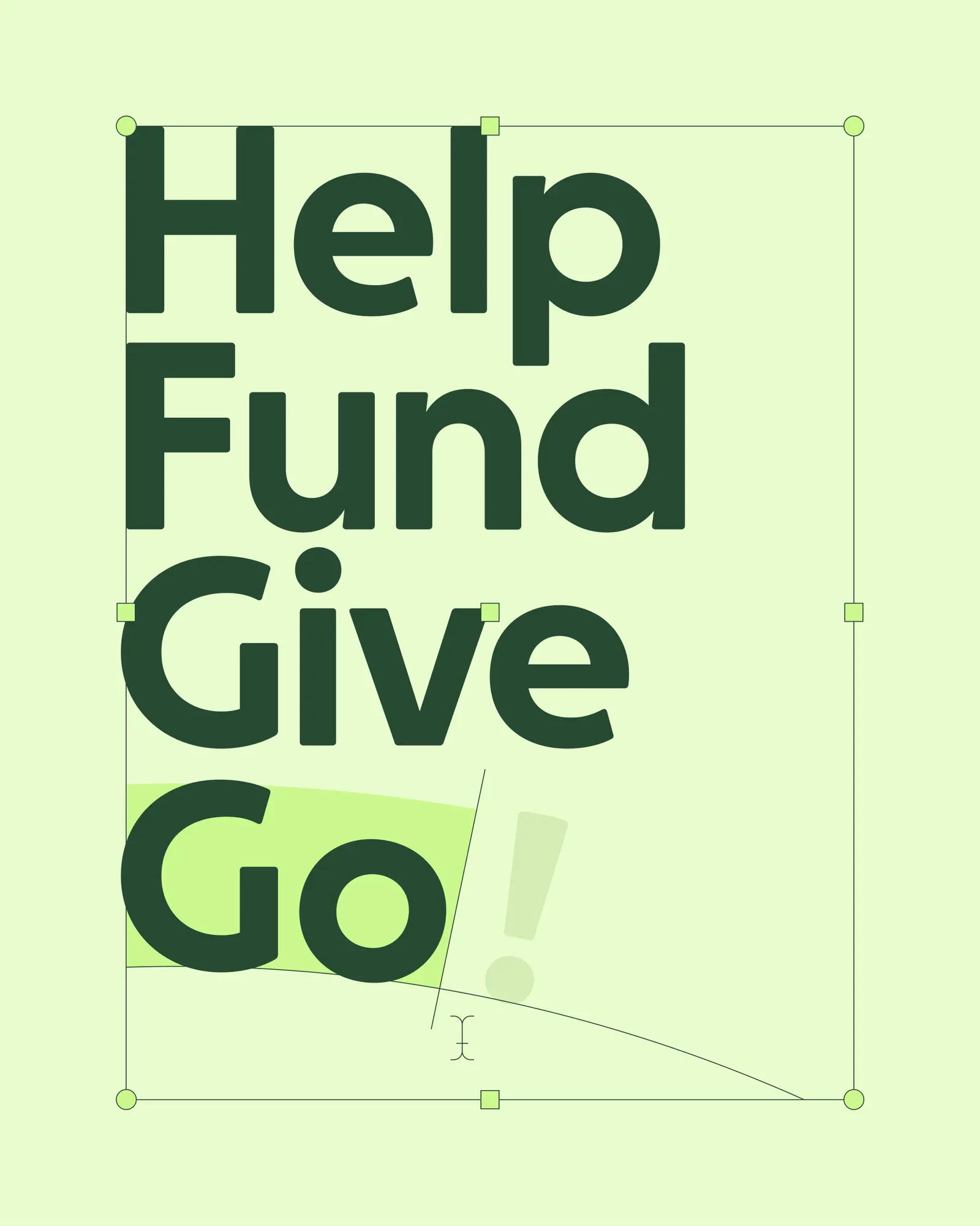
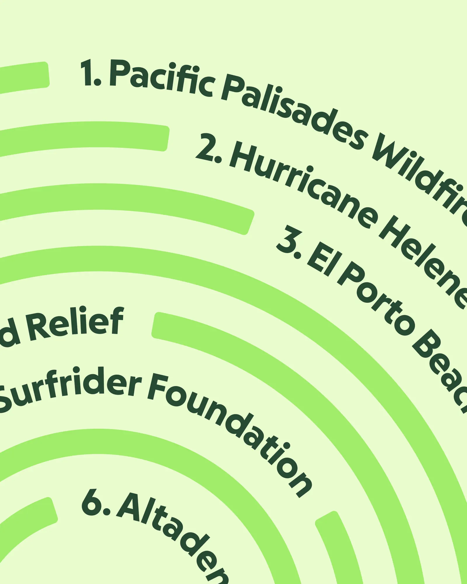
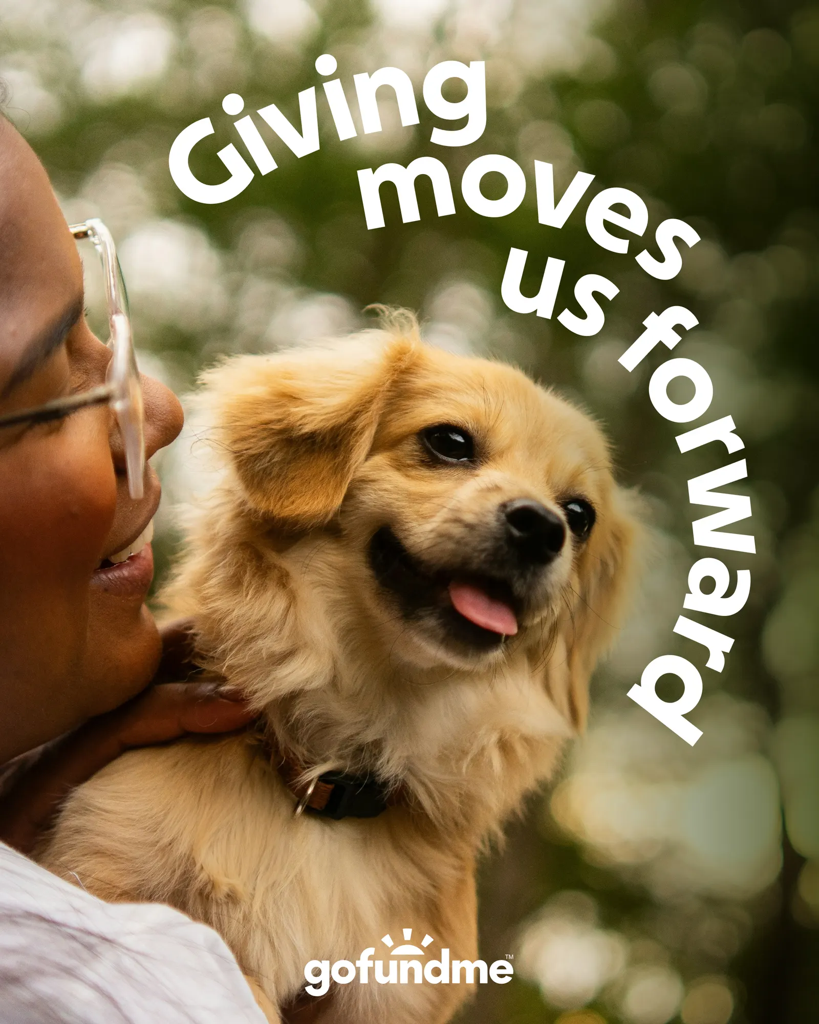
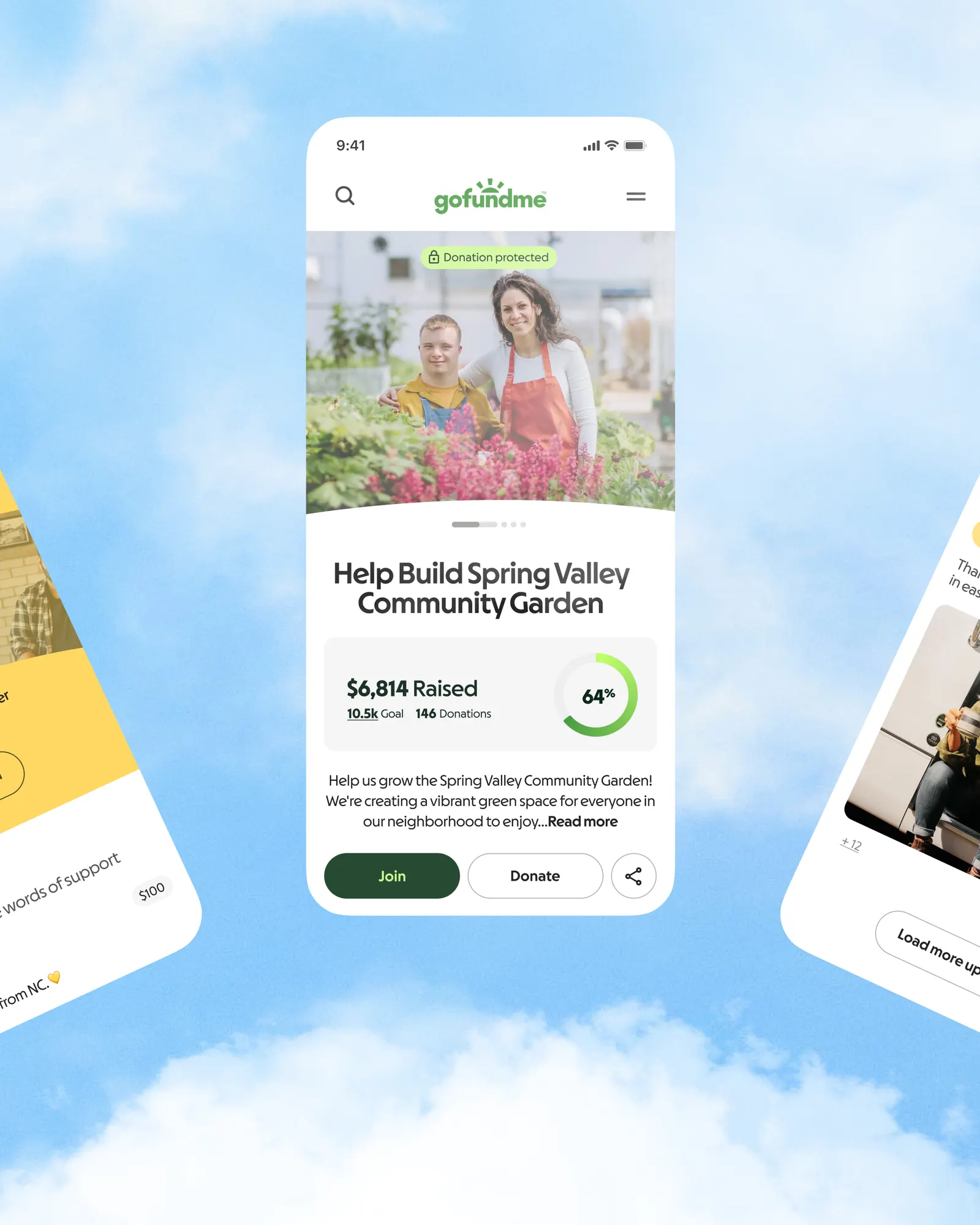
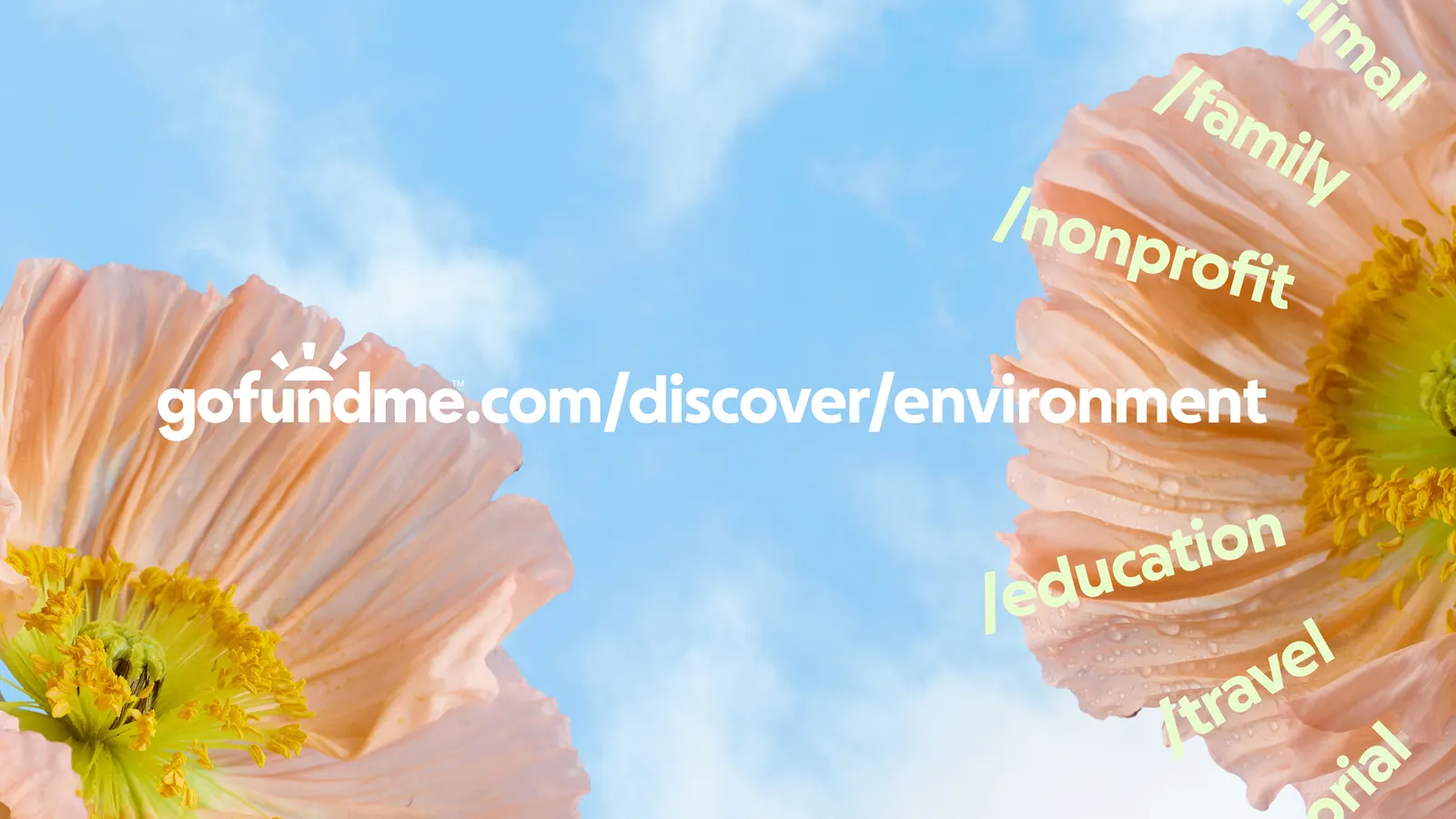
The goal bar becomes a progress circle, which opens into an arc at the center of the logo. That arc works across the system and scales to introduce GoFundMe Pro without splitting the story in two. Working with Lift Type and Romain Oudin on design and typography, Koto extended the idea through radial type and fingerprint-like patterns that keep the system human and collective. The idea then moves into the product itself, shaping goal tracking, donation flows, and campaign pages so progress shows up in small, visible moments.
Images and video from koto.com, by Koto.



