The Brand Monograph
Innovation Endeavors
by Mast
Mast returned to its own work a decade later, and the interesting part is how little it changed. For Innovation Endeavors, the studio treated the original identity as an asset to refine rather than replace, letting the brand catch up to the firm the venture investor has become.
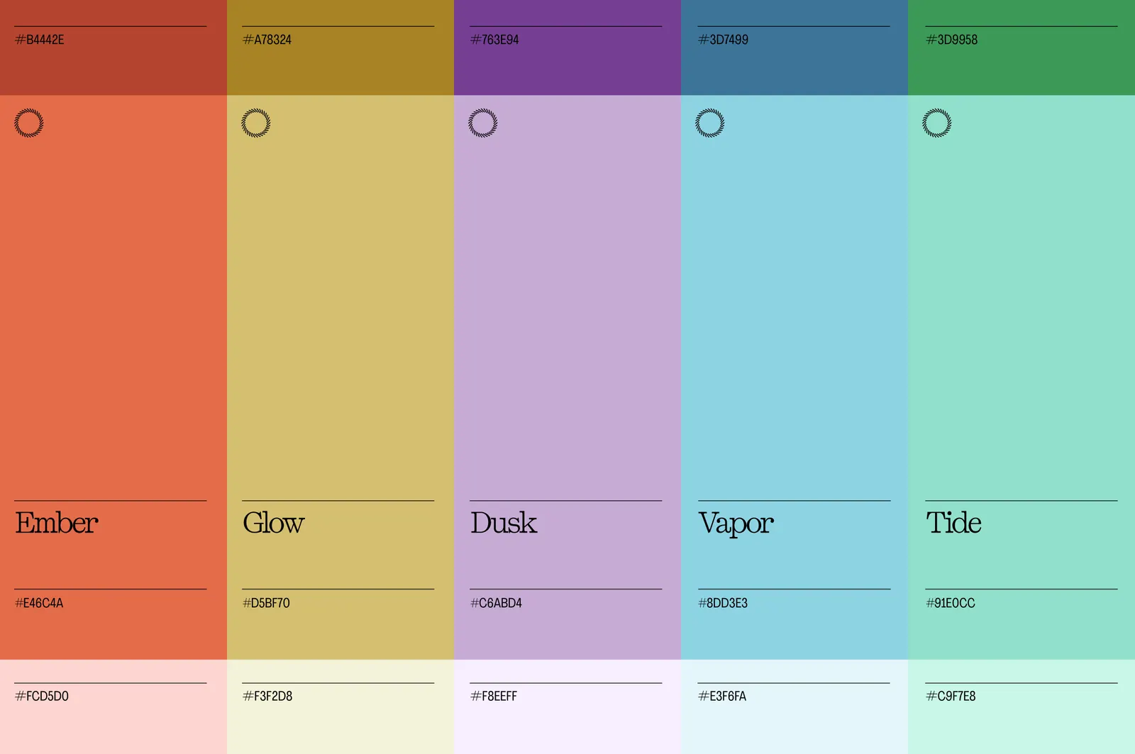
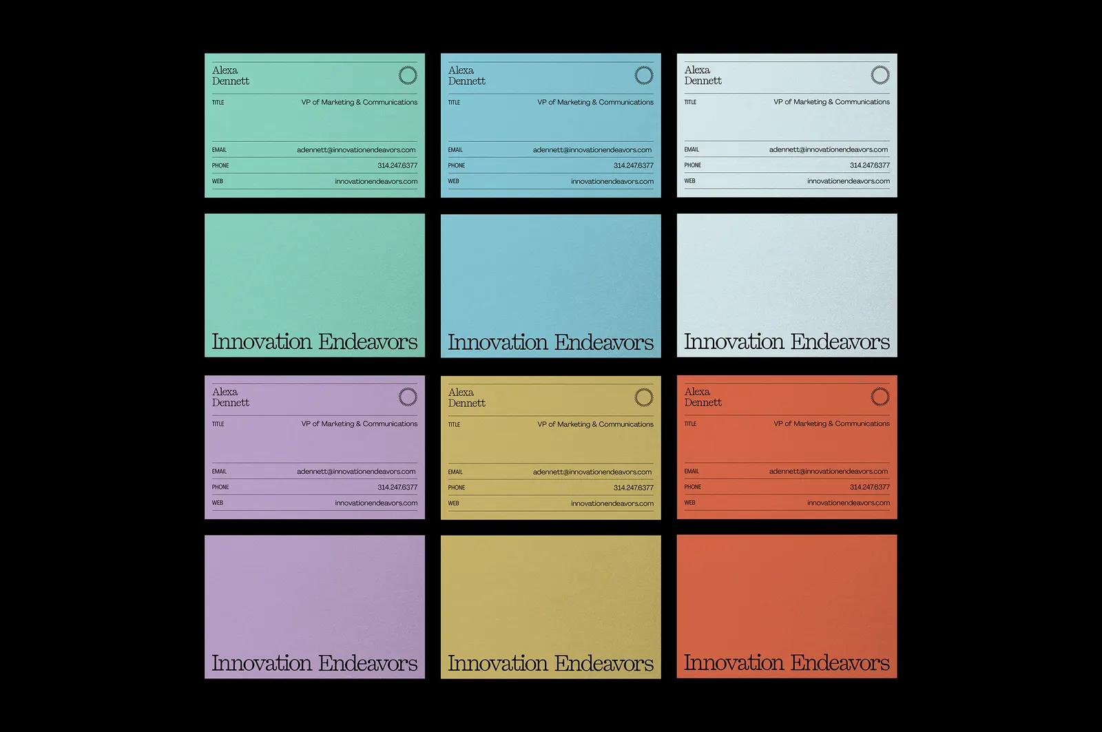
When Mast first built the identity, the firm was still defining itself. Ten years on, the portfolio is deeper and the perspective sharper, and the early-stage energy of the original no longer fit. The studio kept the symbol, where nearly a decade of recognition lives, along with the core blue and green. Saturation came down and the palette widened, shifting the color from bright and technical to refined and mood-driven. The new wordmark has cleaner letterforms and better proportions, with a rhythm closer to an old imprint than an engineering firm.
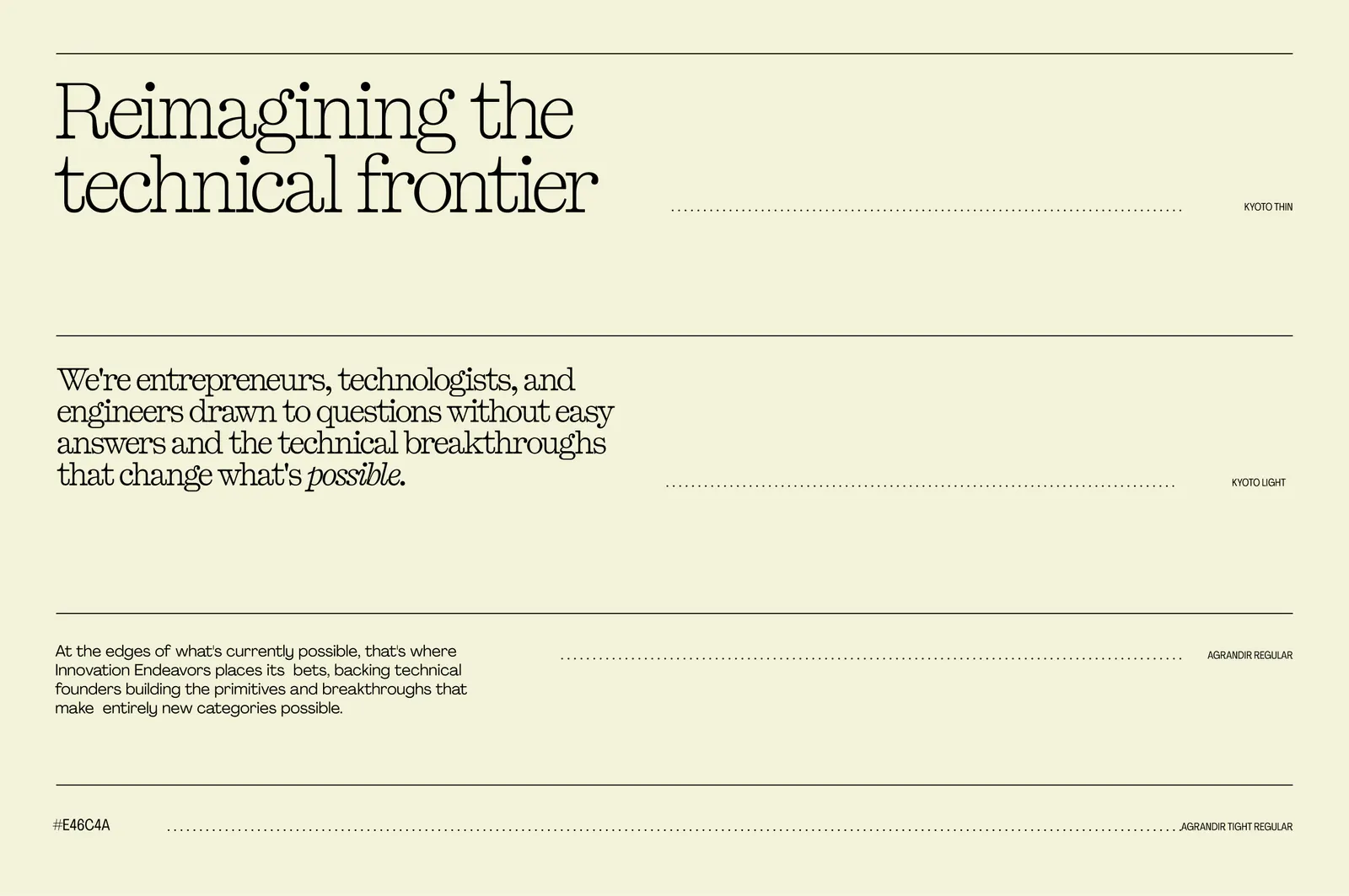
Typography sits within a ruled-line system, with Kyoto giving each layout editorial weight, and a four-part grid that can hold a single quote or a full portfolio spread. Hand-drawn illustration brings the character, loose but intentional linework that reflects the curiosity of the founders the firm backs. Mast kept the circle from the earlier illustration system as a fixed point, a quiet thread between the two eras of the brand.



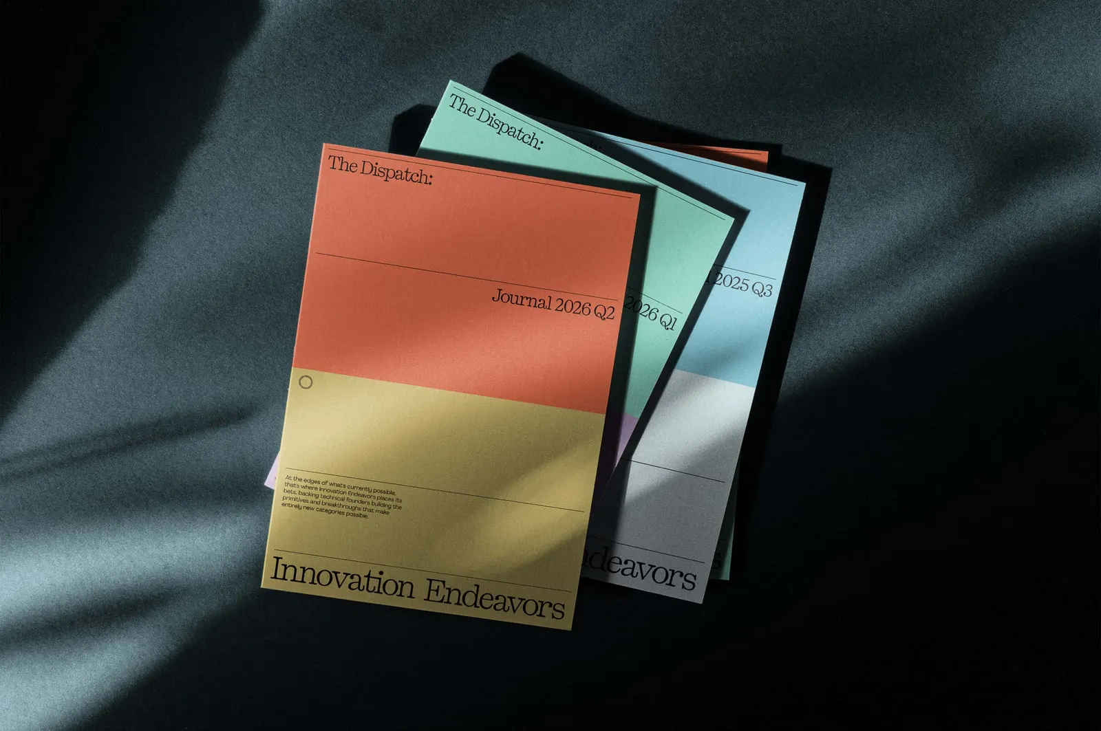
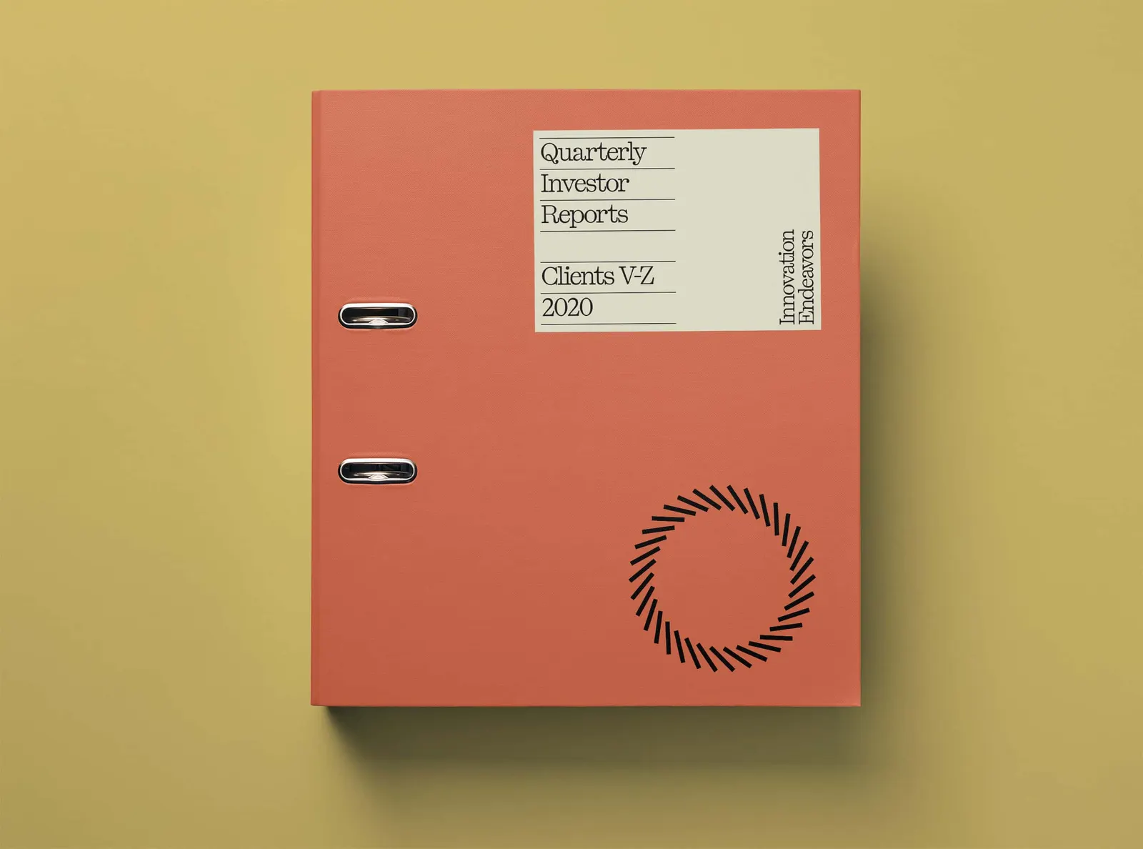


Images and video from studiomast.co, by Mast.