The Brand Monograph
Kleenex®
Few brands can claim they invented their category, and Kleenex® is one of them. As it reaches 100 years, Turner Duckworth has given it a visual identity with the confidence of a market leader, one that finally looks like a single brand wherever it appears in the world.
The brief was to unify a household name that had grown visually scattered across markets. Turner Duckworth's answer starts with restraint: Saul Bass' 1961 script stays almost exactly as it was, and the new system forms around it. A crown inspired by a tissue now holds the wordmark, signaling leadership and the brand's idea of bringing strength to everyday moments.
The details reward a closer look. Designers Alec Tear and Lewis MacDonald, who also handled typography, worked with a tighter, richer palette built on a refreshed Kleenex® Blue, which adds depth while keeping variety under control. The illustration style takes its cues from the crown's soft curves and sets the brand in the moments where tissues matter most: mighty sneezes, untimely spills, and tears of joy. The result is a clear visual throughline across every touchpoint, built to hold off competition from private labels and shirtsleeves alike.
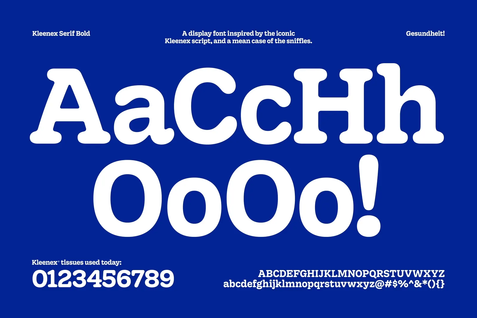

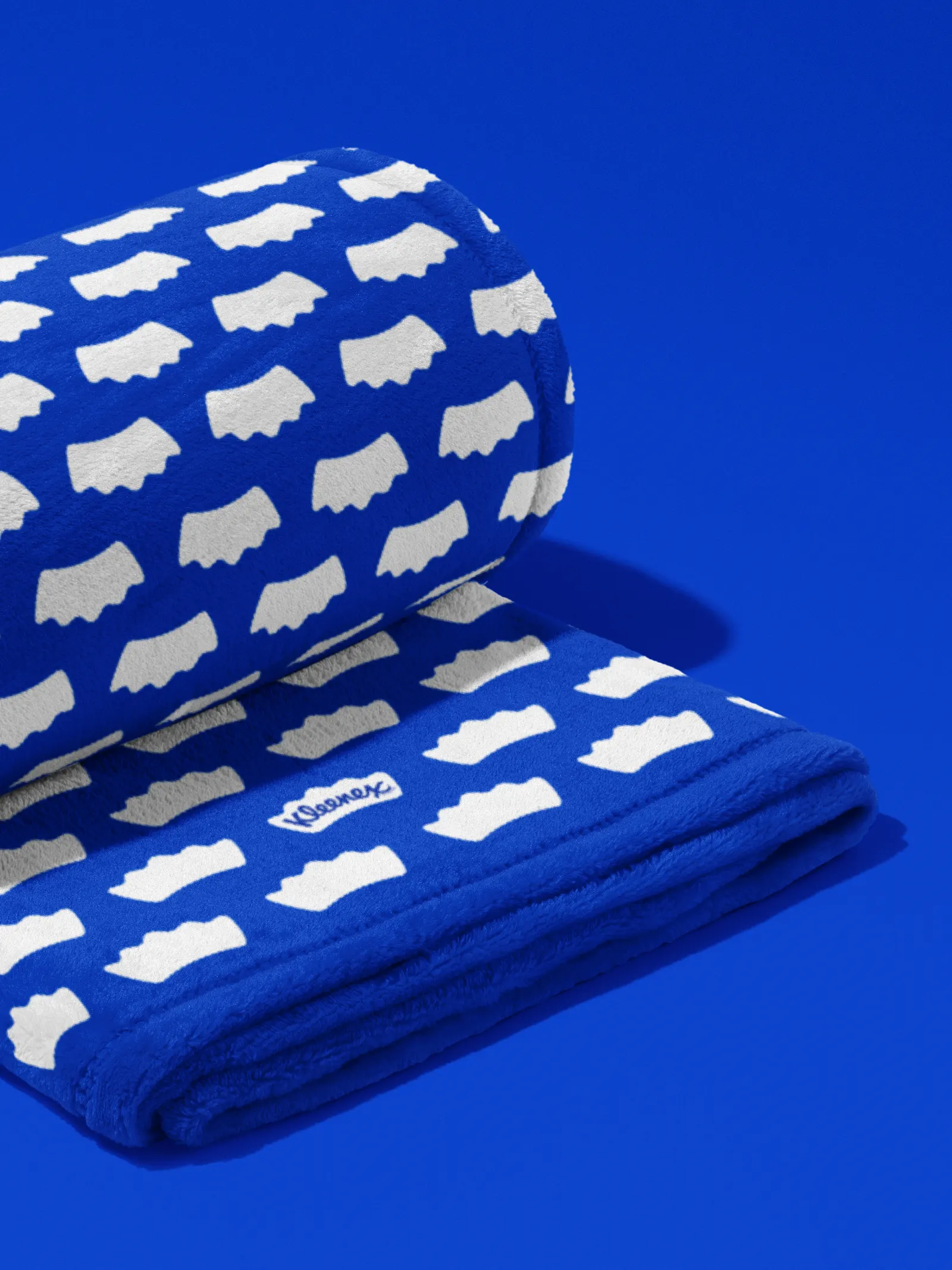



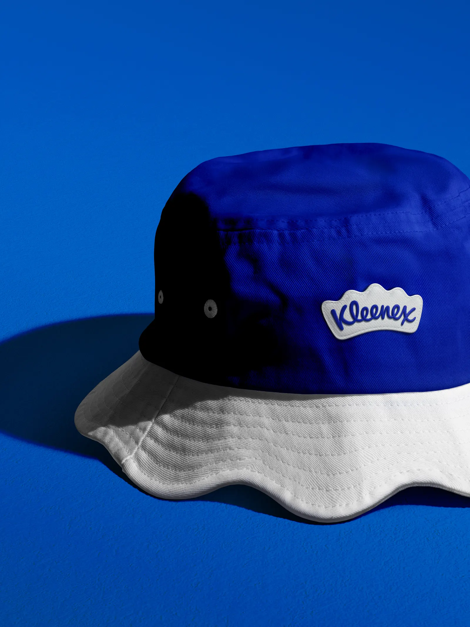

Images and video from turnerduckworth.com, by Turner Duckworth.