The Brand Monograph
Nubank
by Koto
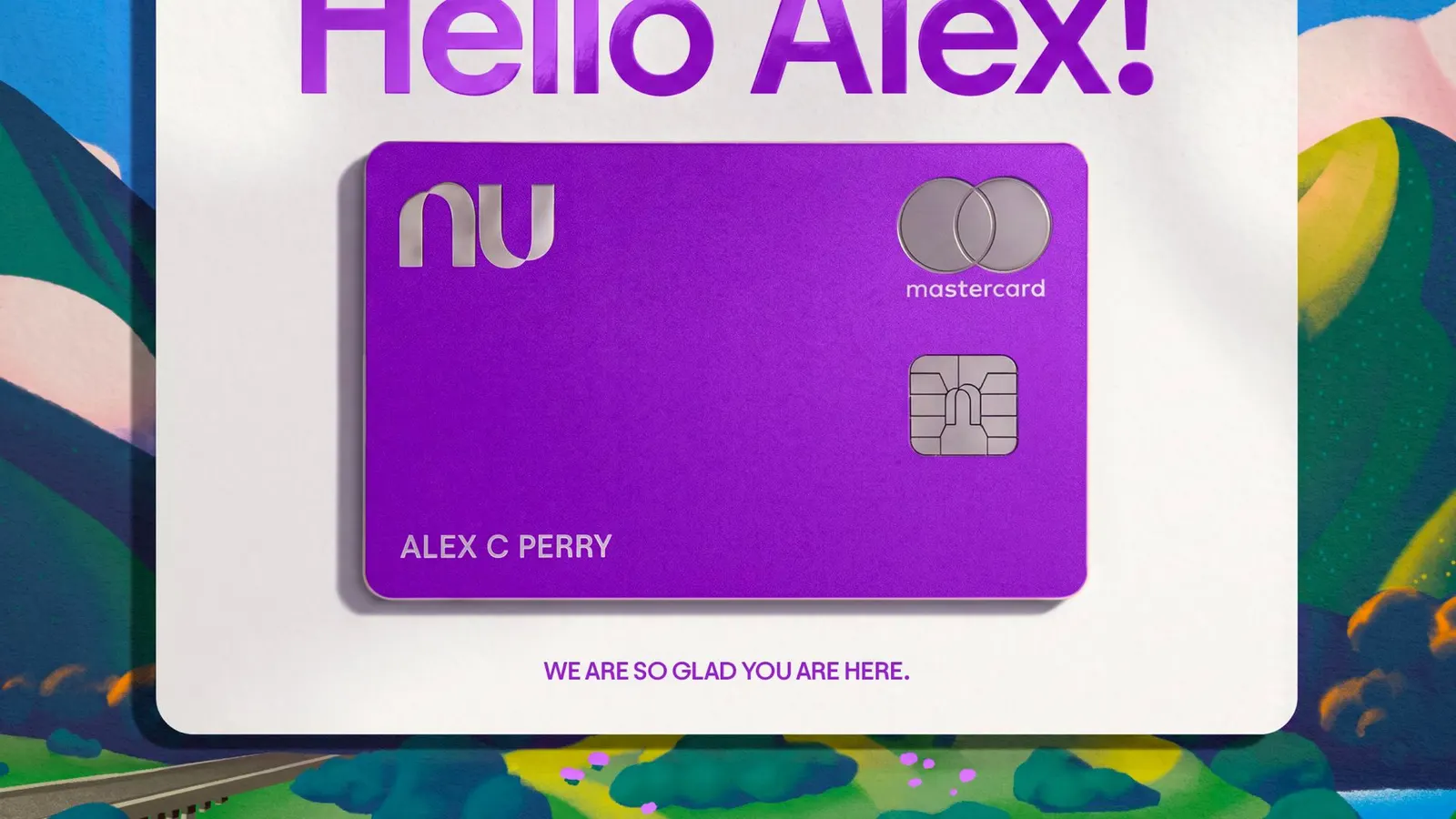
What stands out about Nubank's rebrand is how much it holds without losing its simplicity. Koto took a brand built for a smaller, simpler bank and made it work for 140 million customers across new markets, products, and audiences, and it still feels unmistakably Nu.
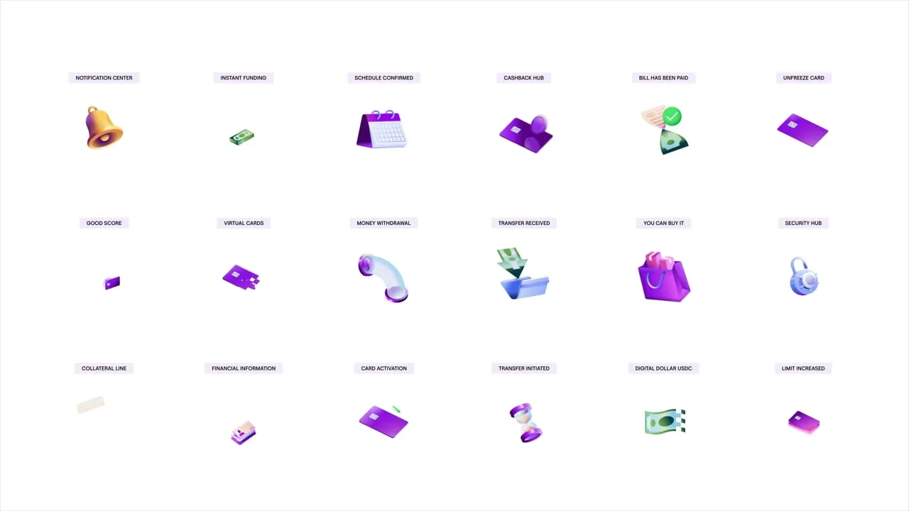
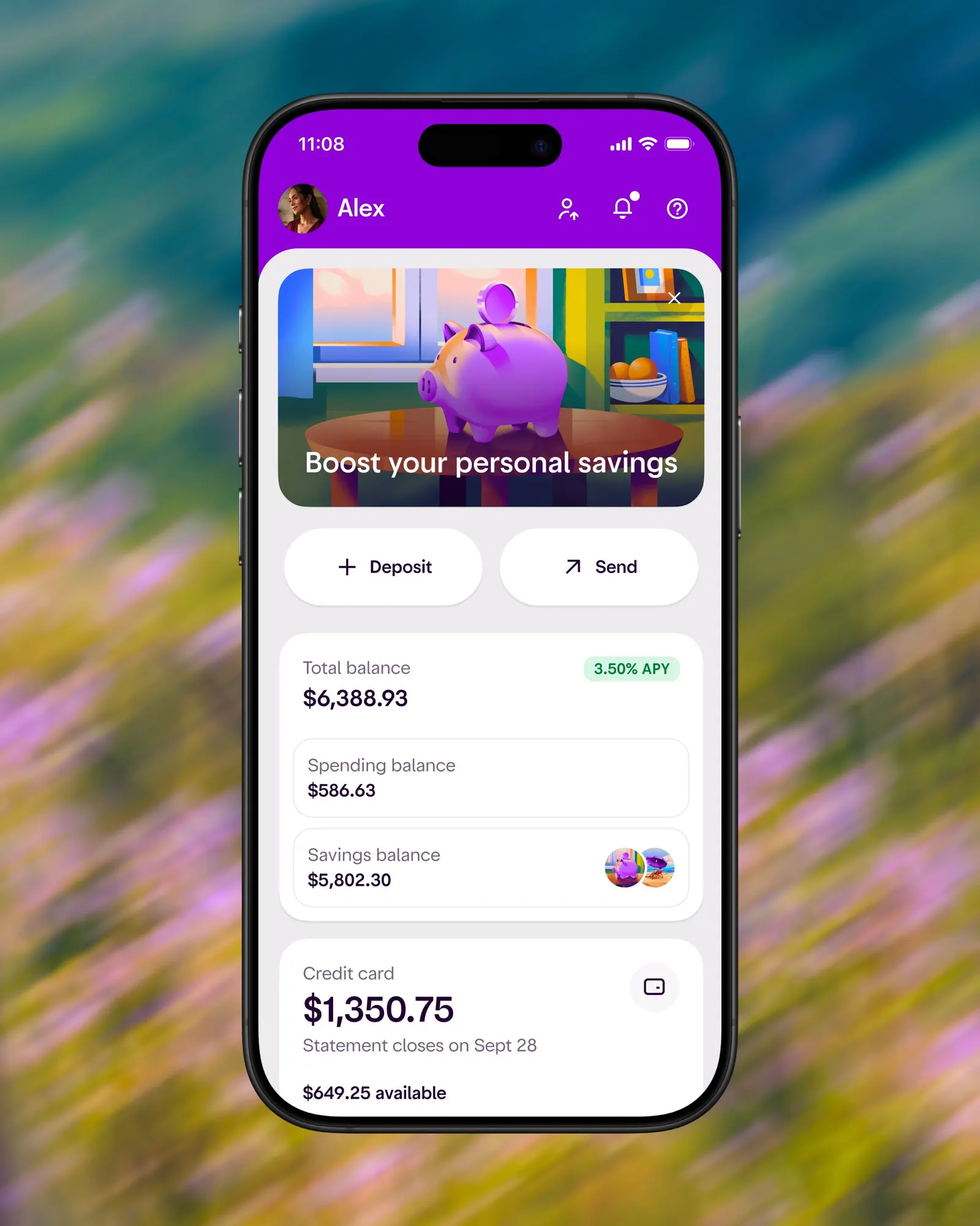
The idea mirrors how Nubank operates: do the hard work behind the scenes so everything feels effortless. Koto built a graphic system from a few recognizable ingredients (color, modules, and layers) that combine and recombine to give the brand range. Motion extends the same logic, from big brand moments to animated illustrations and interactions inside the app. Typography was developed with Blackletra Type Foundry.
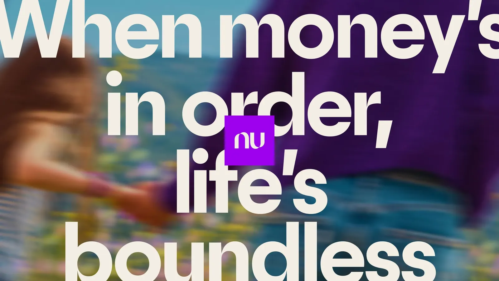
The art direction is a smart choice. Photography shows people absorbed in real relationships and unguarded moments of joy, so financial freedom reads as a life being lived rather than a bank's promise. Illustration handles the ideas photography can't, adding warmth and play. The system carries through nu.com, built to work across products, languages, and regulatory requirements, and into two sub-identities: Croma, more expressive and colorful, and Ultravioleta, the premium offering, which finds richness without leaning on the usual codes of exclusivity.


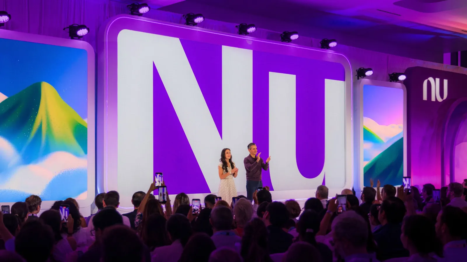
Images and video from koto.com, by Koto.