The Brand Monograph
Patreon — Visual Identity and more
by Wolff Olins
Patreon's new identity is built to stay unfinished. Instead of a fixed mark that asks for attention, Wolff Olins gave the platform a logo that behaves like work in progress, which leaves room for the creators to take center stage.
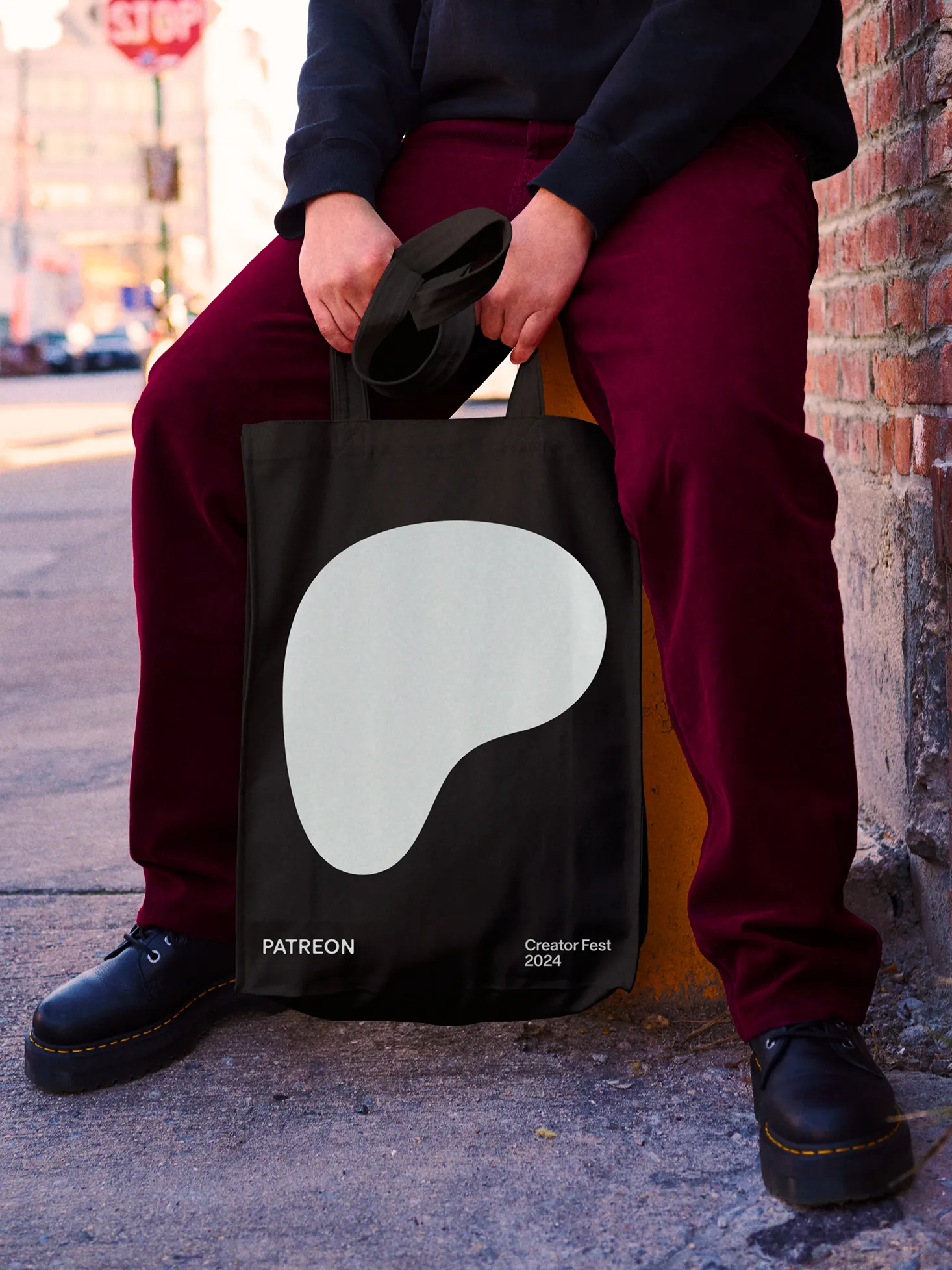
The brief came a decade after Patreon invented a new way for fans to support the people they follow. The company wanted to grow from a membership business into a "creator company," and the open question was how far the brand could step back. Wolff Olins answered with something deliberately DIY: a fluid, rounded shape drawn from the letter P that works as a container for endless variations, so creators can help shape the brand over time.
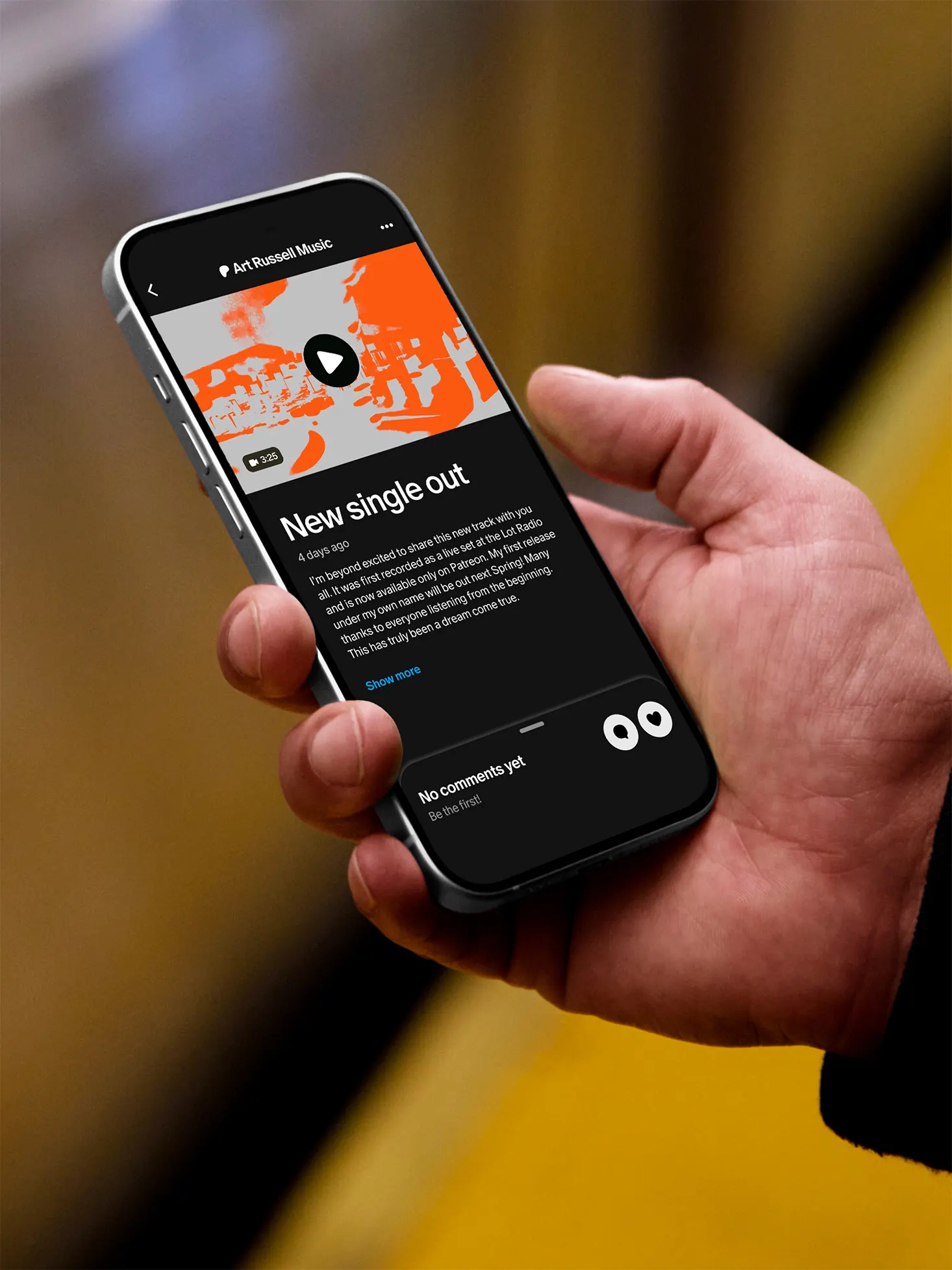
The details carry the idea. 3D artist David McLeod worked with the studio to explore what the material of creativity might feel like, from how it moves to the textures it takes on. Dinamo Type Foundry drew a matching wordmark that slides from a hairline weight, which keeps the focus on the creator, to a heavier one when Patreon needs to lead. Patreon's in-house team reworked the app and art direction to match, and the system is set to expand with motion assets and customizable pages. The work earned recognition at Fast Company's Innovation by Design Awards and the Graphis Design Awards.

Images and video from wolffolins.com, by Wolff Olins.