The Brand Monograph
Stack Overflow Rebrand: A legacy recoded
by Koto
Few rebrands start with a question as pointed as this one: what happens when your own data helps train the thing that replaces you? Koto's work for Stack Overflow answers it with a clear strategic move and a lot of well-judged craft.
When mainstream AI changed how developers look for answers, the platform's relevance came into doubt. Koto turned the problem around. AI is only as good as the knowledge it learns from, and Stack's archive of human-validated discussion is exactly that. The studio positioned Stack Overflow as the hub of truth for the industry, simplified the portfolio into Stack Overflow and Stack Overflow Business, and anchored it all in a new idea: Always in Build.
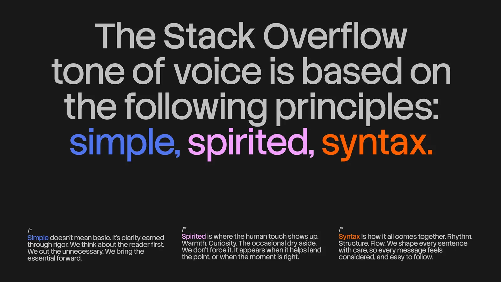
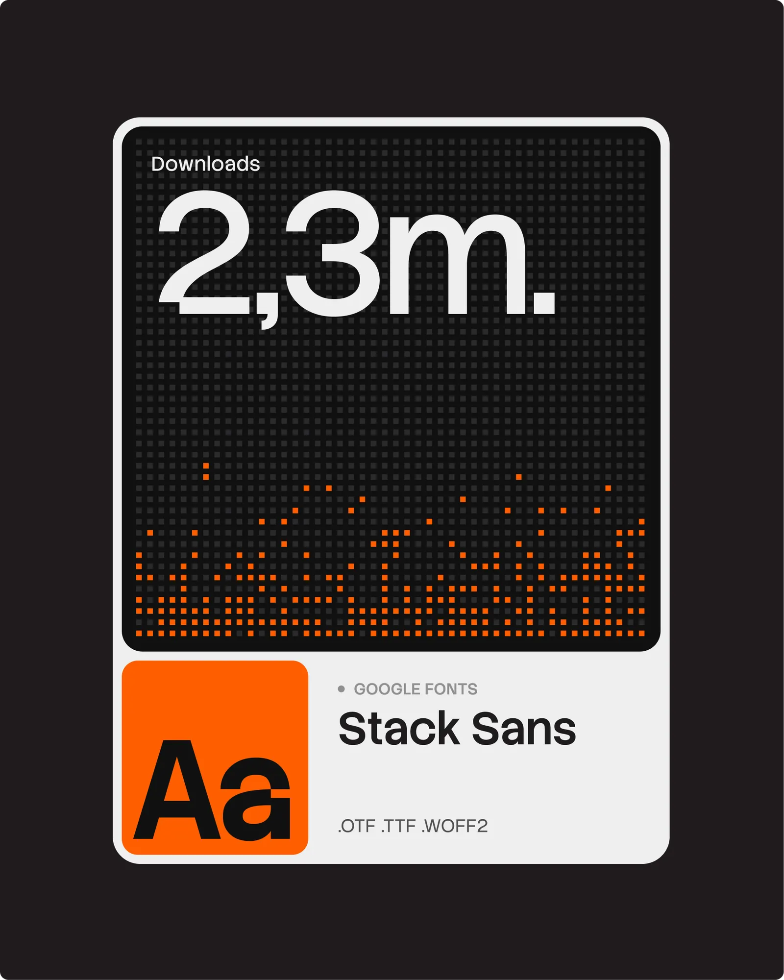
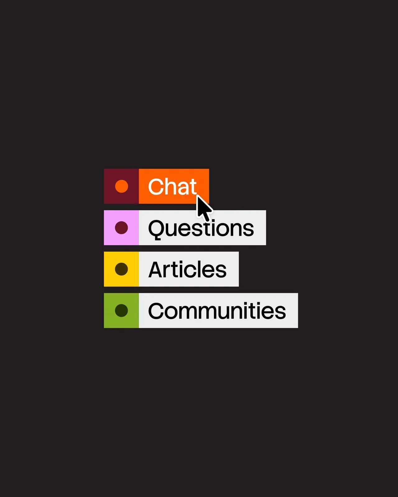
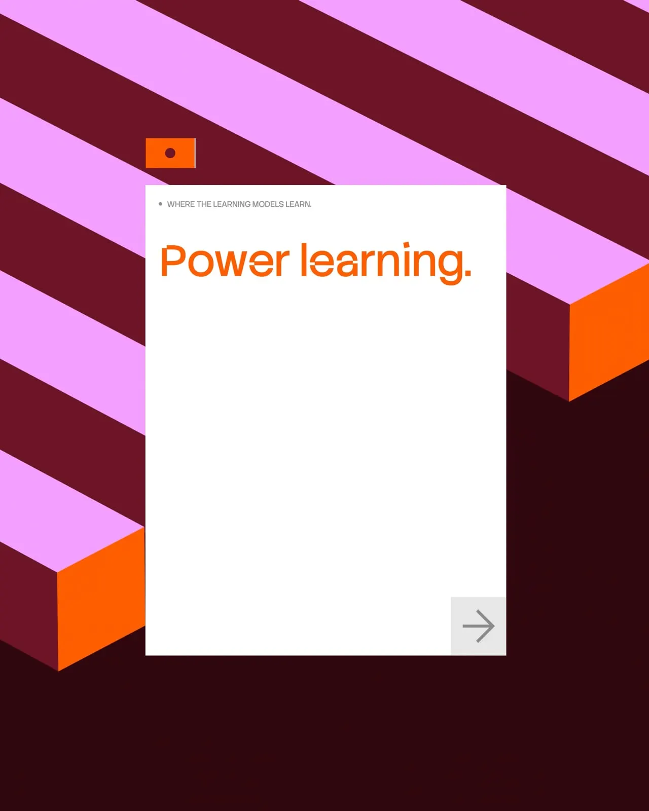
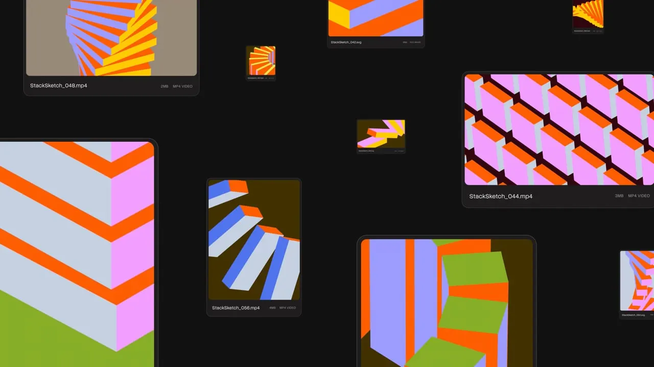
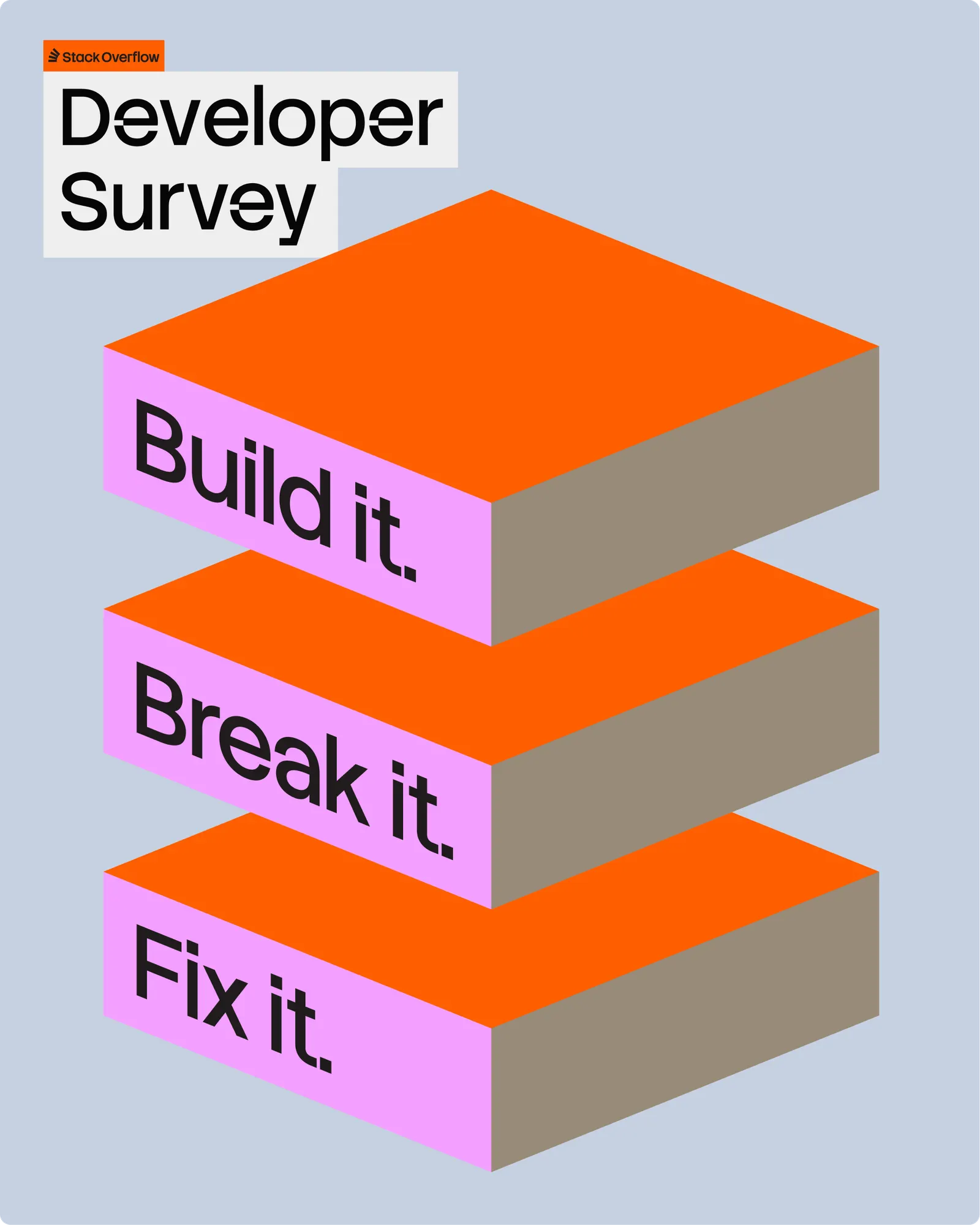
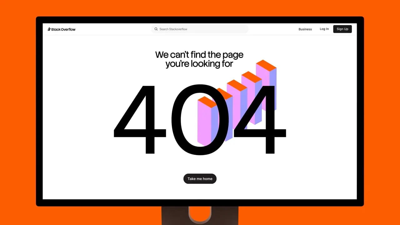
The identity rewards a close look. The single-color logo reads as building blocks in motion, and the toppling tower stays intact as a nod to the engineering error behind the name. Its geometry grows into a fluid visual language, backed by a custom generative tool for producing assets at scale. Koto also drew Stack Sans, a typeface with a notch detail inspired by building, now available on Google Fonts. The system knows when to stay quiet, protecting flow state in product and turning expressive in campaigns and the Developer Survey, while the tone of voice trades jargon for clarity and dry wit.

Images and video from koto.com, by Koto.