The Brand Monograph
A new fit-for-a-leader design system
by Kontrapunkt
Most logos sit still. Nybolig's, in the hands of Kontrapunkt, now moves, signals, and sticks in memory. The Danish studio turned the brand's position as the country's leading estate agent into a design language that works as hard as the business behind it.
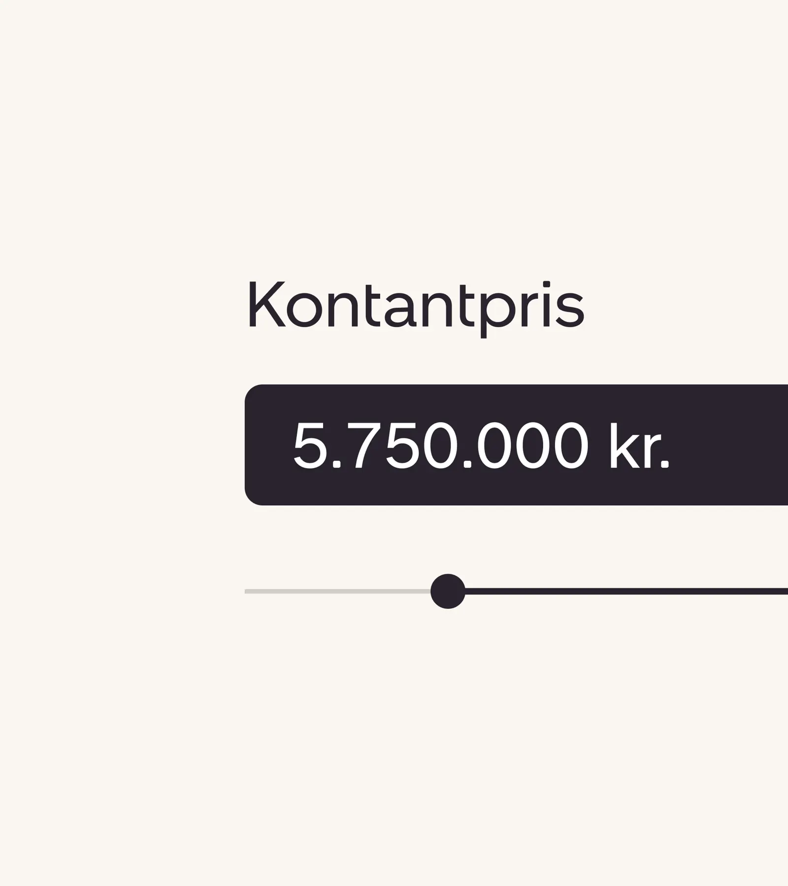
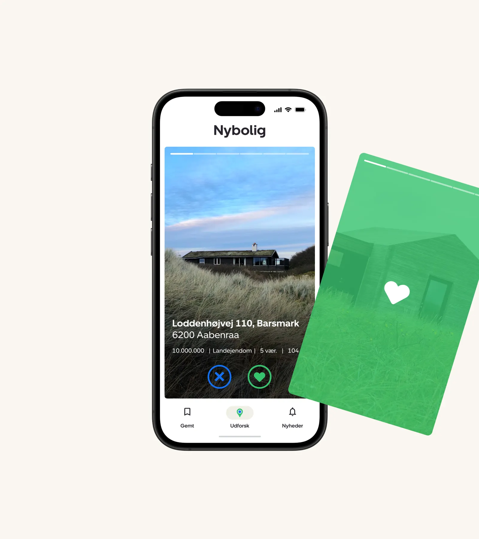
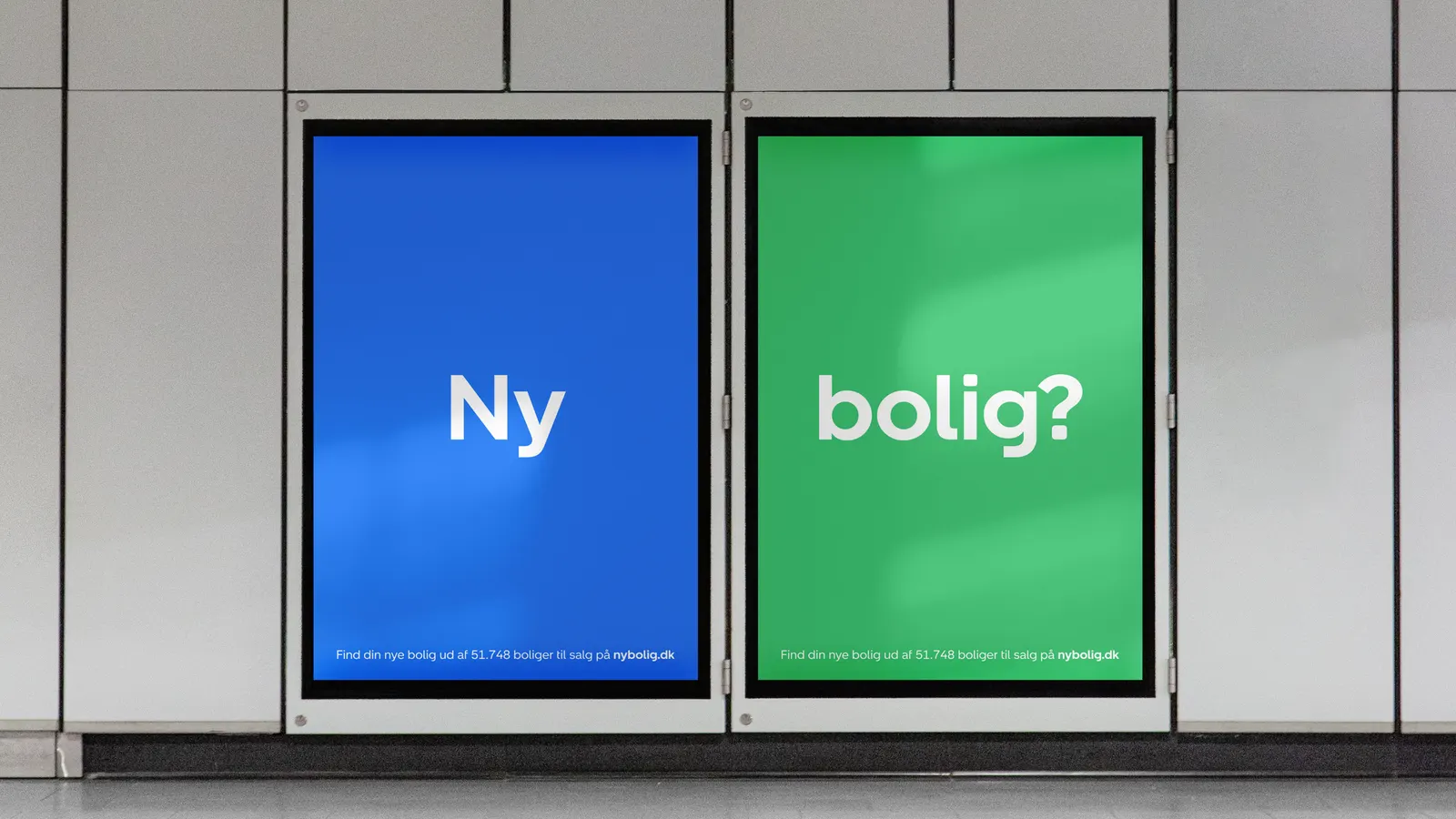
The brief was to take Nybolig's most recognizable assets and make them work across a landscape of screens, streets, and touchpoints. Kontrapunkt's answer was to open up the formerly static logo into a system of microinteractions, mnemonics, and a flexible communications engine that stays unmistakably Nybolig however it is used.
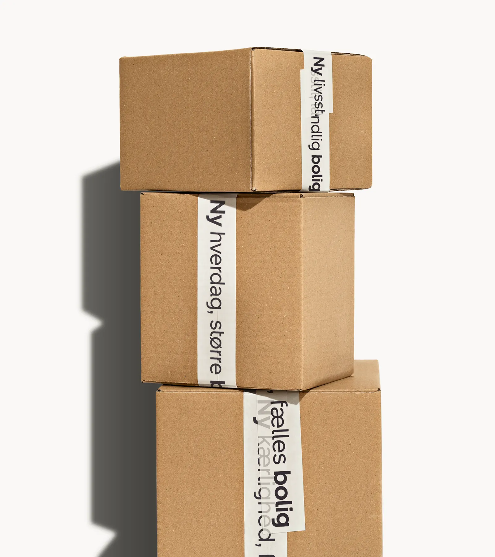
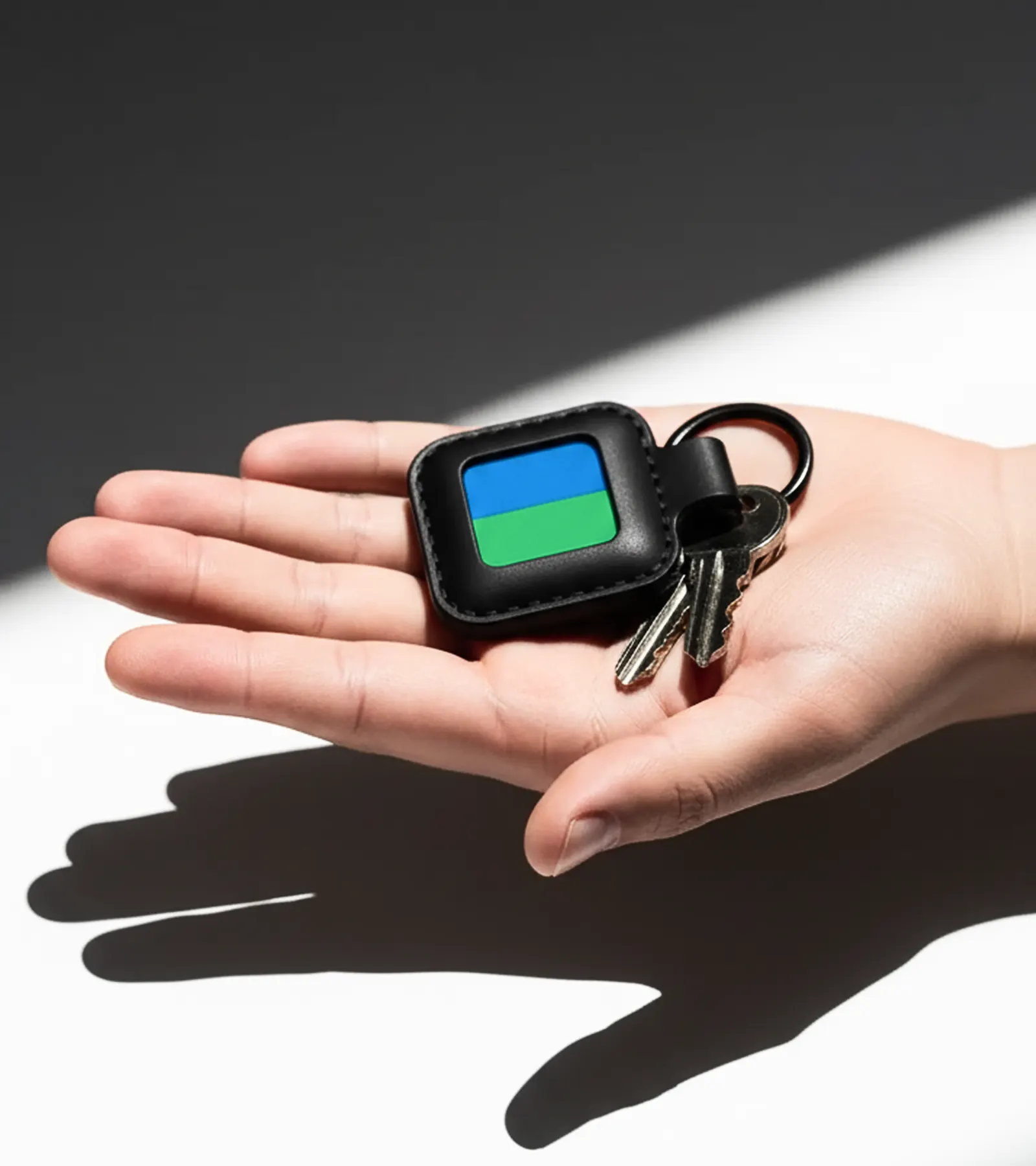
The details carry the idea. A bespoke typeface gives the brand its own voice, and reworked digital platforms, merch, and signage extend it into everyday use. The most tangible result is on the street, where redesigned "for sale" signs multiply the number of times a listing is seen. The identity doesn't just look like a leader. It sets a higher standard for how an estate agent can present itself.
Images and video from kontrapunkt.com, by Kontrapunkt.