The Brand Monograph
Focused forward
by Kontrapunkt
Jyske Bank has grown from a regional lender into one of Denmark's largest banks, and Kontrapunkt's new identity makes a point of keeping the personality that got it there. The work balances two things banks rarely hold together: the weight of a big institution and the directness of a local one.
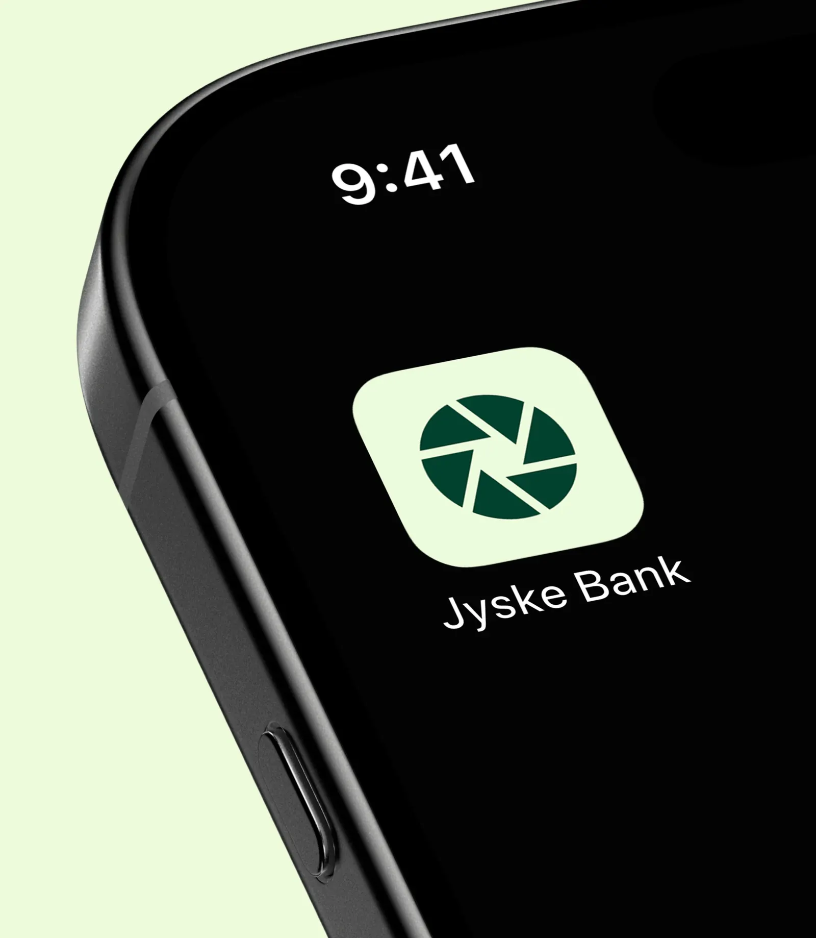
The brief was to revitalize that foundation rather than replace it. Kontrapunkt built the idea around the iris, a symbol that has been with Jyske Bank for decades. Instead of discarding it, the studio redrew it as a sharper, more dynamic mark. The logic is neatly visual: an eye that can zoom in on the smallest detail and pull back to see the whole picture, which is also a fair description of what a bank should do for its customers.
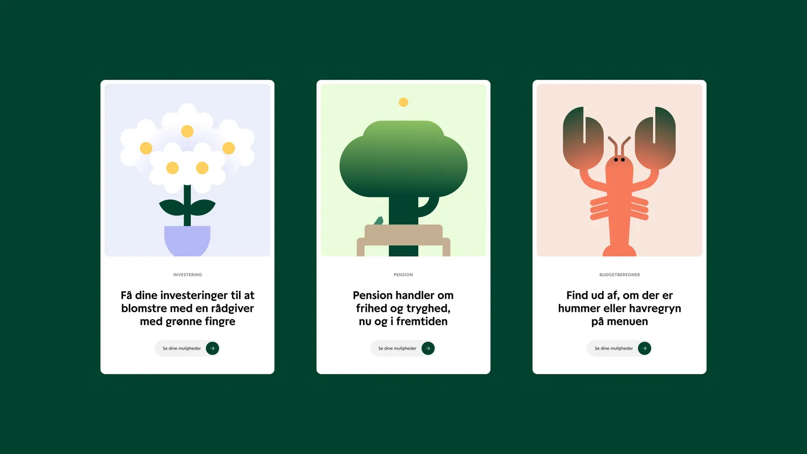
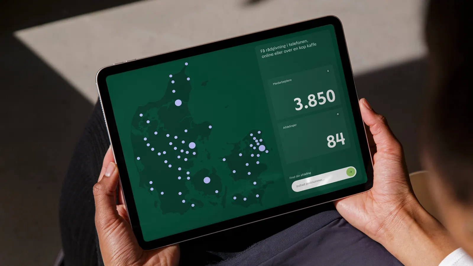
Around the symbol, the studio strengthened the wordmark and gave the brand a typographic voice that feels warm and confident rather than formal. A green palette carries its own expressive tone, steering clear of the usual financial blues. Together these pieces form a system that speaks to customers at eye level, with competence, informality, and a bias toward action. It feels more rooted in its origins, and better prepared for what comes next.

Images and video from kontrapunkt.com, by Kontrapunkt.