The Brand Monograph
A brand as timeless as its porcelain
by Kontrapunkt
Royal Copenhagen's new identity treats a 250-year-old porcelain brand the way its makers treat the porcelain: with a lighter, steadier hand. Kontrapunkt resisted the urge to reinvent a heritage the brand already owns, and refined it instead.
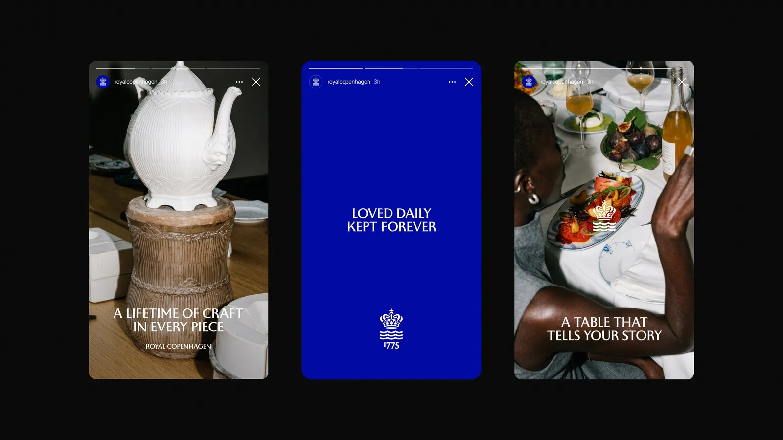
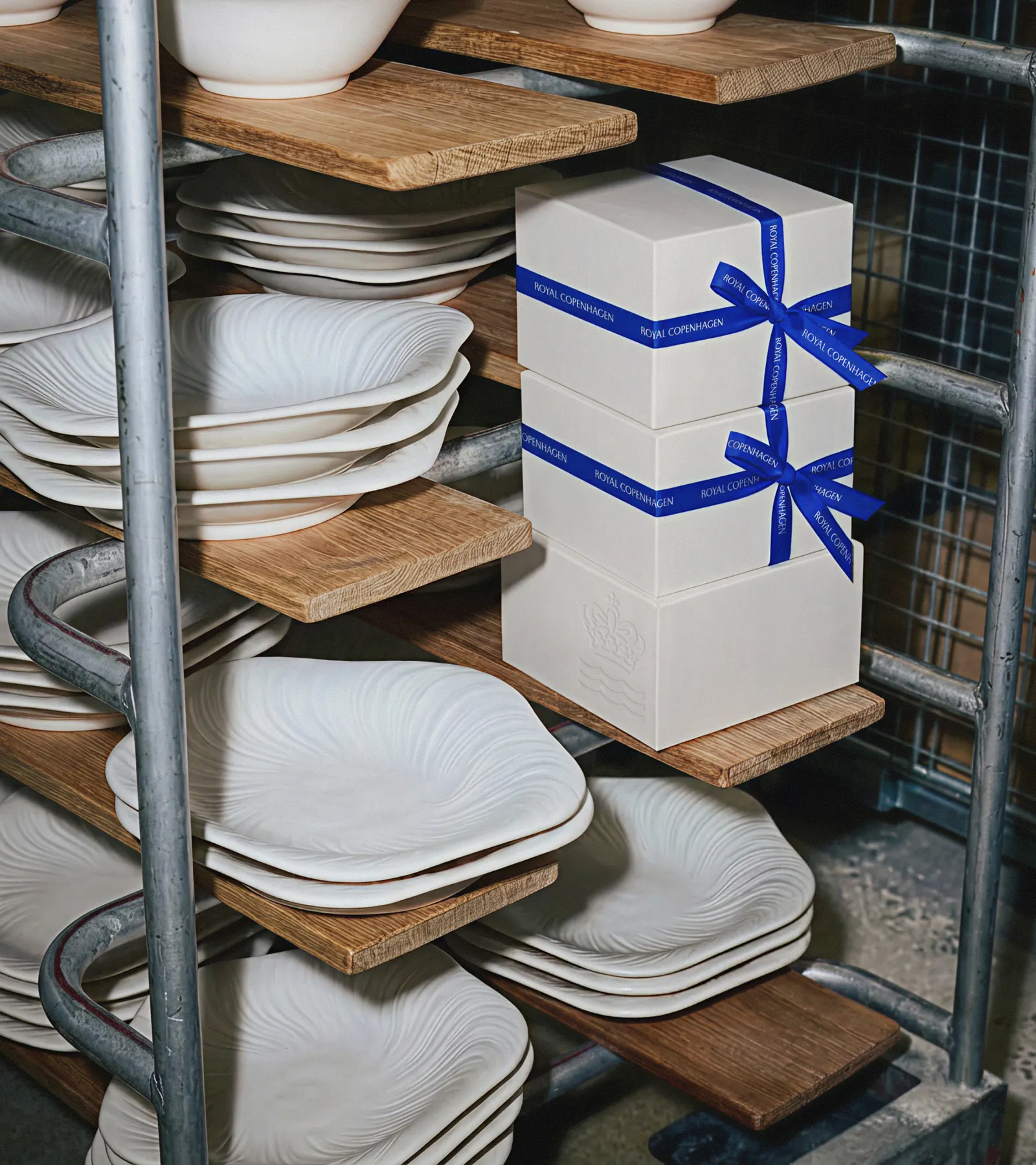
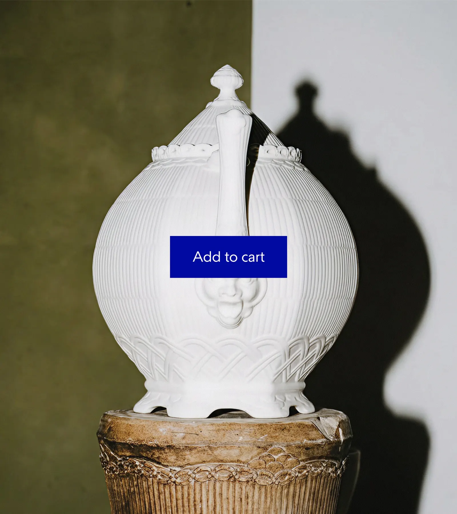
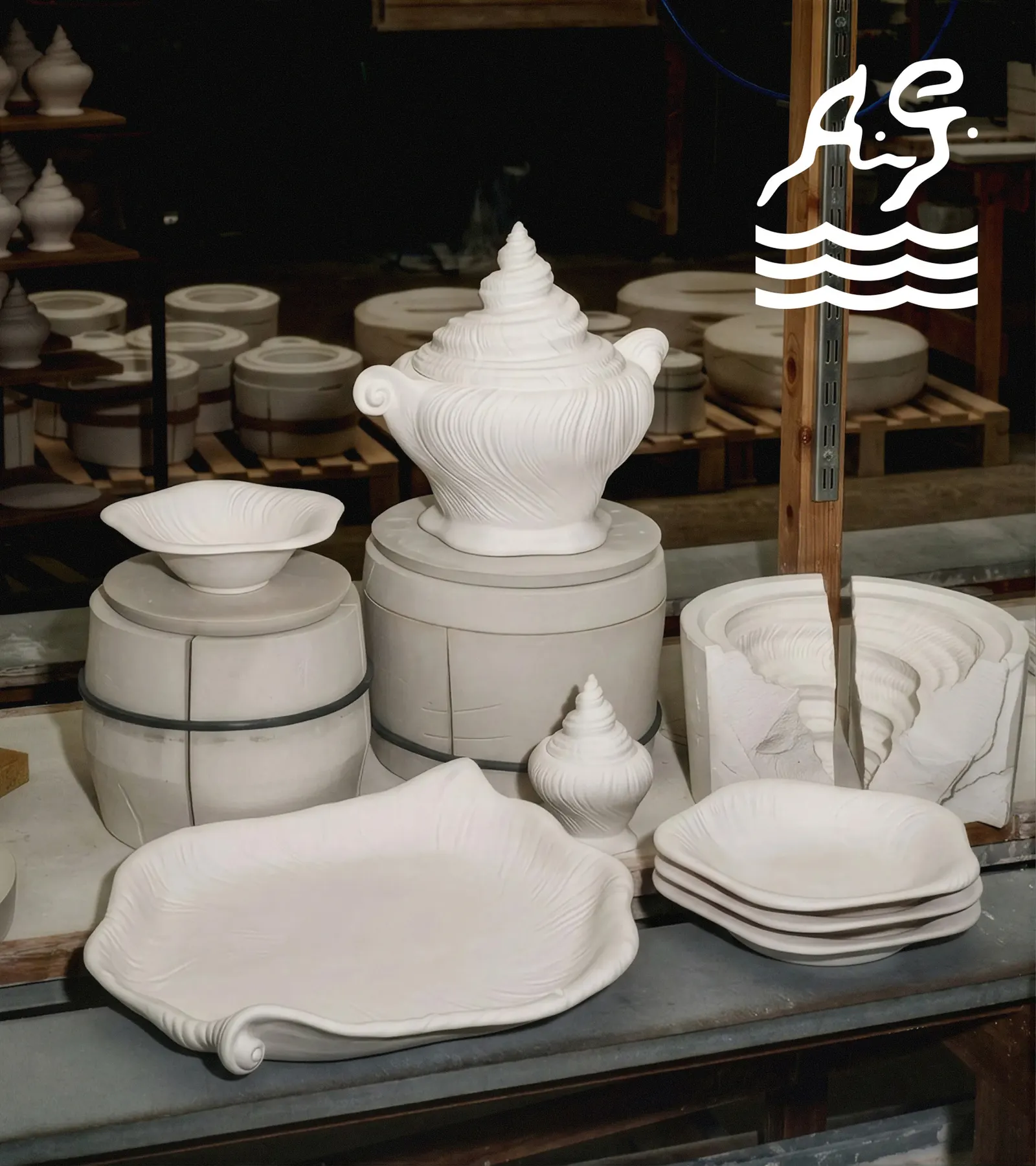
The Copenhagen studio was asked to redesign the visual identity so it reflects the craft and care behind every piece. Its answer is a simple idea, that Royal Copenhagen is made with life. Its pieces turn up at family dinners, holiday tables, and everyday coffee breaks, and the identity is meant to carry some of that warmth, from the painter's brushstroke to the generations who inherit the plates.
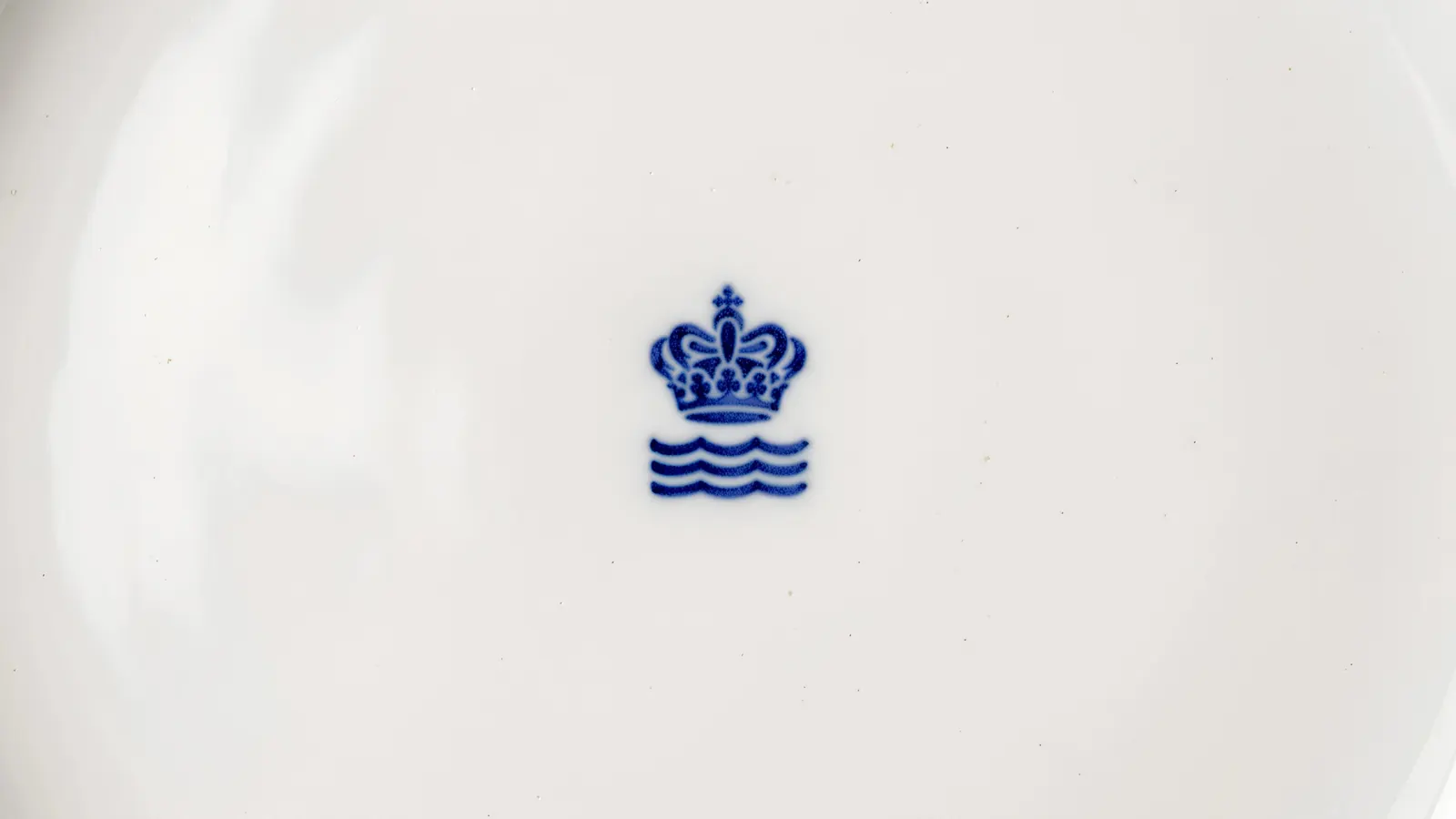
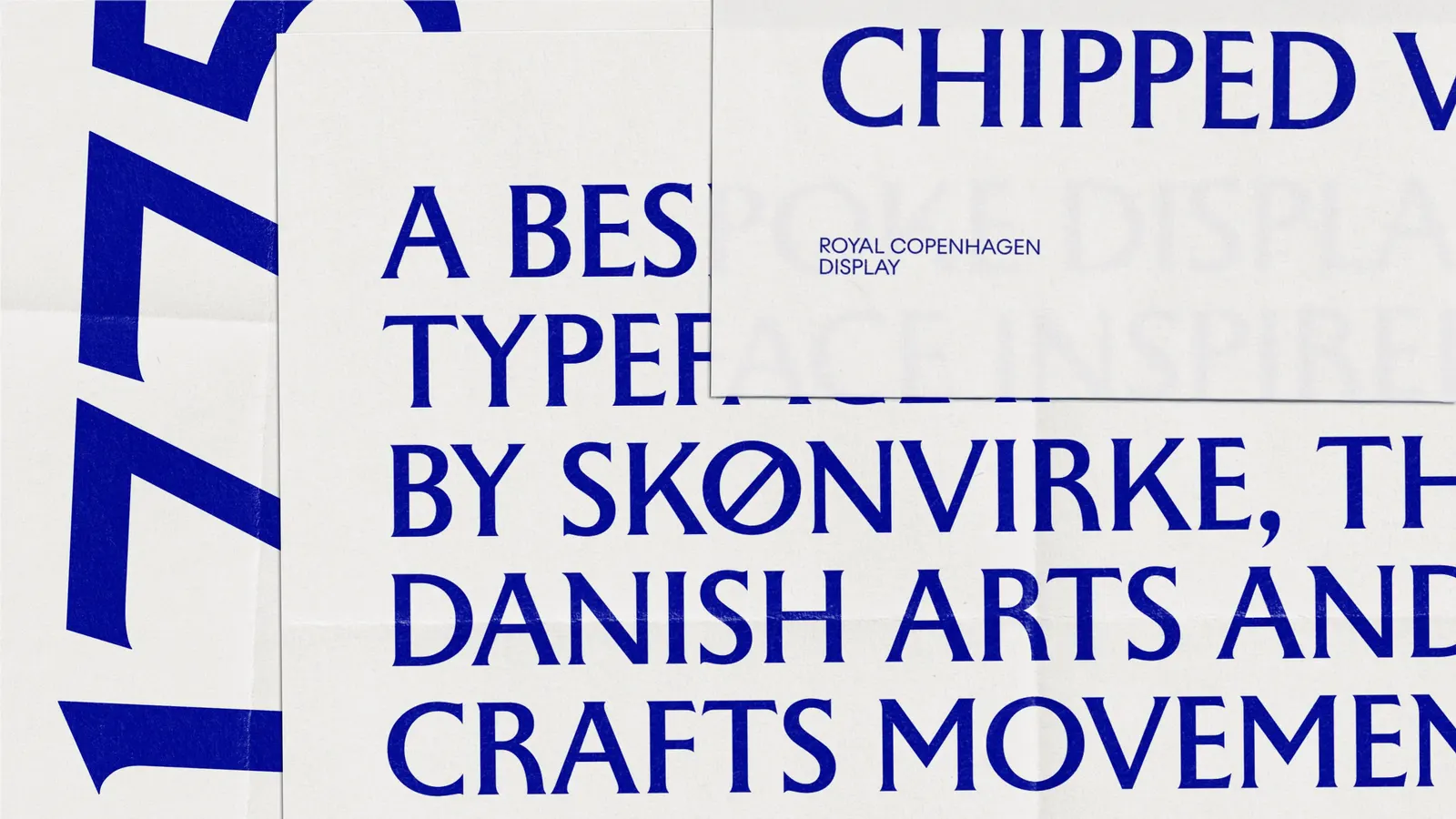
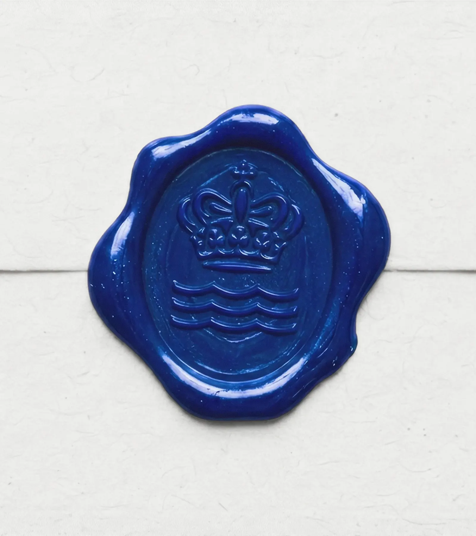
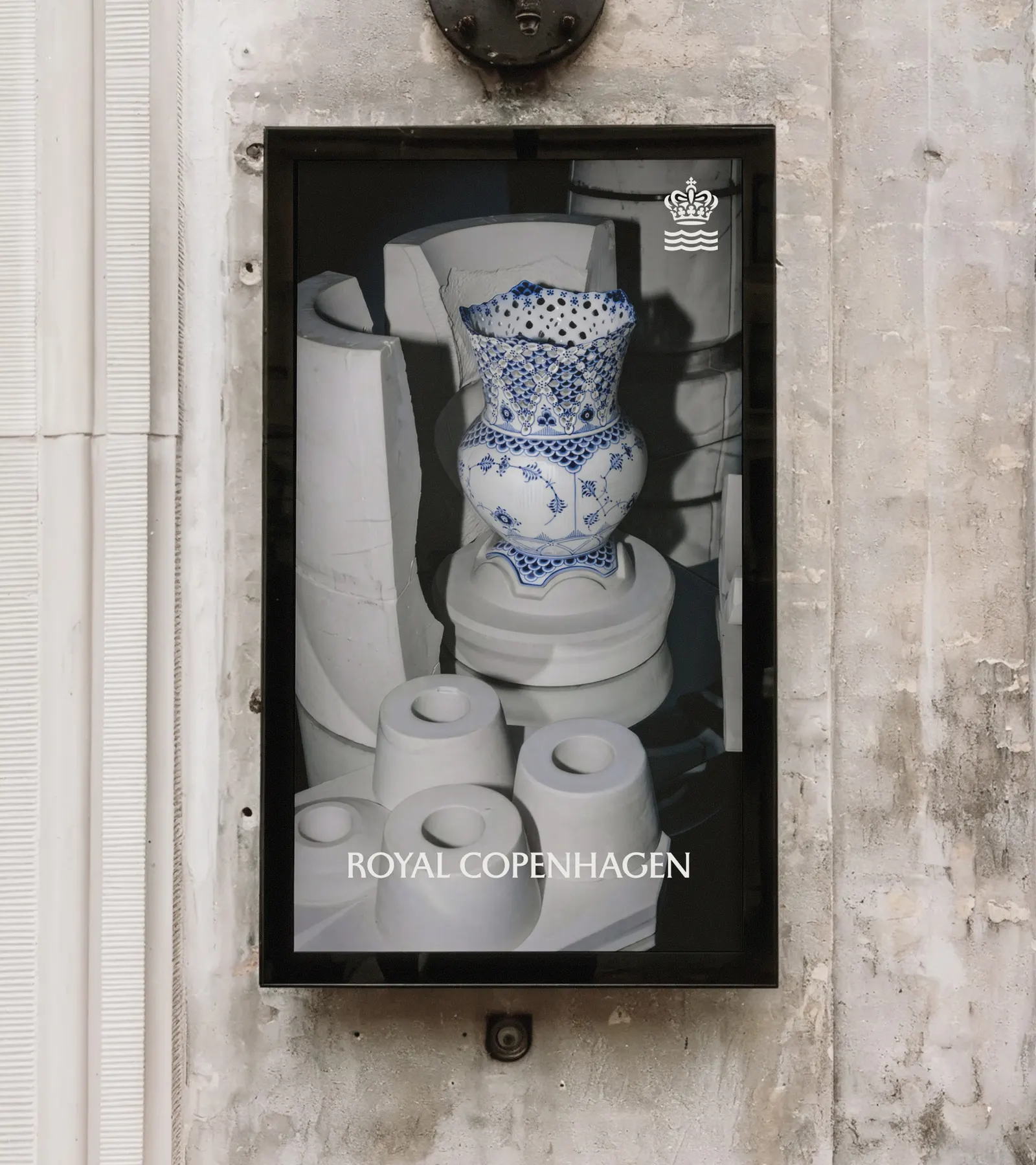
The craft is in the details. Kontrapunkt redrew the brand's centuries-old crown and wave with more deliberate precision, keeping the symbols recognizable while giving them a sharper, more considered line. Alongside them sits a bespoke typeface, as delicate as the porcelain itself. Together they give a global brand a quieter, more confident voice that feels at home on a table or on a screen.
Images and video from kontrapunkt.com, by Kontrapunkt.