The Brand Monograph
Blank Street — Brand Strategy and more
by Wolff Olins
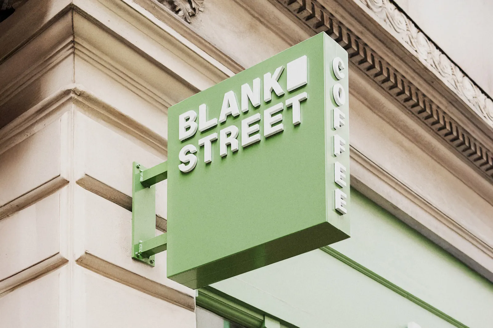
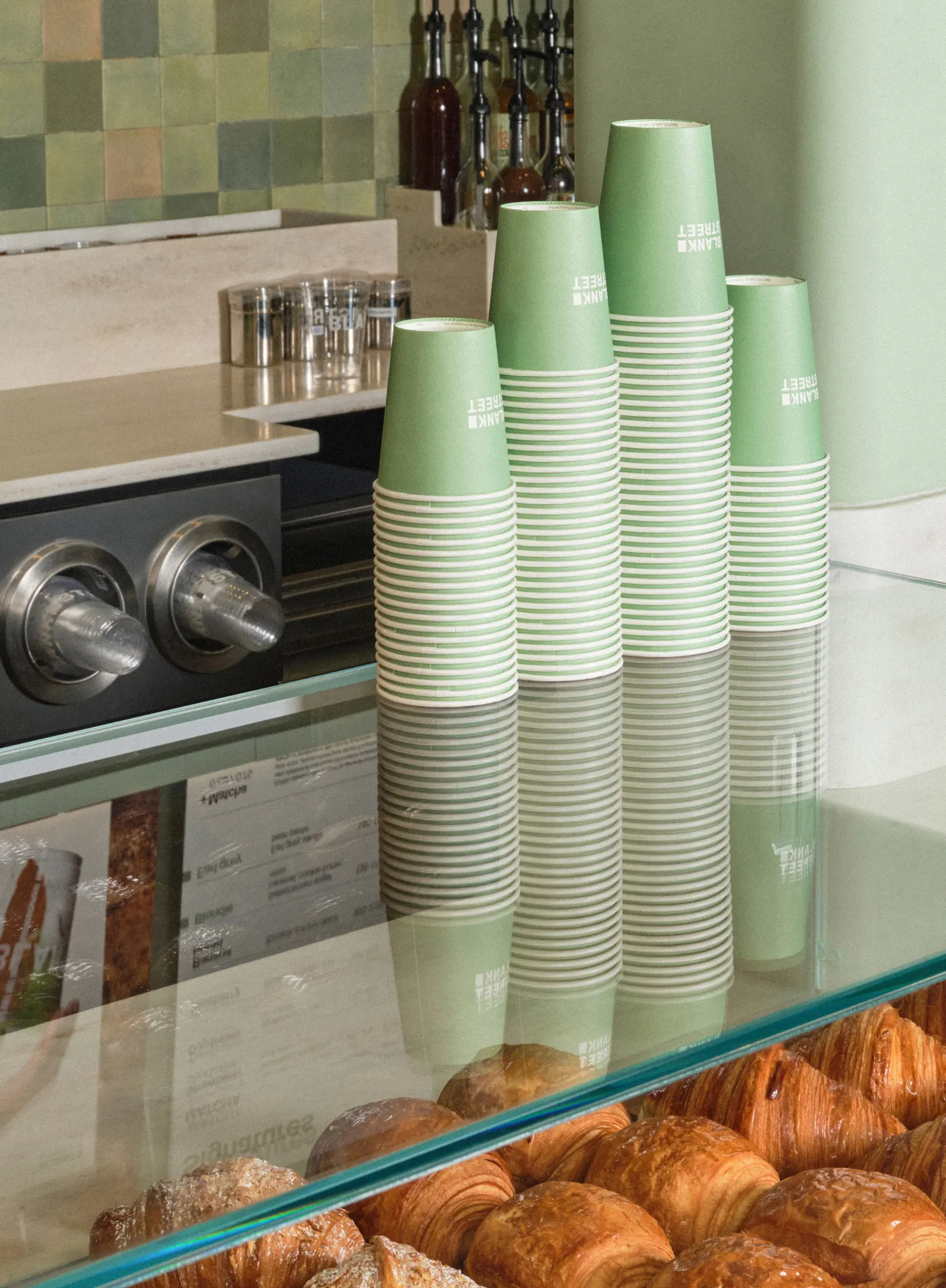
Blank Street's palette runs from 6 AM Green to 6 PM Green, so the brand shifts with the day it serves. It's a small idea that sets the tone for an identity built around everyday rituals, and Wolff Olins treats them with real polish.
The coffee company began as a Williamsburg cart in 2020, a lean model of small footprints and fast service. Within a few years it had dozens of locations across multiple cities, and the challenger look no longer fit. Wolff Olins reframed the daily coffee run as a moment worth showing up for, and built the strategy, verbal and visual identity, and employee value proposition around "Regularly remarkable." The idea holds together the high and the low, morning and evening, classics and specials.
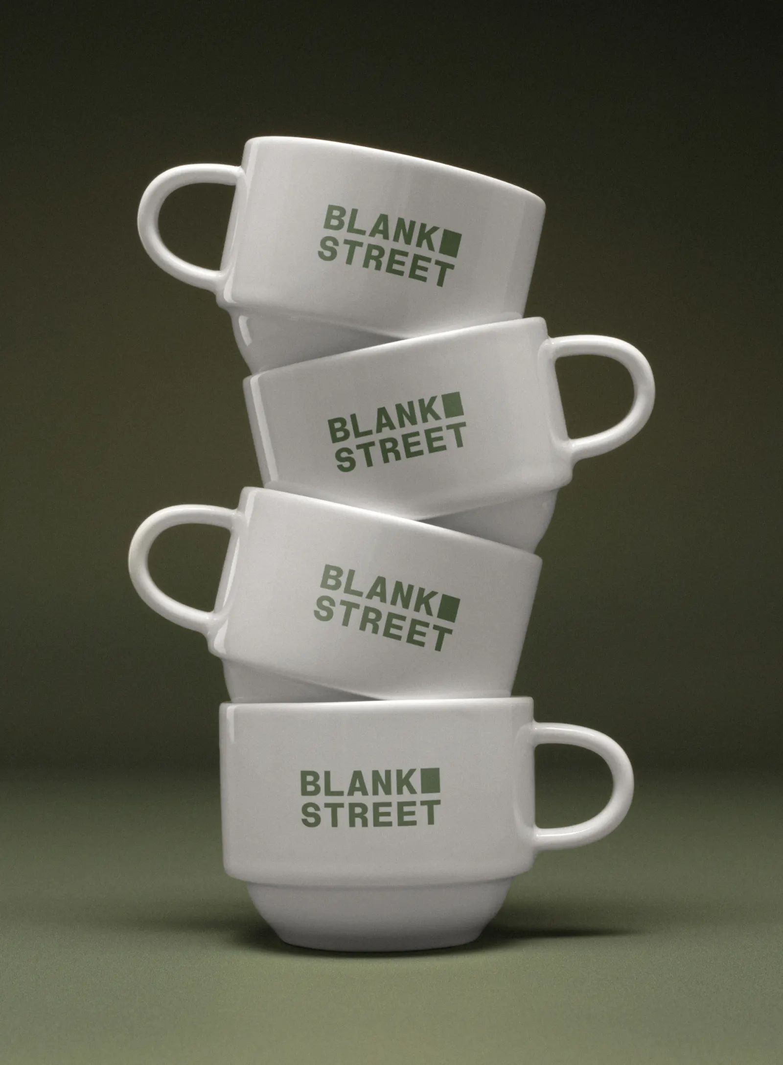
That tension shows up throughout the system. The logo nods to the original cart's rectangular window. Typography, developed with Due Studio, pairs Regular Sans and Remarkable Sans at a 70/30 split. The voice moves between enviably at ease and naturally friendly, and the art direction borrows from fashion and vintage editorial, closer to Vogue than to coffee-shop stock photography. The result is resonating with Gen Z: they made up 60% of first-month sales at the Glasgow store, and user-generated posts are up 80% year over year.



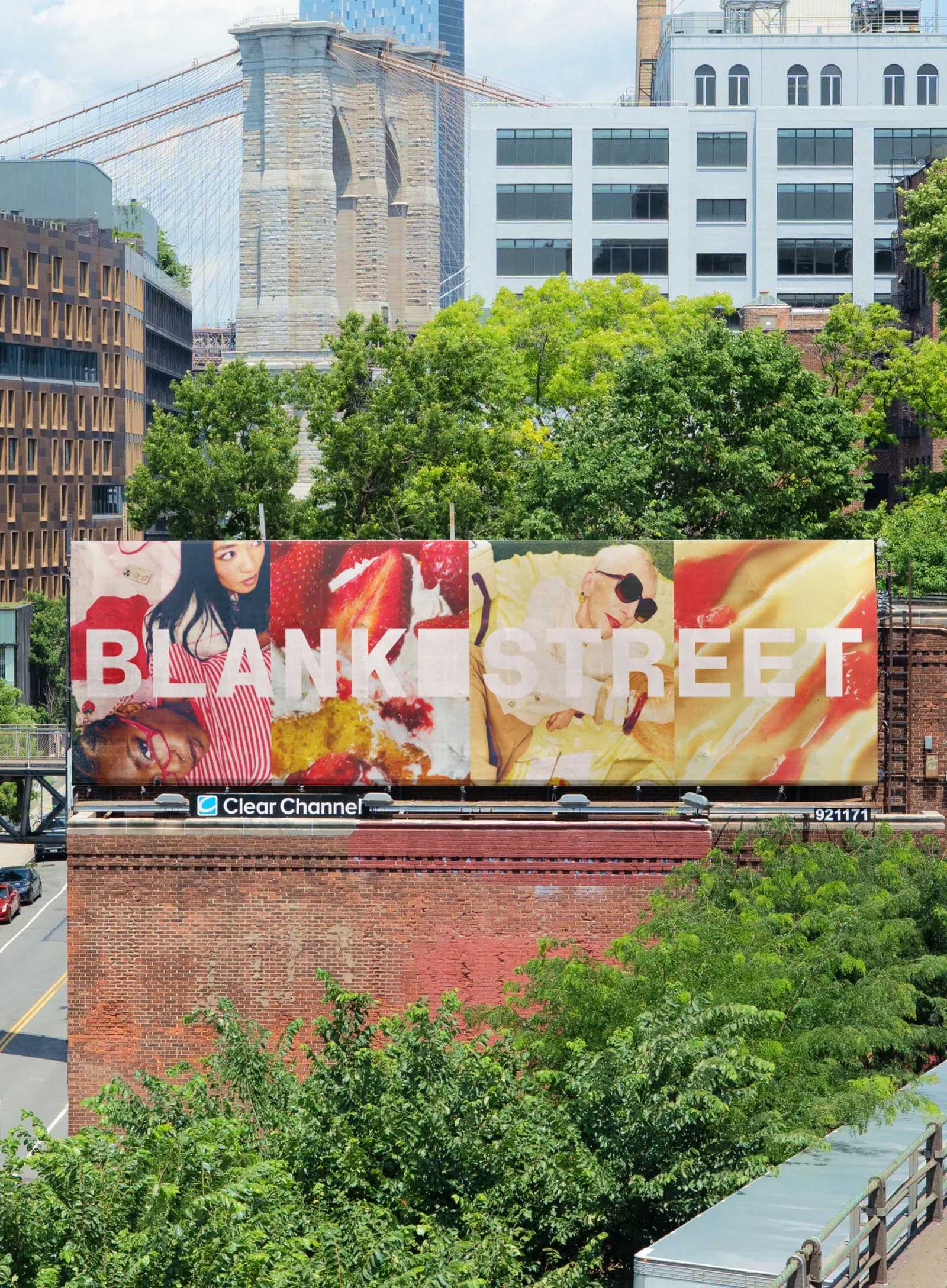
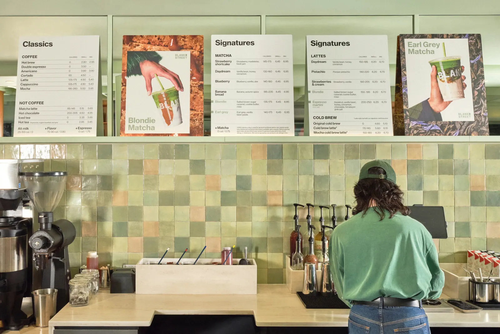
Images and video from wolffolins.com, by Wolff Olins.