The Brand Monograph
Decathlon — Brand Strategy and more
by Wolff Olins
Wolff Olins did something rare for a company of Decathlon's size: it gave a sprawling retailer a reason to be loved, not just shopped. The studio folded 85 brands into one, and the result feels like a sports brand with a point of view rather than a store with a lot of stock.
The brief was to move the world's third-biggest sports company, with more than 2,000 stores, from retailer to global sports brand across 70 markets and 85 sports. Wolff Olins' research kept returning to the same truth: people stop playing when they stop enjoying it, and few of them are chasing glory. That led to a strategy built on wonder, an invitation to play your way that suits beginners and pros alike and fits Decathlon's long-held belief in accessible sport.
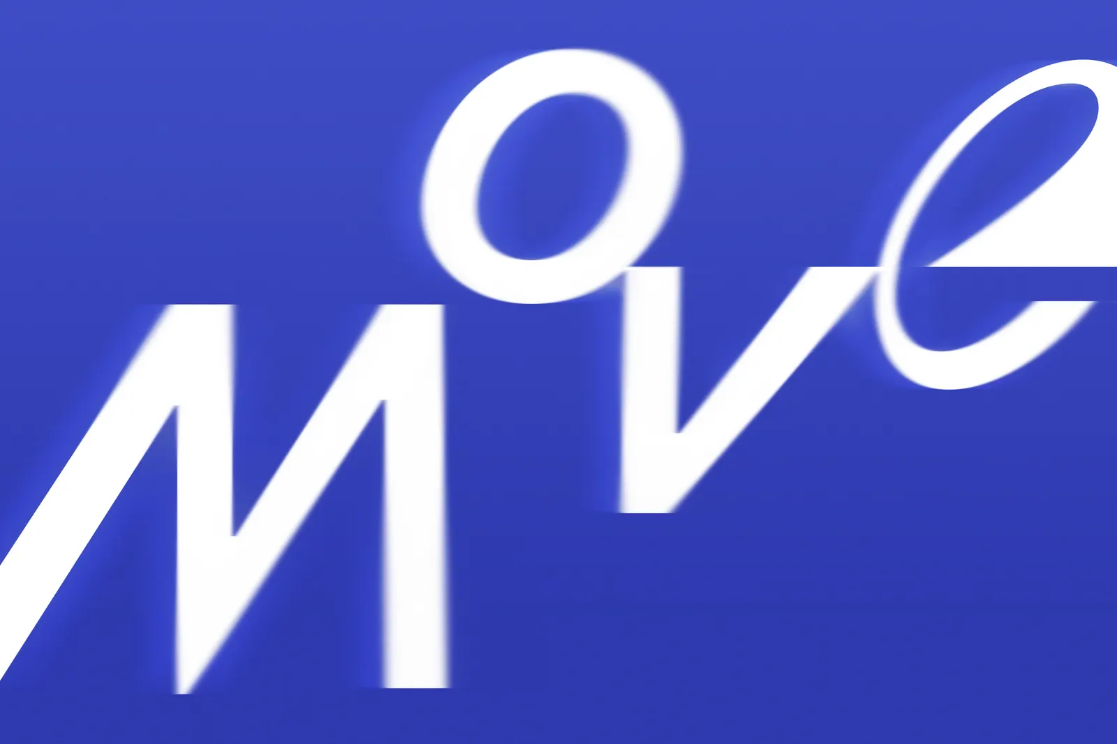
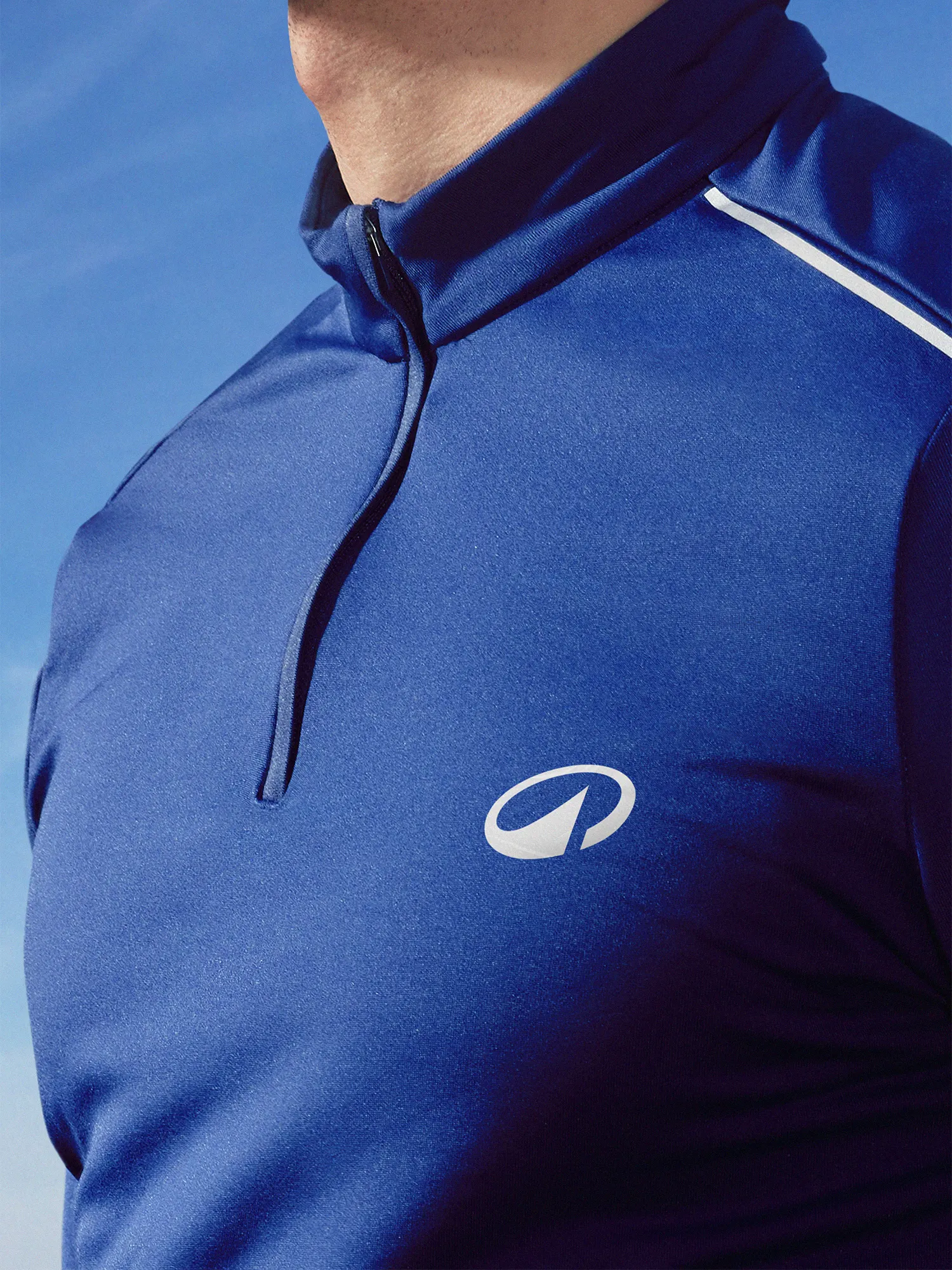
The craft carries that idea through. A refreshed blue and a refined wordmark anchor the identity, while L'Orbit, the new symbol, suggests movement and circularity, with an angle drawn from the wordmark and a peak nodding to the outdoors. Decathlon Sans, developed with Grilli Type and Alistair McCready, is a clean grotesque whose alternate characters add deliberate disruptions that give it a sense of motion. Voice, art direction, motion, and iconography round out a system flexible enough to work from play to pro, with icons and color that also highlight product features and sustainability benefits.

Images and video from wolffolins.com, by Wolff Olins.