The Brand Monograph
Uber — Brand Strategy and more
by Wolff Olins
What makes Wolff Olins' long run with Uber worth studying is how far the work reaches beyond a logo. Since 2017, the studio has helped the company shift its emphasis from scale to service, starting with culture and working outward to the brand people actually see.
The brief began with the fallout of hypergrowth: drivers, employees, and riders whose needs had gone unmet. Wolff Olins responded with a new cultural mindset for Latin America, an employee proposition built around going far and fast together, and a brand narrative rooted in the idea that movement ignites opportunity. A simplified brand architecture followed ahead of the 2019 IPO and was later extended after COVID-19.
The craft shows in the details. "Safety blue" gives riders a color that makes the company's renewed commitment visible. The global design language grew out of conversations with more than 200 stakeholders, so it puts people first while leaving room for local adaptation, with MCKL Type Foundry collaborating on the typography. The studio's work later extended to office and driver center experiences, Uber Boat, and Uber Travel. Brand value rose 51% before the IPO.

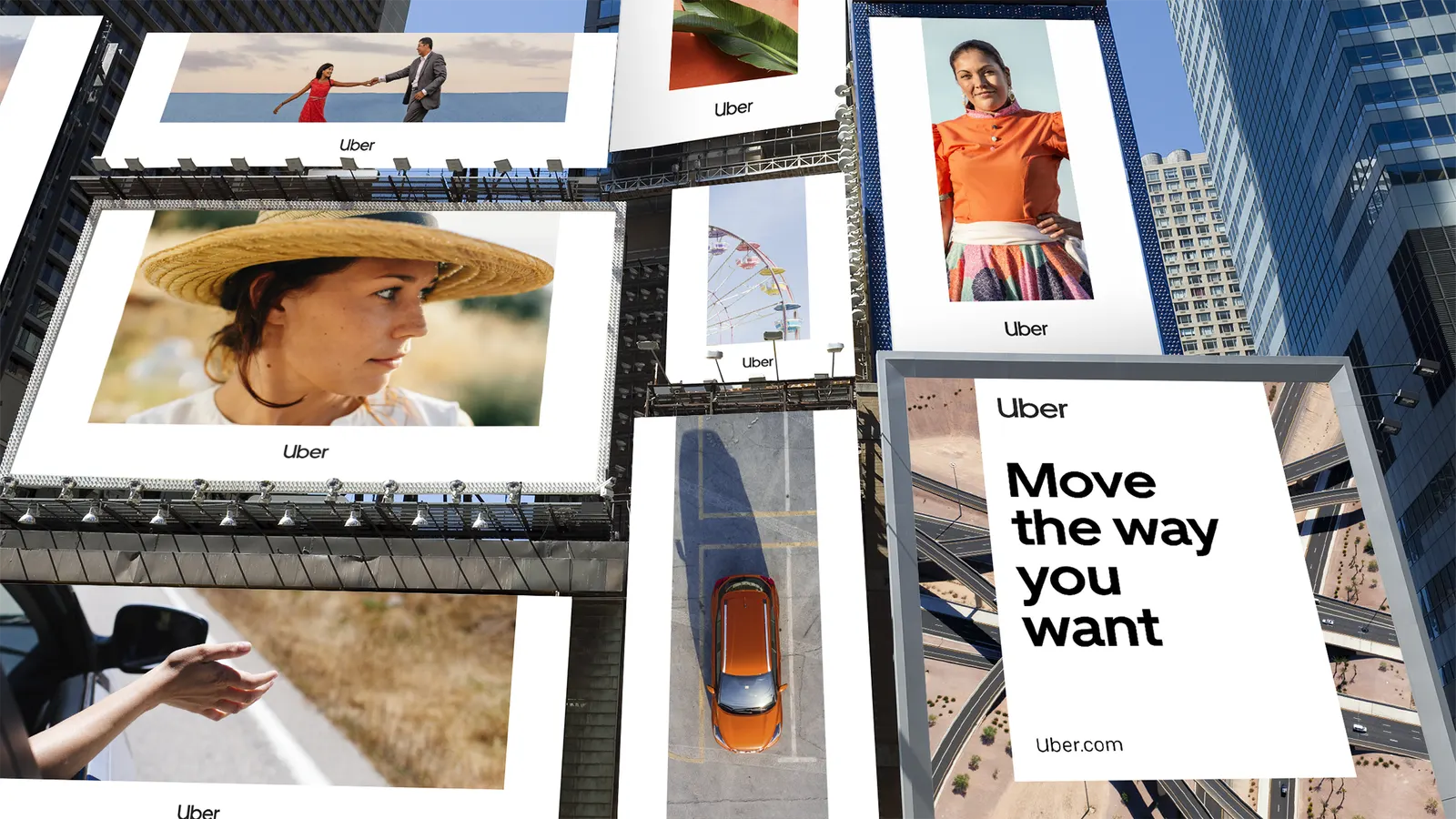

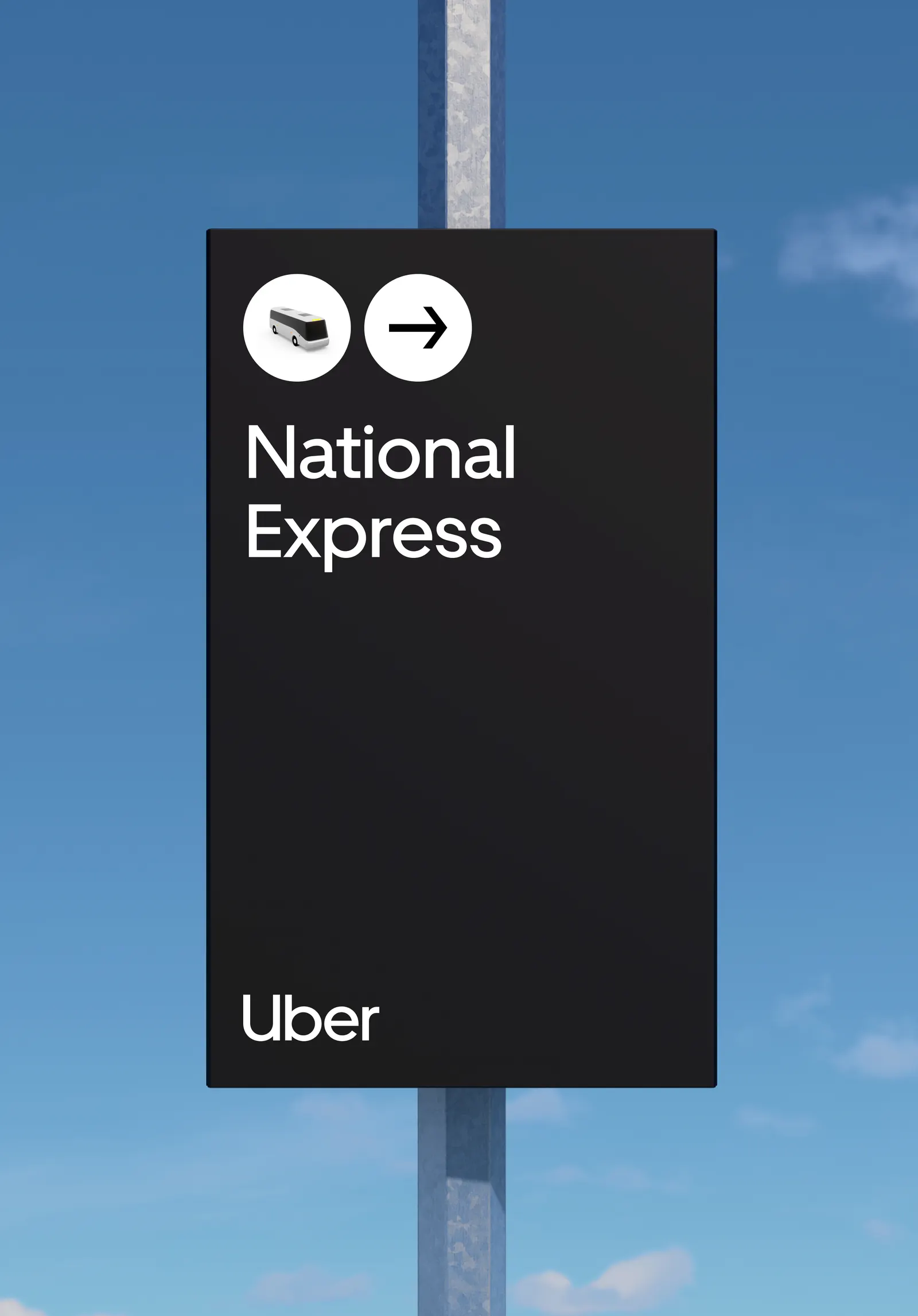
Images and video from wolffolins.com, by Wolff Olins.