The Brand Monograph
GSK — Brand Architecture and more
by Wolff Olins
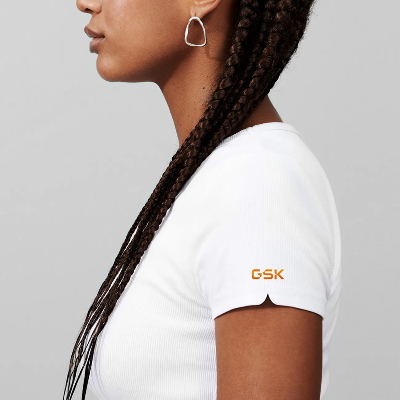
Few rebrands hang so much meaning on a single shape. For GSK, Wolff Olins created a logo, the "signal," that always points ahead, a fitting gesture for a company that has spent two decades reinventing itself.
The brief came out of GSK's demerger, which began in 2020 and moved the company away from consumer healthcare to focus on biopharma. That shift called for more than a new mark. Wolff Olins worked with GSK to align its purpose, strategy, voice, and culture around the line "Get ahead of disease together." The identity makes that idea visible: forward-facing, adaptable, and grounded in striking bioscientific imagery.
What we admire is how well the system holds together. Curved forms borrow from the human immune system, giving the identity a living, responsive quality that carries across digital, social, and physical spaces. Typography from F37 Foundry and development by Neverbland help bring it to life in practice. After launching in June 2022, the new brand drew 247,000 social mentions in its first month, with 97% of the sentiment positive.


Images and video from wolffolins.com, by Wolff Olins.