The Brand Monograph
Lloyds — Brand Strategy and more
by Wolff Olins
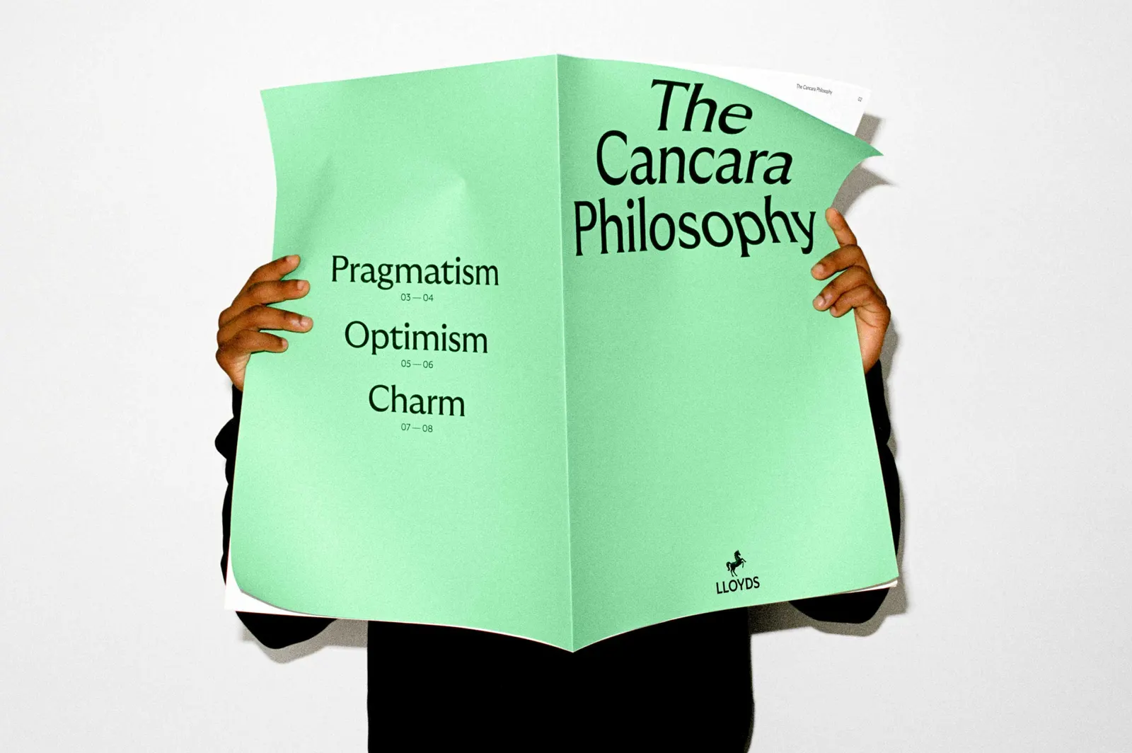
Most bank rebrands start with a logo. Wolff Olins started with a horse's name. The studio gave Lloyds' black horse its original name, Cancara, and built a design philosophy around it, so every part of the brand feels unmistakably Lloyds.
The brief came as the bank, nearly 330 years old, set out to become digital-first and bring its full range of products together around what customers need. Wolff Olins built on the existing purpose of Helping Britain Prosper and found a more human angle: nearly everyone has a step forward to take, but some feel stuck. That became the positioning "Lloyds moves everyone forward," which works across consumer and business banking and gives product teams a practical prompt. The studio treated the brand as an operating system, something that keeps evolving rather than a fixed set of rules.
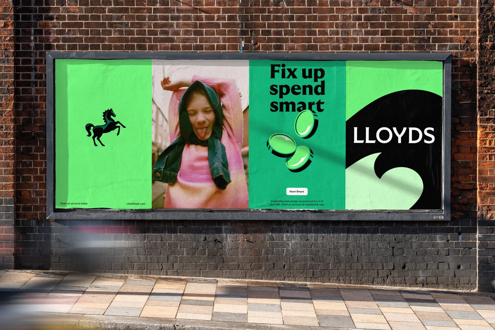
The craft shows in the details. Wolff Olins consulted an equine expert to refine the horse's stylized anatomy, then let it move, with motion behaviors drawn from classic horse gaits. Working with Grilli Type, the studio customized GT Ultra, drawing on early 20th century British typefaces and adapting it dynamically through weight and shape. Lloyds green is richer and more confident, nodding to the British landscape. The tone of voice is grounded, and the photography, shot with Kintzing and Sophie Green, reflects contemporary culture. The relaunched app brings it all together.

Images and video from wolffolins.com, by Wolff Olins.