 The Brand Monograph
Amazon
by Koto
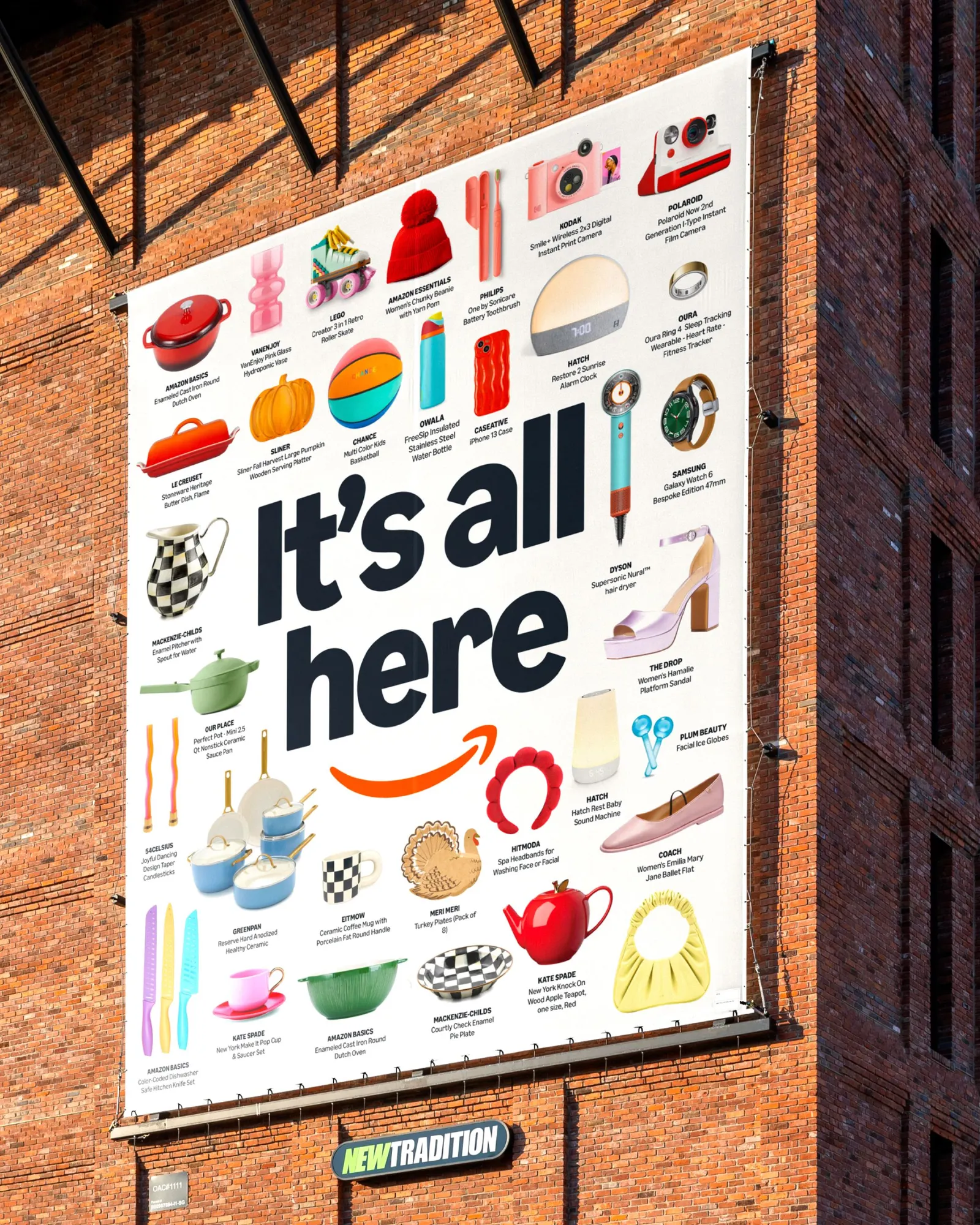
Koto gave Amazon its first logo update in more than 20 years, and the most telling change is a subtle one: a deeper, more emphatic smile that moves the emphasis away from the arrow and toward delight.
The brief, delivered with Amazon XCM over 18 months, was to pull a sprawling brand back together. Across 15 markets and more than 50 sub-brands, Koto built a single system that links every line of business to its parent while leaving room for different audiences and teams to make it their own.
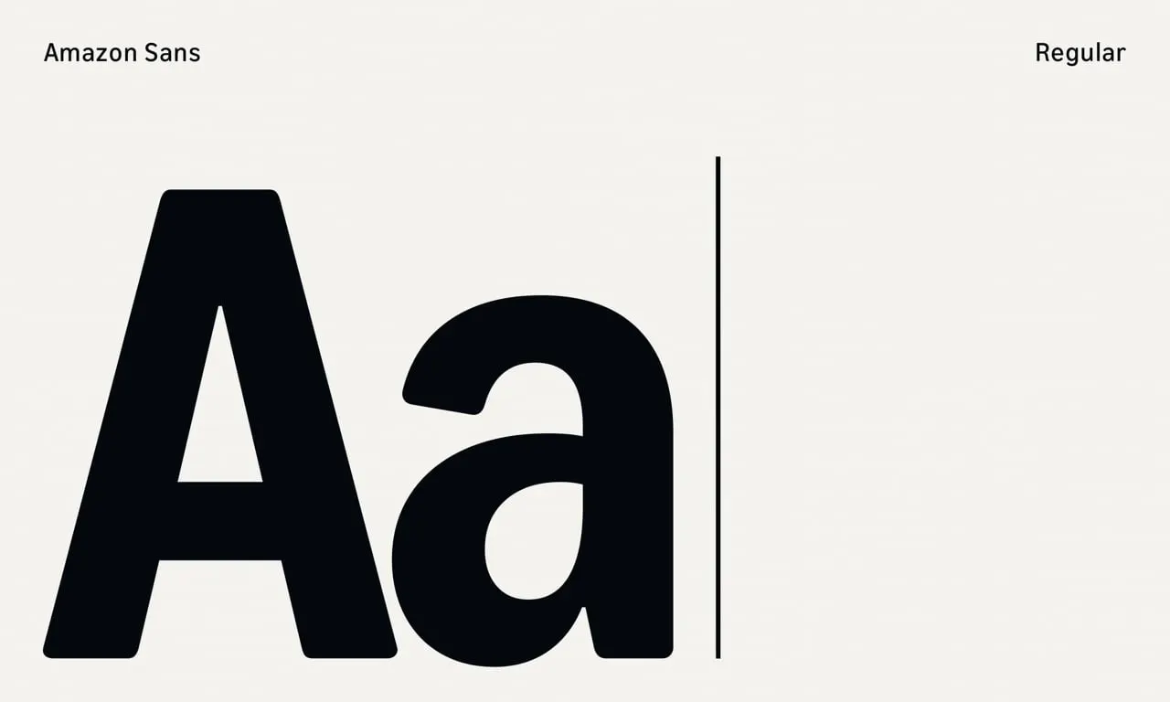
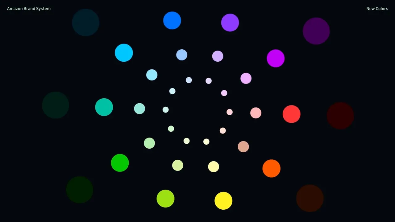
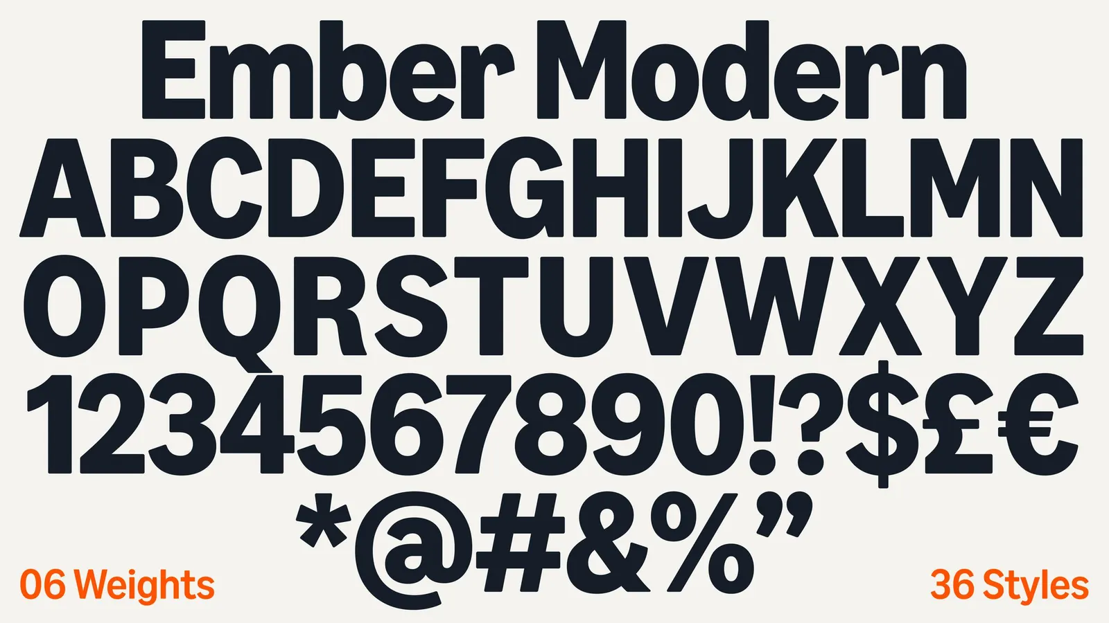
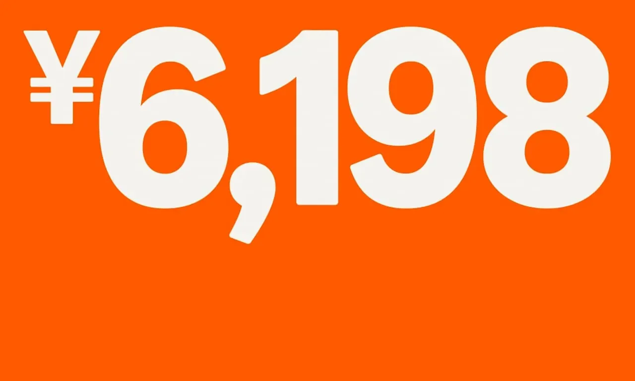
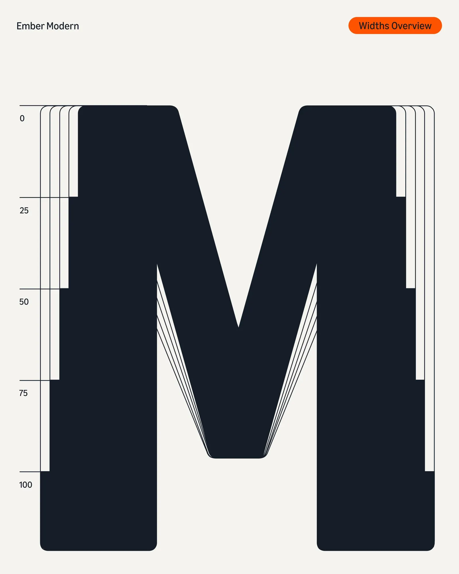
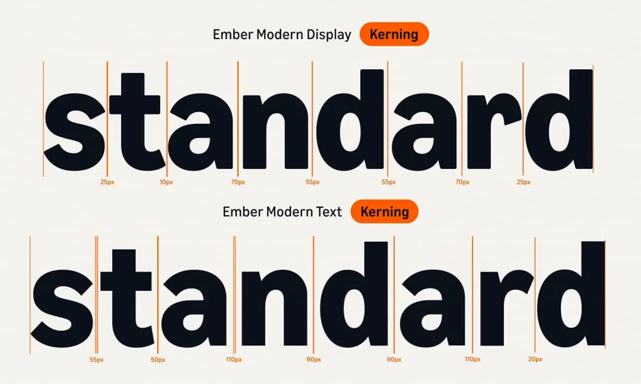
The craft is in the details. The studio redrew the original letterforms and extended them into a custom alphabet, Amazon Logo Sans, so any sub-brand logo can be built in seconds. The many oranges became one Smile Orange, Prime moved to a more saturated, digital-first blue, and each sub-brand received a bolder, more accessible palette. Ember, originally made for Kindle screens, evolved with NaN into Ember Modern, a typeface that can be loud in campaigns and quiet in product interfaces, with support for 364 languages. A new icon system adds the same order and a touch of "charm and disarm" across the ecosystem.












Images and video from koto.com, by Koto.



