The Brand Monograph
by Koto
Koto's work for WhatsApp makes a quietly radical argument: the world's most-used messaging app isn't a social network at all. It's a utility, and the studio gave that idea a visual language that feels as plain-spoken and trustworthy as the product itself.
The brief came from a platform with more than 2 billion users that wanted to be seen differently, and to close the gap between its private in-app experience and its public marketing. Koto built a universal design system around the idea of Forward. Together., positioning WhatsApp as a tool for intimate connection and social change rather than a feed to scroll. Accessibility shaped the thinking from the start, so the system works across age, location, bandwidth, and literacy.
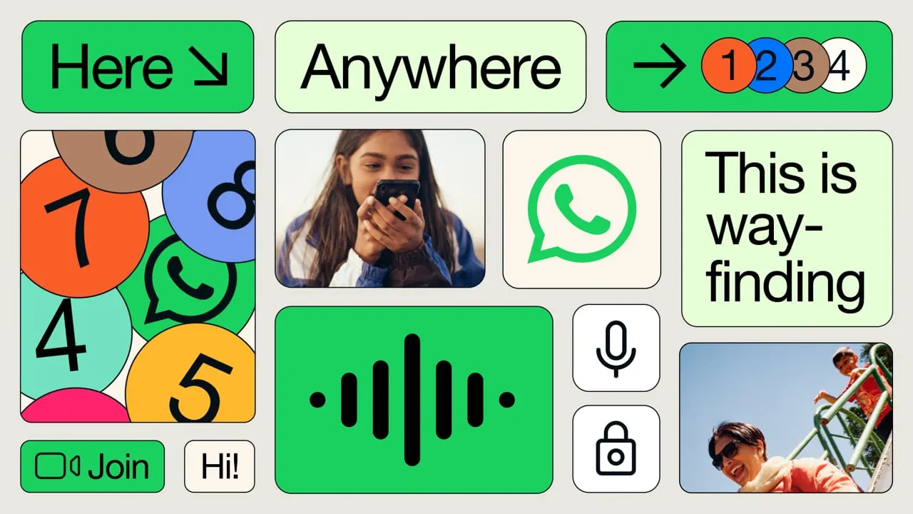
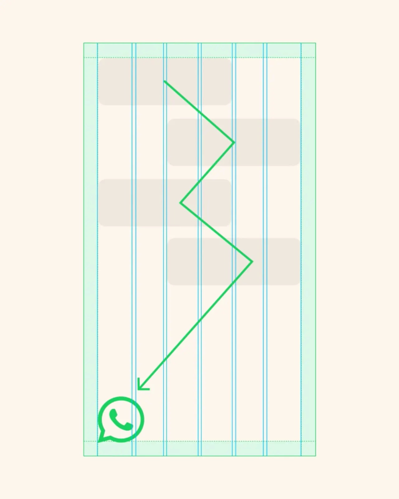
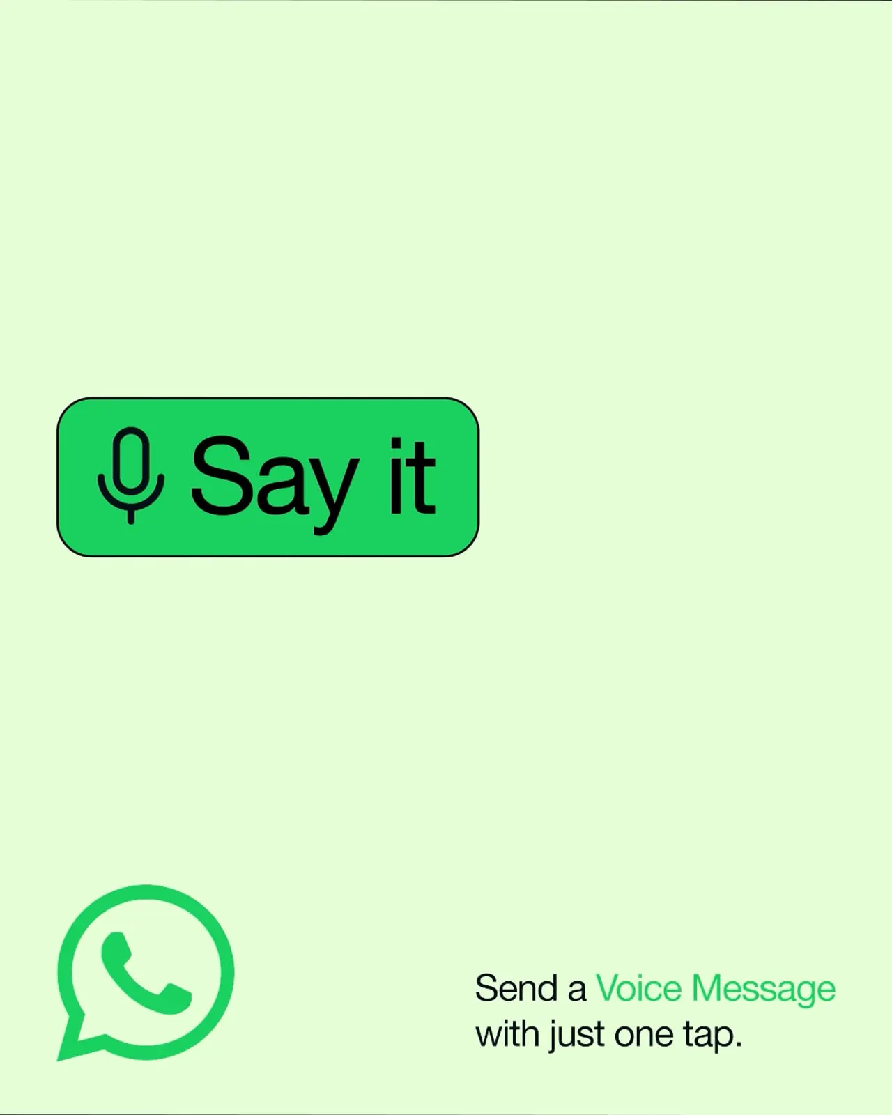
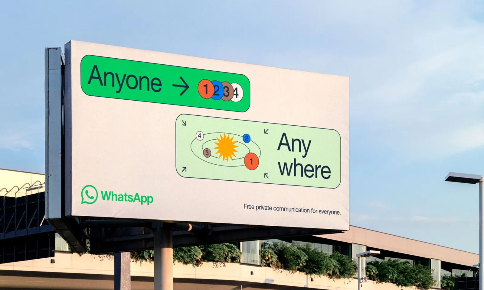
The craft is in the details. The palette is product-led, drawing on the familiar WhatsApp green and its dark mode variations so that campaigns feel like extensions of the app. Modular graphic blocks borrow the back-and-forth rhythm of a chat, turning the cadence of conversation into flexible layouts. The same wayfinding and storytelling pieces stretch from one-to-one messaging to global campaigns, across digital and physical spaces, and adapt to local contexts without losing coherence. It's a restrained, scalable system that keeps WhatsApp's minimalist clarity intact.
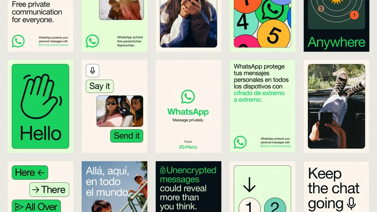
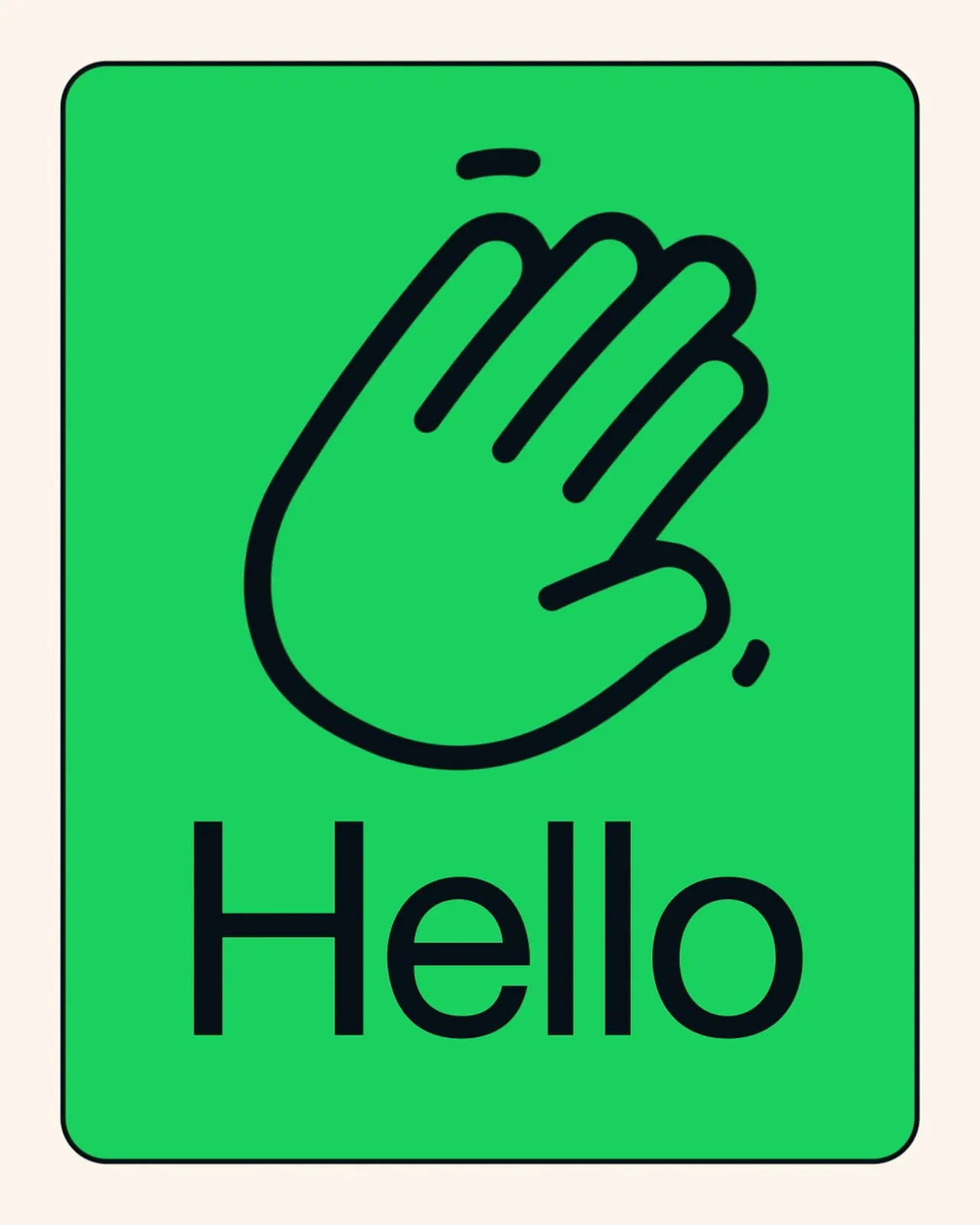



Images and video from koto.com, by Koto.