The Brand Monograph
andSons brand identity by Base Design
↗andSons stands out because it ignores the visual language chocolate usually borrows from Europe. Base Design, with designers Arno Baudin, Gabriela Carnabuci, Gina Shin, and Min Lew, built the identity and packaging for a Los Angeles chocolatier run by brothers Marc and Phil Covitz, working with chocolatier Kriss Harvey.
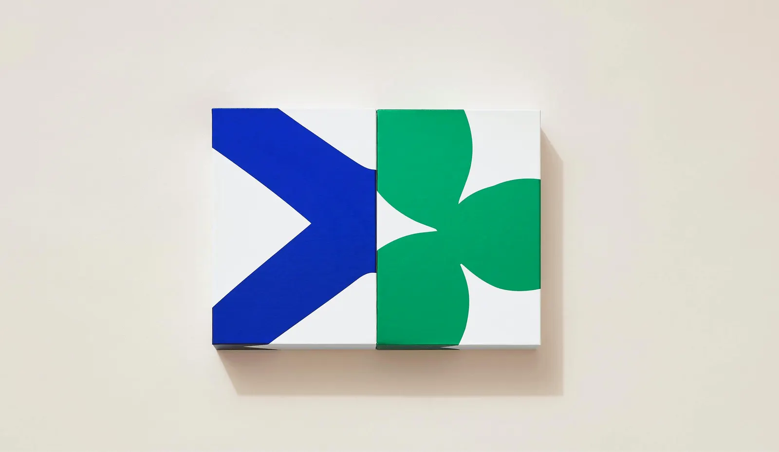
The brief was to launch a new brand out of a family confectionery shop and make its chocolates worth giving. The studio's answer is rooted in California: bright color, hand-cut illustrations, and a refined typeface that nods to chocolate-making tradition. Everything sits on white, leaving room for customization. The box swaps the usual hinged lid for two horizontal sections that slide apart, so opening it becomes part of the gift.
Why it works
The white backgrounds do a lot of quiet work. They act like a gallery wall, letting the color and cutout shapes read as art objects, which suits a product people keep and display. The classical typeface adds credibility, so the playfulness never tips into novelty. And the sliding box turns the unwrapping into a small ritual. In a category dominated by dark browns and metallic accents, this identity is recognizable at a glance and still feels personal.
Logo

Applications




Images and video from basedesign.com, by Base Design.