The Brand Monograph
Château de Grandson brand identity by Base Design
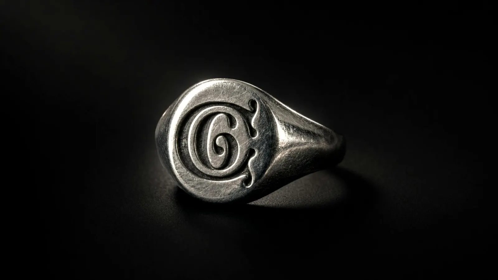
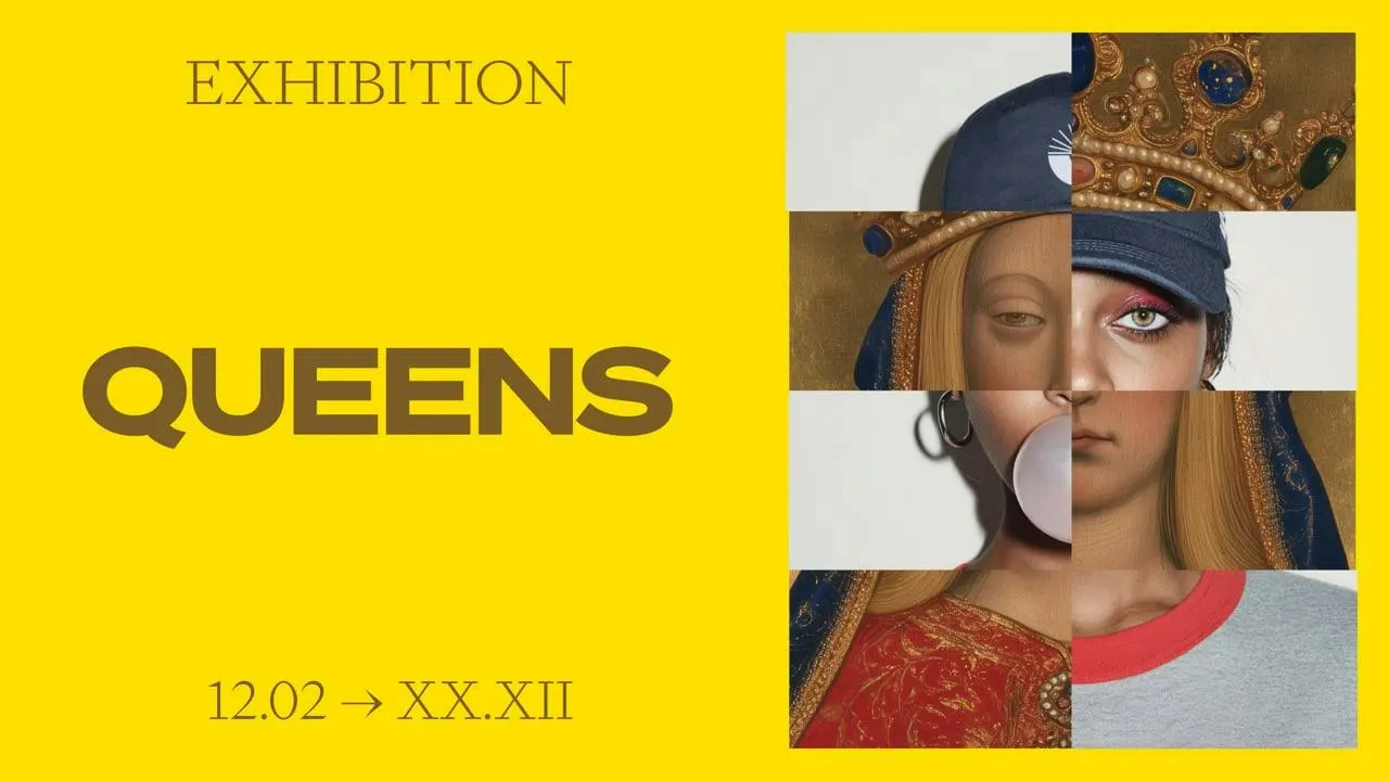
↗Base Design's identity for Château de Grandson treats a medieval fortress as something that can still pick an argument. The castle above Lake Neuchâtel has been a stronghold, a prison, a hospital, and a tobacco factory, and it reopened in 2026 as a rethought museum after fifteen years of restoration.
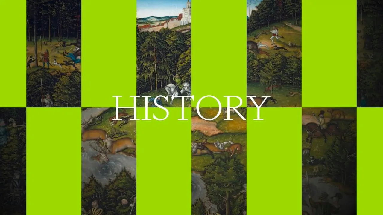
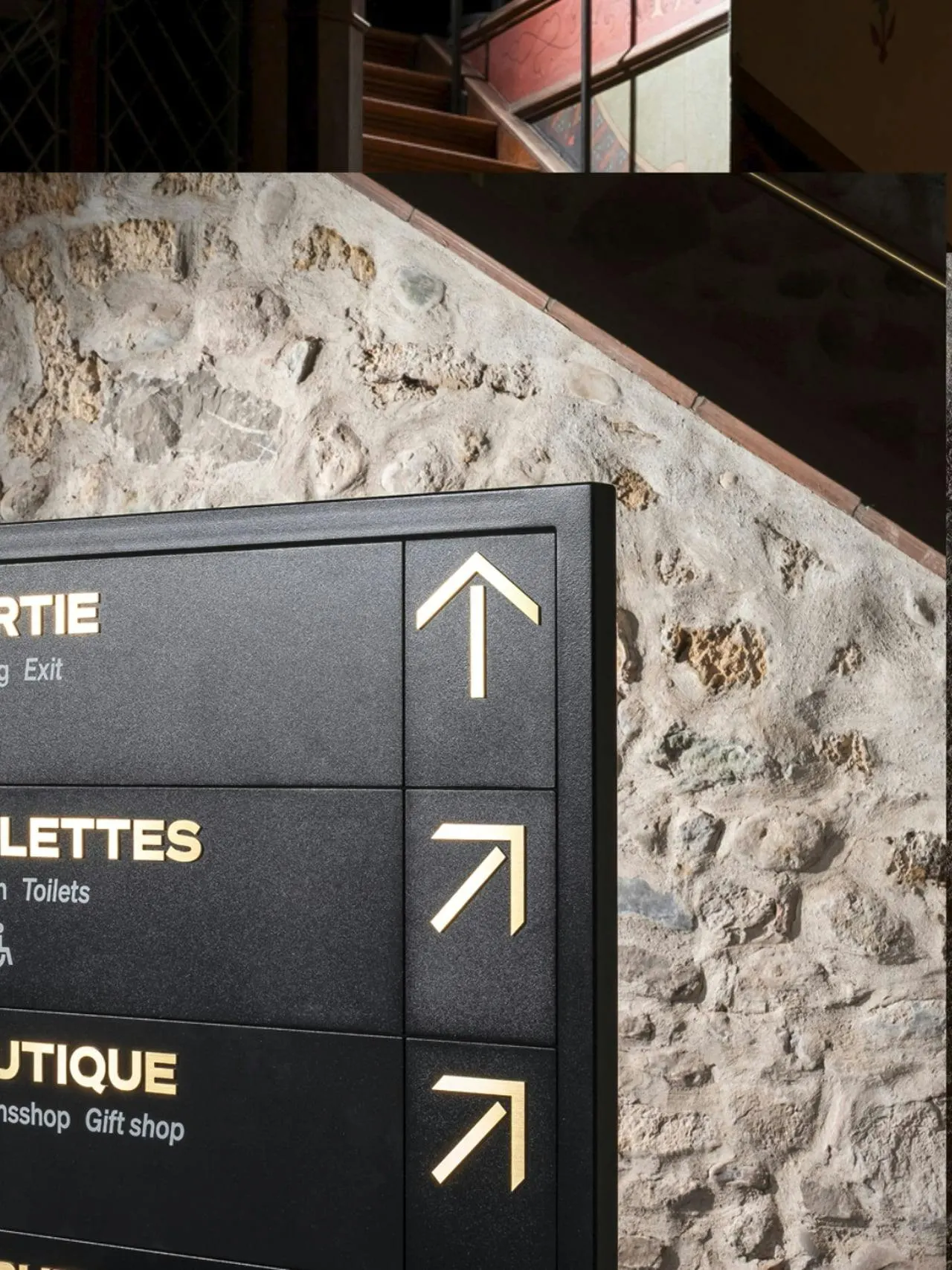
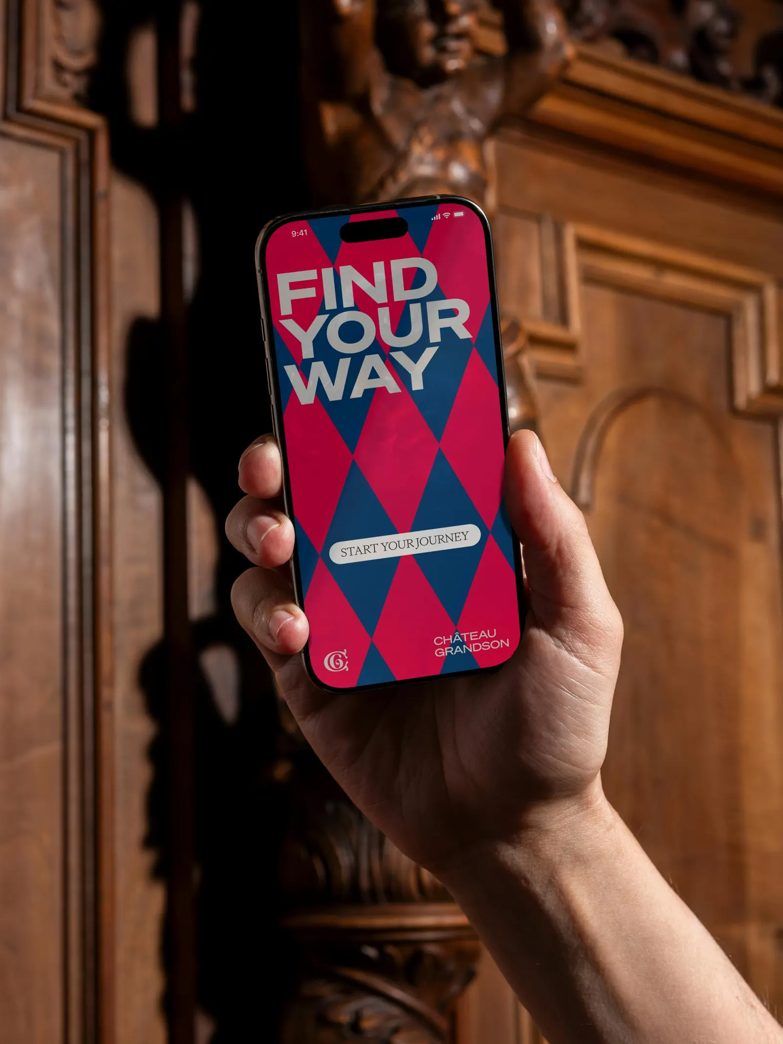
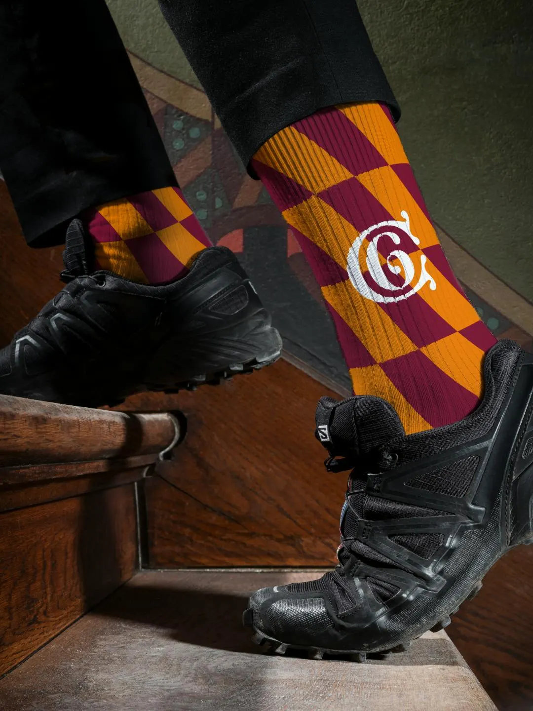
The brief called for a identity that could hold a historian, a child, and a visitor who came for the view, without going stiff. Base Design borrowed heraldry's blunt graphic logic and pushed it through heavy type, hard contrasts, and sudden jumps in scale. Deliberate anachronisms, like a skateboard in a medieval hall, supply the humor. The system runs across signage, exhibitions, digital, and social, with Luc Vega and Vincent Sauvaire on design, Federal.li on motion, and Federal Studio on film.
Why it works
Heraldry was already a visual language built to be read fast and from a distance, so it is an honest source for a castle and a practical one for signs and screens. Extreme scale and strong contrast give the museum a voice that carries to a teenager mid-scroll as well as a reader of wall texts. The humor is staged with discipline, which tells visitors the place is confident enough to laugh at itself, and that sets it apart from the hushed tone of most heritage institutions.
Applications
Typography
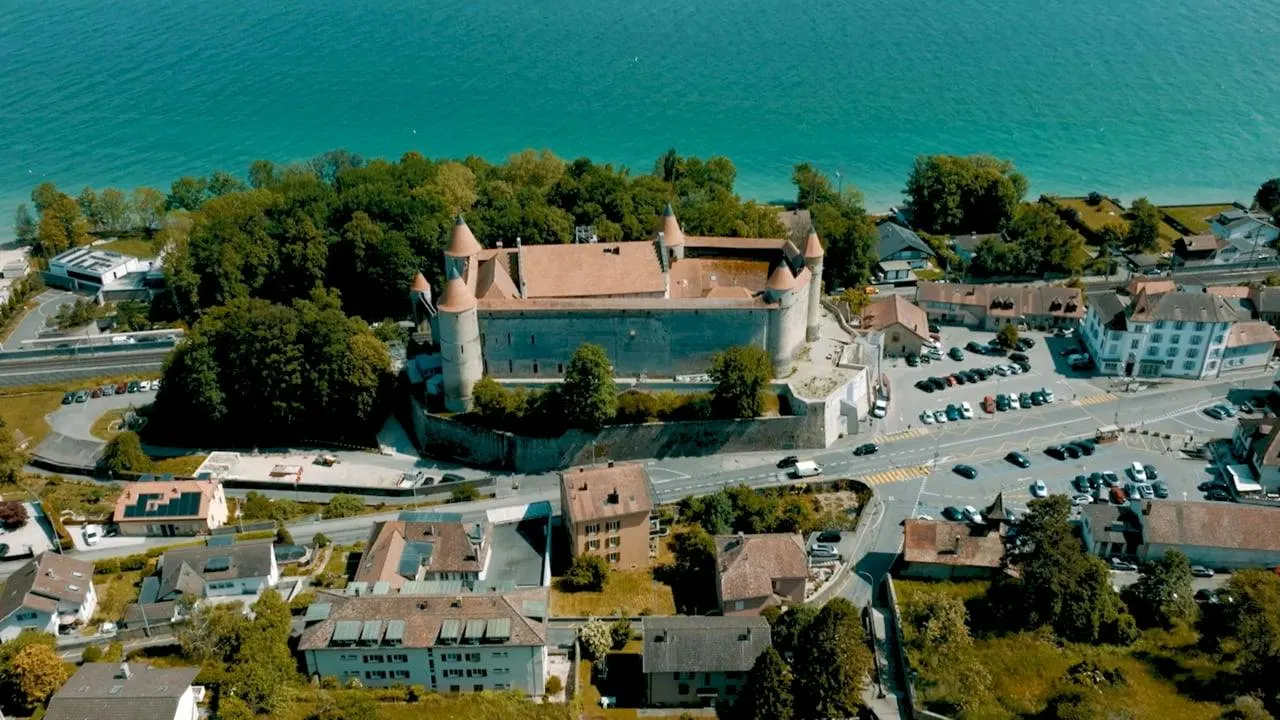
Images and video from basedesign.com, by Base Design.