The Brand Monograph
Grand Palais brand identity by Base Design
↗Few institutions can carry a name as well as the Grand Palais, and Base Design built an entire identity on that fact. The studio was brought in for the building's June 2025 reopening, after four years of renovation, with a brief to give a 1900 landmark a voice that felt current rather than commemorative.
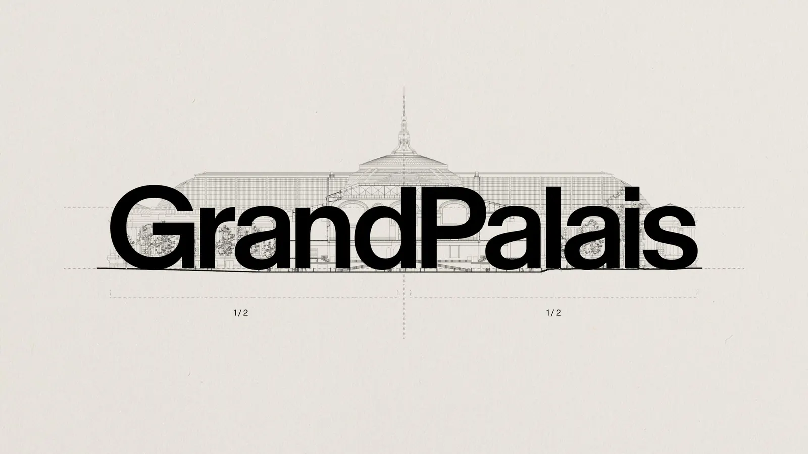
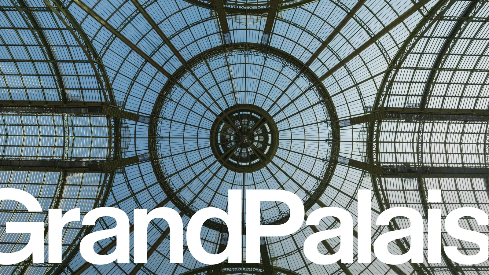
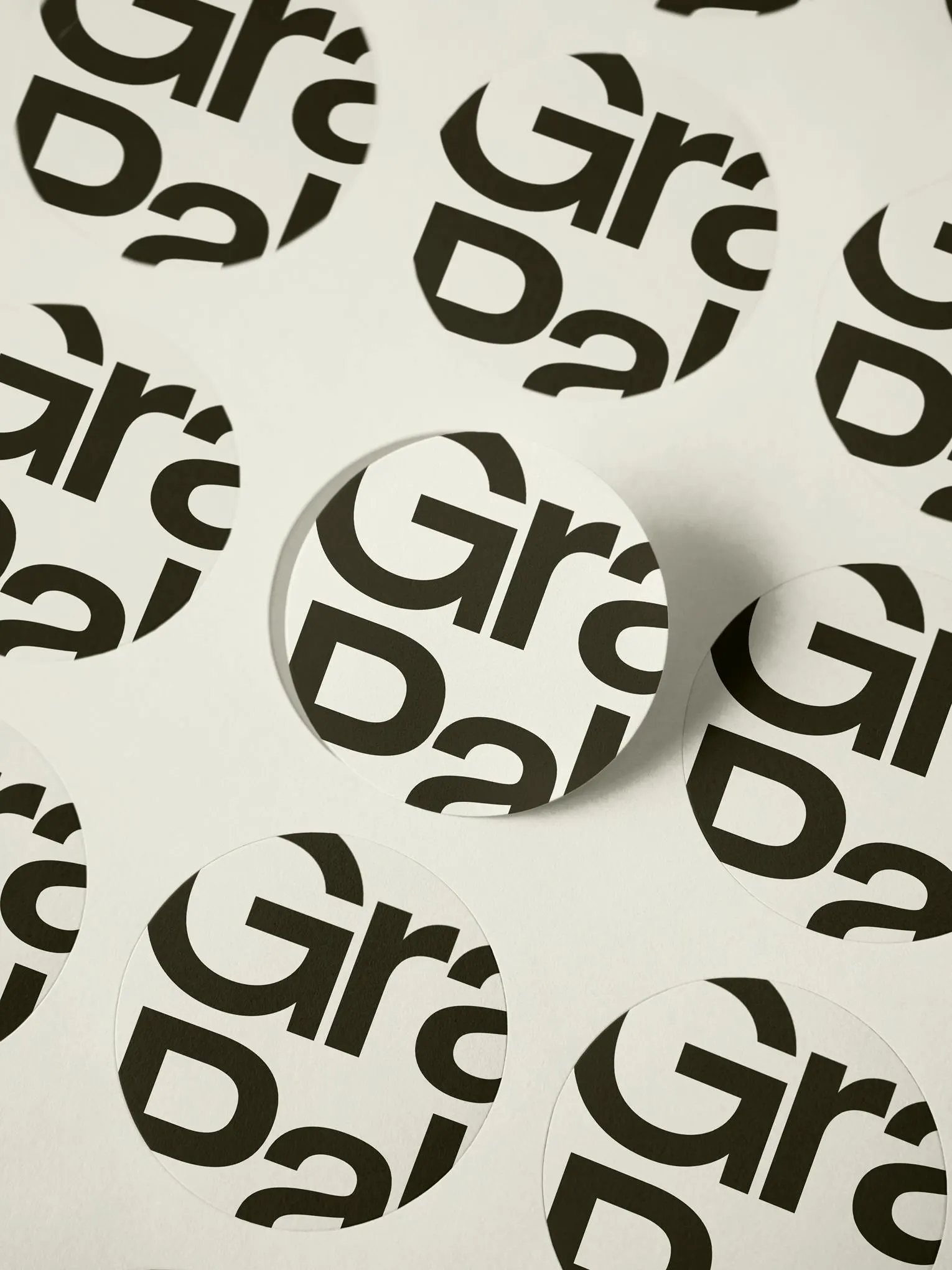
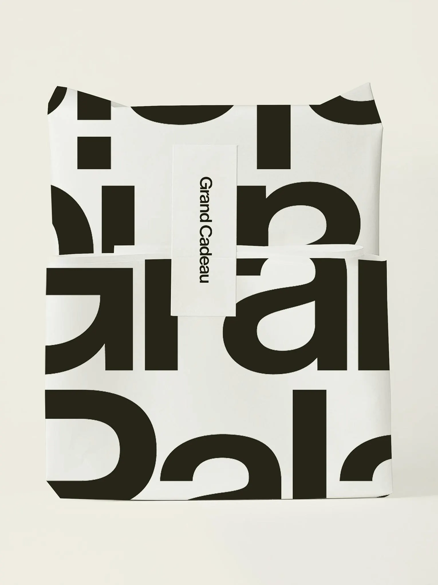
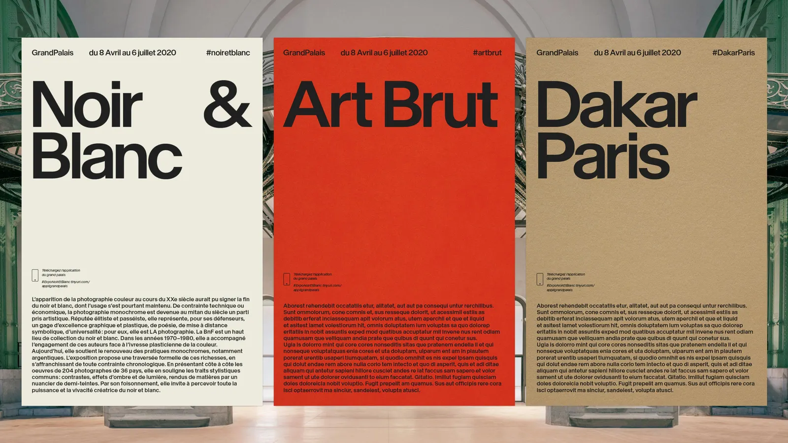
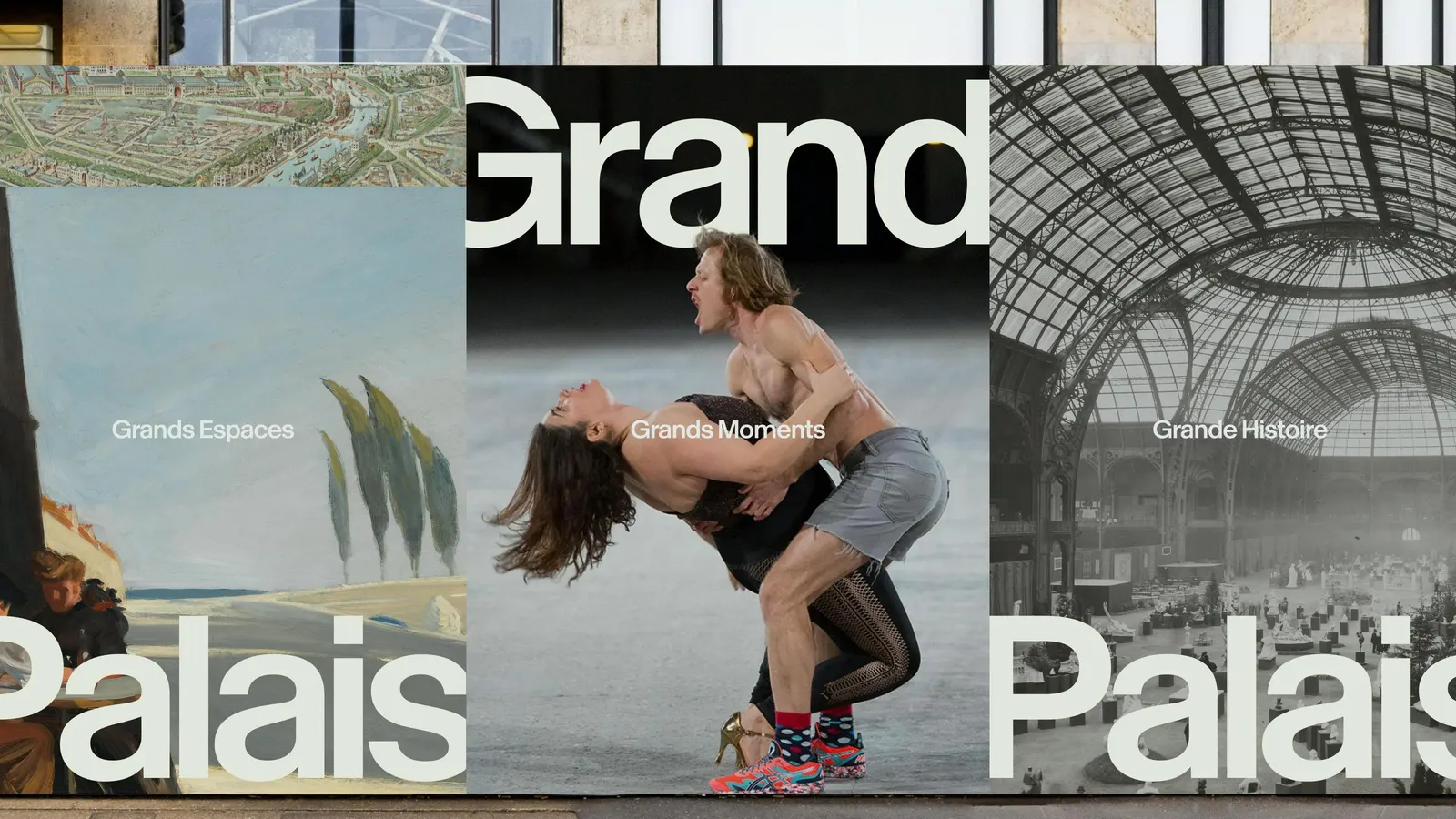
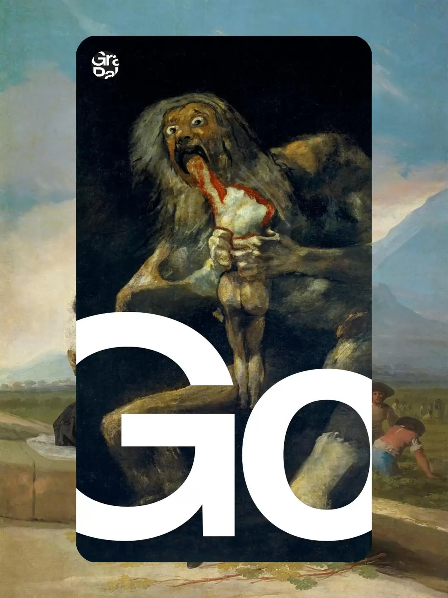
The logo joins the two words of the name in a way that echoes the façade. Headlines, set in oversized type developed with Newglyph, push past the edges of the layout, while elastic grids and animated transitions, shaped by motion designers Antoine Barras and Arthur Dubois, carry that scale across digital, social, and print. The word "grand" also becomes a naming device for spaces and services, from the café to gifts, so one system can cover a program that runs from fashion shows to art fairs. Léa Wolf, Sander Vermeulen, and Thomas Leon led the design, with strategy from Gaston Lafond.
Why it works
Cultural institutions often default to restraint, a quiet wordmark that lets the program speak. Here the name does the work, and the identity commits to it. Type that spills past the frame gives the building's scale a graphic equivalent, which suits an audience that comes for spectacle. Because the naming device is a single word rather than a fixed look, it can move between a runway and a café without spawning sub-brands. Looking forward instead of leaning on nostalgia also sets it apart from heritage venues.
Logo
Applications
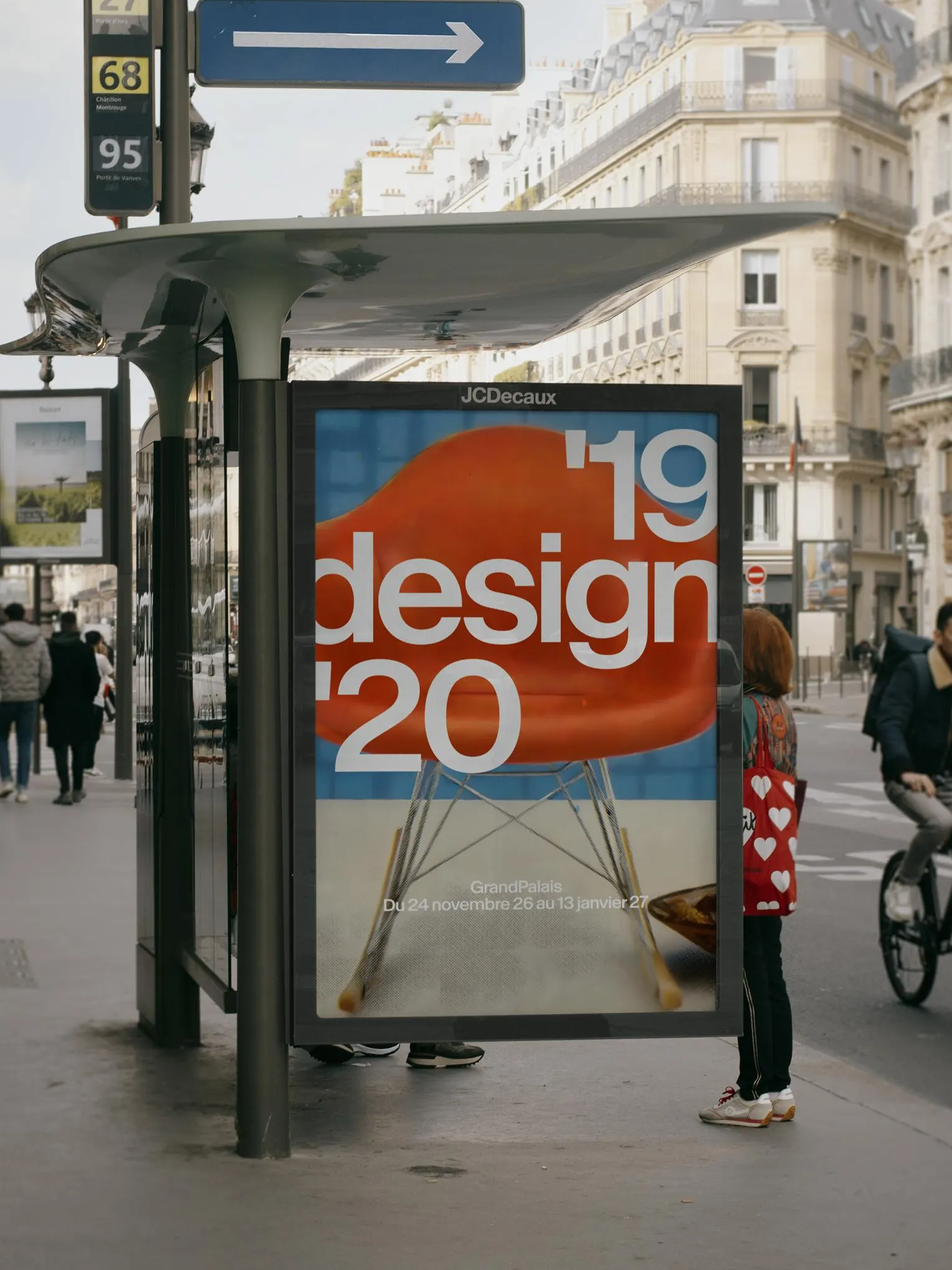
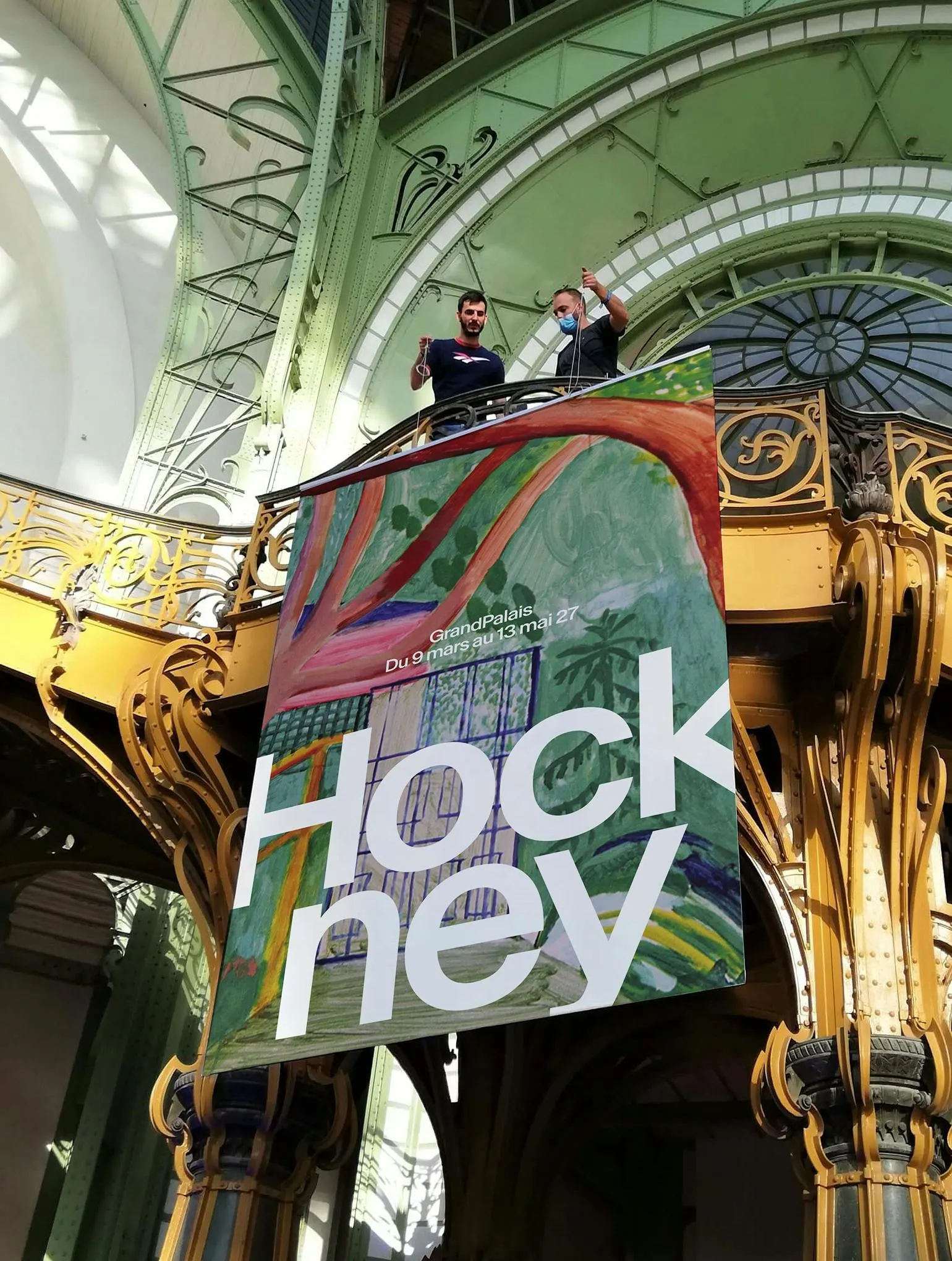
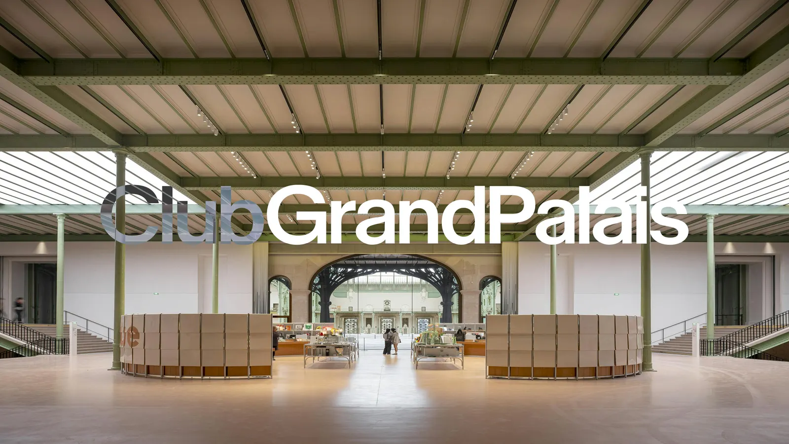
Images and video from basedesign.com, by Base Design.