 The Brand Monograph
Anson Calder brand identity by Collins
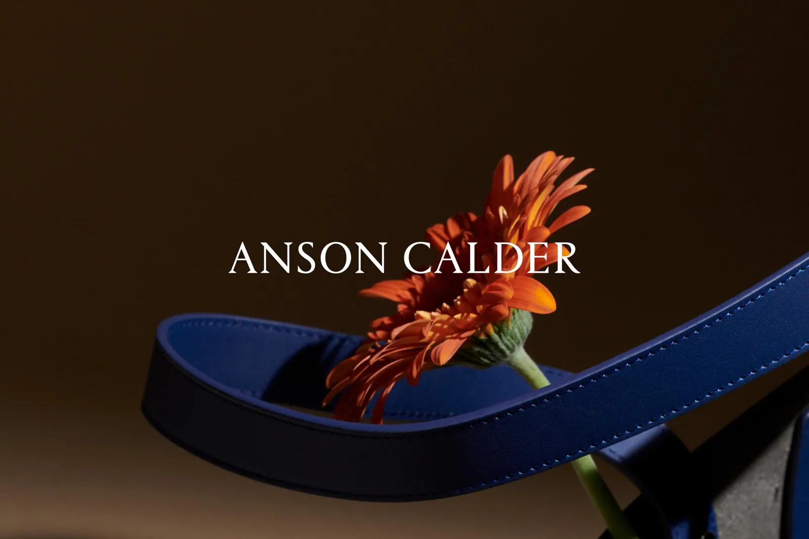
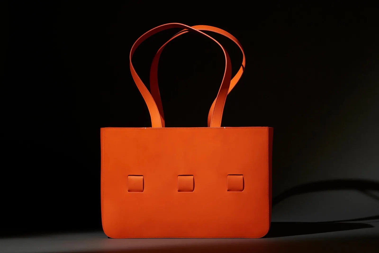
↗Anson Calder's wallets and bags were already well made. What stands out in Collins' work is how little the studio had to invent and how much it chose to sharpen. The brand's minimalism, full-grain French calfskin, and microfiber linings become the substance of its luxury claim rather than a backdrop to it.
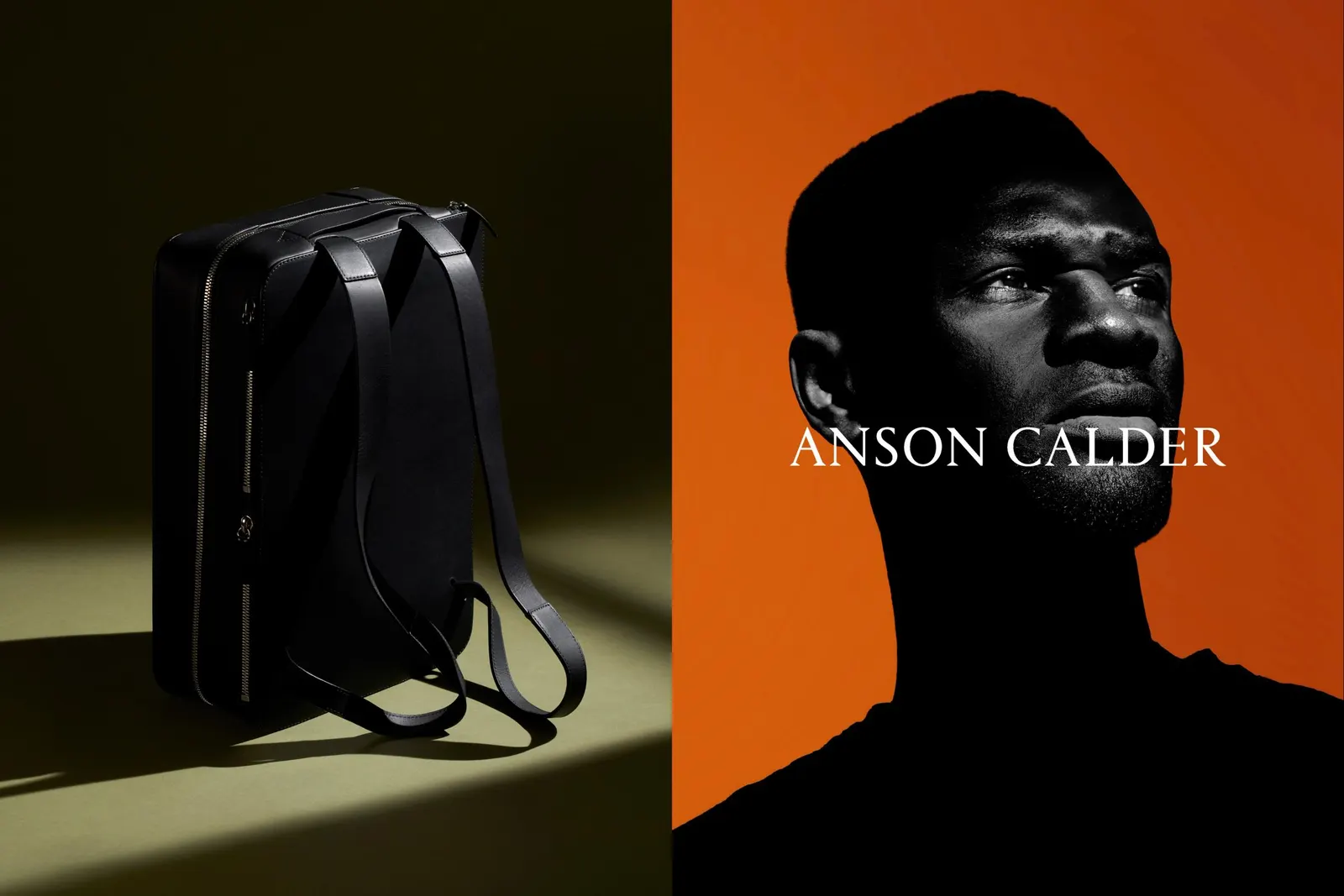
The brief grew out of a market shift. Affordable-luxury names like Coach and Michael Kors were winning a growing pool of affluent buyers, and Anson Calder wanted to stand apart and command higher prices. Collins tightened the look across packaging, web, and marketing so every touchpoint felt equally modern and restrained. It then paired that look with stories about craftsmanship, values, ethical sourcing, and leather built to last. Lucas Gouvêa and Mari Juliano contributed the photography. The payoff was a full accessories line, shelf space at Nordstrom and Neiman Marcus, and room to raise prices.
Why it works
Luxury at this level rarely comes from adding more, and Collins seems to understand that. Minimalism was already Anson Calder's signature, so the smart move was applying it with discipline from the box to the website, where consistency reads as confidence. Next to rivals that trade on recognizable logos, a quiet, uniform system signals a brand with nothing to prove. Grounding the story in materials and longevity also gives a higher price a reason buyers can verify in hand, which makes the repositioning credible rather than merely aspirational.
Applications
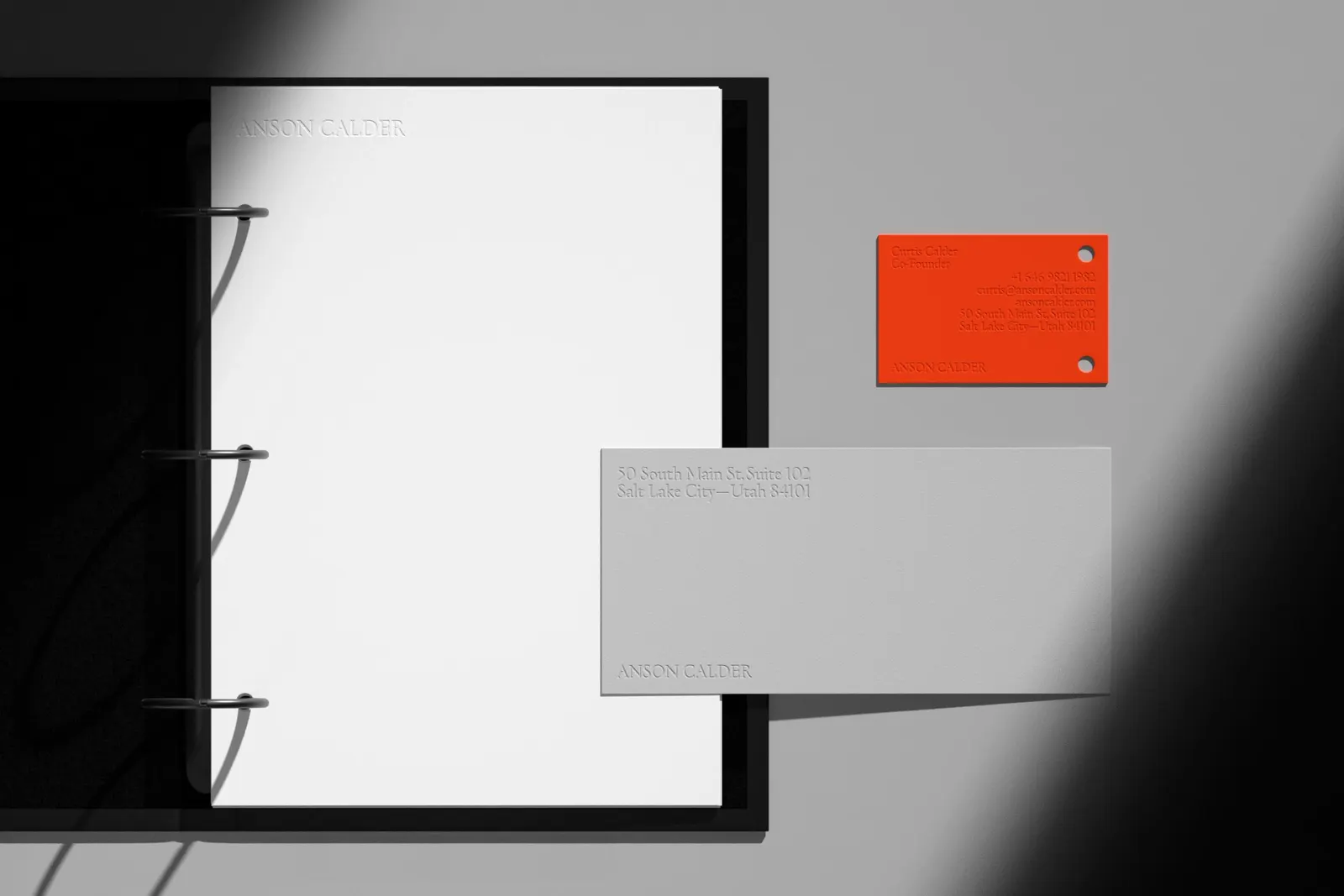
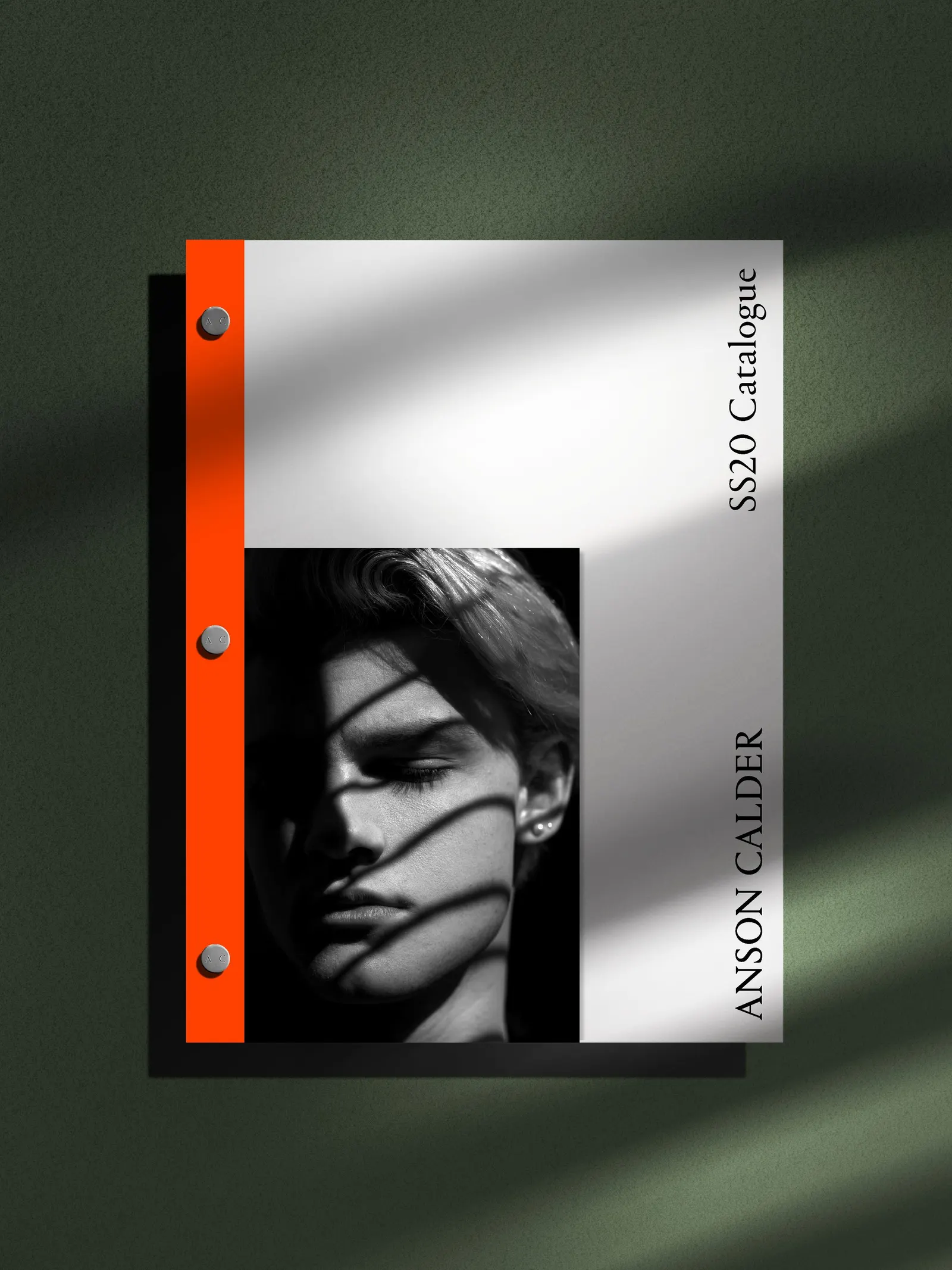
Images and video from wearecollins.com, by Collins.


