 The Brand Monograph
Bellerose brand identity by Base Design
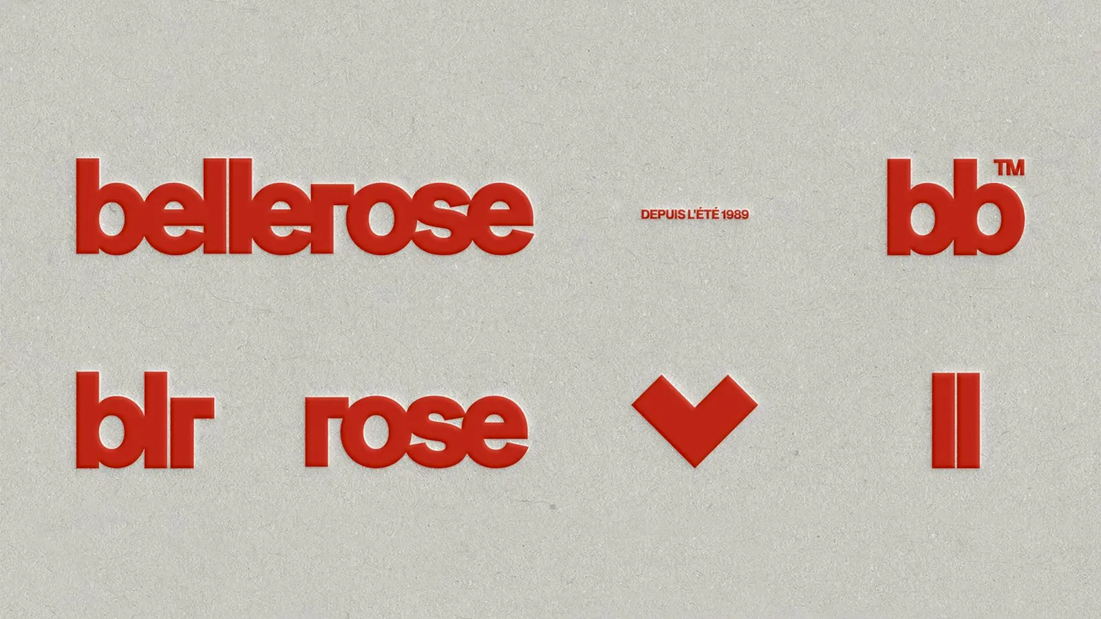
↗Bellerose is a case of a brand changing its look because its direction changed, and Base Design treated it as a full rebuild rather than a restyle. The Belgian label, founded in 1989 and still run by the family, built its name on relaxed, Americana-flavored everyday clothing for the whole household, sold alongside unexpected objects like camping knives. When Derek Van Heurck became Creative Director, he brought a more contemporary stance, and the studio was called in to give it shape.
Working with Bellerose's leadership, Base started at the foundations: vision and storytelling first, visual identity after. Design by Jeanne Viviès, Léa Wolf, and Thomas Byttebier, with strategy from Coline Leclère, moved the brand away from 70s nostalgia toward something more editorial and architectural, with a bolder European attitude. Delphine Volkaert handled development, and Lola Philippart and Margaux Doucet handled production. The result reads as one cohesive system rather than a set of updates.
Why it works
Nostalgia is the easy default for a heritage label with an American-inspired past, and it is also what makes so many family clothing brands look alike. An editorial, architectural direction gives Bellerose structure and a point of view closer to fashion than to workwear pastiche, which suits a label that dresses parents as seriously as it dresses children. Building the identity on a clear vision first also means it can stretch across the private label and the other brands the store carries without feeling arbitrary.
Logo

Applications


Images and video from basedesign.com, by Base Design.


