The Brand Monograph
Rooster Beers brand identity by Base Design
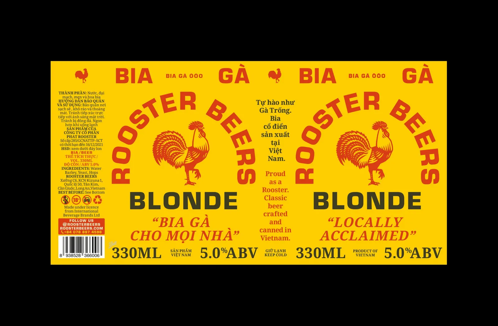
↗Base Design's Ho Chi Minh City studio, BaseSGN, gave a brewery with an expat-sounding name an identity that reads as Vietnamese before anyone takes a sip. Phat Rooster Ales became Rooster Beers, losing a word and keeping its mascot. The brief was to pull craft out of air-conditioned bars and make it feel classic and unfussy, in a market of easy lagers on one side and polished imports on the other.
The palette of red and mustard yellow comes from what Saigon already looks like: delivery bikes, street signage, and bia hơi joints. The voice does the rest. A rooster's crow is written out in Vietnamese on coasters, and a delivery team rides branded bikes in matching workwear. Mark Bain, Pedro Pereira, and Ruby Chau led the design, with Ruby also illustrating. Lý Xuân Lợi and Wing Chan handled photography, and Tung Dinh created the 3D work.
Why it works
The restraint is what makes it smart. Keeping the rooster holds on to the brewery's existing character, while dropping one word changes its tone. Colors pulled from the street make the beer look like it belongs on the block, something imported craft can't fake. The humor and the Vietnamese-language voice show exactly who the brand is talking to. The delivery team adds a layer most beer identities lack: the brand moves through the city, so people meet it in daily life rather than only on a shelf.
Logo

Applications



Images and video from basedesign.com, by Base Design.