 The Brand Monograph
QoQa brand identity by Base Design
↗Base Design's QoQa rebrand stands out for how much personality it keeps in play. The Swiss daily-deals platform has been running for more than 18 years and has spread into 11 brand universes, including Qwine, Qsport, Qhome, and Qids, so the brief was less about inventing a character than about recovering the one it started with.
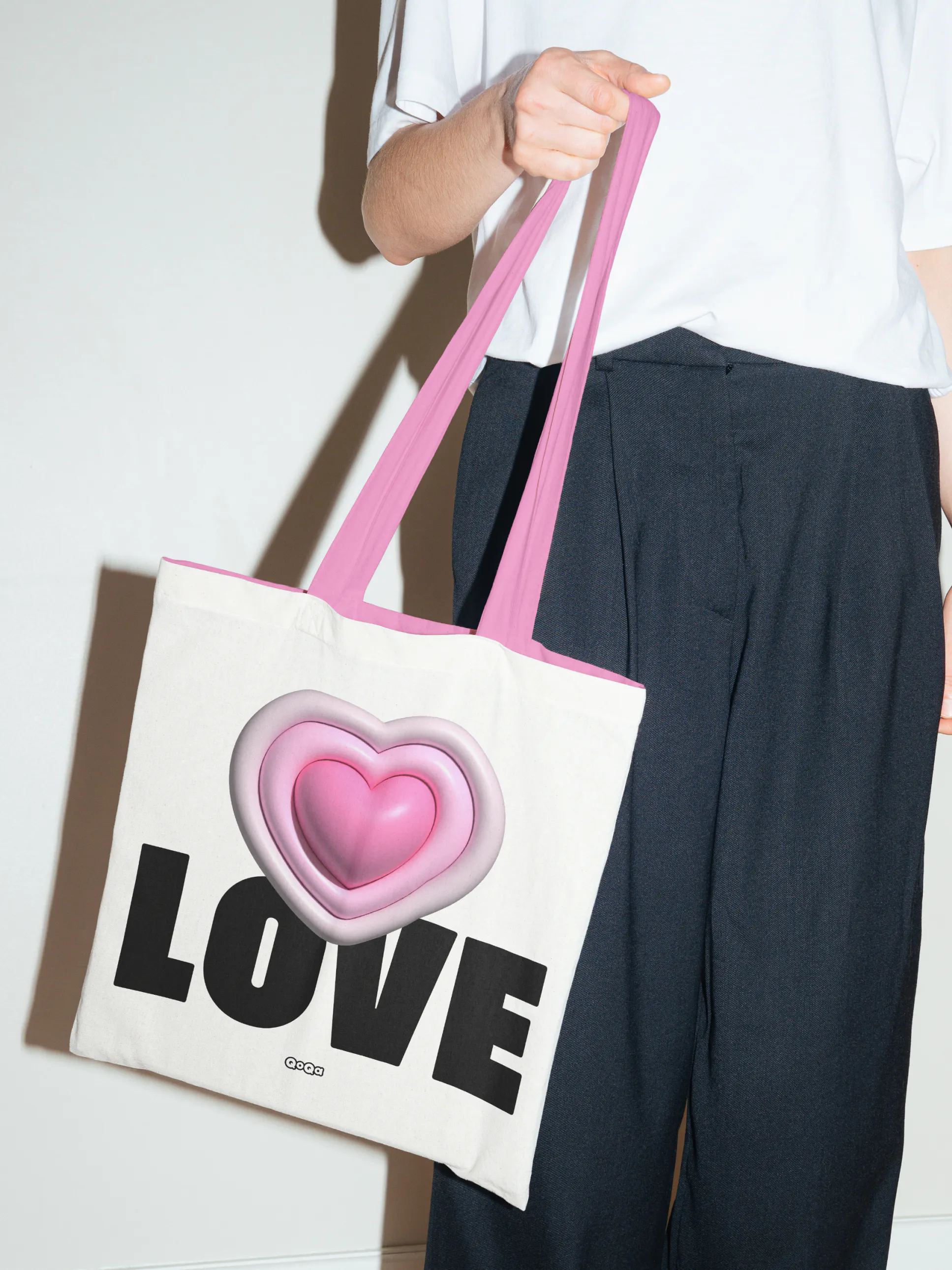
The studio answered with a new logo, a custom typeface developed with typographer Matthieu Cortat, a palette built around generous pink, and a redrawn otter mascot that members can customize as their own avatar. Luc Vega and Vincent Sauvaire handled design, Hervé Rigal and Séverine Malant shaped the strategy, and Mirko Mamarella led motion. Together they form a system flexible enough for a growing family of sub-brands.
Why it works
Pink is a confident choice in a category that often leans on urgency red, and it makes QoQa recognizable at a glance, whichever universe a member lands in. A proprietary typeface gives all eleven worlds one shared voice, so they can differ in subject without drifting apart. The otter is the smartest move. Making the mascot something members can customize turns it from a logo accessory into a personal stake in the brand, which suits a community-driven platform far better than a fixed character would.
Logo
Applications




Images and video from basedesign.com, by Base Design.