 The Brand Monograph
Demostack brand identity by Further
↗Most software brands show you the product. Further's identity for Demostack shows you the person using it, and it does so with a pair of hands. The studio took on a category where interactive demo tools mostly competed on specs, even though the sales reps giving those demos wanted something warmer. Demostack lets teams clone their product into an editable, clickable environment, so Further started by asking what that capability feels like for the person presenting.
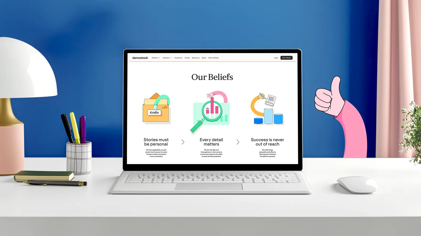
The answer is a system built around people rather than screens. Hands recur as the central motif, illustrations pair physical objects with interface elements to suggest depth, and a tinted palette marks where interaction happens. The wordmark draws on handwriting. The website and resource hub carry the idea further, and the Demostack team can now remix a growing library of assets.
Why it works
Hands are the one thing a screenshot can't show: someone in control. They give a rational category a human anchor without leaning on stock smiles. The tinted color does real work, pointing to interaction instead of decorating, which mirrors what the product sells. A wordmark rooted in handwriting separates Demostack from the neutral sans-serif logos that crowd SaaS. The modular illustration approach gives the team room to keep playing without drifting off brand.
Applications


Graphic elements


Images and video from further.group, by Further.
