The Brand Monograph
Gaia brand identity by Ragged Edge
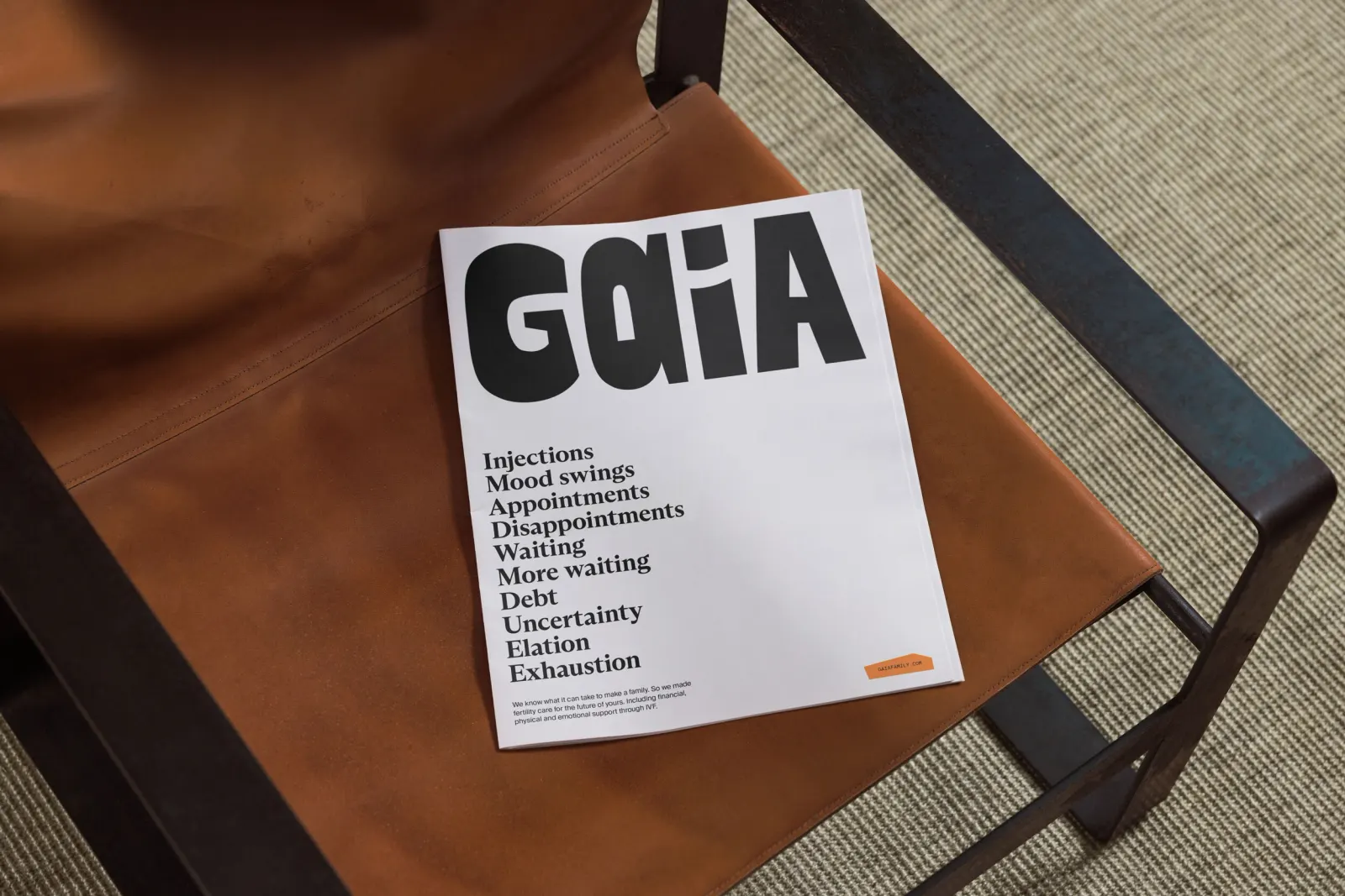
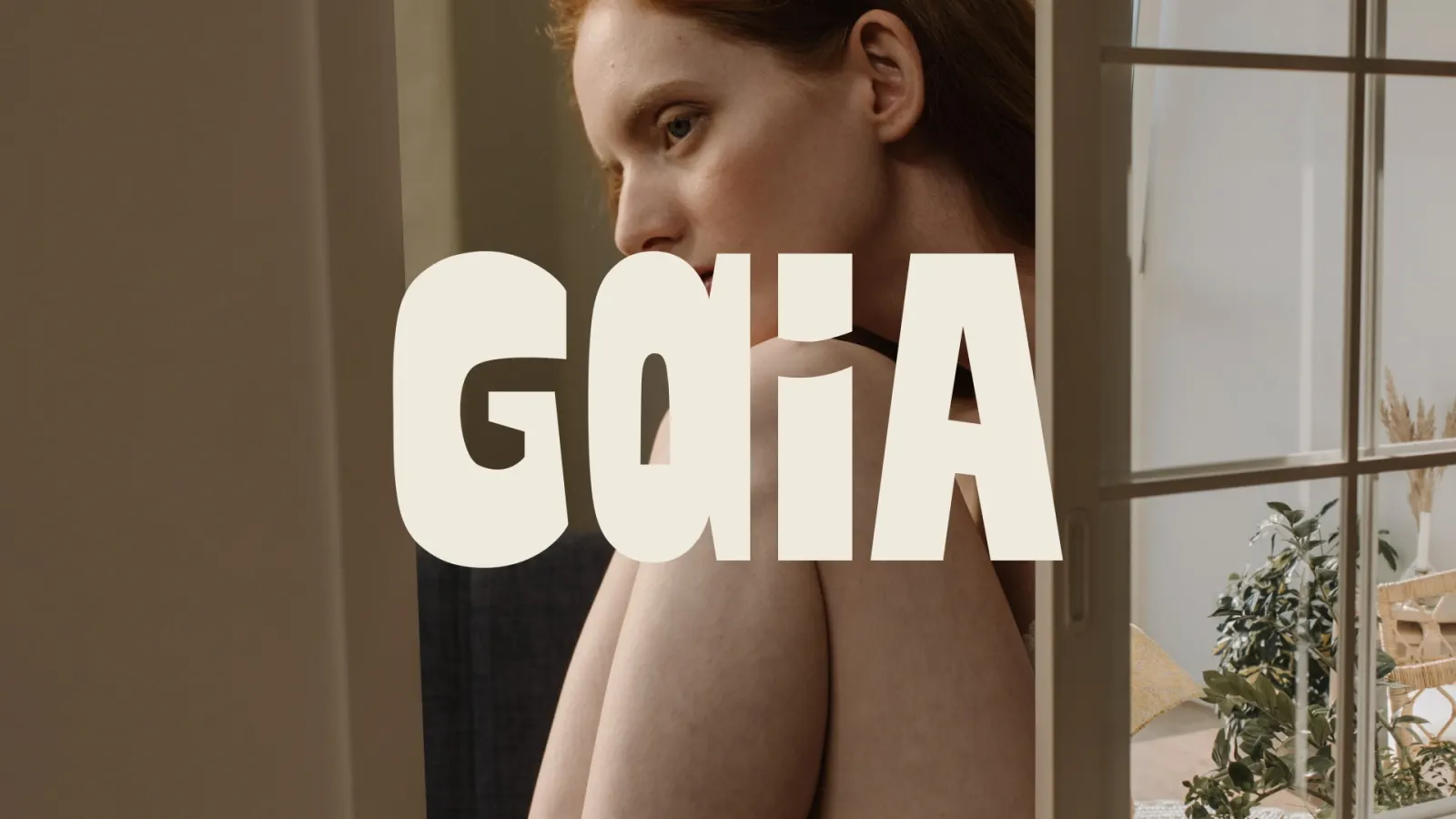
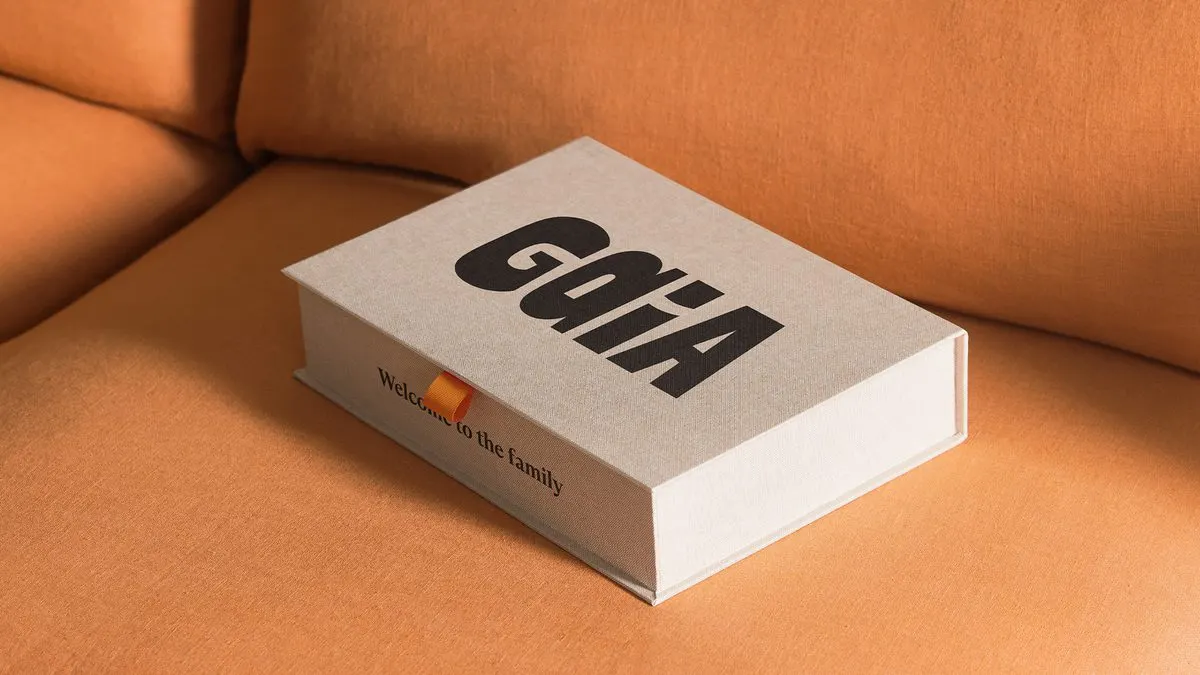
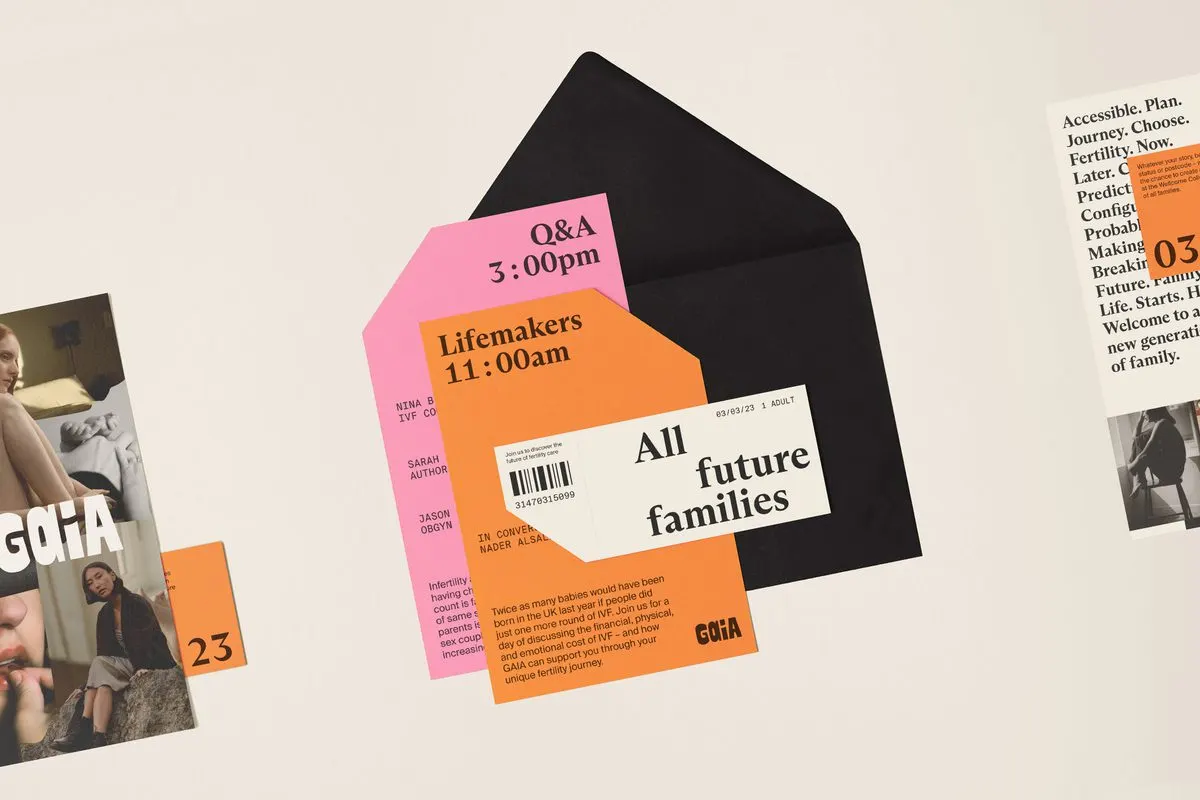
↗Gaia's wordmark makes its argument with one small decision: the two A's are drawn differently, so the name itself says families come together in more than one way. Ragged Edge created the identity as the fertility insurer, which pairs a personalized prediction of your chances of having a child with an insurance plan, prepared to enter the US market.
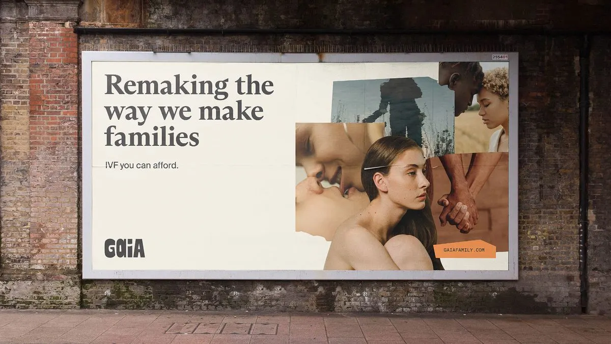
The brief was to make IVF feel like a considered choice rather than a fallback. Ragged Edge answered with a collage device that combines photography by Charlie McKay and individual illustrations into mixed, deliberately imperfect compositions, plus a confident, caring tone of voice. The studio built the system with Gaia's in-house team for web, social, and print. Since the October 2022 launch, Gaia has reached 57 US locations and raised a $14 million Series B.
Why it works
The mismatched A's are easy to miss at first, which suits a brand that wants to reassure rather than shout. Collage is a smart fit for the subject. It can hold many kinds of families in a single frame, so Gaia never has to settle on one idealized picture of parenthood. That matters in a category where imagery often narrows to a single story. Pairing it with a direct, warm voice also suits a company whose product is an honest probability.
Applications
Typography
Images and video from raggededge.com, by Ragged Edge.