The Brand Monograph
Papaton brand identity by Shuka Brand Bureau
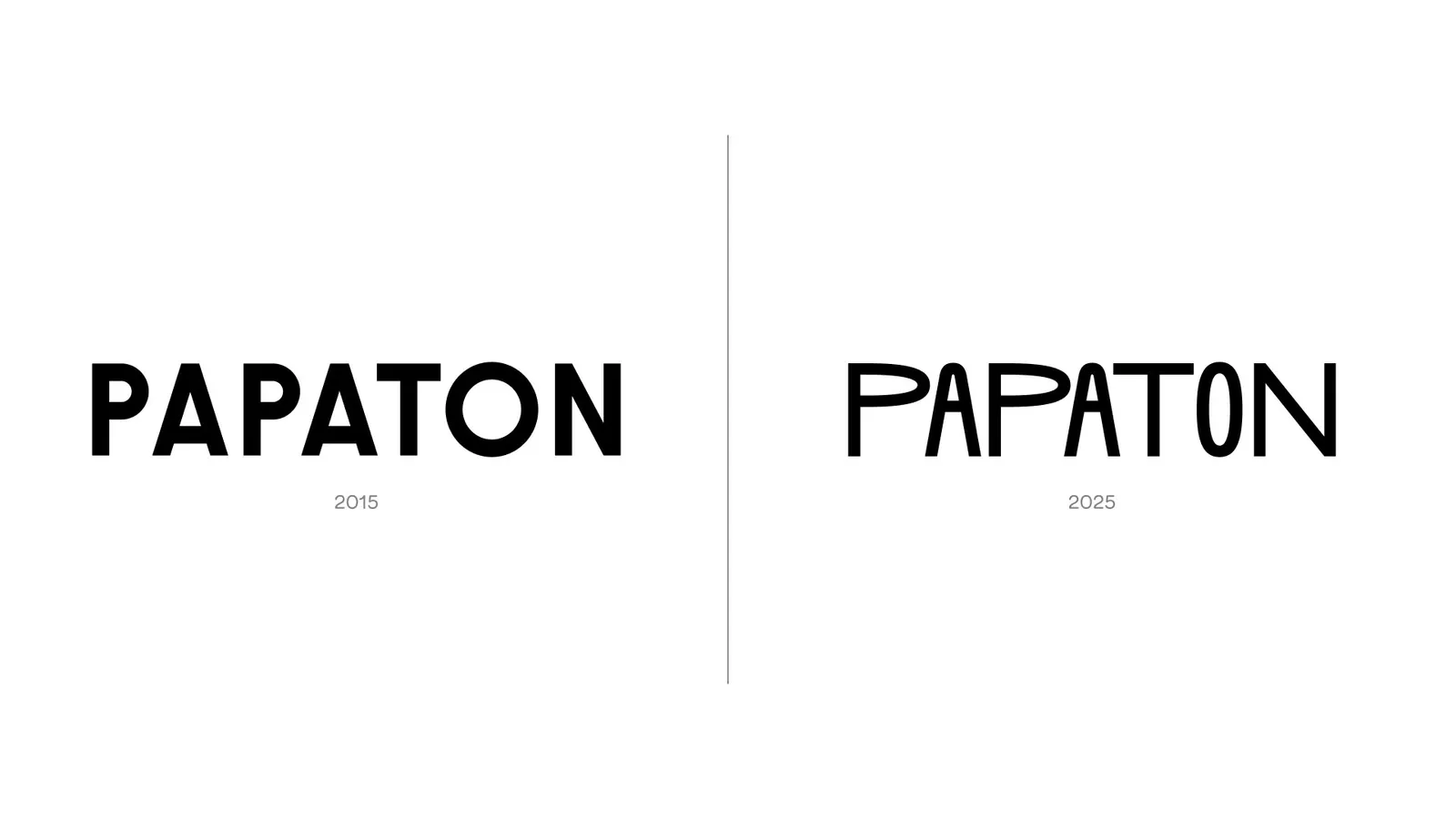
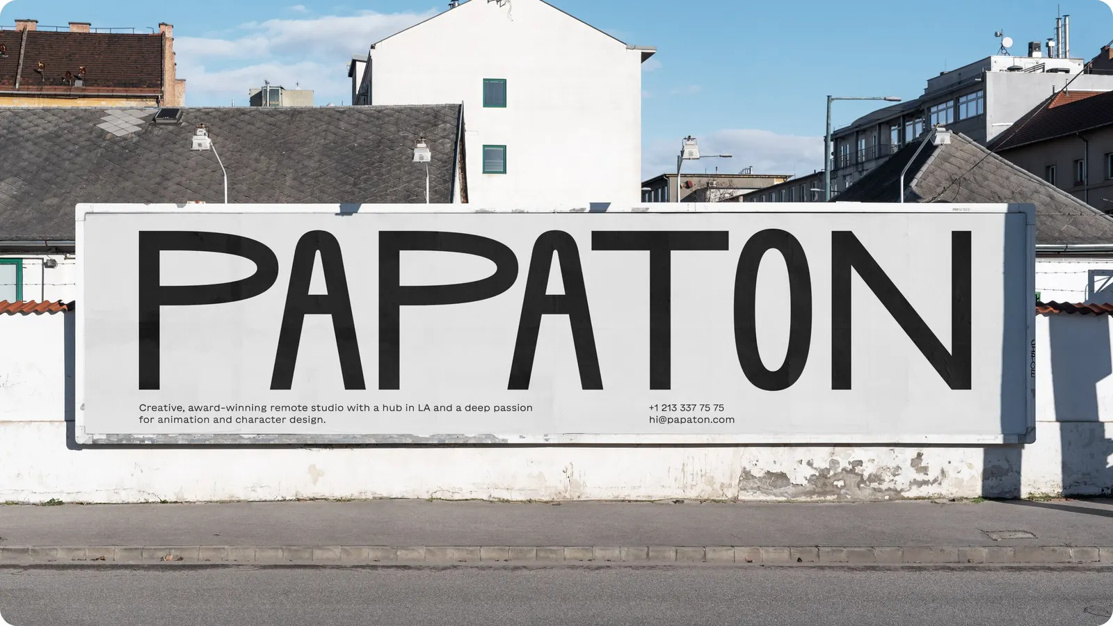
↗Most animation studios say they bring things to life. Papaton's new identity actually does it. Shuka Brand Bureau built the wordmark so its letters stretch, twist, and leap, applying to type the same physics that animate the studio's characters.
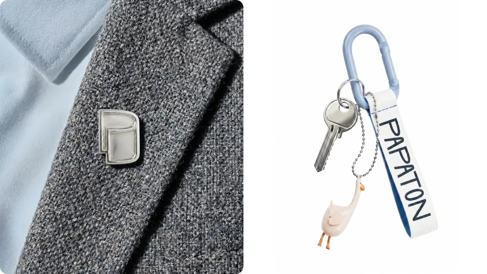
The timing made sense. Papaton makes 2D and 3D characters and full animated worlds for brands, yet it had used the same identity since 2015 while much of its field settled into a similar look. Shuka's designers, Artem Rulev, Diana Vasina, and Ivan Velichko, created a new wordmark, a custom typeface, and a brand mark, with Anna Chekushkina on motion, Ksenia Samoijlova on strategy, and Anna Vanisheva on copy. The mark took the longest to resolve: a sheet of paper, folded so that it reveals a "P."
Why it works
A plain sheet of paper is a modest symbol in a category that often leans on glossy, showy visuals, and that restraint reads as craft and human authorship, which is what brands hiring a character studio want to see. The fold doubles as an initial, so the mark needs no monogram and stays tied to the lettering. Because the wordmark carries the motion, the symbol can stay calm and simple. The logo itself becomes a small demonstration of the studio's skill.
Logo
Applications
Images and video from shuka.design, by Shuka Brand Bureau.