 The Brand Monograph
Rogo brand identity by Together
↗Few launches have to earn trust as quickly as Rogo's. The AI research company had a working product and early customers but no public face, and its audience of bankers, analysts, and investors is hard to impress. Together worked with the founders to settle the story first, then shaped the identity, website, and product UX around it.
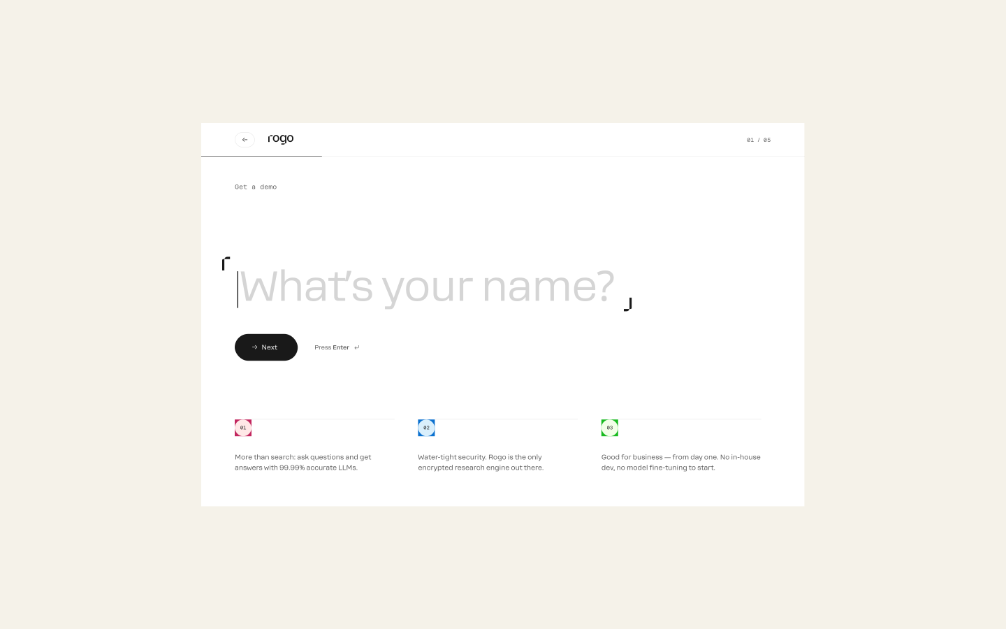
The craft is in the restraint. Typography, developed with Interval Type, along with color and motion, is handled with discipline, and the voice speaks to finance professionals rather than at them. The product's range is organized around three outcomes: speed, traceable sources, and safe handling of confidential documents. Tying it together is the Frame, a recurring device that structures information and directs attention across the site, the interface, and analyst outputs.
Why it works
In finance, people trust what looks careful, and this identity reads as careful throughout. Exact typography and sparing color and motion suggest a product that can be trusted with sensitive work, which is the real question for this audience. The Frame matters most. Because the same device appears in the marketing and in the product, the website never promises something the interface can't deliver. Leading with outcomes instead of features also answers what a skeptical buyer actually asks.
Logo
Applications



Images and video from together.agency, by Together.


