The Brand Monograph
New Zealand Rugby — Two iconic teams, behaving as equals
by re.design
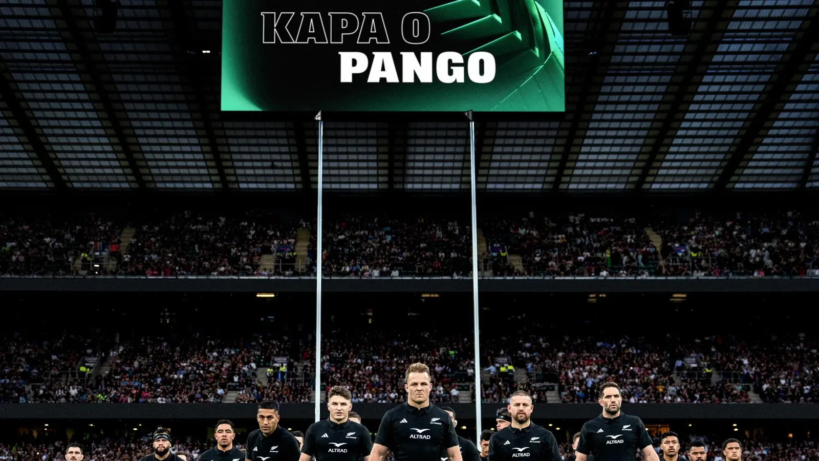
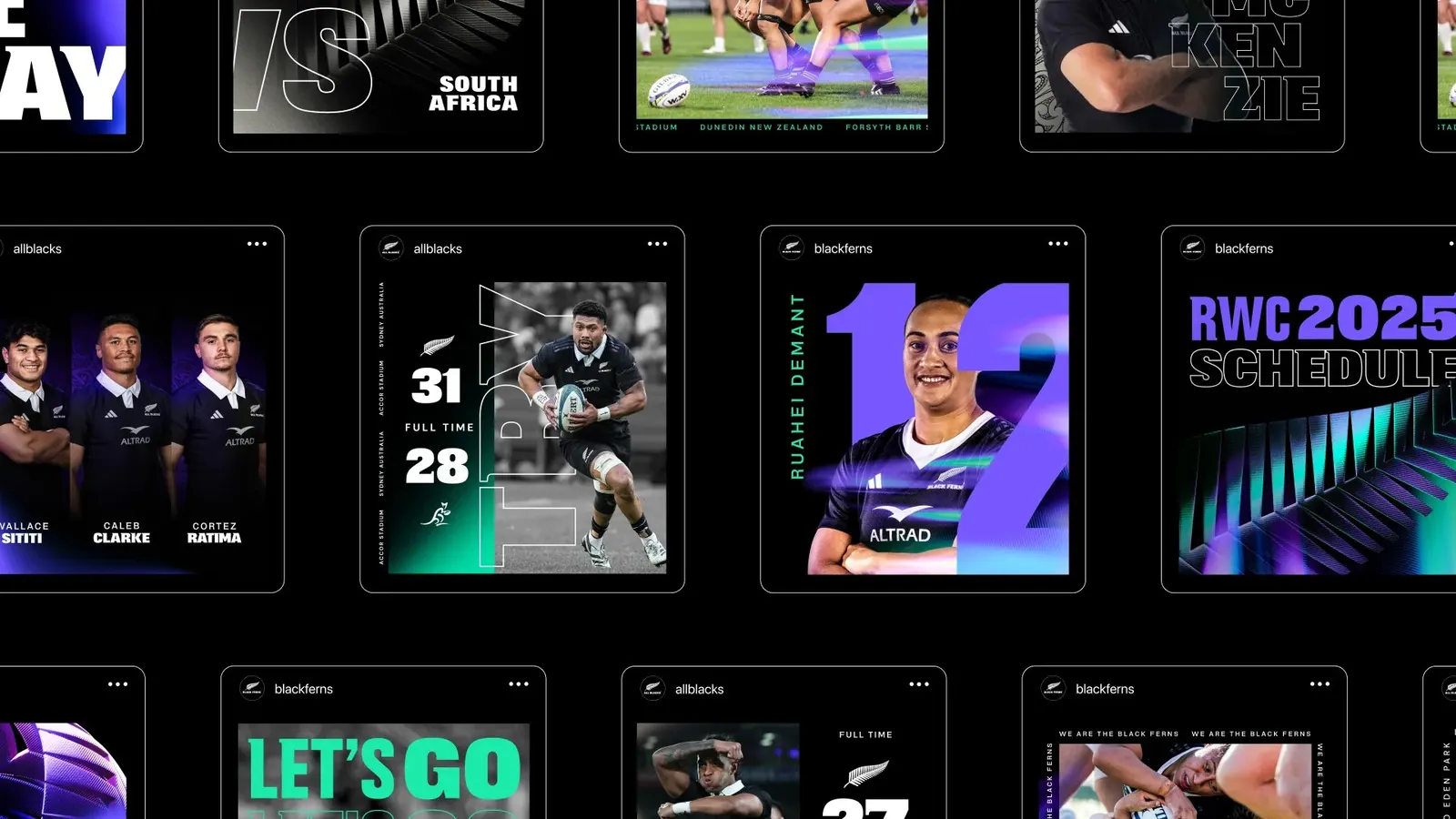
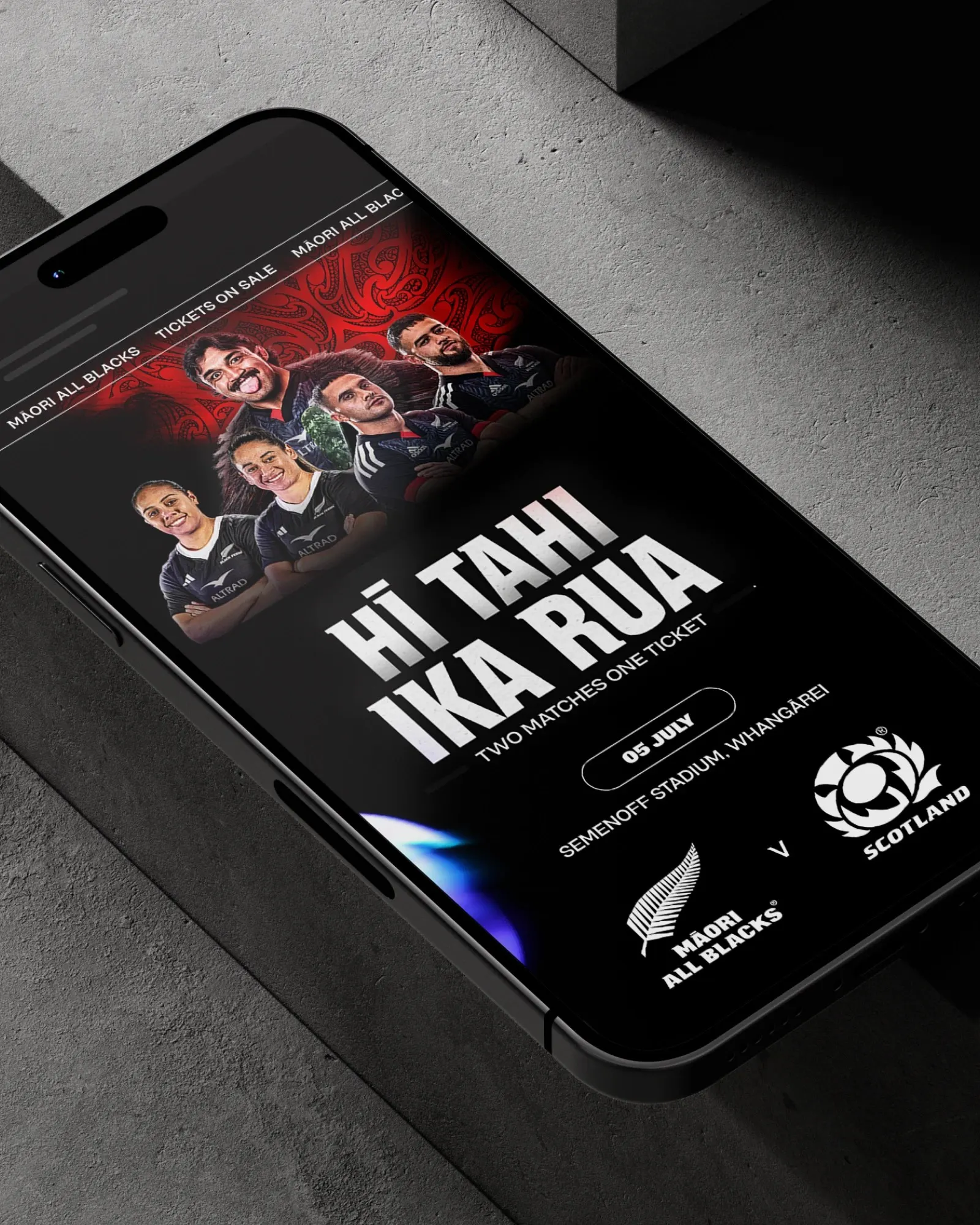
Most sports brands treat the women's team as a sibling to the main event. re.design's work for New Zealand Rugby does something harder: it makes the All Blacks and the Black Ferns true equals, and builds that equality into how the brand behaves.
The brief came at a moment of change. Women's rugby was growing fast, yet the two teams still lived in separate brand systems, which made real parity hard to deliver. re.design's idea was to unify them, so both teams carry the same authority, investment, and cultural weight wherever they appear.
The detail worth noticing is that the equality is behavioral as well as visual. Working with Luke Bell-Booth on motion, the studio gave the system a shared way of moving, so the two teams act alike as well as look alike. It's a good reminder that a brand's values are most convincing when they show up in how it moves and responds, not just in how it looks.




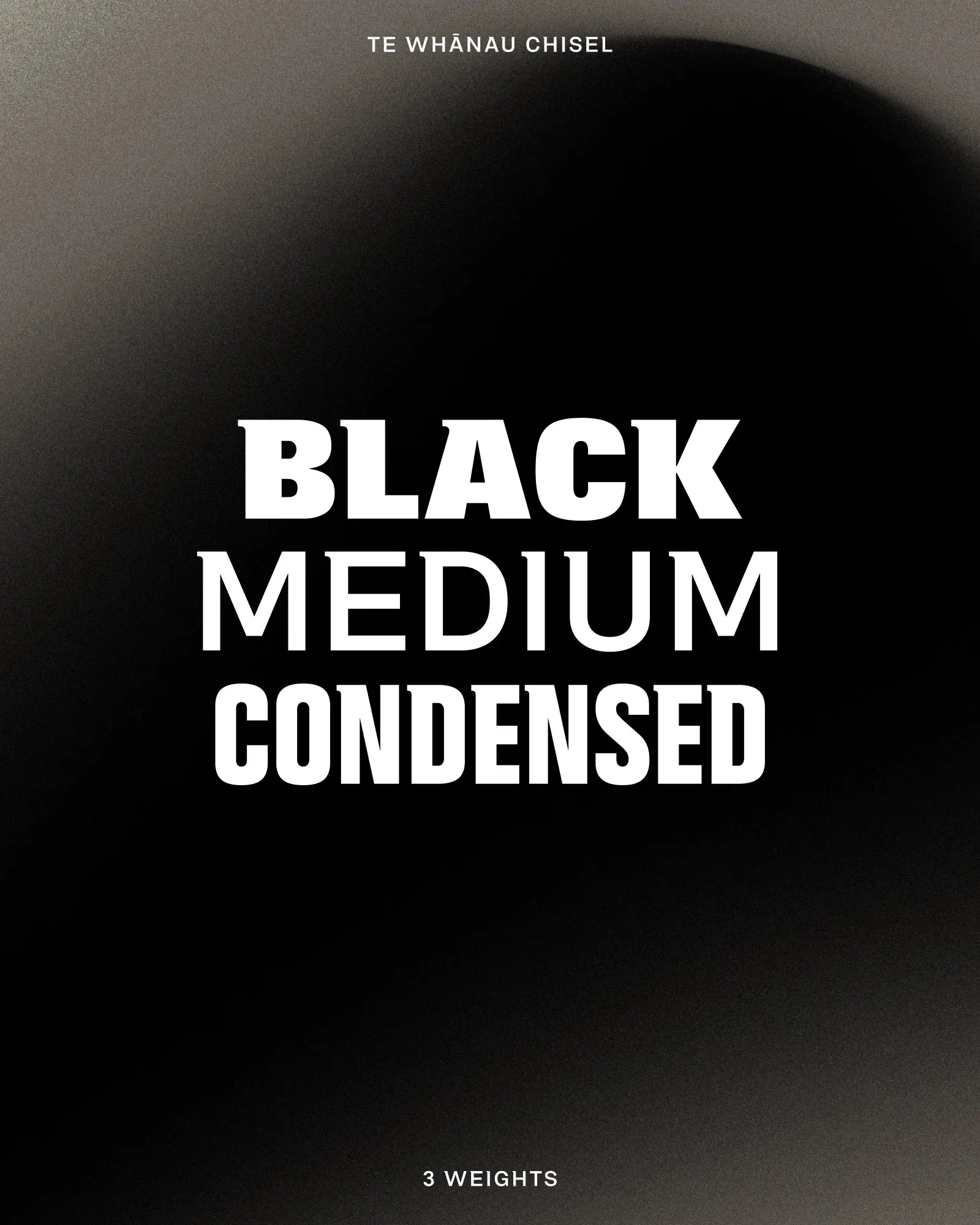
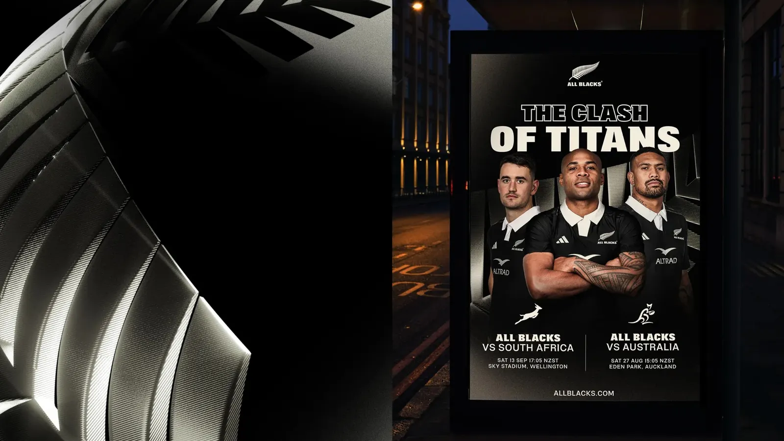

Images and video from re.design, by re.design.