The Brand Monograph
Branding and Packaging for Fable & Mane
by Alphabet
A tiger and a rounded window do much of the storytelling in Alphabet's work for Fable & Mane, a hair wellness brand that treats centuries-old ritual as a starting point for something new. The identity feels rooted and contemporary at once, which is harder to pull off than it looks.
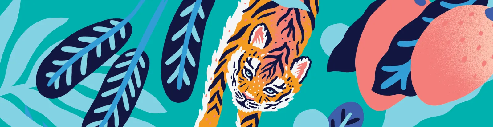
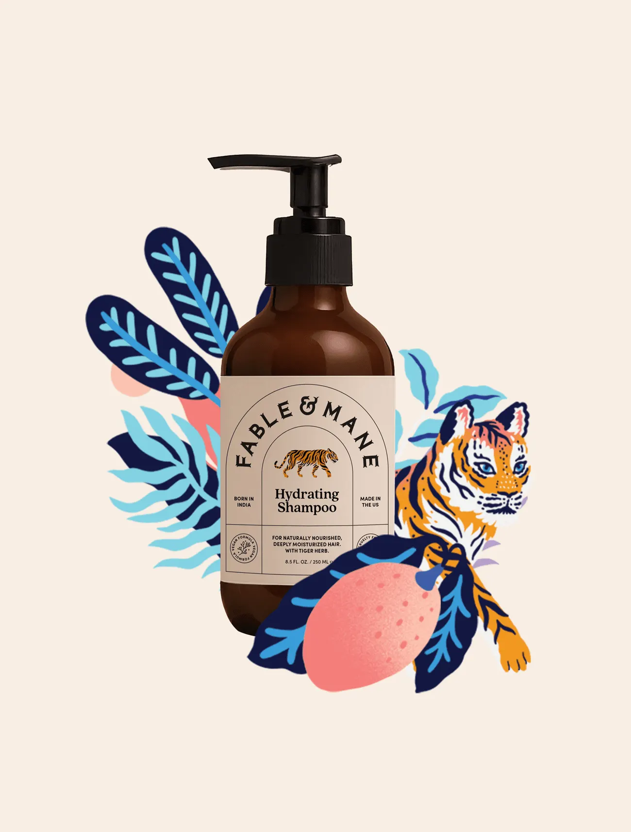
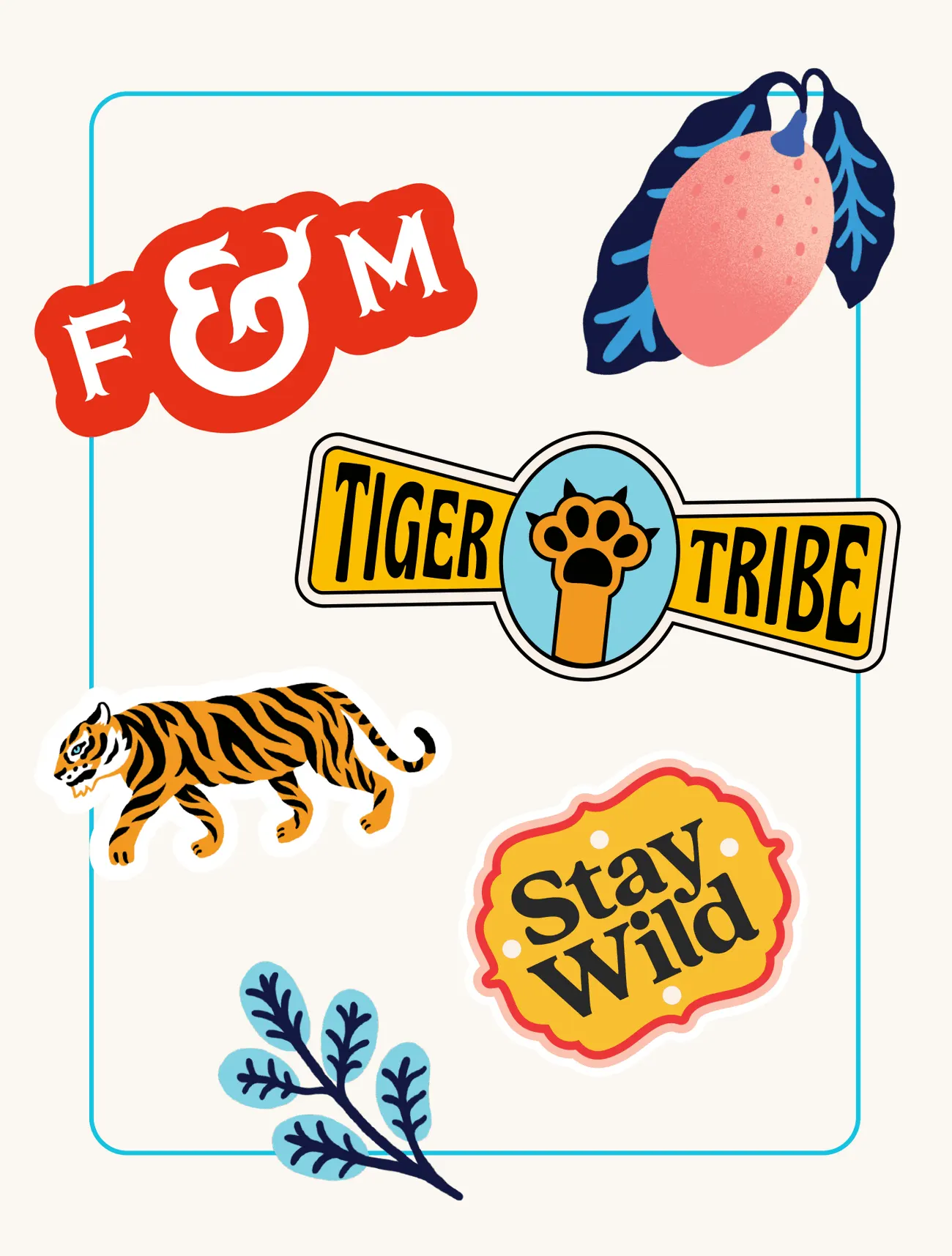
The studio built the brand from the ground up, beginning with research, strategy, and naming, and drawing on the founder's Indian heritage and the tradition of hair oiling. The tiger, a symbol of power, beauty, and bravery in Indian culture and Hindu mythology, became the anchor for both the logo and the wider imagery. That gives a personal family practice a figure with real cultural weight, and a brand meant to last across generations.
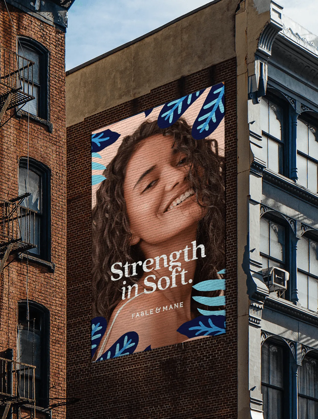
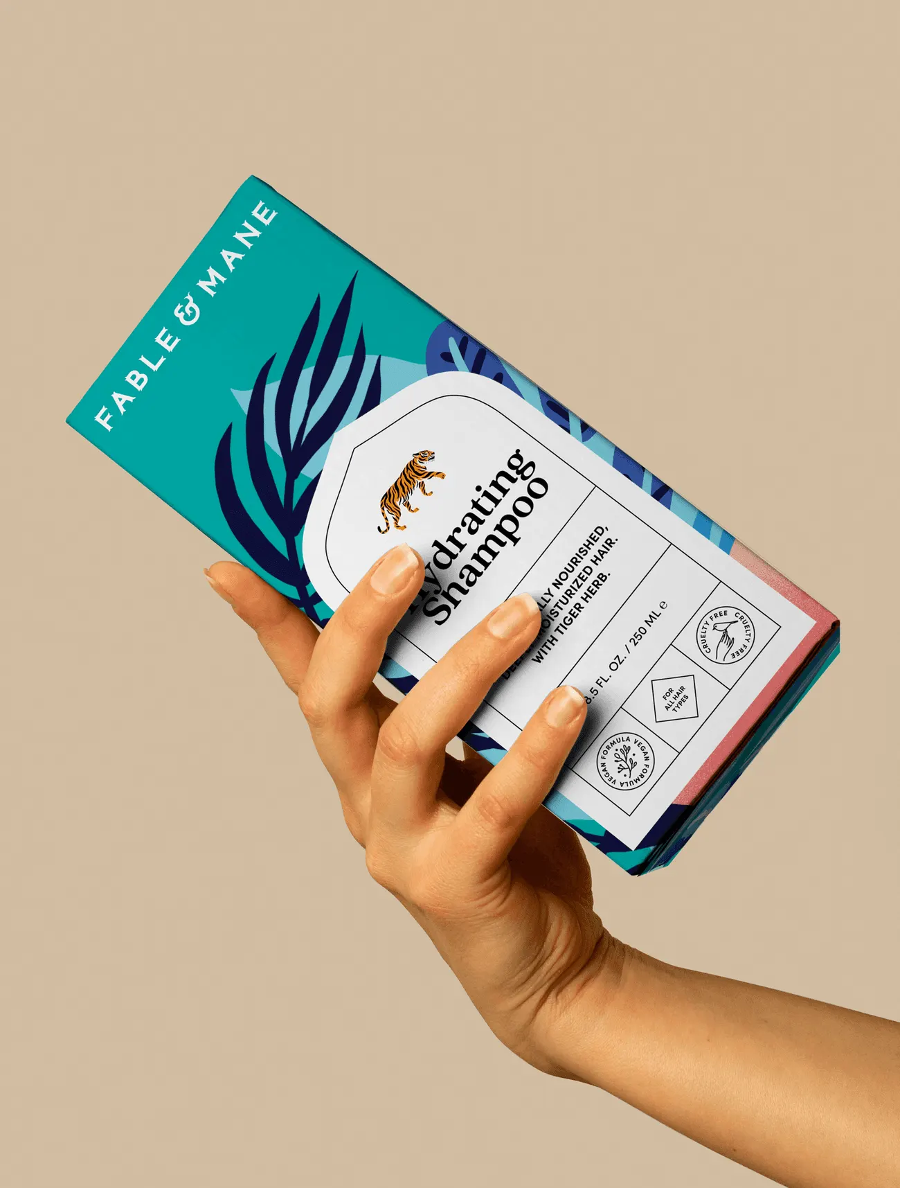
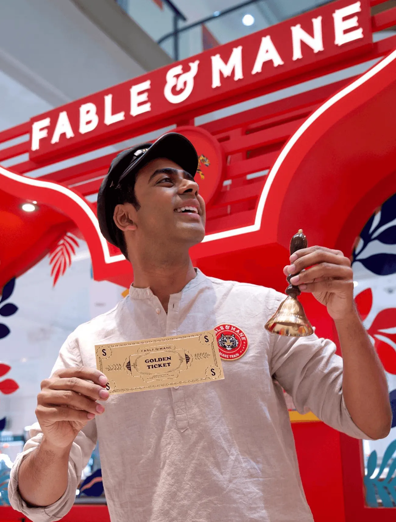
The packaging is where the idea becomes tangible. Alphabet shaped the label around a rounded window inspired by historic architecture, pairing a clean, modern layout with traditional Indian influences. Illustrator Marcos Navarro contributed bright, story-led artwork that ties the range together, while fresh photography and playful pops of color keep the tone light. The result is an "east meets west" balance, carried through digital and print rollout.




Images and video from madebyalphabet.com, by Alphabet.