The Brand Monograph
Oxford Street
by Koto
Oxford Street's identity doesn't try to stand above the crowd. It joins it. Koto designed the brand to behave like part of the street's flow, knowing when to be loud and when to let the surroundings take over.
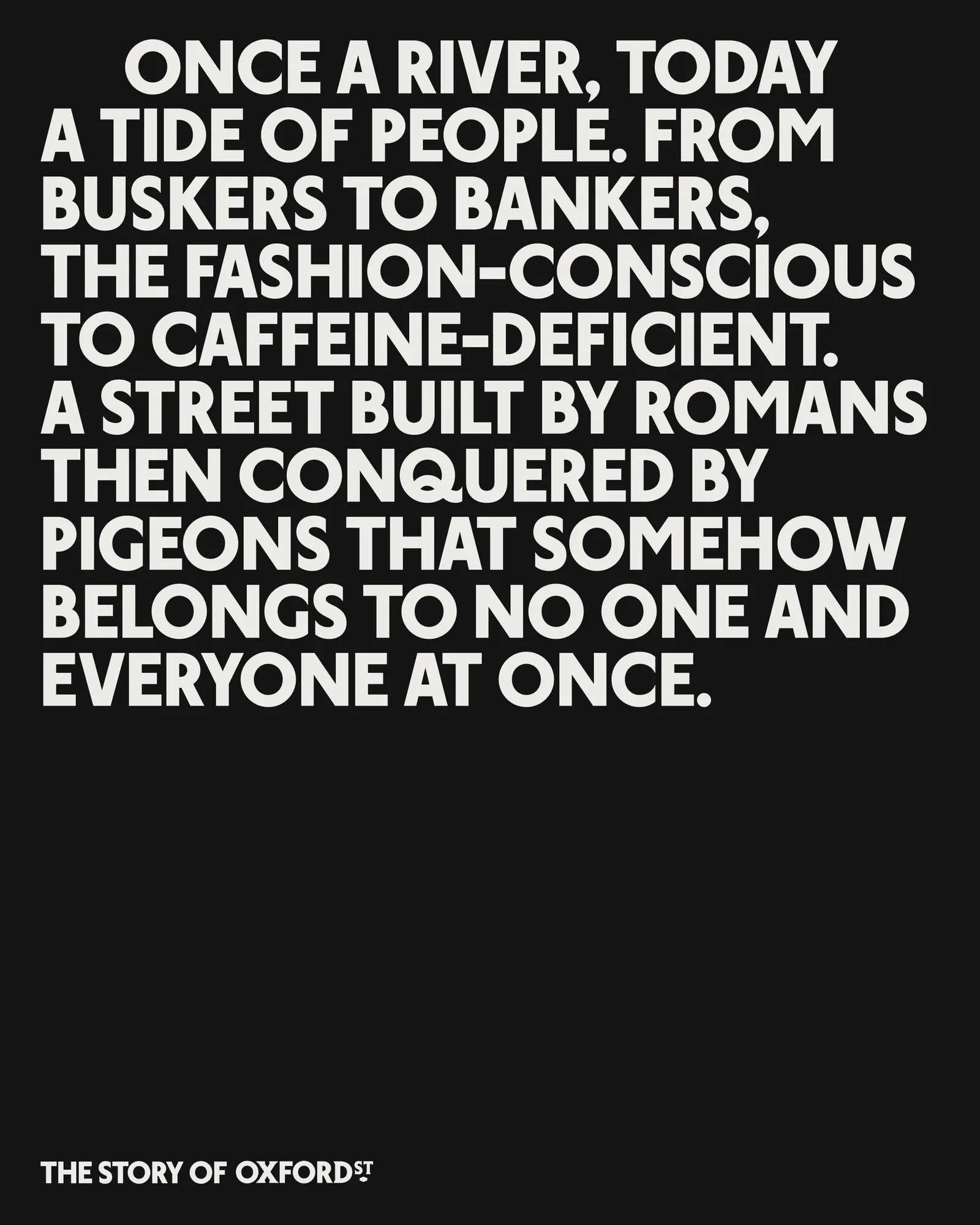
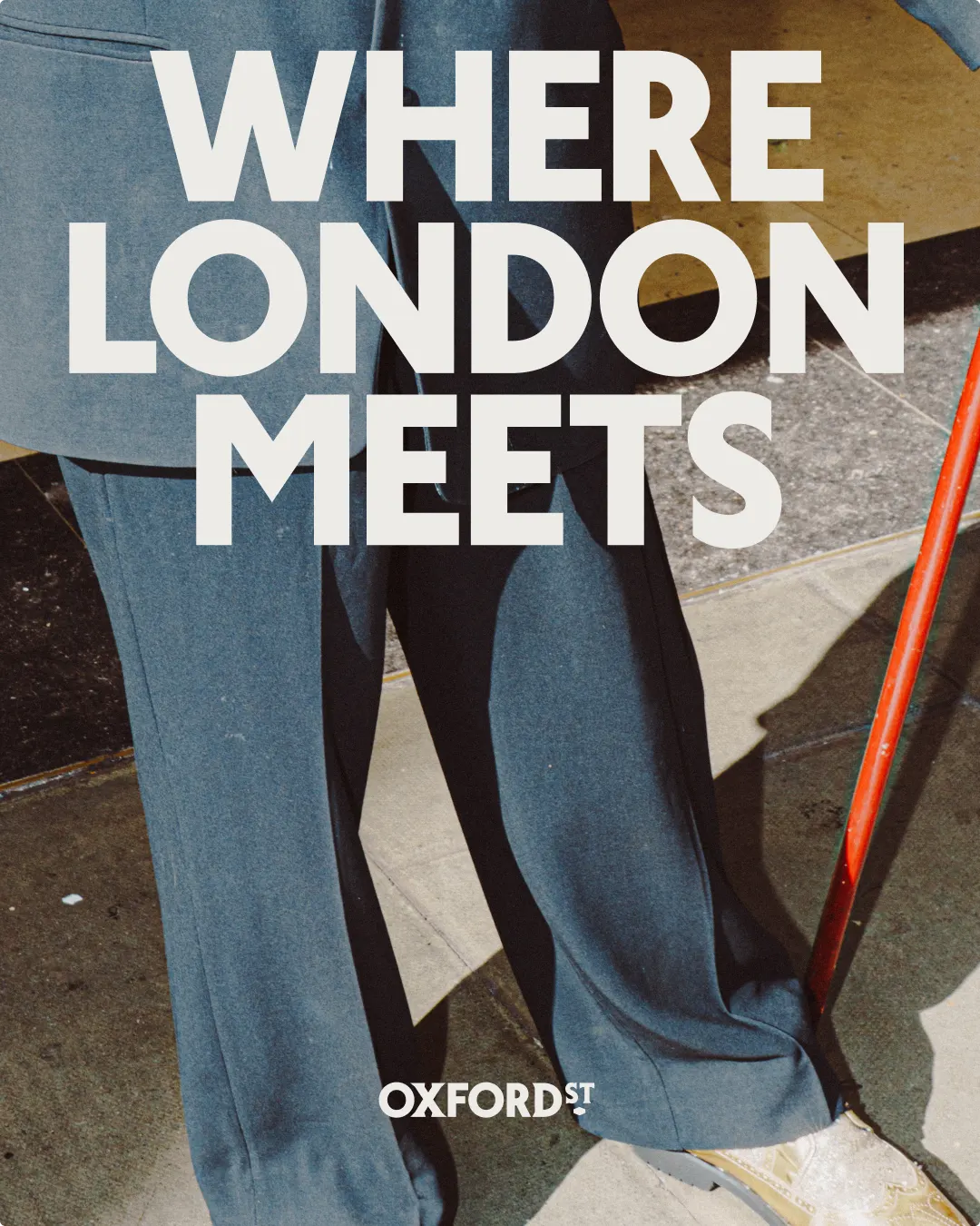
The timing matters. With pedestrianization opening a new chapter for a street that has gone from Roman road to global shopping destination, the brief called for something that could change as the place does. Koto's answer is a single idea, "Oxford Street for everyone," which shapes everything from tone to imagery. Art direction takes an unfiltered look at familiar faces and passing moments, while campaign headlines use a flexible copy mechanic to find humor in the street's eclectic reputation.
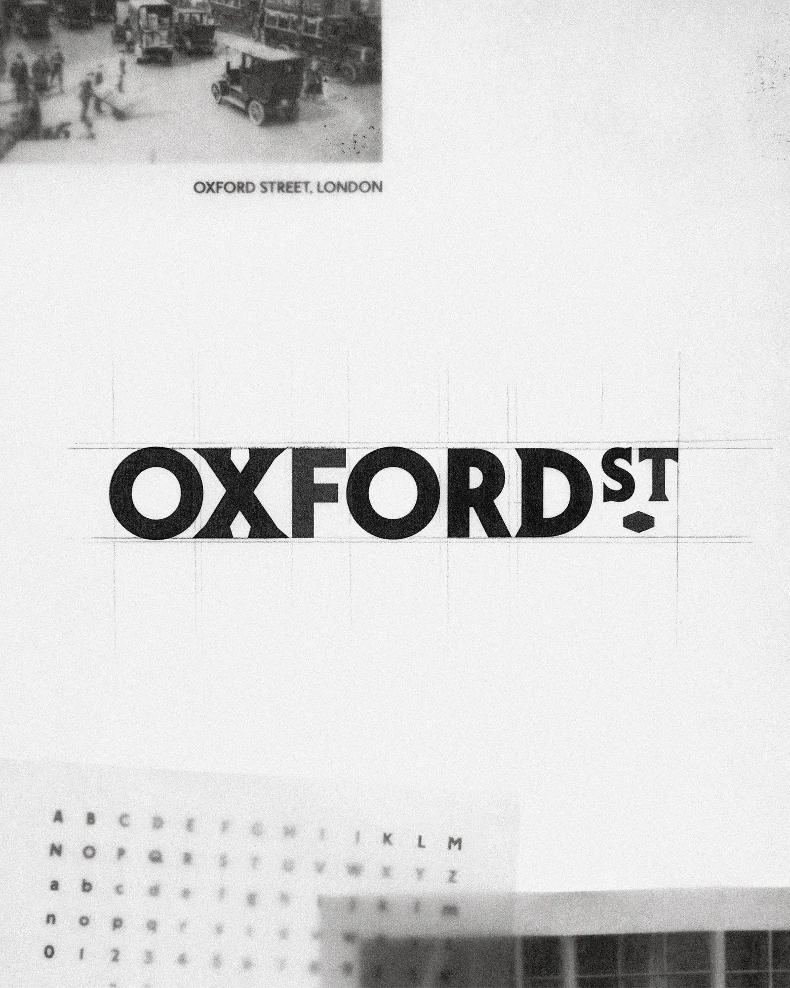
The typography carries much of the character. Working with St Bride Foundation, Koto drew on London's typographic heritage to create London Sans, a contemporary typeface with a local accent. The wordmark sets it against a contrasting serif and a lozenge borrowed from historic signage. Type meanders across layouts like foot traffic, and a monogram of intersecting letters nods to local architecture and shop signs. A family of icons based on the street's recognizable sights helps with wayfinding, completing a system built to grow.


Images and video from koto.com, by Koto.