The Brand Monograph
Imperial
by Pentagram
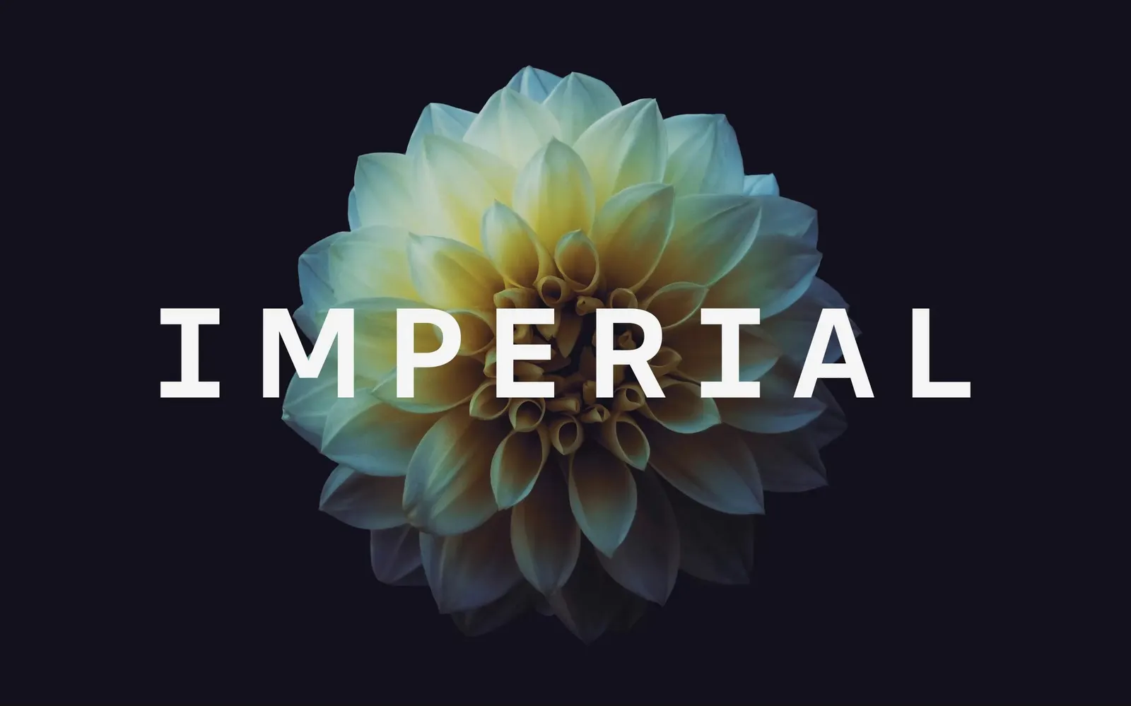
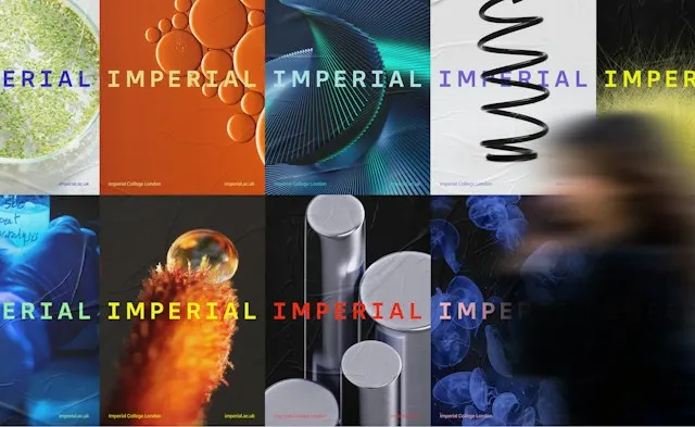
Pentagram's identity for Imperial College London shows how much a single letter can carry. A serifed "I" anchors the whole system, turning one of the world's top-ten universities into something that feels open, confident, and distinctly modern.
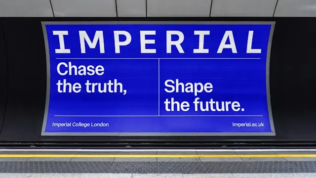
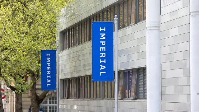
The brief was to bring order to an identity dating from the 1990s that never had a clear proposition behind it. Working from a brand strategy by Simple Revolution, the studio made "Imperial" the official visual shorthand, in the same spirit as Oxford, Cambridge, Harvard, and Stanford. The full name stays, but the shorter one leads. The university also chose to face the word's colonial associations directly, opening a candid conversation about its history rather than avoiding it.
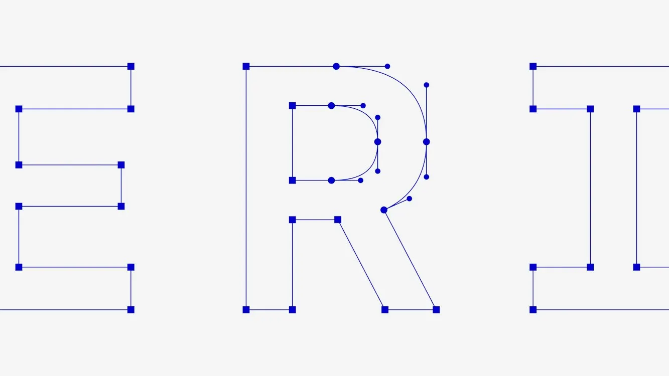
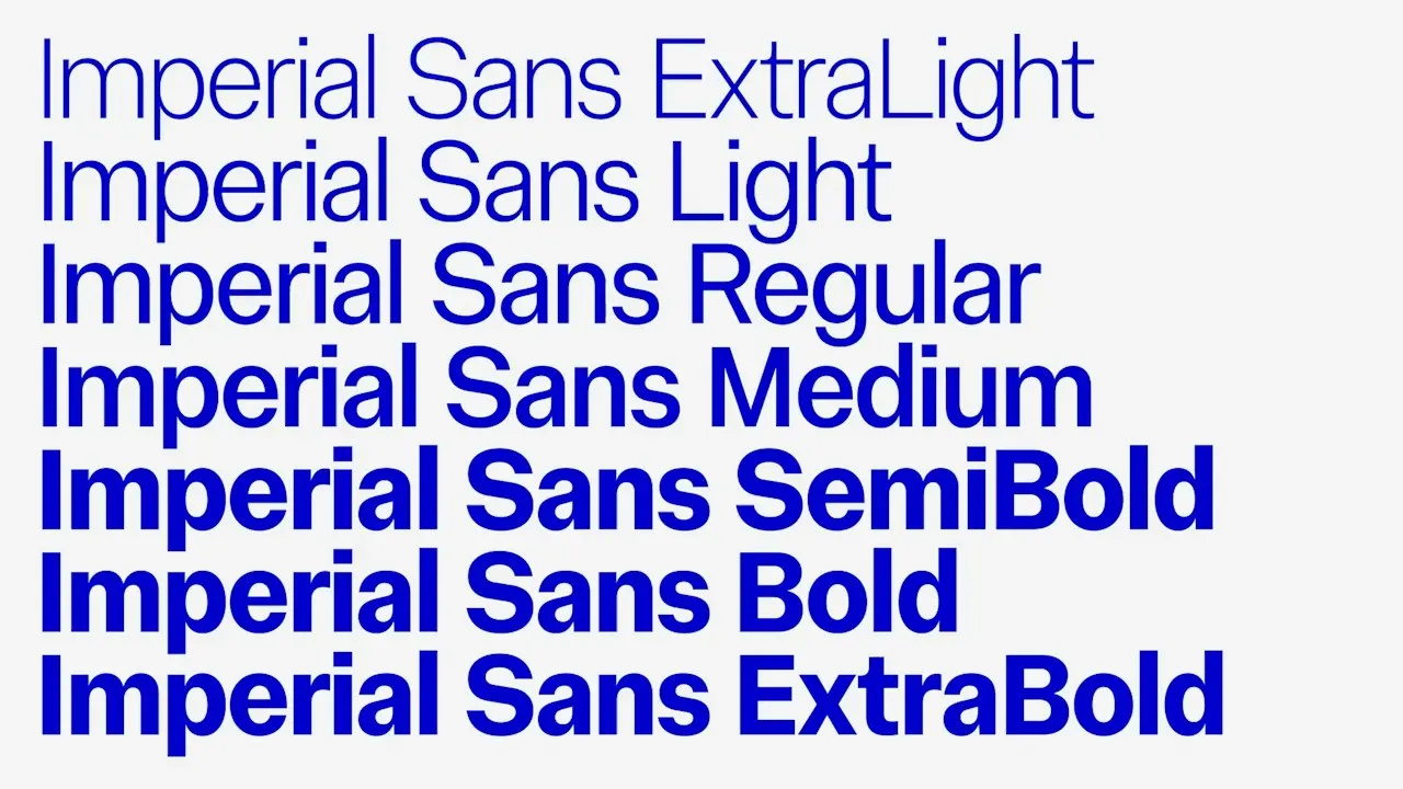
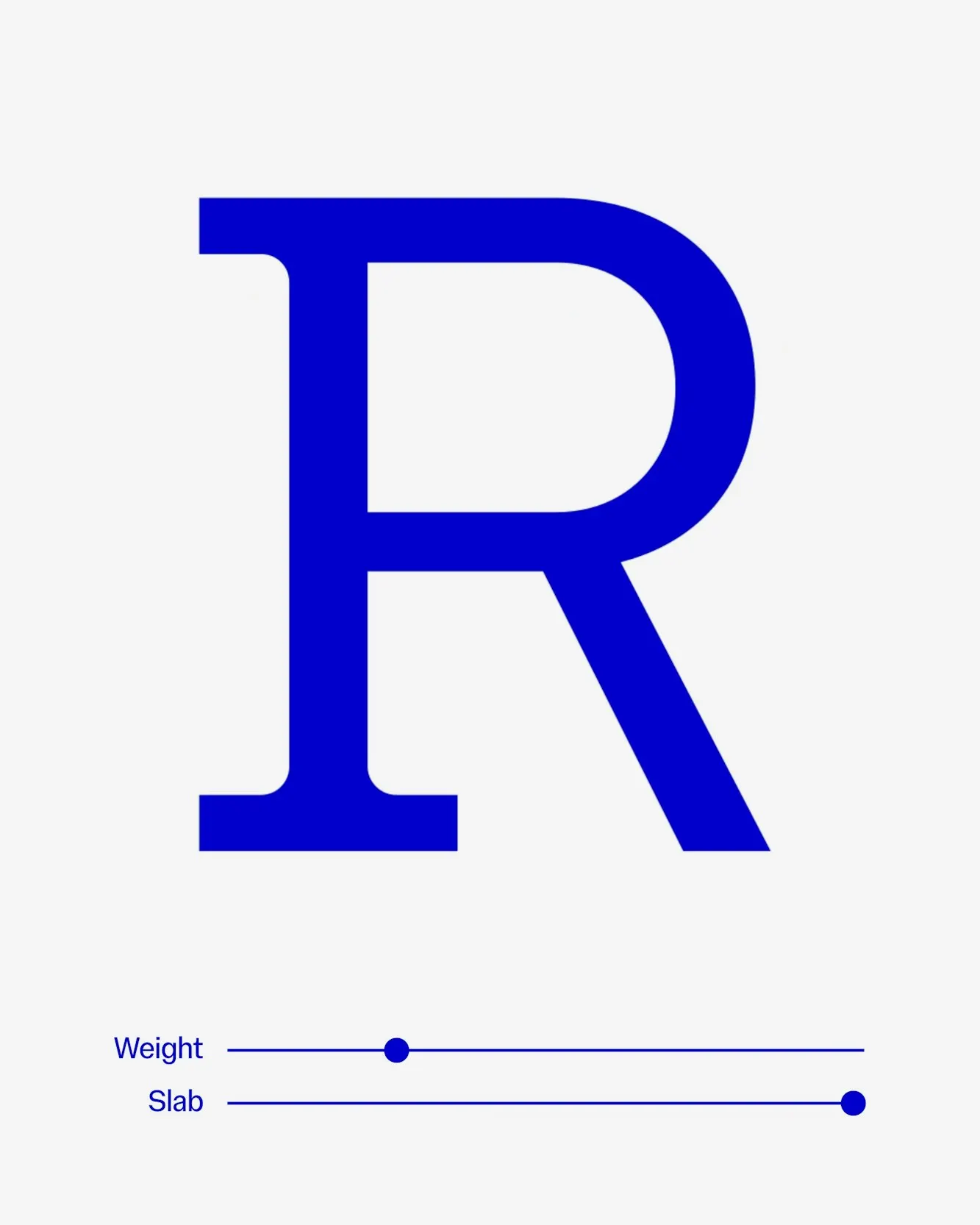
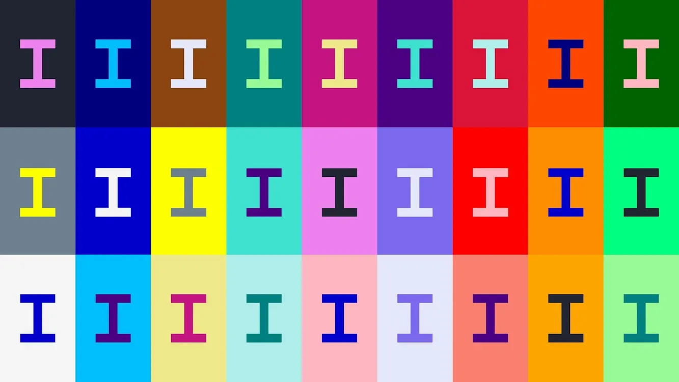
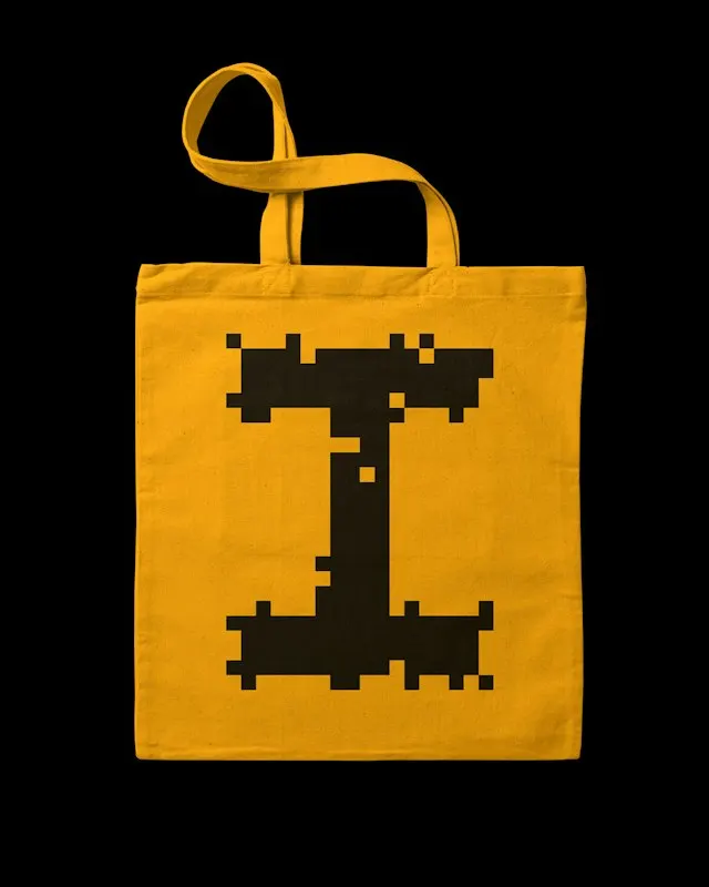
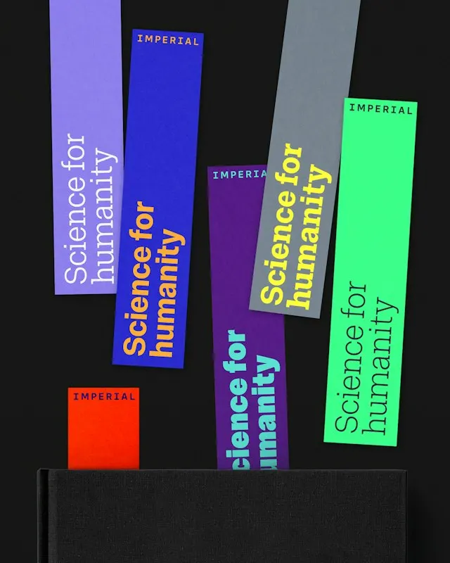
The craft is in how disciplined the system is. A bespoke wordmark in Imperial Blue, paired with black and white, keeps things bright and puts science at the center. NaN, working with Pentagram's Luke Prowse, designed a variable typeface family: Imperial Sans, Imperial Sans Display, and Imperial Slab. Illustrated letter "I"s and expressive repeat patterns add playfulness and structure, and a supporting palette gives the identity room to flex.







Images and video from pentagram.com, by Pentagram.