The Brand Monograph
MOCA LA
by Base Design
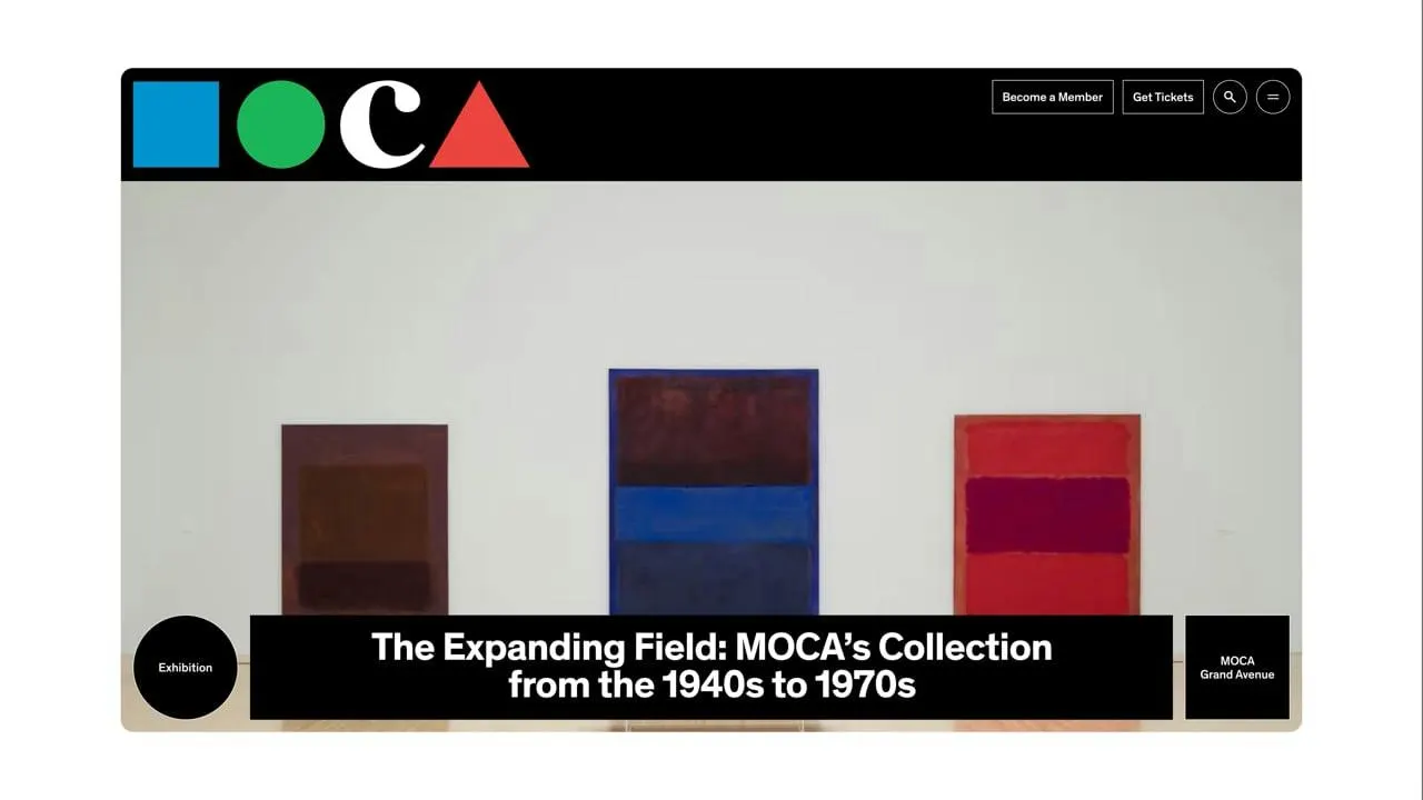
Base Design has turned one of the most recognizable museum logos in Los Angeles into a working piece of interface. For MOCA's new website, the circle and square from Chermayeff & Geismar's 1984 mark no longer sit in a corner as a signature. They are the navigation.
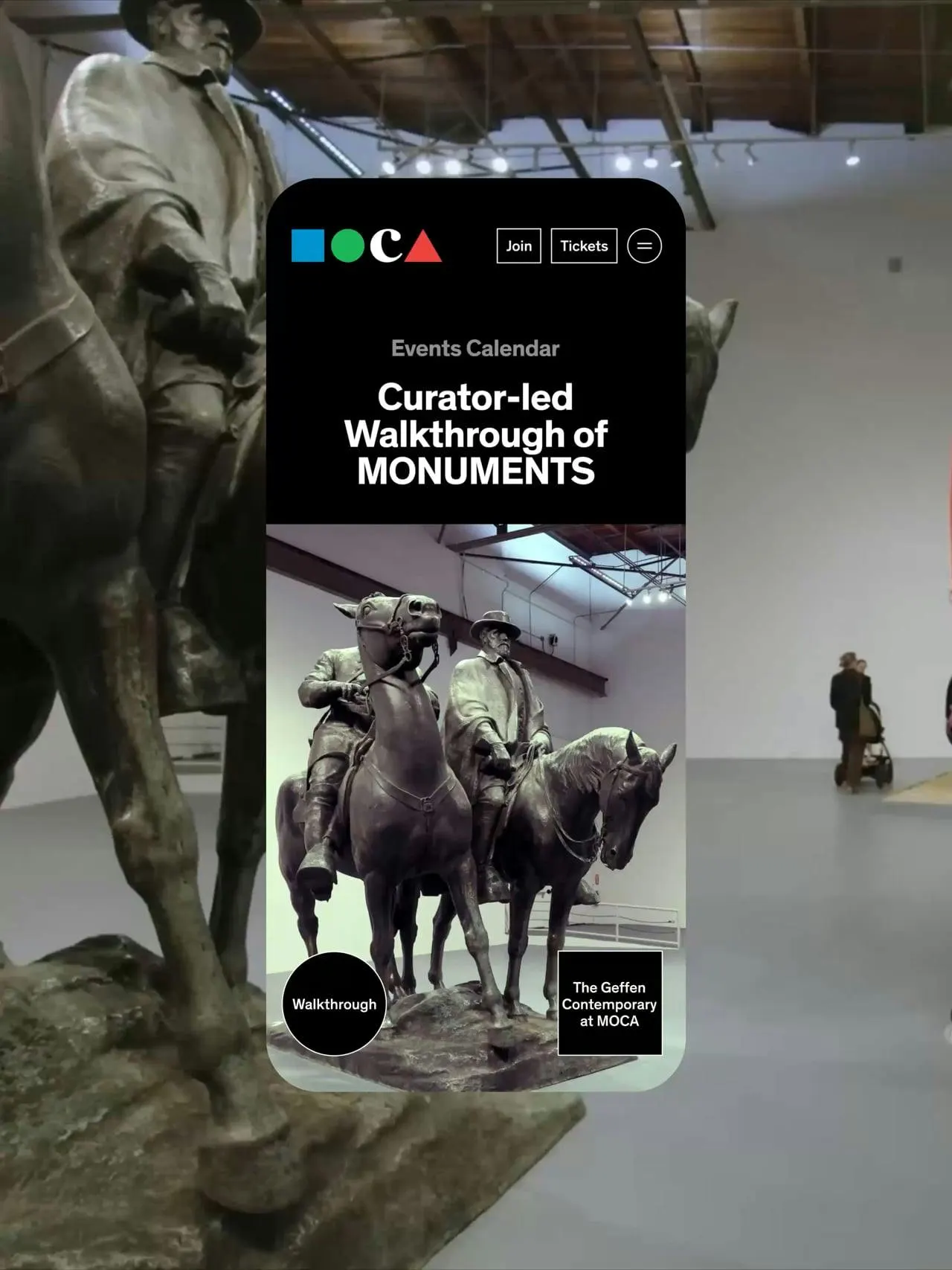
The brief was to carry MOCA's history and restless energy online without making the museum into something it isn't. Museum sites tend to bury visitors in menus, so Base Design started with a practical question: how do you keep navigation under the thumb and out of the art's way? Its answer was to move the circle and square to the bottom of the phone screen and give them a job.
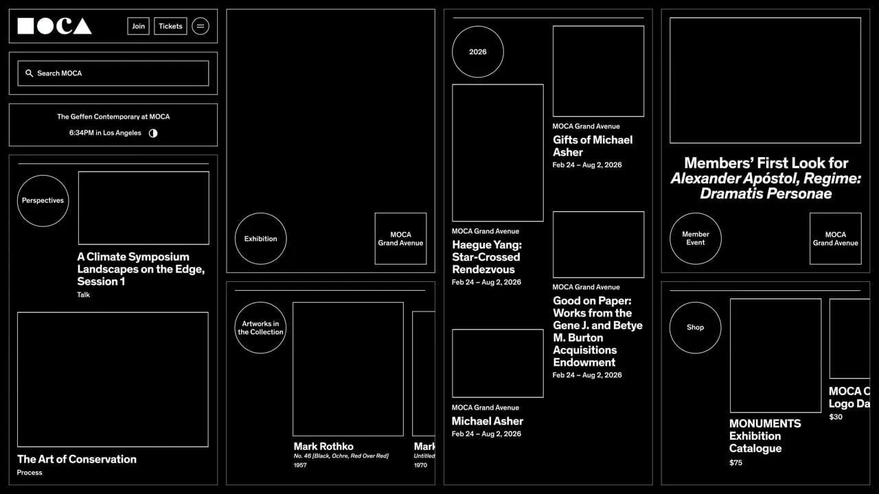
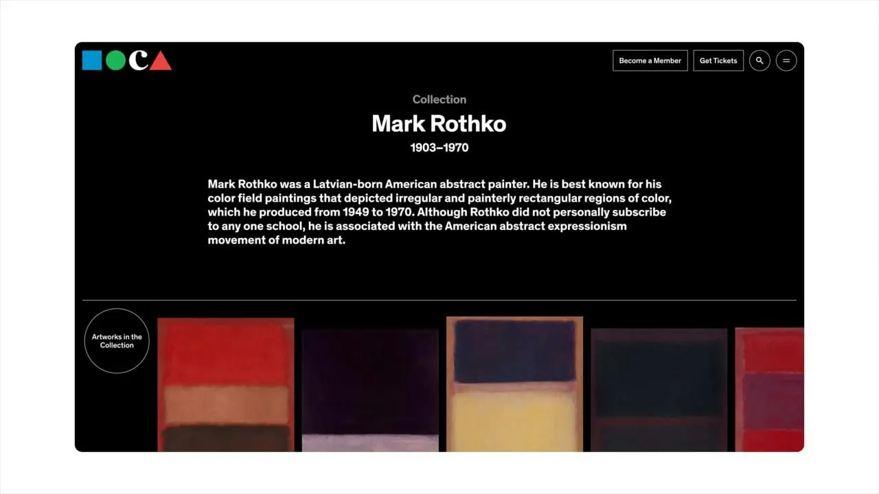
That small gesture became the logic of the whole site. Working with strategist Mirek Nisenbaum, the design and development teams used the shapes to open menus, mark content, identify the two locations, and keep pages and scrolls feeling continuous. The result is less hierarchy, fewer detours, and more room for the work. Base Design added no new visual language, and it didn't need to. The original mark simply had more to say.
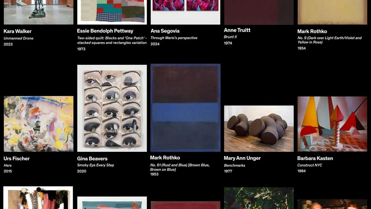
Images and video from basedesign.com, by Base Design.